In this series, we’ve walked through how exactly you can use R for statistical analysis, from the absolute basics of R coding (in part 1) to visualizing data and correlation tests (in part 2).
Since you’re reading this on TechGraphs, though, you might be interested in statistical projections, so that’s how we’ll wrap this up. If you’re just joining us, feel free to follow along, though looking through parts 1 and 2 first might help everything make more sense.
In this post, we’ll use R to create and test a few different projection systems, focusing on a bare-bones Marcel and a multiple linear regression model for predicting home runs. I’ve said a couple times before that we’re just scratching the surface of what you can do — but this is especially true in this case, since people write graduate theses on the sort of stuff we’re exploring here. At the end, though, I’ll point you to some places where you can learn more about both baseball projections and R programming.
Baseline
Let’s get everything set up. We’ll have to start by abandoning –well, modifying– that test data set that served us so well in Parts 1/2; we’ll add another two years of data (2011-14), trim out some unnecessary stats, and add a few which might prove useful later on. It’s probably easiest just to download this file.
Then we’ll load it:
fouryr = read.csv("FG1114.csv")
convert some of the percentage stats to decimal numbers:
fouryr$FB. = as.numeric(sub("%","",fouryr$FB.))/100
fouryr$K. = as.numeric(sub("%","",fouryr$K.))/100
fouryr$Hard. = as.numeric(sub("%","",fouryr$Hard.))/100
fouryr$Pull. = as.numeric(sub("%","",fouryr$Pull.))/100
fouryr$Cent. = as.numeric(sub("%","",fouryr$Cent.))/100
fouryr$Oppo. = as.numeric(sub("%","",fouryr$Oppo.))/100
and create subsets for each individual year.
yr11 = subset(fouryr, Season == "2011")
colnames(yr11) = c("2011", "Name", "Team11", "G11", "PA11", "HR11", "R11", "RBI11", "SB11", "BB11", "K11", "ISO11", "BABIP11", "AVG11", "OBP11", "SLG11", "WAR11", "FB11", "Hard11", "Pull11", "Cent11", "Oppo11", "playerid11")
yr12 = subset(fouryr, Season == "2012")
colnames(yr12) = c("2012", "Name", "Team12", "G12", "PA12", "HR12", "R12", "RBI12", "SB12", "BB12", "K12", "ISO12", "BABIP12", "AVG12", "OBP12", "SLG12", "WAR12", "FB12", "Hard12", "Pull12", "Cent12", "Oppo12", "playerid12")
yr13 = subset(fouryr, Season == "2013")
colnames(yr13) = c("2013", "Name", "Team13", "G13", "PA13", "HR13", "R13", "RBI13", "SB13", "BB13", "K13", "ISO13", "BABIP13", "AVG13", "OBP13", "SLG13", "WAR13", "FB13", "Hard13", "Pull13", "Cent13", "Oppo13", "playerid13")
yr14 = subset(fouryr, Season == "2014")
colnames(yr14) = c("2014", "Name", "Team14", "G14", "PA14", "HR14", "R14", "RBI14", "SB14", "BB14", "K14", "ISO14", "BABIP14", "AVG14", "OBP14", "SLG14", "WAR14", "FB14", "Hard14", "Pull14", "Cent14", "Oppo14", "playerid14")
(We’re renaming the columns for each subset because the merge() function has some problems if you try to merge too many sets with the same names. If you want to explore the less hacked-together way of reassembling data frames in R, take a look at the dplyr package.)
Anyway, we’ll merge these all back into one set:
set = merge(yr11, yr12, by = "Name")
set = merge(set, yr13, by = "Name")
set = merge(set, yr14, by = "Name")
Still with me? Good. Thanks for your patience. Let’s start testing projections.
Specifically, we’re going to see how well we can use the 2011-2013 data to predict the 2014 data. For simplicity’s sake, we’ll focus mostly on a single stat: the home run. It’s nice to test with–it’s a 5×5 stat, it has a decent amount of variation, it gives us experience with testing counting stats while being more player-controlled than R/RBI… and, come on, we all dig the long ball.
Now when you’re testing your model, it’s nice to have a baseline–a sense of the absolute worst that a reasonable model could do. For our baseline, we’ll use previous-year stats: we’ll project that a player’s 2013 HR count will be exactly what they hit in 2014.
To test how well this works, we’ll follow this THT post and use the mean absolute error–the average number of HRs that the model is off by per player. So if a system projects two players to each hit 10 homers, but one hits zero and the other hits 20, the MAE would be 10.
(If you end up doing more projection work yourself, you may want to try a more fine-tuned metric like r² or RMSE, but I like MAE for a basic overview because the value is directly measurable to the stat you’re examining.)
To find the mean absolute error, take the absolute value of the difference between the projected and actual stats, sum it up for every player, then divide by the number of players you’re projecting:
sum(abs(set$HR13 - set$HR14))/length(set$HR14)
> [1] 6.423729
So the worst projection system possible should be able to beat an average error of about six and a half homers per player.
Marcel, Marcel
Now let’s try a slightly-less-than-absolute-worst model.
Marcel is the gold standard of bare-bones baseball projections. At its core, Marcel predicts a player’s stats using the last 3 years of MLB data. The previous year (Year X) gets a weight of 5, the year before (X-1) gets a weight of 4, and X-2 gets a weight of 3. As originally created, Marcel also includes an adjustment for regression to the mean and an age factor, but we’ll set aside such fancies for this demonstration.
To find Marcel’s prediction, we’ll create a new column in our dataset weighing the last 3 years of HRs. Since our weights are 5 + 4 + 3 = 12, we’ll take 5/12 from the 2013 data, 4/12 from the 2012 data, and 3/12 from the 2011 data. Then we’ll round it to the nearest integer.
set$marHR = (set$HR13 * 5/12) + (set$HR12 * 4/12) + (set$HR11 * 3/12)
set$marHR = round(set$marHR,0)
Voila! Your first (real) projections. How do they perform?
sum(abs(set$marHR - set$HR14))/length(set$HR14)
> [1] 5.995763
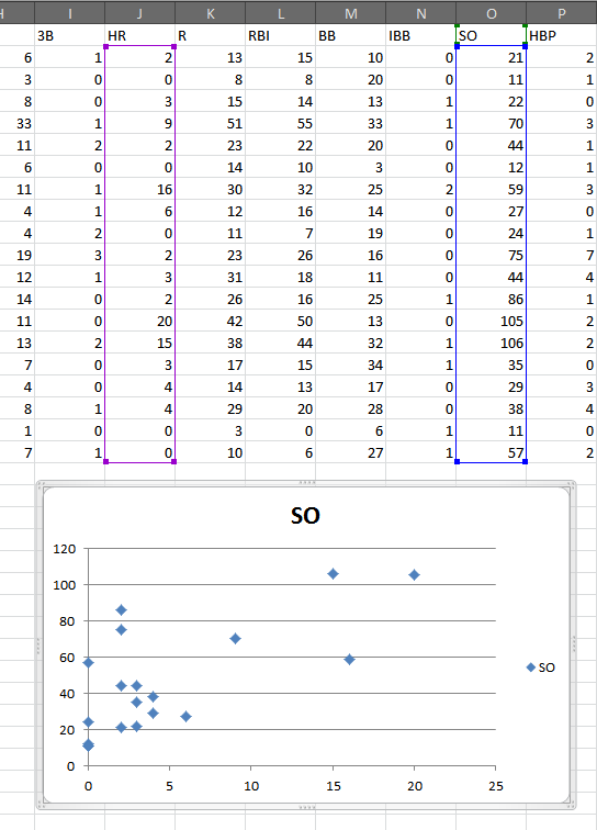
Better by nearly half a home run. Not bad for two minutes’ work. 6 HR per player still seems like a lot, though, so let’s take a closer look at the discrepancies. We’ll create another column with the (absolute) difference between each player’s projected 2014 HRs and actual 2014 HRs, then plot a histogram displaying these differences.
set$mardiff = abs(set$marHR-set$HR14)
hist(set$mardiff, breaks=30, col="red")
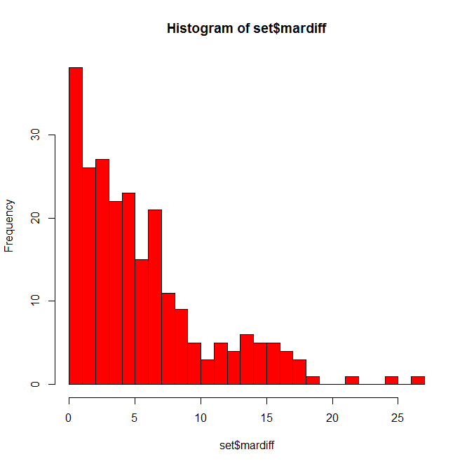
Not as bad as you might have thought. Many players are only off by a few home runs, some off by 10+, and a few fun outliers hanging out at 20+. Who might those be?
set = set[order(-set$mardiff),]
head(set[c(1,72,90,91)], n=10)
(In that last line, we’re calling specific column names so we don’t have to search through 100 columns for the data we want when we display this. You can find the appropriate numbers using colnames(set).)
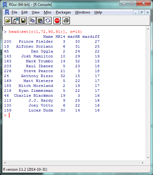
A list headlined by a season-ending injury and two players released by their teams in July; fairly tough to predict in advance, IMO.
While we’re here, let’s go ahead and create Marcel projections for the other 5×5 batting stats:
set$marAVG = (set$AVG13 * 5/12) + (set$AVG12 * 4/12) + (set$AVG11 * 3/12)
set$marAVG = round(set$marAVG,3)
set$marR = (set$R13 * 5/12) + (set$R12 * 4/12) + (set$R11 * 3/12)
set$marR = round(set$marR,0)
set$marRBI = (set$RBI13 * 5/12) + (set$RBI12 * 4/12) + (set$RBI11 * 3/12)
set$marRBI = round(set$marRBI,0)
set$marSB = (set$SB13 * 5/12) + (set$SB12 * 4/12) + (set$SB11 * 3/12)
set$marSB = round(set$marSB,0)
And, for good measure, save it all in an external file. We’ll create a new data frame from the data we just created, rename the columns to look nicer, and write the file itself.
marcel = data.frame(set$Name, set$marHR, set$marR, set$marRBI, set$marSB, set$marAVG)
colnames(marcel) = c("Name", "HR", "R", "RBI", "SB", "AVG")
write.csv(marcel, "marcel.csv")
Before we move on, I want to quickly cover one more R skill: creating your own functions. We’re going to be using that absolute mean error command a couple more times, so let’s create a function to make writing it a bit easier.
modtest = function(stat){
 ame = sum(abs(stat - set$HR14))/length(set$HR14)
 return(ame)
}
The ‘stat’ inside function(stat) is the argument you’ll be including in the function (here, the column of projected data we’re testing); the ‘stat’ shows up inside the bracketed text where your projected data did when we originally used this command. The return() is what your function outputs to you. Let’s make sure it works by double-checking our Marcel HR projection:
modtest(set$marHR)
> [1] 5.995763
Now we can just use modtest() to find the absolute mean error. Functions can be as long or as short as you’d like, and are incredibly helpful if you’re using a certain set of commands repeatedly or doing any sort of advanced programming.
Hold The Line
With Marcel, we used three factors–HR counts from 2013, 2012, and 2011–with simple weights of 5, 4, and 3. For our last projection model, let’s take this same idea, but fine-tune the weights and look at some other stats which might help us project home runs. This, basically, is multiple linear regression. I’m going to handwave over a lot of the theory behind regressions, but Bradley’s how-to from last week does a fantastic job of going through the details.
Remember back in part 2, when we were looking at correlation tests in r² and we mentioned how we were basically modeling a y = mx + b equation? That’s basically what we did with Marcel just now, where ‘y’ was our projected HR count and we had three different mx values, one each for the 2013, 2012 and 2011 HR counts. (In this example, ‘b’, the intercept, is 0.)
So we can then use the same lm() function we did last time to model the different factors that can predict home run counts. We’ll give R the data and the factors we want it to use, and it’ll tell us how to best combine them to most accurately model the data. We can’t model the 2014 data directly in this example–since we’re testing our model against it, it’d be cheating to use it ‘in advance’–but we can model the 2013 HR data, then use that model to predict 2014 HR counts.
This is where things start to get more subjective, but let’s start by creating a model using the last two years (2013/2012) of HR data, plus the last year (2012) of ISO, Hard%, and Pull%. In the lm() function, the data we’re attempting to model will be on the left, separated by a ‘~’; the factors we’re including will be on the right, separated by plus signs.
hrmodel = lm(set$HR13 ~ set$HR12 + set$HR11 + set$Hard12 + set$Pull12 + set$ISO12)
summary(hrmodel)
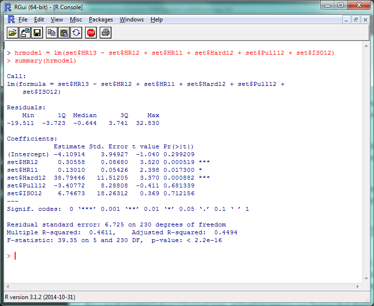
There’s a lot of stuff to unpack here, but the first things to check out are those “Pr(>|t|)” values in the right corner. Very simply, a p-value less than .05 there means that that factor is significantly improving your model. (The r² for this model, btw, is .4611, so this is accounting for roughly 46% of the 2013 HR variance.) So basically, ISO and Pull% don’t seem to add much value to this model, but Hard% does.
It’s generally a good practice to remove any factors that don’t have a significant effect and re-run your model, so let’s do that:
hrmodel = lm(set$HR13 ~ set$HR12 + set$HR11 + set$Hard12)
summary(hrmodel)
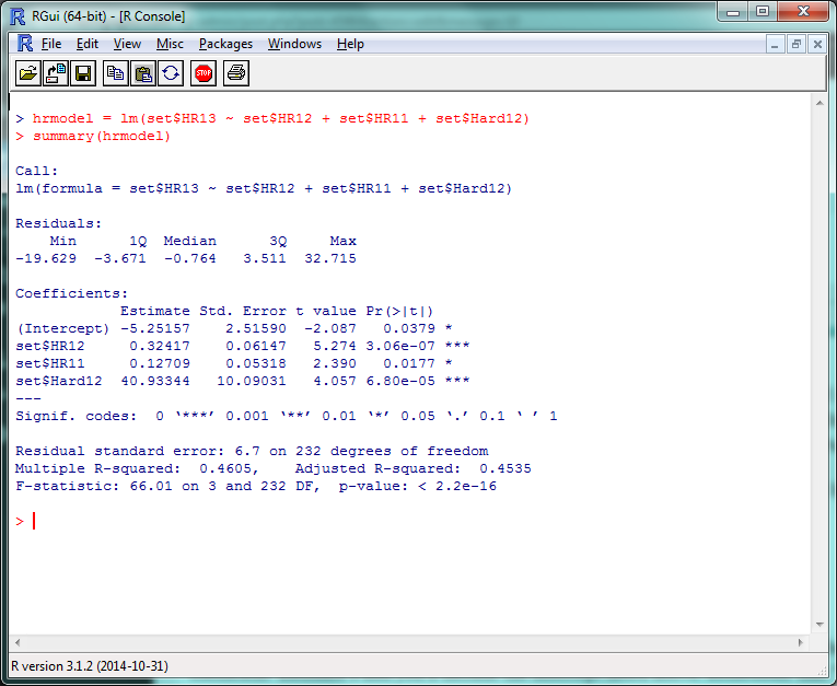
And there’s your multiple linear regression model. The format for the actual projection formula is basically the same as what we did for Marcel, except your weights will take the coefficient estimates and you’ll include the intercept listed above them. Remember that “HR12”, “HR11”, etc., are standing in for “last year’s HR total”, “the year before that’s HR total”, etc., so make sure to increment the stats by a year to project for 2014.
set$betHR = (-5.3 + (set$HR13 * .32) + (set$HR12 * .13) + (set$Hard13 * 40))
set$betHR = round(set$betHR,0)
Survey says…?
modtest(set$betHR)
> [1] 5.95339
…oh. Yay. So that’s an improvement of, uh…
modtest(set$marHR) - modtest(set$betHR)
> [1] 0.04237288
1/20th of a home run per player. Isn’t this fun? Some reasons why we might not have seen the improvement we expected:
- We probably overfit the data. Since we ran the model on 2013 data, it probably did really well on 2013 data, but not as great on 2014. If we check the model on the 2013 data:
set$fakeHR = (-5.3 + (set$HR12 * .33) + (set$HR11 * .13) + (set$Hard12 * 40))
set$fakeHR = round(set$fakeHR,0)
sum(abs(set$fakeHR - set$HR13))/length(set$HR13)
> [1] 4.877119
It runs pretty well.
- We didn’t include useful factors we could have. We just tested a few obvious ones; maybe looking at Cent% or Oppo% would be more helpful than Pull%? (They aren’t, just so you know.) More abstract factors like age, ballpark, etc., would obviously help–but including these would also require a stronger model.
- Finally, projections are hard. Even if you have an incredibly customized set of projections, you’re going to miss some stuff. Take a system like Steamer, one of the most accurate freely-available projection tools around. How did their 2014 preseason projections stack up?
steamer = read.csv("steamer.csv")
steamcomp = merge(yr14, steamer, by = "playerid14")
steamcomp$HR = as.numeric(paste(steamcomp$HR))
steamcomp$HR = round(steamcomp$HR, 0)
steamcomp$HR[is.na(steamcomp$HR)] = 0
sum(abs(steamcomp$HR - steamcomp$HR14))/length(steamcomp$HR14)
> [1] 4.892157
That said, the lesson you should not take away from this is “oh, our homemade model is only 1 HR/player worse than Steamer!” Our data set is looking at players for whom we have several seasons’ worth of data — the easiest players to project. If we had to create a full-blown projection system including players recovering from injury, rookies, etc., we’d look even worse.
If anything, this hopefully shows how much work the Silvers, Szymborskis, and Crosses of the world have put in to making projections better for us all. Here’s the script with everything we covered.
This Is Where I Leave You
Well, that about wraps it up. There’s plenty, plenty more to learn, of course, but at this point you’ll do well to just experiment a little, do some Googling, and see where you want to go from here.
If you want to learn more about R coding, say, or predictive modeling, I’d definitely recommend picking up a book or trying an online class through somewhere like MIT OpenCourseWare or Coursera. (By the end of which, most likely, you’ll be way beyond anything I could teach you.) If there’s anything particular about R you’d still like to see covered, though, let me know and I’ll see if I can do a writeup in the future.
Thanks to everyone who’s joined us for this series — the kudos I’ve read here and elsewhere have been overwhelming — and thanks again to Jim Hohmann for being my perpetual beta tester/guinea pig. Have fun!
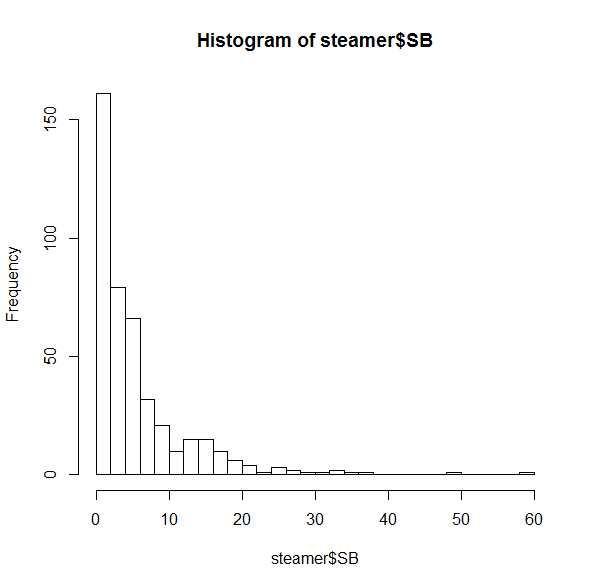
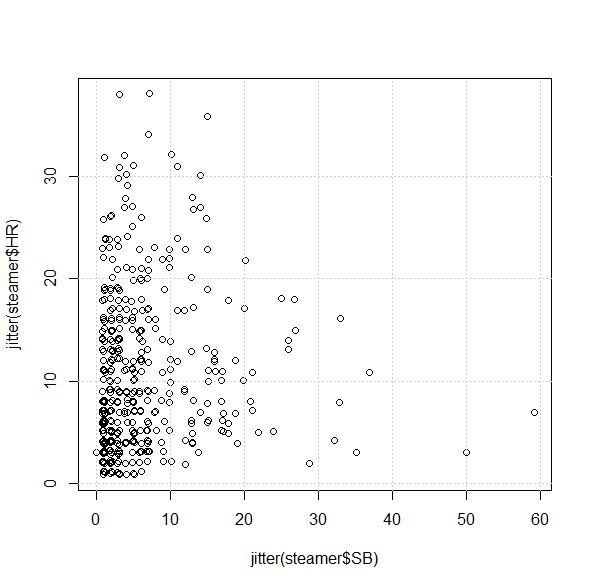
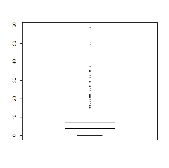 This makes it as plain as possible that any player projected for more than about 15 SB is, quite literally, a statistical outlier.
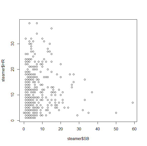 This isn’t bad, but unfortunately it doesn’t give us a good sense of how many players fall into each category, since there’s only one dot for all of the 5 HR/3 SB players, one dot for all the 2 HR/4 SB players, etc. A quick workaround for this is the jitter() command, which moves the points around by tiny increments to get rid of some of the overlap: