How To Run Sports Data Regressions in Microsoft Excel
The shorthand description of a regression: It’s the best possible trend line between a scatter of dots. Like this:
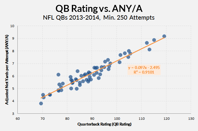
One of the fun things about regressions is that they give us formulas — line equations, specifically. So if we have a quarterback with a 100 QB rating, we can plug his 100 into our formula (y = 0.097 * 100 – 2.495) and get a reasonable estimation of what his Adjusted Net Yards per Pass Attempt (ANY/A) would be (about 7.2). The R2 tells us essentially how reliable the regression is — or, more specifically, how much of the variation in QB Rating is explained by ANY/A.
Of course, the problem with the data here (which I just kind of threw together as an example) is that QBR and ANY/A use almost the same inputs and attempt to do the same thing. It’s nice to see they have about 91% overlap (it basically says they’re just about interchangeable), but no one is going to use QB rating to derive or forecast a ANY/A.
Regressions are more useful when we start with something small and reliable, then move our way to more all-encompassing but volatile stats. This is like how we use contact or plate discipline data (small and reliable) to expand into an xBABIP calculator (big and more meaningful).
There are two ways to run some regressions in Excel:
- Use the scatterplot tool (as above) and create a simple, two-variable regression.
- Use the Data Analysis ToolPack to run a more complete and useful regression.
The first method is the easiest, but it doesn’t output the peripheral data that is essential to fully understanding a regression’s findings.
The Scatterplot Regression
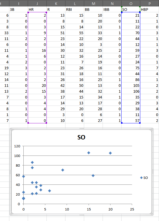
For the first method, just select two columns of data and make a scatterplot (Insert > Scatter). That will give you something like this:
With the chart selected, choose to add a linear trendline (Layout > Trendline > Linear Trendline):

Now double-click the trendline to produce the “Format Trendline” window. In that menu, check the boxes for “Display Equation on chart” and “Display R-squared on chart”:
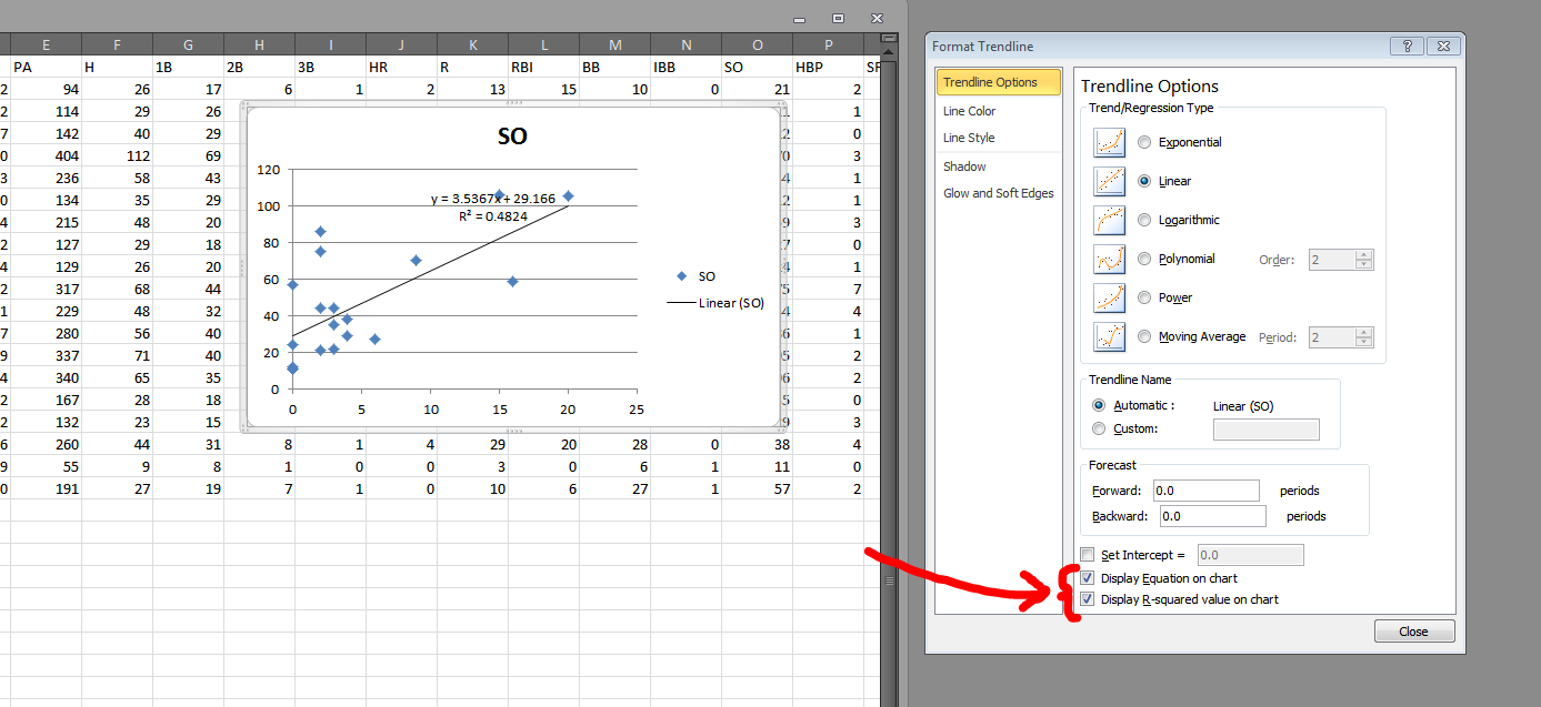
So now we have a regression! The formula (HR = 3.5367 * SO + 29.166) tell us there is a positive connection between home run totals and strikeout totals. And the R2 tells us the relationship between HR and SO explains 48% of the variation between the two of them.
What this regression doesn’t tell us:
- What direction, if any, is the causality? Are homers causing players to strikeout? Or do more strikeouts make more homers?
- Are their peculiarities in the residuals? This article does a great job of teaching how to interpret residuals plots.
- Does the regression fit the data? And ANOVA analysis can be useful in augmenting what the R2 tells us.
The first issue is a matter of deeper research. A regression won’t tell us direction of causality. But we can still answer those other two questions — as well as add more variables — using Excel data Analysis ToolPack. The first thing we’ll need to do is enable that ToolPack.
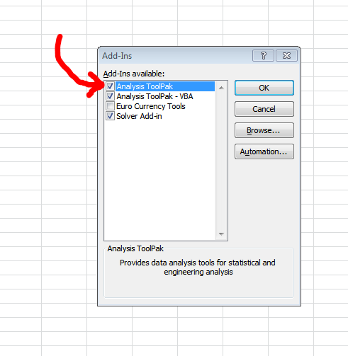
In the File > Options > Add-Ins section, you’ll notice a “Go…” button at the bottom of the window.
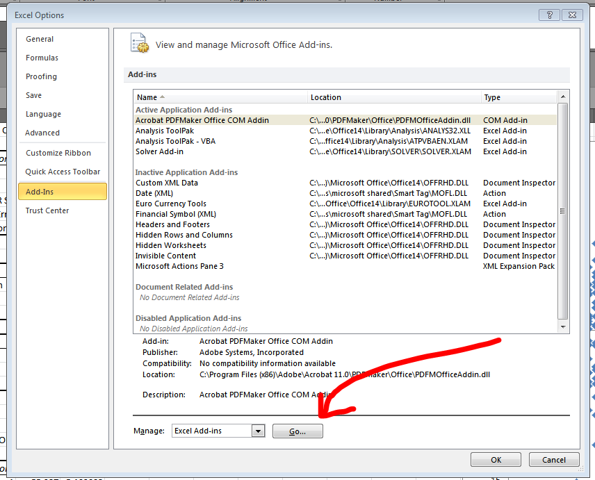
Select the top option in the available Add-Ins (“Analysis ToolPack”) and then click “OK.”
Now, after this first step, you should have a new option in your Data tab. Let’s explore that. Go to Data > Data Analysis. That will open a simple dialogue with a list of various operations. Choose “Regression” and click “OK”.
You should then get this screen:
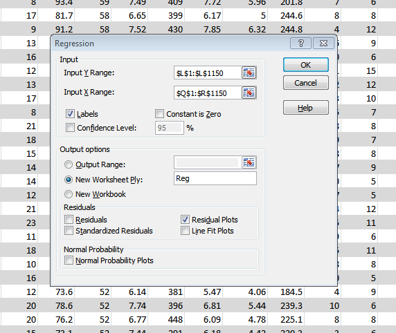
In the Y Range text box, you will want to add only a single column of data. I prefer to include the column headings so that the output screen will be more easily understood. In this instance, I’m choosing a big column of completions percentage data from Pro-Football-Reference.com (from this data: NFL QB seasons since 1969 with min. 10 TD). I’m regression this Cmp% data against the quarterbacks sack total and yards per attempt (Y/A) total.
In short, I’m asking: Can Y/A and sack totals predict a QB’s accuracy?
So in the X Range, I’m going to select the Q and R columns (titles and all). The output is something like this:
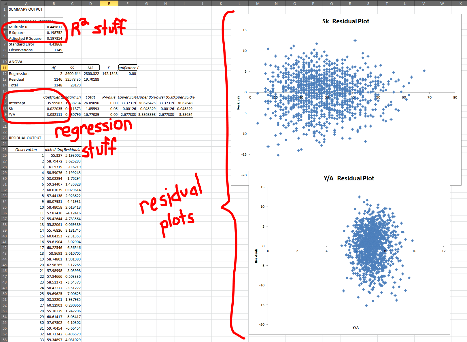
So this is kinda what it will look like after a regression. Let’s break down the three big areas one at a time, in the typical order I look at them:
- Residual Plots: These look good! You want a shotgun blast looks. If you start to see anything other than a circle, in any of your residual plots, then you’ll need to rework your regression. (See that above article for more details.)
- R2 Results: What is a good R2? Well, higher is always (well, usually) better, but there’s no clear perfect R2. Truth is, we have to be as intellectually honest as possible and determine how much explanation is the right amount of explanation. With multiple variables, it’s important to look at Adjusted R2 because it helps combat the unintentional increase in R2 caused by just adding more data. In this case, though, R2 and Adjusted R2 are about the same, so whutevz.
- Coefficients: The coefficients tell us both the formula of the regression (Cmp% = 36 + 0.02 * Sacks + 3.03 * Y/A) but also the strength of the variables involved. And it doesn’t take much work realized which variable is more important. Even a QB who has been sacked will only see his Cmp% moved by 1.5%. What’s more: It increases 1.5%. That’s a red flag right there for a bad variable. Maybe Sack% would be a more useful tool because the sack totals are merely telling us he played more (and QBs who played more probably had better performances because otherwise they would have been benched).
Anyway, I hope this has been helpful. I encourage readers to learn more about regression before attempting any, as they are a complicated and tricky tool and can lead a researcher astray quickly if used incorrectly.
NOTE: For those wondering why I haven’t gone into detail about significance testing for P-values, it’s because I believe that field of statistical study is generally arbitrary and altogether intellectually bankrupt. But there are dozens of great tutorials out there on the subject. I just can’t in good ethical faith write one.
“How To Run Sports Data Regressions in Microsoft Excel”
For your own sake, just don’t do it!
Okay, actually, for some people this will be the easiest way and will allow them to have fun with sports data. But if you’re working with very large datasets or like to have total control and do super cool analyses….don’t do it in Excel. See TechGraphs’s R tutorials for more details 🙂
R is great. Personally, I always recommend the Python data analysis stack — especially Pandas (pandas.pydata.org) for working with sports data. For the NFL especially, it’s simple to use in conjunction with NFLDB. I’ve been meaning to write some “getting started” pieces on that for a while.
I get why you don’t like P values with the data you analyze, but don’t say they are intellectually bankrupt for all datasets. There are plenty of datasets that P Value is quite good for telling us important aspects of correlations. However, I suspect you are probably right for sports statistics that P values are probably not a good way to go. (Note: As a Religious R user [former STATA], this was a great tutorial.)
Intellectually bankrupt? Huh? Are you saying it’s impossible or “just” that it’s evil to attempt to differentiate signal and noise? I’m really confused….
Reminds me of AP stats from a long time ago. Wish I would have done something sports related in that class. Nice article.