How To Use R For Sports Stats: Visualizing Projections
If you’re reading TechGraphs right now, there’s a good chance you’re prepping for fantasy baseball, and if you’re doing that, there’s a good chance you’re making use of projection systems like Steamer or ZiPS. In this post, we’ll explore some basic tools that might help you look at these projections in a new way — and brush up on those R skills that you probably haven’t touched since last fall.
(From a skills perspective, this post will assume that you’ve previously read through the “How To Use R For Sports Stats” series. Even if you haven’t, the insights below will hopefully still be worth your while. I’d also be terribly remiss if I didn’t point you towards Bill Petti’s recent THT post unveiling his baseballr R package.)
We’ll use Steamer projections for this post, though the methods we’ll look at can be used with ZiPS, FG Depth Charts, or, for that matter, actual by-season data. Download Steamer’s 2016 batting projections from FanGraphs, rename the file to “steamer16.csv”, and load it up in R. We’ll remove players projected for fewer than 100 AB to clean up the data a bit:
steamer = read.csv("steamer16.csv")
steamer = subset(steamer, PA > 100)
Visualizing Tiers
As fantasy baseball managers, we all have an innate ability to estimate a player’s value from their stats, judging how good a 30/10/.285 player is vs. a 15/15/.280. We get pretty good at this if we want to do well in our leagues — but we can still develop blind spots in our assessments, or hold on to an outdated idea of quality as MLB trends change. (For example, the average AVG in MLB has dropped from the high .260s 10 years ago to the low .250s today; if you’re still thinking a .255 hitter is below average, you might want to reconsider.)
The point, then, is that if you’re getting a sense of how good a player will be by looking at their projections, it can be helpful to step back and recalibrate your thinking from time to time by looking at the broader trends in an image or two.
Let’s look at Steamer’s projections for stolen bases, for example. We’ll draw on what we learned back in part 2 to make a quick-and-hasty histogram counting the number of MLB players who are projected for different SB totals:
hist(steamer$SB, breaks = 30)
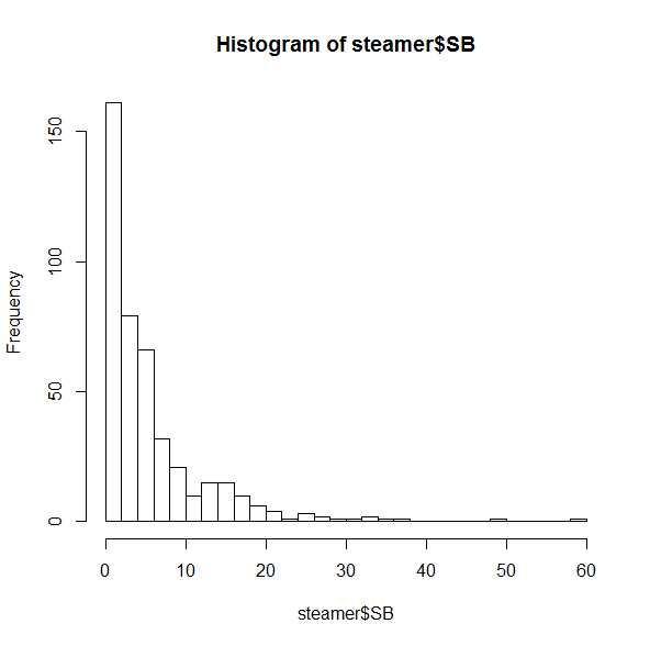
Most of these players are projected for fewer than 10 SB. This is sort of interesting, but their huge counts are keeping us from seeing the trends on the right side. Let’s zoom in a bit:
hist(subset(steamer, SB > 10)$SB, breaks=30)
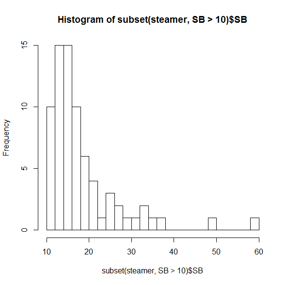
Even among this crowd of speedsters, it’s uncommon to see someone projected for more than 20 SB, and incredibly rare to have more than 30.
You probably didn’t need to be reminded that the two folks on the far right (spoiler alert: Billy Hamilton and Dee Gordon) would stand out, though it’s useful to see just how distant they are from everyone else. But if you were thinking that players like Jarrod Dyson (35 projected SB) or Billy Burns (32) are solid, but not elite, on the basepaths, it may be time to reassess. (Did I mention that SB totals in MLB dropped 25% between 2011 and 2015?)
If you’re the kind of person who prefers boxplots instead, R’s got just the thing:
boxplot(steamer$SB)
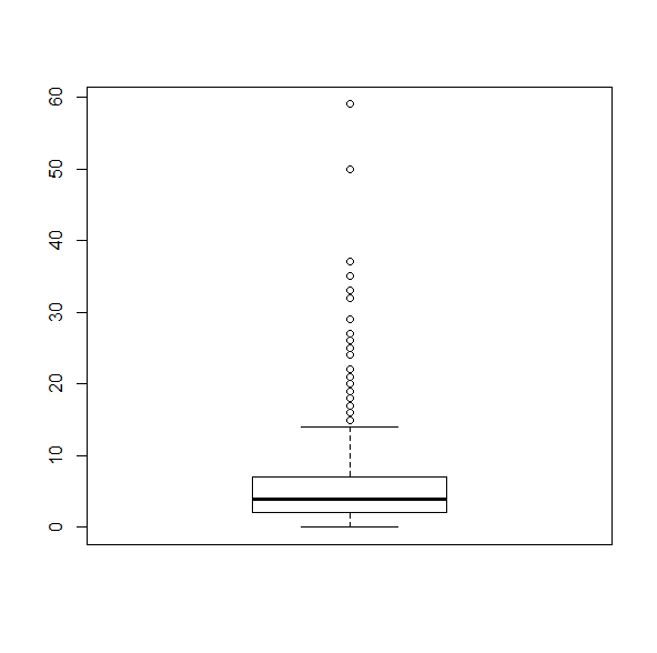 This makes it as plain as possible that any player projected for more than about 15 SB is, quite literally, a statistical outlier.
20/20 Vision
The same idea goes for getting a grasp on multi-category players. Most of us are looking for players who can bring in both HR and SB, but how many of those are really available? Let’s do a quick 2D plot:
plot(steamer$SB, steamer$HR)
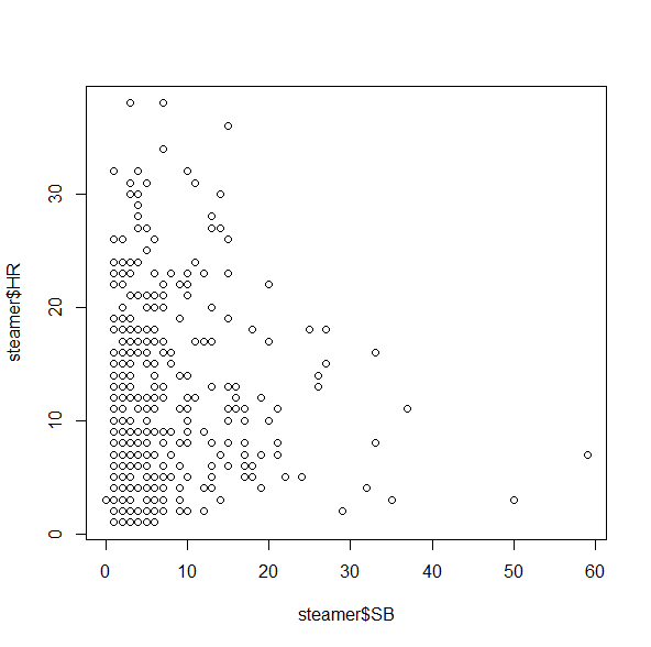 This isn’t bad, but unfortunately it doesn’t give us a good sense of how many players fall into each category, since there’s only one dot for all of the 5 HR/3 SB players, one dot for all the 2 HR/4 SB players, etc. A quick workaround for this is the jitter() command, which moves the points around by tiny increments to get rid of some of the overlap:
plot(jitter(steamer$SB), jitter(steamer$HR))
And, for good measure, let’s add a grid on top:
grid()
Your plot should now look something like (but not exactly like) this:
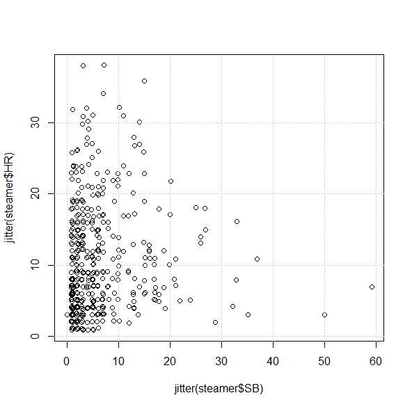
From the chart, we can see that it’s not impossible to find players projected for 30/10 or 10/30, but it looks like there’s only one 20/20 guy in Steamer’s projections:
subset(steamer, (SB >= 20 & HR >= 20))

            Name   Team  PA  AB   H X2B X3B HR  R RBI BB  SO HBP SB CS X.1   AVG   OBP   SLG   OPS
40 Carlos Correa Astros 636 571 157  33   3 22 80  82 54 110   4 20 11  NA 0.275 0.339 0.458 0.797
Of course. As if being a 21-year-old SS with plus average wasn’t enough.
Fun With Subsets
Let’s close this out by doing a bit more with subset() — possibly one of R’s most useful tools for our purposes because it’s just so much quicker and more customizable than online tools or Excel.
Say you want to find the prospective “five-category players”; you may have a sense of who some of the candidates are, but you might be surprised by what the numbers actually suggest. How many players, for example, are projected to do better than 10/80/80/10/.275?
subset(steamer, (HR > 10 & SB > 10 & R > 80 & RBI > 80
 & AVG > .275))

               Name         Team  PA  AB   H X2B X3B HR   R RBI  BB  SO HBP SB CS X.1   AVG   OBP   SLG   OPS
1        Mike Trout       Angels 647 542 166  32   5 36 104 104  90 138   8 15  6  NA 0.307 0.410 0.585 0.995
5  Paul Goldschmidt Diamondbacks 652 543 158  36   2 30  93  93 100 142   3 14  7  NA 0.290 0.401 0.531 0.931
7  Andrew McCutchen      Pirates 653 554 165  34   3 23  88  87  84 123   9 12  6  NA 0.297 0.395 0.496 0.891
25    Manny Machado      Orioles 663 597 170  35   2 27  91  87  53  99   4 14  8  NA 0.285 0.345 0.484 0.829
Fewer than you may expect–which could well make them all the more valuable.
Conclusion
Projections, of course, are just projections, and you shouldn’t take one set — or even a combination of sets — to be a true predictor of what will happen this season. But if you typically look up projections player-by-player, or if you’re disinclined to take in a huge wall of stats at a single glance, looking at the broader trends in individual visualizations can help keep you on the right track as you prep for this fantasy season.
Here*, as always, is the code used for this post. If you have anything else you’d like to see us do with R as the new season comes near — or any suggestions with what you’ve used R for — let us know in the comments!
*download the ZIP and extract the R file.
Brice lives in the Washington, DC area, where he does communications for linguistics and space exploration organizations. Brice has previously written for Ars Technica, Discovery News and the Winston-Salem Journal. He's on Twitter at @KilroyWasHere.
This is great! And timely for me, as I’m in week 5 of an edX class on the fundamentals of statistics, which is teaching me some wonderful things using RStudio. Highly recommended.
Thanks! Glad you enjoyed it.
Thank you for this, Brice!
Thank *you*! Let me know if there’s anything you’d like to see in a future post.
Brice, thanks for this article and the 3 part series “How To Use R For Sports Stats” . They have really opened my eyes to R programming. I used to spend hours trying to manipulate Excel spreadsheets for a tasks that take mere minutes in R.
In part 3 of “How To Use R For Sports Stats” , I had a question about merging the data sets back together. You used a series of commands like
set = merge(set, yr13, by = “Name”)
However these only take the intersection of the sets. I was using 2012 through 2014 and trying to project 2015 (your examples were all one year earlier). By the time I merged all 4 years, I noticed I was down to 33 players or rows of data.. I can improve the merge by using:
set = merge(set, yr14, by = “Name”, all.x=TRUE)
When I do the merge this way, I can start with the latest year and merge backwards. This give me all the latest players (in my case 2014), but many players may only have one or two years of data. I now want to use different weights depending n how far back my data goes. If I have 3 years of data I want to use (5/12, 4/12, 3/12). If I only have 2 years data, I’m guessing I would use (5/9 and 4/9). My model falls apart at one year. I just multiply by 1 and use the last years data? That would give me the same as the base model described in that series. I guess my only question is rhetorical. Please consider probing into the projections a little deeper for your next article. Thanks.