Author Archive

Behind the Code: Sports-Reference Founder Sean Forman

Behind the Code is an interview series centered around the sports-related web sites we use every day. The first installment features Sports-Reference founder Sean Forman.

For the first century of sports, newspapers, almanacs, and baseball cards were the medium of choice for communicating statistics. But the world of sports statistics has gone from paper to electric in less than two decades — and the Sports-Reference family of websites has been a key component in that transition.

We caught up with Sean Forman, founder of the Sports-Reference network — which includes Baseball-Reference.com, Pro-Football-Reference.com, and Basketball-Reference.com — and talked about the genesis and future of his family of stats sites.

Bradley Woodrum: What inspired you to start the site back in 2000? I know David Appelman started FanGraphs to help his fantasy team. Did B-Ref have equally humble beginnings? Or was the expectation to become, essentially, the modern almanac for sports statistics?

Sean Forman: I had a similar creation story. There was really nobody doing an online encyclopedia and I thought it would be a great medium for that work. You could hyperlink between pages. So rather than leafing through a book (sounds crazy now) to hunt down Joe DiMaggio’s teammates you could just click a link and see them all. I didn’t expect it to do much. I worked hard on it for two months (while I was in grad school and should have been working on my dissertation) and got the basic site done.

BW: What was the online sports statistics scene back in 2000? What were your go-to resources for stats before Sports-Reference and before the Lahman database?

SF: The Lahman DB was the first bones of the site. It wouldn’t have happened without Lahman’s DB and the work of Pete Palmer that the Lahman DB is based upon. There was no historical content really online in 2000. TotalBaseball.com had a site, but it was barely usable. I was a disciple of Jakob Nielsen at that time, so my focus on usability and ease of use really paid off initially as there was so much cruft out there in web design. Splash pages, flash sites, image maps, blink and marquees.

While TotalBaseball.com had a pretty nifty biography section for major players back in 2000, it lacked the meat of a more statistically rigorous site.

BW: I understand you were previously a teacher before working on Sports-Reference full time. What was that transition like? And how did you finally make the decision to go full time?

SF: I was a full-time math/CS professor for six years. I actually completed the site before taking that job. During that time, I did B-R in my free time. One mitigating factor is that we weren’t updating in-season at that time, so the stress was a lot lower and we didn’t need to be as on top of things. I could leave it for a week and not worry about it.

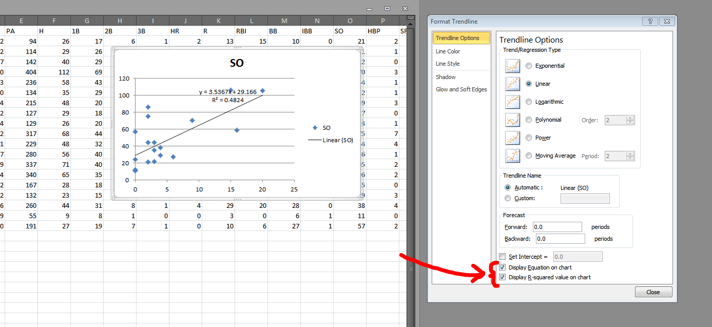
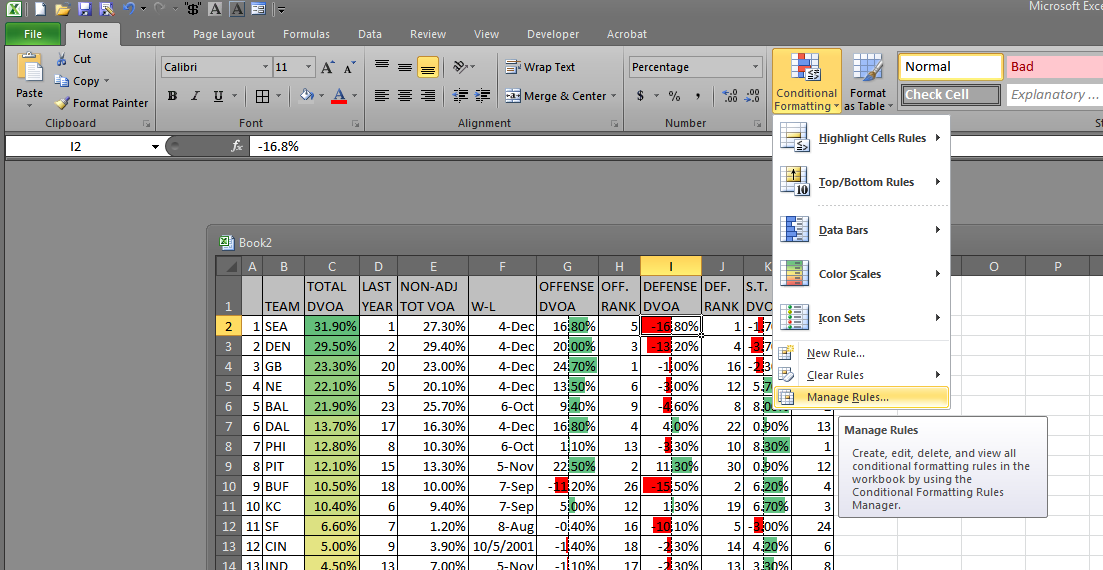
BW: The Sports-Ref family is famous for its Spartan design — outside of the player pictures on B-Ref, there’s, what, a single PNG on the whole site, and that’s the logo. Even the interactive charts and graphs have a minimalist design. Has this aesthetic lasted the test of time for its functionality, or is it more just the site’s personality at this point?

SF: [It has a] few more [pictures] than that, but not many. We are trying to reduce them further.

It’s both our personality and for functionality reasons. I’ve heard some people call it the Craigslist of baseball stats. I like to think one of our strengths is that we can view the site from the user perspective better than most. That is really hard to do. We have 250 MB internet connections and gigantic phones and use the latest chrome browser and know internally how the site is put together, but a new user has none of that. They may be on an old windows machine with a 1200×800 resolution with a slow internet connection. Basically you’ve got to make things more obvious than you can even imagine being necessary.

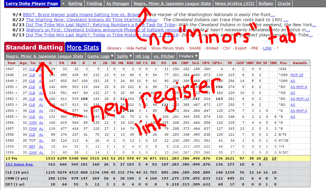
We had a good example of this last week. We launched a new “register” section to combine the minors, Japan, NLB, Cuba and KBO stats into one area. Larry Doby is our test case for this. We called it register because we’ve got 70+ Sporting News Baseball Registers on our shelves and those showed the stats pretty much in the way we are doing it now. Within 20 minutes of launching, we got complaints that we’d taken away the minor league stats, asking are were expecting people to “sign-up” (read register) for the site. We should have caught that on our end, but we were able to fix it quickly and improve the clarity in the process.

Larry Doby's page shows the new layout and links for the stats register. Even small changes like this can cause big waves with users.
Larry Doby’s page shows the new layout and links for the stats register. Even small changes like this can cause big waves with users.

BW: Speaking of the lesser known stats, the B-Ref Bullpen has developed into a go-to resource for baseball fans and writers, oftentimes trumping player’s actual Wikipedia pages. What inspired you to add this feature? Do you expect the basketball and football sites will eventually get their own wiki’s too?

SF: I started it because 1) I love Wikipedia. Wikipedia may be the greatest human accomplishment of all time. I’m not joking. Think about how valuable having all of that knowledge in one place is. (DONATE!). 2) For good reason Wikipedia starts their baseball articles with info like “Ty Cobb is an American baseball player…” and I thought that it would be interesting to put together pages for players that were more in depth and baseball oriented than wiki would want. The funny thing is that the star players get almost no treatment on our site, but we have 1000’s of words on Japanese players, Negro Leaguers and early players. It makes sense as there is a need to know about those players.

As for the other sites, we probably should have just done it by now. I’ve been skeptical we’d get any traction with them, but it would have been a good idea to start them.

BW: Baseball, basketball, football, hockey, and Olympics. Is there any area remaining that you might want to add? Maybe prep / high school stats?

SF: The great frontier is soccer (fbref.com). It makes the history of professional baseball look like child’s play. We have a great dataset and hope to get something launched this winter. My favorite stat I’ve discovered is that the English Wikipedia has more pro soccer clubs listed than there have been players in Major League Baseball history.

BW: Oh wow. I can’t even conceptualize that many teams. I’m looking forward to see how you handle that!

A big thanks to Sean for taking the time to talk with us! Be sure to give him a follow on Twitter at @Sean_Forman.


How to Get the Most Out of “Format as a Table”

One of the Excel features that I feel too many people ignore is the “Format as a Table” tool. Let’s say we’ve got this data, 2014 team defense data from Pro-Football-Reference.com. I’ve cleaned it up a little — gotten rid of the totals at the bottom and consolidated the headers into one row — but it should still be a fairly recognizable table.

File -> PFR2014.csv

The process of formatting data as a table is really stupidly simple. Click anywhere within the table’s data (so anywhere from A1 to Z33). Now choose “Format as a Table” from the Home tab:

A variety of designs will appear when you click the button. They all have the same functionality, and you can change the colors easily at any time, so just pick one.

I am going to select the third from the top red design because red is the greatest color. When I do pick that design, I get a popup and a blinking border around my data:

Excel, being full of magical and distressing insights, knows where my data begins and ends. So all I need to do is make sure the "My table has headers" button is checked (it is) and then press "OK."
Excel, being full of magical and distressing insights, knows where my data begins and ends. So all I need to do is make sure the “My table has headers” button is checked (it is) and then press “OK.”

Presto magnifico, I have a table!

“But Bradley, you had a table all along.”

Shut up, and yes, I did — but this one is better. Lemme show you why.

The first thing I like to do is enable “Wrap Text” on the header row (select the top row, then Home > Wrap Text). It allows me to see the whole table much better. (This is a simple operation, but if you’re confused, Professor Google should have a plethora of resources on the matter.)

The second thing I like to do is rename this table — especially if I’m going to do work with multiple tables. To rename the table, head to Formulas > Name Manager. The name manager popup window should have only one table in it — Table1. Double click that line, and a subsequent pop up will enable us to edit the name:

Let's rename this one "Defense."
Let’s rename this one “Defense.” If we ever want to rename the table, we can follow these same steps without any harm to formulas throughout the spreadsheet.

Once you choose a name, click OK then Close. Now when we select all the data in the table, it will highlight the name “Defense” in a names drop-down menu:

Conversely, when we select "Defense" from the names drop-down menu, Excel will highlight the table data.
Conversely, when we select “Defense” from the names drop-down menu, Excel will highlight the table data.

Of course, we can name a table without it being formatted through the “Format as Table” function. But what’s nice about the “Format” table is that if I add a row or a column, the named table “Defense” automatically expands. Let’s try this out.

Go to cell AA1 and type “Pass – Rush AVG” (we’re going to create a new column). Excel will automatically create and format a new column, like this:

The new column will automatically carry the formatting to the end of the table.

Now, I’m going to type a new formula into it:

=[Passing NY/A]-[Rushing Y/A]

Whoa! That’s not a normal Excel formula! That’s right. It’s a table formula. Now that we have a named table, we can use the column names to complete formulas within (and without) the table. More on that in a second.

Depending on your settings, the formula may have automatically filled to the bottom of the spreadsheet. If it didn’t, just click on the autofill icon that appeared at the bottom left corner, and choose to allow the formula to overwrite the contents of the column:

No need to click and drag a formula to the end of a spreadsheet. This is particularly useful with lots of data.
No need to click and drag a formula to the end of a spreadsheet. This is particularly useful when you have many rows of data.

And hey, remember that strange formula we made a second ago? Let’s do something similar on a different tab. I’m going to add another sheet, Sheet2, and type into any cell:

=AVERAGE(Defense[Pass - Rush AVG])

That’s a basic =AVERAGE formula, but because of the named table “Defense” and the named column “Pass – Rush AVG,” I’m able to write the formula without using the mouse or worrying about cells moving or data changing. In fact, I can go back and change the name of that column to “Net Pass AVG” and guess what happens to my formula? It changes automatically to:

=AVERAGE(Defense[Net Pass AVG])

One of the biggest advantages to using named tables (and editing those table names) is that when formula get REALLY complicated, you can read something that’s close to English, not a collection of meaningless cell references (“Wait, was A1:D22 the running data? Or was that in F2:Y54?” as opposed to “Oh, I have Running[AVG] not Running[Data] selected. Oops!”).

Consider this formula from my Scoresheet dataset:

=IF(VLOOKUP(CONCATENATE([@firstName]," ",[@lastName]),FGDC,19,0)=0,"",VLOOKUP(CONCATENATE([@firstName]," ",[@lastName]),FGDC,19,0))

“FGDC” is data pulled from the FanGraphs Depth Charts leaderboard. I have that data on a separate tab. Here’s how the above formula would look without named sections:

=IF(VLOOKUP(CONCATENATE(Combined!G2:G1010," ",Combined!H2:H1010),'FG DC'!A2:X1141,19,0)=0,"",VLOOKUP(CONCATENATE(Combined!G2:G1010," ",Combined!H2:H1010),'FG DC'!A2:X1141,19,0))

Both formulas are unwieldy, but at least the first one is intrinsically sensible. I’m combining the column “firstName” with “lastName” and looking them up in table FGDC. If I don’t find them, then I want Excel to put nothing into the cell (i.e. print “”).

If you want to learn more about structured references, I recommend this rundown of the syntax and various uses of structured refs.

It’s also important to note a named table automatically adds filters and applies those filters even to new columns and rows.

Filters allow us to sort and sift through the data much more easily.

Another small, but useful component of tables is that the jump shortcuts (e.g. CTRL+→) will jump to the end of the table, even if the row or column is empty. In other words, in the empty Sc% column, if we press CTRL+↓, the cursor will move to X33 instead of X1048576, which is where it would normally and uselessly end.

There’s a multitude of other little handy features when it comes to structured tables, like being able to neatly and easily select whole columns of data without also selecting the header and the empty cells beneath the data. But for now, I hope this is enough to get the Excel newbie started with exploring this surprisingly robust feature.


How To Run Sports Data Regressions in Microsoft Excel

The shorthand description of a regression: It’s the best possible trend line between a scatter of dots. Like this:

The orange line (and the connected equation) represent the most basic idea of a regression.

One of the fun things about regressions is that they give us formulas — line equations, specifically. So if we have a quarterback with a 100 QB rating, we can plug his 100 into our formula (y = 0.097 * 100 – 2.495) and get a reasonable estimation of what his Adjusted Net Yards per Pass Attempt (ANY/A) would be (about 7.2). The R2 tells us essentially how reliable the regression is — or, more specifically, how much of the variation in QB Rating is explained by ANY/A.

Of course, the problem with the data here (which I just kind of threw together as an example) is that QBR and ANY/A use almost the same inputs and attempt to do the same thing. It’s nice to see they have about 91% overlap (it basically says they’re just about interchangeable), but no one is going to use QB rating to derive or forecast a ANY/A.

Regressions are more useful when we start with something small and reliable, then move our way to more all-encompassing but volatile stats. This is like how we use contact or plate discipline data (small and reliable) to expand into an xBABIP calculator (big and more meaningful).

There are two ways to run some regressions in Excel:

  1. Use the scatterplot tool (as above) and create a simple, two-variable regression.
  2. Use the Data Analysis ToolPack to run a more complete and useful regression.

The first method is the easiest, but it doesn’t output the peripheral data that is essential to fully understanding a regression’s findings.

The Scatterplot Regression

For the first method, just select two columns of data and make a scatterplot (Insert > Scatter). That will give you something like this:

Here's a scatterplot of the 2015 Durham Bulls' strikeout and home run totals.
Here’s a scatterplot of the 2015 Durham Bulls’ strikeout and home run totals, min. 50 PA.

With the chart selected, choose to add a linear trendline (Layout > Trendline > Linear Trendline):

Adding a linear trendline will create a basic linear regression.

Now double-click the trendline to produce the “Format Trendline” window. In that menu, check the boxes for “Display Equation on chart” and “Display R-squared on chart”:

These two boxes give you the bare minimum of data necessary to interpret a regression.

So now we have a regression! The formula (HR = 3.5367 * SO + 29.166) tell us there is a positive connection between home run totals and strikeout totals. And the R2 tells us the relationship between HR and SO explains 48% of the variation between the two of them.

What this regression doesn’t tell us:

  • What direction, if any, is the causality? Are homers causing players to strikeout? Or do more strikeouts make more homers?
  • Are their peculiarities in the residuals? This article does a great job of teaching how to interpret residuals plots.
  • Does the regression fit the data? And ANOVA analysis can be useful in augmenting what the R2 tells us.

The first issue is a matter of deeper research. A regression won’t tell us direction of causality. But we can still answer those other two questions — as well as add more variables — using Excel data Analysis ToolPack. The first thing we’ll need to do is enable that ToolPack.

In the File > Options > Add-Ins section, you’ll notice a “Go…” button at the bottom of the window.

This button opens a dialogue that allows us to turn on the data Analysis ToolPack. Why is this not enabled by default? Who knows? Maybe Bill Gates.

Select the top option in the available Add-Ins (“Analysis ToolPack”) and then click “OK.”

You can also add in these other ones if you're feeling frisky. I rarely use them, though.
You can also add in these other ones if you’re feeling frisky. I rarely use them, though.

Now, after this first step, you should have a new option in your Data tab. Let’s explore that. Go to Data > Data Analysis. That will open a simple dialogue with a list of various operations. Choose “Regression” and click “OK”.

You should then get this screen:

The Y Range will be what you are regression against, so to speak.

In the Y Range text box, you will want to add only a single column of data. I prefer to include the column headings so that the output screen will be more easily understood. In this instance, I’m choosing a big column of completions percentage data from Pro-Football-Reference.com (from this data: NFL QB seasons since 1969 with min. 10 TD). I’m regression this Cmp% data against the quarterbacks sack total and yards per attempt (Y/A) total.

In short, I’m asking: Can Y/A and sack totals predict a QB’s accuracy?

So in the X Range, I’m going to select the Q and R columns (titles and all). The output is something like this:

Here are the big three components of a regression.

So this is kinda what it will look like after a regression. Let’s break down the three big areas one at a time, in the typical order I look at them:

  1. Residual Plots: These look good! You want a shotgun blast looks. If you start to see anything other than a circle, in any of your residual plots, then you’ll need to rework your regression. (See that above article for more details.)
  2. R2 Results: What is a good R2? Well, higher is always (well, usually) better, but there’s no clear perfect R2. Truth is, we have to be as intellectually honest as possible and determine how much explanation is the right amount of explanation. With multiple variables, it’s important to look at Adjusted R2 because it helps combat the unintentional increase in R2 caused by just adding more data. In this case, though, R2 and Adjusted R2 are about the same, so whutevz.
  3. Coefficients: The coefficients tell us both the formula of the regression (Cmp% = 36 + 0.02 * Sacks + 3.03 * Y/A) but also the strength of the variables involved. And it doesn’t take much work realized which variable is more important. Even a QB who has been sacked will only see his Cmp% moved by 1.5%. What’s more: It increases 1.5%. That’s a red flag right there for a bad variable. Maybe Sack% would be a more useful tool because the sack totals are merely telling us he played more (and QBs who played more probably had better performances because otherwise they would have been benched).

Anyway, I hope this has been helpful. I encourage readers to learn more about regression before attempting any, as they are a complicated and tricky tool and can lead a researcher astray quickly if used incorrectly.

NOTE: For those wondering why I haven’t gone into detail about significance testing for P-values, it’s because I believe that field of statistical study is generally arbitrary and altogether intellectually bankrupt. But there are dozens of great tutorials out there on the subject. I just can’t in good ethical faith write one.


How to Make a Poor Man’s Heat Map

Presumably you’ve got some data. Maybe it’s PITCHf/x data, maybe it’s just a bunch of data points, and you want those represented in a heat map. How do you make this happen? Well, in the spirit of leading with the lede:

Just make a scatterplot and reduce the opacity of the dots.

Yeah, it’s not elegant and it’s not truly a heat map — not algorithmically calculated like the fancy stuff Jeff makes at Baseball Heatmaps or the complex zone-grids over at FanGraphs. But, hey, for many people, it should be enough.

Let’s go ahead and make a faux heat map together!

Let’s start by ripping out some Expanded Tabled Data from Brooks Baseball and pasting that data in Excel.

For the sake of this post, we’re looking at Chris Heston’s no-hitter from June 9, 2015. Once we plop that data into Excel, we’ll want to cruise on down to the columns titled “px” and “pz.” Highlight these columns and plop in a scatterplot:

It's hideous right now, but we'll make it beautiful.
It’s hideous right now, but we’ll make it beautiful.

Right click on those blue diamonds and choose “Format Data Series.” Then, in the ensuing popup, browse to the “Marker Options” tab and change the markers to circles:

Circle icons are not only best for faux heat maps, they are also just more appropriate (especially for baseball) in general.

Then go to the “Marker Fill” section and choose “Solid fill.” We can then crank that transparency down:

You will want the dots pretty close to fully transparent, though this will depend on the amount of data points you have. Here, we only have about 100 and they are pretty widely dispersed, so we'll go with 60% transparent.
You will want the dots pretty close to fully transparent, though this will depend on the amount of data points you have. Here, we only have about 100 and they are pretty widely dispersed, so we’ll go with 60% transparent.

Now we need to get rid of the pesky blue outline on each of the data points. Head to “Marker Line Color” and change that to “No line.”

Without the marker outlines, the chart looks a lot more heat map-ish.

So we’ve effectively got a heat map now. With a little bit of tweaking (moving the Y-axis to the left, changing the background color, making the markers bigger, and adding a quick little strikezone box — pretty much all of which you can accomplish through the Format Data Series window), we can get something like this:

The transparency causes overlapping data points to appear darker, which is the key component of a heat map.

I should mention the strike zone is just a rectangle shape I inserted, and is not necessarily accurate. I set the fill to No Fill and made the border a hashed line. For specific guidance on where to put the strike zone, I suggest using Mike Fast’s article here, and then just eyeballing a shape like I did here.

Heat maps are really most useful when you have many hundreds of data points, not just one hundred. For instance, here’s a little heat map (took less then three minutes to make) that shows the correlation between HR totals and wRC+ (offensive production) for individual hitters’ seasons from 2000 through 2014. I threw in a reference line for 100 wRC+ (league average) and a linear regression trendline (in the Chart Tools > Layout section):

The heat map style here let's us see how the majority of hitters are clustered 6 and 32 homers, and between 74 and 148 wRC+.
The heat map style here let’s us see how the majority of hitters are clustered 6 and 32 homers, and between 74 and 148 wRC+.

Here’s another one. This one took more time to cook up, but it’s 1494 records — every NFL quarterback season since 1920 who’s thrown at least 10 touchdowns. So that’s a line for every QB for every season, thus Drew Brees — for his 2009 and 2011 seasons — occupies the top two spots in the completion percentage column.

Anyway, a heatmap here really helps us see the clustering around the middle:

The trend line show a weak correlation, but the heat map tells us where the data is clustered -- and how small sample sizes and random data points might be throwing  off the calculation.
The trend line show a weak correlation, but the heat map tells us where the data is clustered — and how small sample sizes and random data points might be throwing off the calculation.

The transparency on the markers is at 91% (you’ll want higher transparencies for certain colors and for more data).

It’s not technically a heat map, but if you need to throw together some data to make or display a point, the built-in tools in Excel will certainly work in a pinch.


All the Things You Wanted to Know About Conditional Formatting in Excel

What are conditional formats? Simply put: They make a wall of data more readable. Tell me which dataset can you more quickly identify the best player:

Not only do the conditional formats catch the reader's attention, they also help us see the outlier data more easily.
Not only do the conditional formats catch the reader’s attention, they also help us see the outlier data more easily.

Here’s a great example of a time where conditional formating helps a lot. We’re looking at the 2005 NFL Draft. It makes sense to organize it by the order the players were picked, but our emphasis is on Career Average Value (CarAV) and Drafted Team Average Value (DrAV) — two simple, but useful stats that Pro-Reference-Football.com provides to estiamte a player’s total worth.

The conditional formatting immediately draws our attention to DeMarcus Ware, Aaron Rodgers, and Logan Mankins — the three most valuable players from the first round. And the conditional formatting draws our attention to these players while also helping us notice — immediately — that neither Rodgers nor Mankins were top picks.

The NFL Draft is a great example of when conditional formatting helps most. If I just wanted to compare the Career AV numbers of all the players who entered the league in 2005, irrespective of draft location, then I’d probably make a simple list and sort it large to small. But when we want to preserve a specific order of the data — or want to represent multiple components at once — conditional formatting does a stalwart job.

Here’s another instance, this one unrelated to sports — my spreadsheet for looking for a second car on Craigslist:

Conditional formatting can also stay within a boundary, so to speak, so unlike denominations can be compared side-by-side.

Here, I care mostly about the Kelley Blue Book value of the vehicle (“KBB Value”), but I also want to know about gas mileage and the other facts of the car. I’ve set up the color coding, though, so that I don’t have to worry about 28 MPG throwing off a $4,000 asking price. Also, the higher the value of the car the more green it is, but the more expensive the asking price, the more red it is.

In other words, I just look for as much green as possible, and that’s my best bet.

So let’s talk about setting up our own table with conditional formatting. First, we need data pertinent for conditional formatting. Let’s go with 2014 NFL Team Efficiency stats from Football Outsiders.

First, I scrape the data with a little copy/paste action. Just highlight the table area in the middle and paste it into your Excel document. I recommend pasting without formatting. To do this, just right click on the spreadsheet and choose the special paste icon:

Pasting without formatting keeps the spreadsheet simple and readable.

Now, after a little cleaning up — deleting those extra headers in the middle of the data, combining the two-line headers into a single line, and moving those headers above the appropriate column — we have something like this:

Now our data is neater, but it's still too much to digest in one glance.
Now our data is neater, but it’s still too much to digest in one glance.

This is another ordinal setup — except we’re not looking at draft positions, but DVOA* rankings.

*DVOA stands for Defense-adjusted Value Over Average. It’s Football Outsider’s total value measurement, much like WAR is for Baseball-Reference and FanGraphs.

But one of the big problems with an ordinal ranking is that the space between No. 1 and No. 2 may not be the same as between No. 2 and No. 3. So conditional formatting helps us see tiers and groupings much more easily.

In order to add a conditional format to this data, we just need to highlight the C column and choose Conditional Formatting > Color Scales > the appropriate color scale.

Color scales are the most typical conditional format -- and they tend to be the most useful.
Color scales are the most typical conditional format — and they tend to be the most useful.

Even though we highlighted the entire column, only the rows with data in them show the conditional format.

So that’s how you set up a basic conditional format! You can play around with the different format types and see which ones you like. There’s no harm in slapping a conditional format on top of another conditional format — as long as you have the same cells selected, it will just delete the old format and apply the new one.

But let’s say you have an issue like we have in Column I:

A negative DVOA on defense is actually a good thing. So I'd rather have those bars appear green.
A negative DVOA on defense is actually a good thing. So I’d rather have those bars appear green.

If you ever have a format that’s not working quite right, just click wherever the format is looking weird, and choose “Manage Rules…” from the Conditional Formatting drop down:

If a format is giving you guff, head to the "Manage Rules..." area.
If a format is giving you guff, head to the “Manage Rules…” area.

If you have the delinquent cells selected (and your Conditional Formatting Rules Manager is set to show “Current Selection” rules), you should see the formatting rules in the window:

This is kind of the go-to place for adjusting conditional formats and making really fun and unique formats.

If you double-click on the format name (“Data Bar” in this instance), you will open the “Edit Formatting Rule” window. This window (and the windows nested inside it) allow us to do a lot of fun stuff.

I’m presently happy with most of what’s going on in Column I, so I really only want to change two things: The positive color and the negative color. So in the Edit Formatting Rule window, I will change the bar color to red:

This allows me to change the default bar color. I want red because a positive defensive DVOA is a bad thing.

And then, right beneath that, I’m going to click the “Negative Value and Axis…” in order to change the red bars to green:

After you apply these changes on the Conditional Formatting Rules Manager window, the column should update.

But let’s say I want to do something even more complicated. Let’s say I want to highlight the teams with bad special teams — and I don’t want to just highlight the special teams column. I want the whole row to broadcast the shame of their punters and kickers.

So I’m going to create a special conditional format. First, I’ll highlight the entire table other than the titles (from A2 to L33). Then, I’ll click Conditional Formatting > “New Rule…” to open the New Formatting Rule window.

More complicated conditional formatting will often require formulas.

So, because we want everything to look at the K column and change its format based on what’s in the K column, I’m going to write a formula that says:

=IF($K<0,1,0)

All this formula says is:

  • =IF: This creates an IF formula. The syntax asks for (1) a formula that can be proved true or false, (2) a value for if the formula proves true, and (3) a value for if the formula proves false.
  • $K2<0: I’m telling Excel to stay in Column K — that’s what the $ in front of $K means. So if the K columns is negative (<0), then the formula is true. The conditional formatting is going to start with the highest row in the selected area, so since our selection begins with A2, we’ll reference $K2 because that’s on the same row. (If we put $K3, it would look at the row beneath the current row.)
  • 1,0: If the formula is true, then 1. If false, then 0. This tells Excel to apply the conditional format (1) if the formula is true (if Column K is negative), and to not format (0) if the formula is false.

After I enter the desired formula, I will set the formatting. Do whatever you want here. Change the fill. Change the font color. Make it bold. The pop up in the “Format…” window is just a typical Excel formatting window, so it should be easy to navigate.

I went ahead and set the format to a dark red fill and a bold white font. This will make the formatted rows very obvious, but also make the the table really busy visually — but I’m doing this for the learning, not for the beauty.

Anyway, we get this:

NOTE: You will need to hit "OK" and then "Apply Changes" or "OK" before the new format appears.
NOTE: You will need to hit “OK” and then “Apply Changes” or “OK” before the new format appears.

Let’s do one final this: Change format priorities. Notice how our conditional formatting in Column C is getting smushed by our new special teams formatting? Well, that’s no good.

So let’s open the “Manage Rules…” dialogue. then, look at the formatting rules for “This Worksheet”:

Regardless of what cells you have selected, looking at "This Worksheet" will show all the conditional formats on the present tab.
Regardless of what cells you have selected, looking at “This Worksheet” will show all the conditional formats on the present tab.

Then, with the special teams format select, let’s press the down button (note the second red arrow above) until it’s at the bottom of the list. Hit Apply or OK and you should get something like this:

Uh oh! The special teams format changed the fonts in Column C too!

This is a good cautionary tale about changing font colors and formats. Since we’re using a simple conditional format for Column C (as in, not a formula-based format), we can’t edit the fonts in that column. So the only real solution is to change the special teams font — or to selectively apply that format.

The second option is simple enough. Just open the “Manage Rules…” window and change the selection area for the format:

We can type in the selected areas and separate the selections with a comma, or we can click and drag to select the first area, then -- hold CTRL -- click and drag to select the second area.
We can type in the selected areas and separate the selections with a comma, or we can click and drag to select the first area, then — hold CTRL — click and drag to select the second area.

All we need to do is change the “Applies to” textbox. Once we select the A2 to B33 area and the D2 to L33 area, the weird formatting disappears from Column C.

The final step to using conditional formatting is presenting that data. Microsoft has done a good job catching up with Google Drive and the sort, allowing us to post table and the sort online. Using File > “Save & Send” should direct you to the SkyDrive services that will enable you to post the spreadsheet online. If there’s enough interest, I can walk through the process for this as well.

Anyway, I hope this has been interesting and useful. Happy Exceling!


Presenting Three or More Dimensions Using Tableau

Whoa! What’s a Tableau, you ask? Well, I have an even more basic Tableau Public tutorial for the likes of questioning minds such as yours. Although, this article is pretty basic too, so either should be decent starting places.

Tableau is a powerful, unique visualization tool. The fact it’s also free is a little unbelieveable. One of the reasons I love Tableau so much is that it allows me to present multiple dimensions of data in a single chart — and do so without ungodly 3D charts.

What do I mean? Well, there’s a great example in the newest addition to the FanGraphs suite of data — the contact rate (Soft%, Medium%, and Hard%) numbers. So let’s say I want to present this data* for the Rays hitters. I’m mostly interested in the contact rates, so I could put together a scatterplot of Hard% versus Medium%.

*If you want to play around with the exact same data that I’m using, download this CSV. Otherwise, you data will be different than mine because you, sir or madame, live in the future.

What’s neat about this chart is that, since Soft%, Medium%, and Hard% are mutually exclusive (a batted ball can’t be both hard and medium) and they are collectively exhaustive (there’s no other hit type, only these three; combined, we called this data MECE, mutually exclusive and collectively exhaustive), we can essentially present the three dimensions in a single scatterplot:

With Excel, we can kind of represent three data dimensions (Soft%, Medium% and Hard%), but that's only a happenstance of MECE data.
With Excel, we can kind of represent three data dimensions (Soft%, Medium% and Hard%), but that’s only a happenstance of MECE data.

So let’s say we wanted to add another component of information to this graph. Let’s say I want you to know which dot is which player. Or, perhaps, the amount of plate appearances corresponding to each of these players. In Excel, we could add a data label, but we would need to go through, by hand, and add each player’s name to the corresponding dot. Excel only inherently gives three label options: X labels, Y labels, or Series labels — and none of those are really useful here.

Let’s try this same chart in Tableau. First, though, we’ll need to work on the CSV a little. I’ll show you what I mean.

Open Tableau Public (preferably the latest version; I think that’s version 9), and you’ll be prompted to open your data source. Choose “Text File” and then navigate to your CSV file.

If you have a CSV or TXT file, this is the option you want.

I should mention at some point that, in Tableau Public, we rarely create data. It’s more about manipulating and presenting what’s already made. So there’s no option for “Blank Spreadsheet” like there is Excel.

Anyway, after connecting to our CSV, Tableau is going to confirm our data has the right settings. And thank goodness for that, because something’s awry:

A space between the number and the percent sign caused Tableau to think this was a string (that is, like a word or something). So we need to fix that.

The system sees the space between “33.3” and “%” and thinks it’s a word (because spaces can’t fit into data). That’s what the blue “ABC” icon means.

This problem is easily fixed a variety of ways. One way: You could open the CSV in Excel and save it as an Excel file. That’s a pretty simple fix. Another alternative is just to scrape all those pesky spaces out of there. I prefer to do this with Notepad (or any similar stripped down word processor).

For that method (which is handy if you’re on a computer without Excel), all we need to do is open the file with notepad, hit CTRL+H (to open the “Replace” dialogue) and then choose to replace a space with nothing.

Open Notepad, then open a file and set the file types too "All Files."
Open Notepad, then open a file and set the file types too “All Files.”
Then I type space (" ") then percent sign ("%") and choose to replace all.
Then I type space (” “) then percent sign (“%”) and choose to replace all.

Save it, then bing, bang, bongo, the file is ready to do work. Head back into Tableau, and then ensure the data is showing up correctly. Once again, our data is not defaulting to decimal, so we’ll quickly change these items to decimal numbers (just click the blue “ABC” and choose “Decimal” from the drop down menu).

You will still need to go through and make sure the pertinent columns are being treated as decimal numbers.

After you’ve got your data looking correct, head on over to Sheet 1 (the automatically generated tab in the lower left of the screen). You will now be in the basic worksheet interface.

For our purposes, go ahead and drag Med% to the Columns section and Hard% to the Rows. Then, pull the Names dimension onto the Detail section.

From here out, it's pretty much click and drag.
From here out, it’s pretty much click and drag.

NOTE: You may need to click on the “Show Me” button on the top right to change to a scatter plot.

The resulting scatter plot looks pretty similar to — and essentially has the same pieces as — the previous Excel chart we made:

It takes only a few actions to recreate the basic scatter plot we made in Excel.

But now let’s expand it with more information. For one, I want the users to know the sample size of each of these dots. I’m looking at all position players on the Rays roster, but that includes even Curt Casali who — at the time of pulling this data — had only 2 PA. To express these differences, we need merely drag the “PA” measure to the “Size” button.

Likewise, I can present how well each of these players is hitting by dropping the “wRC+” measure into the color section. And for even more clarity, I can name each dot with the corresponding player it represents:

Adding different visual manifestations of the data is a simple process in Tableau Public.

None of these dimensions are feasible with an Excel plot, chart, or graph. We would need to make these size, color, and label changes by hand in Excel. But in Tableau, it’s a flick of the wrist.

What’s more, we can clean up this data with the addition of a filter — and a quick filter to allow users to manipulate the filter too:

Adding a filter allows not only the Tableau creator, but also the end product user to adjust the featured data.

When we get the chart to basically where we want it, we can then throw it into a dashboard. A dashboard is the final shape the worksheet will take. Sometimes I combine multiple worksheets into a single dashboard to present a single idea. Other times I use a single worksheet for a single dashboard. We’ll do the latter in this instance:

Putting the chart into a dashboard will ultimately give us something to embed into a blog post or website. It also gives us keys for the sizes and colors.

The most beautiful thing about using Tableau, of course, is that the end product doesn’t have to be a static image. This allows us to embed even more information into the system — for instance, anything we add to the Detail section will appear in the popup when users hover their mouse over given data points.

After a little spicing up with the formats (such as fixing the dimensions for the X and Y axes, adding a linear regression line, and adding a few text boxes to indicate the general Soft% areas), we get a final version like this:

When we combine all these data points together, we can see interesting oddities in the data. For instance: Rookie Joey Butler is having a great year, hitting a 156 wRC+. But looking at his placement on the graph, we see he has a lot of non-hard contact for a guy with such a high wRC+. Likewise, Tim Beckham — the light blue dot in the top right — has crushed the ball this season, but is not showing a strong wRC+.

I should note the limited forecast value of this kind of data. While fascinating (and a great sample for Tableau to flex some muscles), this data does a much worse job predicting future results than a simple glance at these player’s ZiPS or Steamer projections.

That said: How fun is this chart? I think it’s a blast, and I hope it inspires you to present more dimensions of data — in a neat and understandable way — in your next visualization.

Happy Tableauing!


REVIEW: Baseball Mogul, Still Pretty Dang Addictive

Game: Baseball Mogul: Diamond Edition (website)
Platform: PC, Linux (via Wine)
Release Date: 2015
Metascore: n/a
TechGraphs score: 4.0 or 80 B-

General Reaction
A man, presumably speaking to his copy of Baseball Mogul, once wisely asked, “Why can’t I quit you?”

That question is as pertinent today as it was in seasons past. The Sport Moguls crew has dropped the annual naming convention (so no more Baseball Mogul 2014 or Baseball Mogul 2016 stuff). In its place, we have Baseball Mogul: Diamond Edition.

What’s different with the Diamond Edition? Well, not much, actually. I partly expected the name change would come with perhaps a major graphics or interface overhaul. Maybe they were going to simplify the game a little, or maybe add some complexities. Nope, not really. I spotted a few changes here and there from the previous version I played (that would be Baseball Mogul ’13, 96 A+)

This game is still, like, dumb levels of adddicting. If you like baseball simulation video games with large rosters and realistic aging curves, then Baseball Mogul is one great option in a field of just two choices.

Ratings

Graphics: 2.5 stars
I dinged the most recent version of OOTP on account of it’s graphics issues. That problem is more pronounced in Baseball Mogul. While neither this game nor OOTP try to entice users on graphics, it still matters that the interface looks very 1990s and the color scheme is pretty close to Eye Tuberculosis levels.

I guess the green is supposed to evoke thoughts of the Green Monster and other more classic ballparks, but it just feels like a Window 95 theme.

The in-game view is also a little weirder now. The picture of the field (at the top of the screen) is still like a photo of the field with a little computer-animated ball acting out each pitch.

But now the hitter in the middle of the screen is animated, as opposed to that ancient-looking GIF of a guy swinging a bat. The animated hitter doesn’t look bad or anything, it’s just one more example, though, of inconsistent aesthetics.

Concept & Game Modes: 4.5 stars
I’m addicted to this game without the need of online or multiplayer functionality. That said, these features seem like they should be standard in most modern games. Maybe there is a way to play online with Baseball Mogul? But it’s not very self-evident if there is.

I typically simulate my seasons a week at a time, checking my rosters each week to redistribute playing time, tweak the lineup order, check for injuries or healed players, and so on. But for users who want to see every game (which is occasionally me), you can play out every game as the manager or the player or the GM. And each of these modes is pretty fun.

Gameplay & Interface: 4.5 stars
The gameplay is really fun. It’s what makes the franchise not just viable, but delightful. One of the reasons I play it as much or more than OOTP is that I can get through seasons quickly and easily. Everything is just a few steps simplified, so I don’t have slog through a 30-round amateur draft (or feel guilty for changing it to a 10-round draft), or offer contracts to a dozen international amateur free agents every few days, or hire eight new pitching and hitting coaches for the minor leagues.

No, instead, I can build a strong farm system and sign a few major leaguers to relatively uncomplicated contracts and then simulate a whole season in under 30 minutes. Because, just as with real baseball, all I really care about is the stories of my players. Will this part-time scrub blossom into a starter this year? Will this prospect finally turn a corner and become an ace? Can this aging veteran make good for one more season?

In OOTP, we get less of this macro feel because the game offers so many micro elements to work on. In Baseball Mogul, we’re able to step back and look at the current/potential graphs of a 36-year-old Mike Trout and kind of bask in the story of his career.

The gameplay is pretty much 5 stars. The problem is that the interface is not 5 stars. I can customize my free agents screen, my draft screen, my sortable statistics screen (which I use frequently), but I still can’t tweak my lineup or pitching screens — the two screens I need more than any other. If I want to see wOBA, SB, and PA in the same screen as I set my lineup, tough beans. If I want to see IP, ERA, and DICE (which I guess is like the Walmart brand of FIP) on the same screen, tough beans.

There are some nifty new features, like being able to export a player’s stats as a CSV or tab-delimited file, but I’d trade that for a customizeable lineup/rotation screen any day.

Glitches: 4.0 stars
Does the game freeze or scramble your lineup or give the opponent four outs in an inning? No*. Not that I’ve seen. The game, from a debilitating-crash perspective, is bug free.

But there does appear to be a systematic problem with the latest version:

What good is a strong arm if it apparently has no correlation to stopping runners?

Not only does the catcher arm rating seem to be over inflated for most catchers, the arm ratings don’t seem to do a whole lot to defend against baserunners. And speaking of baserunners, why the heck are there so many fast guys now?

My first baseman stole 60+ bags in just 400 PA. I found a scrub third baseman, gave him 600 PA and he stole 116 bags.

Those are just the speed ratings within my own organization. I only specifically targeted two of those guys for acquisition based on their speed. The rest just kind of appeared in my system after just pursuing the best players available.

And looking at the whole league, we can see speed is in abundance in the majors. Why? I don’t know. Maybe they felt previous speed distributions were too pessimistic about the speed of MLB players; or perhaps guys like Billy Hamilton, when given a 90 speed, were disproportionately fast.

All I know is that it’s been a long time since my franchise had a catcher that could climb above the 20% caught stealing rate.

Another minor glitch: Sometimes, for whatever reason, the popups for arbitration offers show 80 current / 75 potential — which is like 99% not the case. Baseball Mogul rarely, if ever, gives a potential rating lower than a current rating.

Here’s an 82/82, late-career Neil Walker showing up as an 80/75:

Yeah, there's something wrong when all of my arb-eligible guys are showing up as 80/75.
Yeah, there’s something wrong when all of my arb-eligible guys are showing up as 80/75.

When I open his player card, the numbers look as expected. But in the arb popup, something is wrong. Not really a big deal though.

*A word to Linux users: Don’t try to build a new stadium. It’s a one-way ticket to Crashville. Unfortunately, running the game through Wine means some things just won’t work. 🙁

Rosters: 4.5 stars
On the spectrum of realistic rosters, it goes: Crappy Facebook games or whatever, MLB the Show-type games, Baseball Mogul, then OOTP. Nothing beats OOTP’s super, ultra complete rosters — which even include actual players for the next-soonest MLB draft. But Baseball Mogul is close. The 2015 opening day rosters have a robust, though not complete, minor league system rich with actual prospects and Quad-A fodder.

Also, the historical rosters — which stretch back pretty much to the time of Moses — give this game enormous replay value.

See Also:

98 A+ Out of the Park Baseball (OOTP) 2015 (PC)
98 A+ Out of the Park Baseball (OOTP) 2014 (PC)
97 A+ Out of the Park Baseball (OOTP) 2013 (PC)
96 A+ Baseball Mogul ’13 (PC)
96 A+ MLB ’12 The Show (PS3)
86 B Out of the Park Baseball (OOTP) 2016 (PC)
82 B- MVP Baseball 2003 (PC)
79 C+ MLB 2K12 (PS3, XBOX 360, Wii, PC, etc.)
74 C MLB Ballpark Empire (Facebook)


REVIEW: OOTP 16, Still Very Good

Game: Out of the Park Baseball (OOTP) 2016 (website)
Platform: PC, Mac, Linux, mobile
Release Date: 2015
Metascore: n/a
Techgraphs score: 4.3 or 86 B

General Reaction
OOTP is our most reviewed and highest reviewed game of all time. It takes all the high-level problem solving of a real baseball front office — salary management, roster management, owner expectations, and so on — and somehow condenses them all into a single game. The game is addictive. It’s fantastic.

That said, I’m trying to review this latest edition as critically as possible. And it’s hard to critique something you’re hooked on. But the game does have some flaws, and I will address those. But overall, it’s another excellent submission to the OOTP franchise.

Ratings

Graphics: 4.0 stars
Let’s face it; you’re not going to play OOTP for the graphics. The only 3D component of the game — an optional view for the in-game management — leaves a lot of a room for improvements. It’s not really a problem, per se — more of a “Where’d it go?” The old versions of OOTP had this realistic face generator. It was really impressive. But I can’t find it among the add-ons now. So we end up with this:

I had no idea Brett Gardner looks like a 45-year-old tax accountant from New Jersey!

Concept & Game Modes: 4.5 stars
OOTP does a nice job of not stretching itself thin with game modes. The database and formulas that serve as the foundation for this game would not be at their best in a “Path to the Majors” or a work-your-way-to-the-top game mode. So having a single player GM/coach mode and a multiplayer GM/coach mode is probably sufficient to please 90% of fans.

It would be interesting, however, so see an arcade mode — hear me out! The latest changes to OOTP have created a system where the player (you, sir or madam) are given a salary and contract based upon your reputation and recent success. What if the game took a page from the NBA 2K video game series and made those salaries worth something? Perhaps players could spend their salary on negotiation classes, improving insight and success rates during trade or salary negotiations. Perhaps players could spend on charitable enterprises and improve their reputation — thereby unlocking more prestigious managers and executives. Or perhaps players could spend money on special camps that have a chance to boost a few players’ rating in special areas (“Send [these three players] to the Barry Bonds Hitter Clinic? Grants 10% chance for increase in either Power or Eye rating. Cost is $100K per player.”).

This kind of stuff actually incentivizes earner a higher income. And it’s just kind of fun.

Gameplay & Interface: 5.0 stars
The interface hasn’t changed much in OOTP 16, but there have been a few minor tweaks that I think show the developers’ really care about user feedback. Lots of tiny things like:

This is a nifty little added feature. Saves a few clicks for all the top draft picks.

I’m giving gameplay and interface a perfect score, but a big part of me wishes I could experience it all over with rookie eyes. Of course the interface seems easy to me; I’ve been playing OOTP for a half decade.

Glitches: 3.0 stars
There’s a lot of little things that impede my enjoyment of the game — problems that didn’t exist before. Ratings filters don’t seem to work in the Find a Player section (a great new addition, if it actually worked for me…).

And more than that, the new owner goals feature had serious signs of inconsistency. Several times early in my franchise, the owner could not recognize the fact that I had completed an assigned task:

Um, okay?
One of several glitches. The owner did not like my having acquired Jake Peavy, apparently, nor could it recognize the fact I improved the team record. :/

More troubling, though, is that there are numerous issues with player valuation. The AI does not seem to value pitchers correctly (a lot of trades that should go through, don’t), and seems to struggle to identify medium-quality talent. Either everyone is a five-star prospect or not a prospect at all. In general, scouts seem to have a bad grasp on pitcher value (a starting pitcher with three strong pitches and good makeup will still have a 21 potential on the 20-80 scale).

How is this not a good pitcher?

And then, after several years into my franchise, the talent pool disappeared. International free agents stopped being prospects all together (except for a few hidden gem pitchers who had great ratings everywhere except their potential ratings); the draft only had one or two premium prospects at most (normally the first round should land everyone a premium prospect); and since I had a world of difficulty convincing other GM that their pitchers had differentiating between a prospect and Quad-A filler, fair trades were hard to come by.

Say what I will about the relative simplicity of Baseball Mogul, at least the ratings are close (as close as a scouting system with variability should be).

Rosters: 5.0 stars
This is always the strength, nay, the stupid strength — so strong it’s dumb — of the OOTP franchise. You won’t find a more accurate system of minor league players and managers.

See Also:

98 A+ Out of the Park Baseball (OOTP) 2015 (PC)
98 A+ Out of the Park Baseball (OOTP) 2014 (PC)
97 A+ Out of the Park Baseball (OOTP) 2013 (PC)
96 A+ Baseball Mogul ’13 (PC)
96 A+ MLB ’12 The Show (PS3)
82 B- MVP Baseball 2003 (PC)
79 C+ MLB 2K12 (PS3, XBOX 360, Wii, PC, etc.)
74 C MLB Ballpark Empire (Facebook)


REVIEW: Schmoylent, Bags of Powder from the Internet

FUN FACT ALERT: The day I started putting this review into actual writing, I got this letter from the makers of Schmoylent — the very product I had been consuming for the purpose of reviewing.

Here’s the skinny: This is not for everyone. In fact, I’m specifically asking, “Is this right for athletes?” I spent a good many years as a collegiate athlete who struggled with nutrition and calories. For college students tight on money and limited on time, though, this could be a good fit. I was a scholarship athlete who could never get calories under control because I was too exhausted and too poor to eat anywhere but the cafeteria, and too poor to afford healthy, but quick groceries.

Liquid meals, therefore, could offer the necessary solution for the under- and overfed athlete on the budget. And that is the purpose of this investigation. It is to find the possibility of the Soylent Athlete.

Here's a look at the pouring consistency of Schmoylent.
Here’s a look at the pouring consistency of Schmoylent. NOTE: There’s a loose chunk of unmixed powder in there, but that tends to be user error. I usually can get it mixed well enough.

Grades

Taste: 8
Texture: 7
Nutrients: 10
Packaging: 3
Ego Depletion: 6
Price: 6 ($4.04 per meal)

Rating: 6.7

Taste

I gave name brand Soylent a 5-out-of-10 rating in taste and basically said no thanks. I’m giving Schmoylent an 8-out-of-10 rating and saying I hardly knew thee. The difference in taste? So far as I can tell, the only difference is the inclusion of chocolate powder in Schmoylent. Could that have made the powder-drink that much more likeable? Or maybe it was the fact that Schmoylent is based off an earlier version of Soylent, one which required the user to add a few bits of oil during the mixing process?

Not that I could taste the coconut oil I was adding per se, but I do recall wondering often how my Soylent would taste with some sort of smoothing agent like oil added to it. Was it better tasting than my so-far favorite 100% Food? Boy, it’s hard for me to believe it, but for some reason I just really like the taste of Schmoylent. I looked forward to my Schmoylent meals.

Texture

Much like Soylent, it tastes dusty. Maybe my having tried Soylent first prepared me in ways that 100% Food failed to prepare me for Soylent. But all I know for certain is that the texture, while not enjoyable, was not a deal-breaker this time.

Nutrients

A nice 2100 calorie supply of food with:

Carbohydrate: 252g
Protein: 114g
Fat: 70g
Fiber: 27g

That’s essentially the aim of this whole project — get sufficient nutrients and do so in a sustainable way. The latter half is still pending, but the nutrients of these liquid meals have typically left me feeling as or more awake and ready than ever.

Packaging

Here’s the problem with Schmoylent: It arrived in unmarked zipper bags.

This isn't at all suspicious.
This isn’t at all suspicious.

Soylent and 100% Food are both clearly young companies, but at least they had unique, professional-looking packaging. Schmoylent felt like some sort of terrifying Internet dare. And while I ultimately loved the product, the packaging would be such a tough sell that I imagine many users would never even taste the product upon seeing it’s floppy, suspicious transmission device.

And besides being a PR problem, the bags also constitute a practicality problem. Whereas 100% Food had self-contained bottles and Soylent had a free pitcher with the first order, Schmoylent lacked any storage accommodations. I was lucky my Soylent order arrived before Schmoylent, otherwise I wouldn’t have had a pitcher appropriate to render my Schmoylent portable (and thereby practical).

Thank goodness for the Soylent pitcher!

Ego Depletion

I honestly think I could eat Schmoylent long term. Had it not ceased its deliveries already. Oh well.

Price

While $4.04 is still better than Taco Bell, but not as good as Soylent’s grocery-level $3.06 price point — especially considering that Soylent also sends a pitcher with the first order.

Conclusions

My final say on Schmoylent:

  1. So far, Schmoylent tasted the best. Still dusty though, so maybe my tastes have begun to change.
  2. That means I should probably give Soylent another go.
  3. I shall miss you Schmoylent, you and your terrifying mystery bags of health powder.

Until the next one, eat well, my friends!

Other Reviews

Check out the Soylent subreddit for some great resources on liquid meal-replacements.


How to Split Strings of Sports Data into Individual Cells in Excel

This is a really simple trick that I think a lot of people will never need, but a few people will love forever. It’s this problem:

Year   Age  Tm  ERA   G     IP  FIP
1906    29 CHC 1.04  36  277.1 2.08
1907    30 CHC 1.39  34  233.0 1.97
1908    31 CHC 1.47  44  312.1 1.87

Here’s Mordecai Brown’s 1906 through 1908 stats from Baseball-Reference. But some nimcompoop has pasted them as pre-formatted values. Paste this biz into Excel and you get something like this:

This is very unhelpful data.

Well, you’re in luck. Because there’s a super easy way to make this into legit data. Go to the appropriately-named “Data” tab and you’ll find the “Text to Columns” function:

Hello there, handsome!

With the data selected, click on this “Text to Columns” button. A pop up window will then prompt you whether you want to treat the text as “Fixed width” or “Delimited.” These concepts are weird-sounding, but actually quite simple:

  • Fixed-width: The data has spaces inserted into it so that it visually lines up. When you’re pasting from pre-formatted text, this is almost always the right choice.
  • Delimited: This is text that has special characters within it to help signify the differences between columns. So, if you’re pasting something from a CSV file (a file that uses commas between each data point), then delimited would be the right choice. You can also use delimited if there are spaces between data points — and this can be very helpful when translating a list not intended for spreadsheet use into a spreadsheet.

For this instance, let’s use Delimited to see what happens:

Highlight the text and then open the conversion wizard.

Step 2 asks us what our delimiters are. We can choose one of the usual delimiters (like tabs and commas) or we can use spaces or even insert our own characters (this can be usual for when, say, we scrape data off a Korean baseball site and special Korean characters divide the columns).

With “Tab” selected, you’ll probably notice the data in the preview box doesn’t change — as in, there are no vertical lines indicating the creation of new columns. If you click the “Space” box though, you should see something like this:

Hy! Look! New columns!
Hey! Look! New columns!

Note the check next to “Treat consecutive delimiters as one.” That is important, because without it, we end up with a lot of columns we don’t need:

Yup, that's too many columns.
Yup, that’s too many columns.

In the third step, we have the option to change the data formats and choose an alternative location for the new separated data to appear — both of which are handy — but in general, our work his here is done. Hit “Finish.”

That should give us something like:

Now the data is separated into unique columns. Note how Excel automatically identified the numbers as numerical despite originating within a text string.

So, the alternative to delimited data is fixed-width. Let’s go Pro on this thing and used the fixed-width setting. But this time, I’m going to use data from my Scoresheet league. I encourage any other Scoresheet users to play along with their own data.

I really like Scoresheet. It is one of the very few fantasy baseball sites to include defense. In fact, it might be the only one. But it has problem. The site’s interface was designed by DARPA to fend off the Soviets, or at least that’s what it feels like:

The 1980s called, and they want to warn us about a time-fissure in the land-line system of the 1980s that allows them to communicate with the future. They also browsed our internet, saw the Scoresheet interface, and they want their design principles back.

So, here’s my undrafted players list (and before you league-mates start thinking you’ve got a peak at my undrafted players list, just know: I’m no longer in the market for a second catcher or extra bat, so ogle all you want). In the middle, big frame, I have a list of players organized first by position and then by playing time accrued (i.e. their real world stats). But what I want to do is combine this data with, say, some projection data like the FanGraphs Depth Charts leaderboard.

But in order to match these undrafted player with the FanGraphs DC projections, I need to first suss out the names of the players. I can achieve that through scraping the numbers of available players here in this undrafted screen and then combine them with the Scoresheet master roster (downloadable here).

For those keeping track at home, I’m combining data like this:

The undrafted list will connect to the master roster which will connect to the FanGraphs  projections which will connect to my  league championship.
The undrafted list will connect to the master roster which will connect to the FanGraphs projections which will connect to my league championship.

We need to scrape the data from the undrafted list. This amounts to clicking in the middle frame of that previous screen, pressing CTRL+A (select all) and then CTRL+C (copy).

Remember, you only need the stuff in the middle frame.

Pasting that into Excel gets something like this (note, I deliberately pasted using source formatting):

It's so beautiful!
It’s so beautiful!

First, we can get rid of those top two rows. Really don’t need them. BUT DON’T DELETE THAT THIRD ROW. We need that.

Let’s go ahead and split our data. Select the entirety of Column A (just click the “A” at the top). Then run our handy converter (Data > Text to Columns). This time, let’s go with Fixed Width (though, once again, we could probably make it work with either).

We see reach a screen like this:

We can click and drag the arrows to change where the columns start. We can also click on spaces in the ruler section to create a new column break.

The key here is that the numbers on the far left are isolated into their own column. It’s fine that the word “Pitchers” is getting sliced into multiple columns; we don’t really need it anyway.

Scrolling down the preview panel, I can confirm that all the numbers are indeed isolated into the far left column. Now I’m going to actually use the Step 3 of the conversion wizard.

In Step 3, I can choose an alternative destination for the conversion. I want to do this. So I’m going to change the “Destination” section to the next available column — in other words, change it from $A$1 to $B$1:

We can change the destination by either typing in a new one or just clicking on where we want the first row and first column to start.

Great! Now I’ve got my data separated out:

Now I've got my original data (on the left) sitting next to my split data (on the right).
Now I’ve got my original data (on the left) sitting next to my split data (on the right).

Now I want to get rid of all the blank or white-font lines. These are leftovers from the column titles on the Scoresheet website. First I select all the data (CTRL+A and then CTRL+A again to select everything), and then I sort by the first column.

Sorting Z to A, I find — midway down the data — this blank spot where white-font titles have gather together:

Let's get rid of these now useless titles.
Let’s get rid of these now useless titles.

After I purge those rows, the data should be clean. Row B should be nothing but numbers. Beautiful, delicious numbers.

So let’s go back to the top and add a title row. I really only need the first two columns for this, so I’m going to name them Original and Number and then delete the rest. Then I’m going — once again in the “Data” tab — add filters (Data > Filter). If you had any one of the data cells selected (i.e. not a blank cell selected), then Excel should add a neat little pair of gray arrows at the top like such:

We can now sort this data in more fun ways.

You may also notice my data is already sorted in the preceding image (note the little up arrow inside the gray box). But this data is clearly not sorted numerically or alphabetically — No. 444 Greg Bird is near the top. It is sorted, however, by color.

See how the items with gray fonts are now all in the top together? These are players already drafted or selected for my queue. This is why we need the original formatting in the first pasting job.

So now I’ve got my numbers isolated. Using VLOOKUP (or INDEX and MATCH), matching these players to their full names should be a cinch (also, a CONCATENATE formula will help join the first and last names of the players). And with first and last names, we can do one more VLOOKUP / INDEX-MATCH to join them to their projections.

The net result, with some formatting and careful data pollination, can look something like this:

WONDERFUL, SEXY DATA!

Now the real trick will be for me to find a way to hide this article from the guys in my league.