Archive for Baseball

Could MLBAM Be Making a Push to Become the Next Sling TV?

By now, you may have heard that the NHL has partnered up with MLB Advanced Media (MLBAM) in a new distribution deal. It’s a bold move for both leagues, and one that shows that the NHL is serious about increasing their online presence and offerings. But hidden in the details are even bigger revelations about the future of MLBAM. From the CBS article:

NHL COO John Collins would not confirm these figures, but word is the league valued the deal at $200 million per year.

The annual breakdown: a $100M rights fee to the NHL, $20M in savings from the league not having to invest in the capital resources/expertise it would take to go on its own, and $80M in equity in MLBAM’s technology business.

The equity portion may not figure in revenue calculations for the purposes of the salary cap. “We were told to expect $120M per year in added revenue… $4M per team,” one governor said.

This new deal is indicative of a fairly serious pivot. MLBAM made a name for itself as a content partner — a company that provided the infrastructure for those who wished to offer online content streaming. The massive system that they built to host their MLB.tv service was essentially leased out to the likes of ESPN, HBO, and WWE.

But with the NHL deal, MLBAM is no longer serving as the back end. They aren’t the ones being paid for hosting, they are paying for distribution rights. And they are buying everything lock, stock, and barrel. Besides being in charge of streaming NHL Center Ice, MLBAM is taking over NHL Network, NHL.com, and individual team web sites. Basically, if you want to view NHL content online, you have to go through MLBAM.

And there’s more. According to Forbes:

Along with the deal, the NHL would have equity in what is now called BAM Tech, a wholly new digital company that will be spun-off of MLB Advanced Media.

There’s the other shoe. What once started as a distribution channel for baseball games has become a lucrative technology business.

But I doubt this is the end for BAM Tech. They could certainly take their subscription fees from baseball and hockey fans along with their licensing fees from HBO and be content being a very profitable company for some time. But if that was the plan, they would have just taken the NHL’s money for distribution rather than paying them for the rights. Sure, they’ll make money from Center Ice and the NHL Network, but it could be indicative of a bigger move.

The “problem” with MLBAM’s business model is that it’s easily repeatable. Any company with enough capital and infrastructure can get in on the action. What MLBAM has that others don’t is partnerships. Right now, it works with two major sports leagues, *edit: I originally neglected to mention that MLBPA also hosts streaming for the PGA*, the biggest name in professional wrestling, the largest sports media company in the world, and the most popular premium cable channel. If one were inclined to, say, start their own over-the-top online TV provider, this would be a pretty good start.

It’s speculation at this point, but it wouldn’t be surprising to see a BAM app available on smartphones and set-top boxes in the near future. While they’d be competing against the likes of Sling TV and PlayStation Vue, the already-formed partnerships along with their world-class technology platform would certainly make them a formidable opponent. And don’t forget that HBO owns Cinemax and is a subsidiary of Time Warner (which just merged with Charter)*, while ESPN happens to be owned by Disney. There are a lot of fingers in a lot of pies here.

* – a studious commenter pointed out my mistake here.

Say you want to pay $120 for MLB.tv. What if BAM Tech could offer that plus HBO, NHL games, the Disney channel, and ESPN offerings for an extra $40 a month? Would the availability of live sports be enough to convince you to cut the cord?

MLBAM already built the gun, and now they’re starting to buy the bullets. There isn’t much stopping the once-quaint sports video service from becoming one of the biggest players in TV.
Independent Baseball’s Newest Umpire Isn’t Human

A simple Twitter search of #RobotUmpsNow or #UmpShow will show fans have been clamoring for an electronic umpire for the strike zone — among other things — for some time. While major league baseball isn’t quite ready to make that jump just yet — nor are any affiliated minor league clubs — there is one hero ball club we can turn to. The vaunted San Rafael Pacifics of the Pacific Associate of Professional Baseball are set to debut a strictly PITCHf/x umpire for tonight’s and tomorrow’s game.

SportsVision, creators and owners of PITCHf/x, are working alongside the Pacifics in handing off the task of calling balls and strikes to the system, though former major league player Eric Byrnes will be on hand for assistance should either team object to the system’s judgement. The two-game affair is designed to raise money for the Pat Tillman Foundation and for each called ball or strikeout, Byrnes will donate $100 to the foundation. If either coach disagrees with the strike zone, Byrnes has the option to eject a player or manager, and in doing so would then donate $10,000 to the foundation for each person tossed from the game.

Given PITCHf/x’s enormous popularity among statistically-inclined baseball fans — including but not limited to Brooks Baseball, Baseball Heat Maps, Texas Leaguers and Baseball Savant — seeing progression towards a computerized  strike zone, even in a charitable role, is amazing. The three camera system on hand for the Pacifics is set to capture a triangulated zone, and since three cameras are better than two eyes, we’ll see an automated strike zone for the first time in organized baseball.

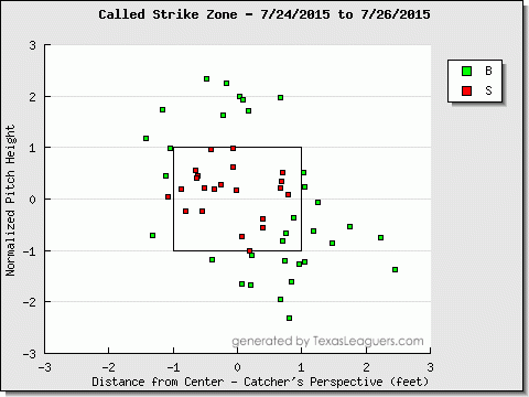
The need for an automated zone is pretty clear, especially when we have the technology to review missed calls in near real time. For example look no further than Jeff Sullivan’s posts on The Worst Called Strike/Ball of the First Half, or more recently, let’s observe one of Sunday’s games. Danny Salazar of the Cleveland Indians started the game, and according the PITCHf/x system over at Texas Leaguers, he may have been robbed of a handful of calls at a very important point in the game.

salazar

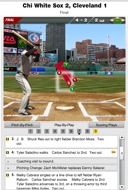
It looks as though three pitches touched the strike zone that were called a ball with an additional trio of pitches in the zone that were called balls. It’s hard to boil down a game to a single pitch, however one pitch can be the difference between walking back to the dugout after the third out or being lifted with two outs and runners on. The latter situation actually happened, and thanks to MLB’s Gameday, we can see the events unfold.

salazar1

Salazar gets ahead of Tyler Saladino 0-1 before the second and third pitches, both appearing to be in the strike zone get called balls. Salazar does well to even things a 2-2, however he probably should have been out of the inning with the score still tied at one apiece. The calls don’t go his way and Zach McAllister comes on to relieve Salazar, who was at 113 pitches, and promptly gave up the tying run. Again, it’s one pitch, but it was arguably the sequence of events that decided the game.

The Indians and the White Sox are both likely outside of the playoff picture at this point, however that shouldn’t be the focus. Given that we have the technology to get the calls correct, it’s awfully disappointing to only see Independent baseball willing to go with an automated system. As Ken Jennings once wrote, I for one, welcome our new computer overlords.

(Header image via the Pacifics’ website)

How to Make a Poor Man’s Heat Map

Presumably you’ve got some data. Maybe it’s PITCHf/x data, maybe it’s just a bunch of data points, and you want those represented in a heat map. How do you make this happen? Well, in the spirit of leading with the lede:

Just make a scatterplot and reduce the opacity of the dots.

Yeah, it’s not elegant and it’s not truly a heat map — not algorithmically calculated like the fancy stuff Jeff makes at Baseball Heatmaps or the complex zone-grids over at FanGraphs. But, hey, for many people, it should be enough.

Let’s go ahead and make a faux heat map together!

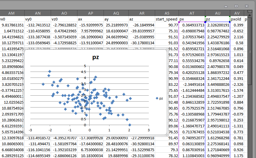
Let’s start by ripping out some Expanded Tabled Data from Brooks Baseball and pasting that data in Excel.

For the sake of this post, we’re looking at Chris Heston’s no-hitter from June 9, 2015. Once we plop that data into Excel, we’ll want to cruise on down to the columns titled “px” and “pz.” Highlight these columns and plop in a scatterplot:

It's hideous right now, but we'll make it beautiful.
It’s hideous right now, but we’ll make it beautiful.

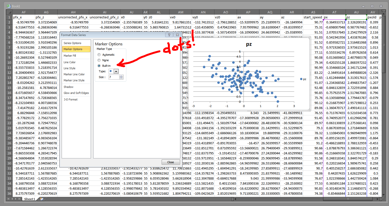
Right click on those blue diamonds and choose “Format Data Series.” Then, in the ensuing popup, browse to the “Marker Options” tab and change the markers to circles:

Circle icons are not only best for faux heat maps, they are also just more appropriate (especially for baseball) in general.

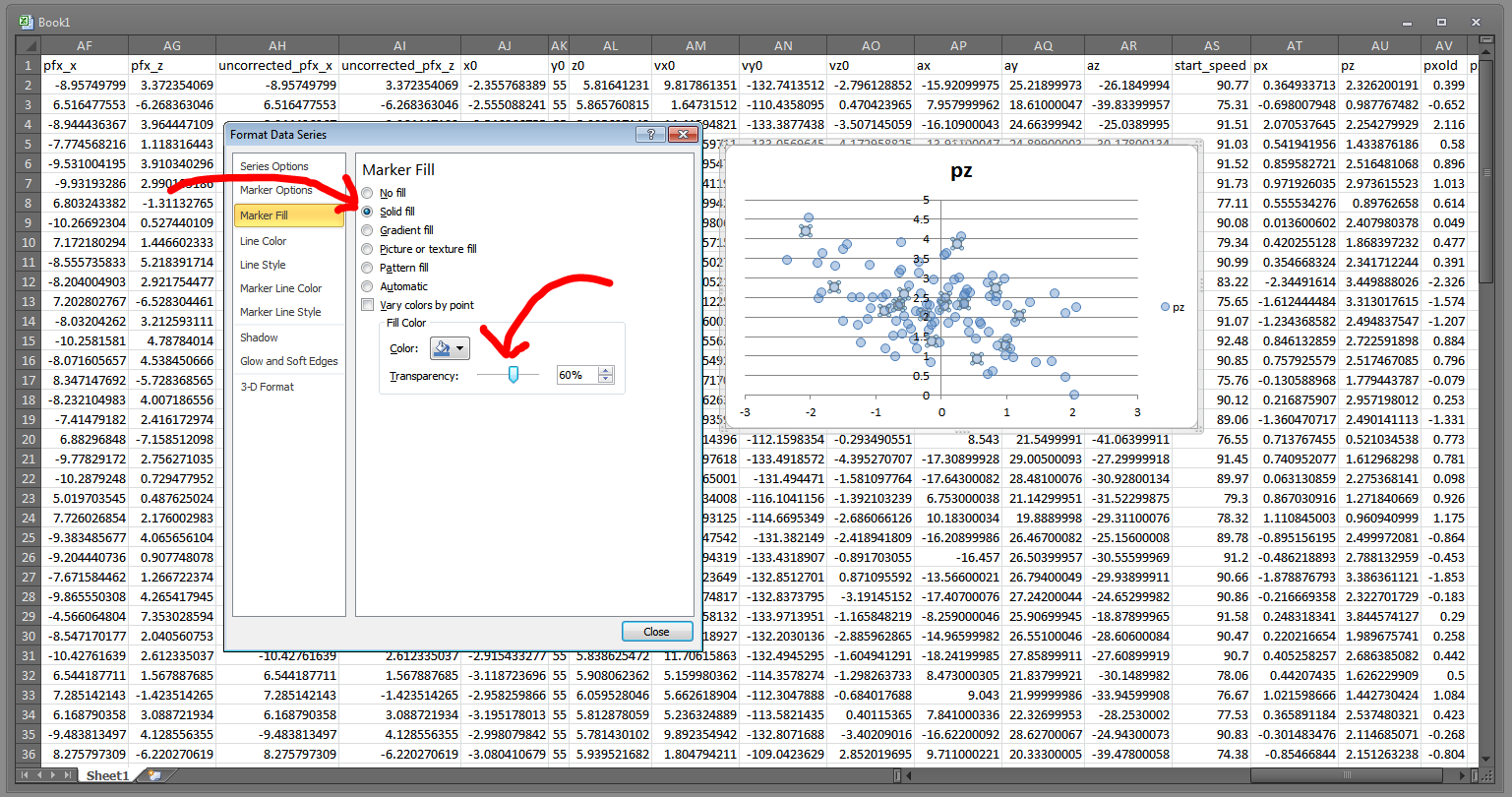
Then go to the “Marker Fill” section and choose “Solid fill.” We can then crank that transparency down:

You will want the dots pretty close to fully transparent, though this will depend on the amount of data points you have. Here, we only have about 100 and they are pretty widely dispersed, so we'll go with 60% transparent.
You will want the dots pretty close to fully transparent, though this will depend on the amount of data points you have. Here, we only have about 100 and they are pretty widely dispersed, so we’ll go with 60% transparent.

Now we need to get rid of the pesky blue outline on each of the data points. Head to “Marker Line Color” and change that to “No line.”

Without the marker outlines, the chart looks a lot more heat map-ish.

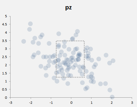
So we’ve effectively got a heat map now. With a little bit of tweaking (moving the Y-axis to the left, changing the background color, making the markers bigger, and adding a quick little strikezone box — pretty much all of which you can accomplish through the Format Data Series window), we can get something like this:

The transparency causes overlapping data points to appear darker, which is the key component of a heat map.

I should mention the strike zone is just a rectangle shape I inserted, and is not necessarily accurate. I set the fill to No Fill and made the border a hashed line. For specific guidance on where to put the strike zone, I suggest using Mike Fast’s article here, and then just eyeballing a shape like I did here.

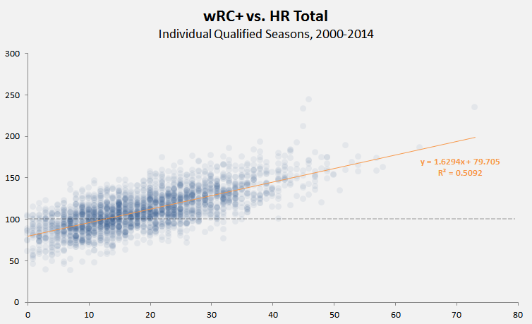
Heat maps are really most useful when you have many hundreds of data points, not just one hundred. For instance, here’s a little heat map (took less then three minutes to make) that shows the correlation between HR totals and wRC+ (offensive production) for individual hitters’ seasons from 2000 through 2014. I threw in a reference line for 100 wRC+ (league average) and a linear regression trendline (in the Chart Tools > Layout section):

The heat map style here let's us see how the majority of hitters are clustered 6 and 32 homers, and between 74 and 148 wRC+.
The heat map style here let’s us see how the majority of hitters are clustered 6 and 32 homers, and between 74 and 148 wRC+.

Here’s another one. This one took more time to cook up, but it’s 1494 records — every NFL quarterback season since 1920 who’s thrown at least 10 touchdowns. So that’s a line for every QB for every season, thus Drew Brees — for his 2009 and 2011 seasons — occupies the top two spots in the completion percentage column.

Anyway, a heatmap here really helps us see the clustering around the middle:

The trend line show a weak correlation, but the heat map tells us where the data is clustered -- and how small sample sizes and random data points might be throwing  off the calculation.
The trend line show a weak correlation, but the heat map tells us where the data is clustered — and how small sample sizes and random data points might be throwing off the calculation.

The transparency on the markers is at 91% (you’ll want higher transparencies for certain colors and for more data).

It’s not technically a heat map, but if you need to throw together some data to make or display a point, the built-in tools in Excel will certainly work in a pinch.


Yahoo! Is Now in the Daily Fantasy Business

You didn’t seriously expect Yahoo Sports to ignore the daily fantasy boom, did you?

That’s the first line of Yahoo!’s introduction to their newly-announced daily fantasy offering. It’s bluntness leans on the cute side, but it’s now without merit. Daily fantasy sports (DFS) seem to be exploding in popularity, and the funding numbers certainly back that up.

Yahoo! is going up against two well-established DFS platforms — FanDuel and DraftKings. Each have their own strengths and weaknesses, but what they both possess is strong market saturation. FanDuel, especially, has been making a huge push in partnerships of late, teaming up with both Major League Baseball and NASCAR. And it’s become increasingly difficult to watch any kind of sporting event without seeing commercials for either DraftKings or FanDuel. Yahoo! has an uphill climb ahead of them if they plan on making a big dent in the DFS market. But they do have a few aces up their sleeve.

Their first advantage is that that are already a huge player in the fantasy sports market. It’s true that their reputation has taken some hits as of late, but they’re still one of the big providers. Millions of traditional fantasy players are already visiting Yahoo! on a frequent basis. All Yahoo! has to do is entice them to give DFS a try (or seven). Whereas FanDuel or DraftKings have to either pay for advertising or enter in partnerships if they want exposure on the popular fantasy sites. Yahoo! has it all baked right in. They just have to convince people it’s worth a shot.

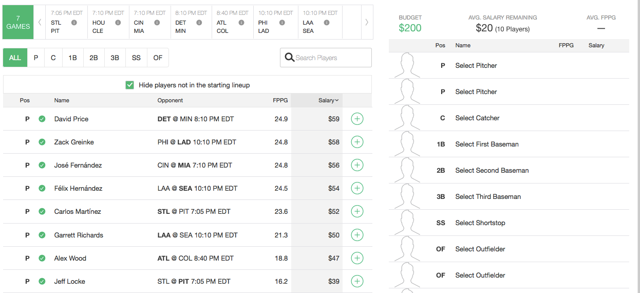
While it hasn’t been up long enough to do a full review, a quick glance at the new DFS site shows a nice, clean interface. The nuts and bolts of it work much like DraftKings or FanDuel, but Yahoo! is taking a different approach with their salary caps. Instead of working within a $50,000 cap, Yahoo! works within a $200 limit. Of course, everything is prorated. Instead of dropping $9,500 on a top-notch player, Yahoo! users would spend something like $60 within their lower cap limit. This is most likely a stab at simplicity — making the the financials easier to manage across a whole roster. It’s a novel idea, one that separates them from the rest of the field. We’ll have to see how it plays out as the season goes on.

yahoofantasy2

The first game of the NFL season comes on September 10th. The second half of the baseball season is clearly the proving grounds for Yahoo!’s new platform — a time to iron out all the bugs before the real money starts rolling in. Whether it works or not, you have to give Yahoo! credit for trying. DFS is eating into their user base and they’re making a move to try and stop the bleeding. Perhaps they can leverage their place in the market into some higher revenues. They certainly have the foothold. Being valued at $40 billion probably doesn’t hurt, either.


BU and edX Are Bringing Back their Sabermetrics 101 Course

Let’s be honest. Learning new stuff as an adult is hard. Without the regiment of formal schooling (and without curriculum provided by experienced professionals), getting a grasp on a new topic can be very challenging. This might be more true of the technology field than any other. If you want to bone up on your history or math skills, many times you can pick up a few books and gain knowledge. But unless you’re researching the history of BASIC, books aren’t always the most helpful thing for learning new technologies. Sure, I can buy a few books that promise to teach me Python (I have) and do all the exercises (I have), but the subject matter is so wide, it’s hard to feel like you have a real good grasp on the subject (I don’t) even after you’ve finished the books. That’s why places that offer Massive Open Online Courses (MOOC) like edX are so great. You get curriculum and direct instruction and are able to interact with other students and instructors when you get stuck.

Learning the underlying technology of baseball analytics is no easy task either. There’s scripting and database work involved. You need a firm grasp on SQL and R and other languages to be able to do what you want. It’s easy to get stuck, and that’s assuming you knew where to start in the first place. Well, edX has a solution for that as well. Boston University is once again offering their Sabermetrics 101 course through edX, and it’s the perfect place to start your understanding of everything that goes into being a good baseball analyst. Oh, and you can take it for free.

Our FanGraphs colleague/spirit animal Paul Swydan did a great writeup of the course when it was offered the first time around. The course starts with some history and basics of sabermetrics, and then moves on to teaching some of the technological tools needed to do one’s own research. You will learn the basics of SQL and R, but, more importantly, how to use these languages for the specific needs of baseball research. Though I didn’t have the bandwidth to take the course the first time around, I did poke around a little, and the offerings are both in depth yet totally approachable for seemingly anyone. All it takes is (very basic) computer skills and a willingness to learn.

Dr. Andy Andres, a senior lecturer at BU and the instructor for the course, told me that even more is in store for version two.

“We have re-vamped the second half of the course, making sure we do justice to WAR as much as we can in an introductory course — we cover not just hitting now, but cover the basics of fielding and pitching. And we have completely re-worked our R curriculum, hopefully having more success is learners getting through some intro programming skills.”

A while back, I presented some how-tos on getting a Retrosheet SQL database onto your machine. Many of you asked for help in querying the thing, which is a reasonable request. However, every time I tried to write one, I got stuck. Sure I could have supplied some sample queries, but to really be able to use the database, one needs understanding of how SQL structure works. If you got through building the database, but still aren’t quite sure how to use it, this is the course for you.

If you didn’t build a database, you can still use the course, however. One of the best parts about Sabermetrics 101 is that all work is done in hosted sandboxes. You don’t need SQL or R installed on your computer to partake in the learning. edX hosts the necessary machines for you. All you need is an internet browser. Sure, you can work on the exercises on your local machine if you wish, but the sandboxing option ensures that any user has access to the proper tools and takes away any apprehension one might have of wrecking their system while they’re trying out new things.

Class starts on July 7, and is certainly worth a look for anyone looking to improve their baseball analysis skills. You can take the course for free, or pay $25 if you want to receive the verified certificate. You won’t learn everything (Andres says that a 201 course is in the works), but you will walk away confident enough to use Google and other tools to find answers that actually make sense.

I encourage any and every TechGraphs reader to take part. I’m fully committing to this session and look forward to seeing all of you in the forums.


Review: Motus Global’s mThrow

When Motus Global’s sleeve was announced last spring, it was supposed to save baseball, stemming the flood of Tommy John surgeries plaguing the majors. Now, the device that teams have been using to study their pitchers’ mechanics since last fall is available to the public. The mThrow has been on sale through the Motus website since March, and began shipping in early May. Eager to see what the device had to offer, I plunked down the $150 (plus $20 for an additional compression sleeve) and waited anxiously.

The box that the mThrow comes in is taken up mostly by the compression sleeve. The actual IMU — the sensor that actually tracks the arm’s motion — is a tiny blue thing, about the size and shape of a circus peanut*. The IMU charges by induction, so all the user has to do is plug in the charging station, place the sensor on top of the station, and wait about an hour.

* – But slightly better-tasting.

Pairing the sensor is simple, too, taking just a few taps of the smartphone app. The hardest part of setting the thing up is probably wedging the sensor into its little pocket in the compression sleeve, and then pulling the sleeve on so that the sensor rests over the infamous ulnar collateral ligament. In fact, the design might be overly simplified. In an effort to make the sensor more water-resistant, there are no lights on the sensor to tell the user of the charge level. The only way to check is to pair the sensor with the smartphone app; if the app doesn’t recognize the sensor, it probably needs to be re-charged.

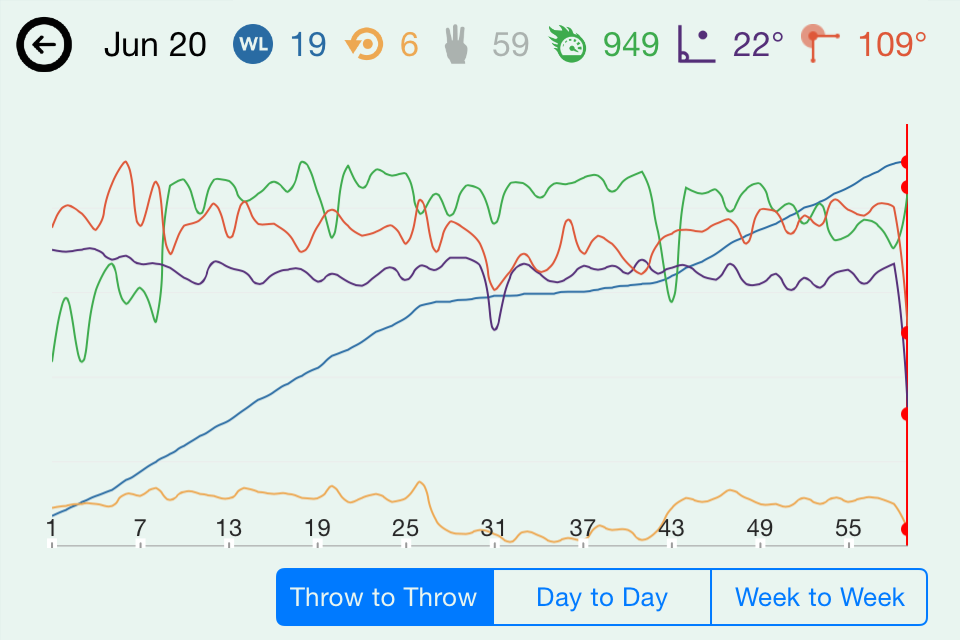
The app is currently available only for the iPhone; an updated version was approved this week. The software now computes five metrics from the sensor data: pitch count; maximum arm speed, a rotational velocity measured in revolutions per minute; arm slot at release; maximum shoulder rotation relative to initial position; and, of course, torque on the UCL. These are then combined into three headline numbers: performance, a measure of mechanical consistency; workload, currently an additive function of elbow torque; and a “throw meter,” an energy bar that drains from blue to orange as the workload increases and consistency decreases.

I ran some preliminary testing of the mThrow, connecting it to an iPhone 4S and throwing 17 fastballs, 17 changeups, and 17 curveballs to the best of my extremely limited ability; all but six throws were recorded. Even if there’s no difference between their speeds and movement, you can still see a difference between my initial warmup tosses (the first dozen, with much lower arm speeds), fastballs (about 13-25), curveballs (26-43, with much lower torque values), and changeups (44 onward, with decreased arm speeds).

image2
This simple relationship was confirmed with a second test using a HitTrax system, which can track speed and late break of pitches as they cross the plate. My subject was a 45-year-old with some collegiate pitching experience who threw ten fastballs and ten curveballs. By comparing the HitTrax velocity report (right) to the mThrow statistics (left), we can see the correlation between the decrease in arm speed and the decrease in velocity as the subject switched from fastball to curves.

donfrancesco
Lastly, I brought the sleeve to a local high school (Blackstone Valley Tech, Upton, MA) to get some insights from active players. Assistant coach John Burke, pitcher Nick Laren, shortstop Joe Corsi, and catcher Jack Lynch took turns throwing an assortment of pitches from a number of release points, seeing how their throwing motions stacked up. The session supported some beliefs — for instance, that the quick motion Lynch uses to throw out would-be base stealers puts more torque on the elbow than a standard pitching delivery. But others were surprisingly contradicted: despite everyone’s belief that sidearm throws put less stress on the elbow than an over-the-top delivery, the app didn’t seem to report a relationship between arm slot and torque.

Chief technology officer Ben Hansen says the mThrow is still in its infancy, and says that the device’s official consumer launch is not scheduled until later this summer. The app currently relies on data compiled from Motus Global’s work with MLB prospects at last fall’s instructional league to generate its workload number, but Hansen and his team are working to produce more meaningful metrics from a more complete data set.

“We’re just capturing as much data as we can to see what’s normal,” Hansen said. “We also have controlled studies going on at every level. We have [NCAA] D1, D3, high school, and Little League players wearing it religiously.”

At this early stage, the app seems to be designed more for Motus’s professional clients than for public users. Maybe the best example of this is the tagging feature, which allows users to tag individual throws as belonging to bullpen sessions, long toss, or game action, and to further break throws down by pitch type. But at the moment, the tags are unavailable to the user after selection, getting passed on to Motus Global with the sensor data but not visible on any of the trend screens. Hansen confirmed that the tags were being used in the company’s research for their MLB clients, however.

“Every week we send reports broken down by tags where we compared each pitcher to the league averages for that pitch type,” Hansen said. “The teams love using the tags and breaking things down into the different pitch types.”

It’s a tantalizing view of an exciting feature that could still be a couple years away. And it’s not just super dorks like me who would find those analytics useful. The key to a good changeup is matching the same arm speed used to throw a fastball, so it’s easy to see coaches like Burke using the arm speed metric to give feedback to young pitchers just learning to throw the pitch. But without any way to divide pitches into different categories, this sort of feedback isn’t possible yet.

“We are looking into a web portal to give users more in-depth analytics,” Hansen said. “But right now we’re focused on getting the analytics right before we move on to other platforms.”

It’s probably still too early to judge the mThrow fairly, and I’m almost definitely not the right person to do it (sabermetrically-inclined tech geeks who can’t pitch are not Motus’s target market). And it’s true that more research could produce findings that actually help young pitchers stay on the field and off the operating table. But as currently constructed, the mThrow raises more questions than it answers, and left me wanting more. Like a top pitching prospect, the technology needs some time to mature before it can make a meaningful contribution.


KinaTrax Gives Rays In-Game Markerless Motion Capture Data

In an effort to keep their pitchers healthy, the Tampa Bay Rays have enlisted the services of markerless motion capture company KinaTrax. As Jeff Passan of Yahoo! Sports reported Monday, the Rays are the first team to partner with the Philadelphia-based company.

When asked about the technology Tuesday, KinaTrax founder Michael Eckstein was reluctant to reveal much of the technology that drove his company’s system. Images from “multiple cameras” positioned throughout the ballpark (an earlier test used eight) are stitched together to create an unobstructed, 360-degree view of the pitcher. Eckstein compared his system to the commercially-available Microsoft Kinect, which uses infrared and sonar tracking to capture a user’s position for video gaming or other applications.

“The Kinect has a focal length of 8 to 14 feet, and captures 30 frames per second,” Eckstein said. “The challenge is, how do you scale that up to an MLB stadium, where you have to capture 275 to 300 frames per second from 350 feet away?”

Once the data is collected and uploaded to cloud storage, “proprietary algorithms” are then used to identify the position of body landmarks like joints and calculate the distances, angles, velocities, and accelerations between the various body segments. In an earlier talk at the 2013 SABR Conference in Philadelphia, Eckstein claimed that the positions measured by the system were accurate to within 1.5 centimeters.

It is probably no surprise that capturing such detailed visual information hundreds of times per second is a costly process. Eckstein estimates that a typical game could produce up to 1.4 terabytes of data. The data is owned by the teams — since it identifies each pitcher and is thus considered medical information, even KinaTrax can’t access it without permission once it’s collected. For teams unable to work with the raw data, KinaTrax can also develop reports on key metrics; Eckstein said in his 2013 presentation his system was capable of generating these reports overnight.

“Some teams have the ability and the staff to say, ‘We want these kinds of reports, and these kinds of analytics,’ and then we can go out and produce them,” Eckstein said. “And then if teams have very qualified staff, they’ll get the raw data to work with themselves.”

Although KinaTrax worked with the Mets in 2013 to develop their system, Tampa Bay is the first major-league team to install the system and collect game data. And while it’s too early to draw any conclusions from the data collected by the system, Eckstein is happy with KinaTrax’s early performance.

“We’ve successfully recorded thousands of pitches, and the system is working as expected,” he said.

According to Eckstein, KinaTrax had discussed possible arrangements with 17 MLB teams between the Winter Meetings, Cactus League, and Grapefruit League before finally coming to an agreement with the Rays. Eckstein was excited about working with the Rays, praising their front office acumen and even the symmetrical shape of Tropicana Field (which made camera installation easier).

“The Rays are among those top major-league teams that understand what we’re doing and have an understanding of big data,” Eckstein said. “We couldn’t ask for a better team for our pilot.”

Teams have already proposed a number of different uses for the system. For major league pitchers, teams could use the system to demonstrate “best practices,” and highlight the subtle changes in mechanics that could separate a great outing from a poor one. But Eckstein also discussed the possibility of installing the cameras in minor-league parks, allowing teams to better teach proper mechanics to young arms while also developing “longitudinal patient records” of changes to a pitcher’s kinematics over time.

“All of the teams we’re speaking to want them in their major league stadiums,” Eckstein said. “But the really innovative teams tell me, ‘Where we will get the most benefit out of this is with our Single-A or Double-A teams.'”

Once installed, the system can also be adjusted to capture mechanics in bullpen sessions, and could be modified to track hitters’ swing mechanics. For now, though, KinaTrax is primarily focused on the action on the pitcher’s mound.

“There’s a consensus among teams about this anecdotal evidence of pitchers who are great in their bullpens but then lose it on the mound,” Eckstein said. “But truth be told, it’s the in-game information that managers, coaches, and scouts are after.”

Before founding KinaTrax, Eckstein worked in the technology sector for 25 years, helping companies figure out how to use technology to develop competitive advantages. A baseball fan, Eckstein found himself at a lunch with a Phillies senior executive in 2012, and the conversation turned to Roy Halladay’s early-season struggles.

“He said, ‘Wouldn’t it be great if we had a way to measure his mechanics and see what he’s doing wrong?'” Eckstein said. “And I said, ‘Oh, this will be easy. We’ll go to Microsoft and they’ll come up with something.'”

It wasn’t that easy, of course. The leap from the existing technology to in-game motion capture from hundreds of feet away required the development of an entirely new technology platform, which became the basis for KinaTrax.

Before Monday, KinaTrax first announced itself at the 2013 SABR Conference in Philadelphia, where Eckstein gave a talk and brief demonstration on his system. At the time, KinaTrax had persuaded the Mets to let them test their camera system in Citi Field. The eight-camera test was successful, but no actual game data were recorded.

Now that the word is out on KinaTrax, Eckstein plans to return to the Winter Meetings and put his newly-tested product before the decision-makers in MLB front offices.

“We’re going to have serious discussions with teams about agreements for the 2016 season,” he said.

But go on the company’s website and you’re greeted not by a picture of a Major Leaguer or of Tropicana Field but by a youth baseball pitcher. This is not just a nice image: Eckstein said KinaTrax is planning to scale its system down for college, high school, and even youth-level teams.

“Clearly the arm motion is very different for an eight or 12-year-old versus a major league pitcher,” Eckstein said. “But we feel that with the nuggets we’ve learned, and with cameras that don’t have to capture 275 to 300 frames per second and don’t have to be 350 feet away, we can bring the price of the system down to that level.”


Presenting Three or More Dimensions Using Tableau

Whoa! What’s a Tableau, you ask? Well, I have an even more basic Tableau Public tutorial for the likes of questioning minds such as yours. Although, this article is pretty basic too, so either should be decent starting places.

Tableau is a powerful, unique visualization tool. The fact it’s also free is a little unbelieveable. One of the reasons I love Tableau so much is that it allows me to present multiple dimensions of data in a single chart — and do so without ungodly 3D charts.

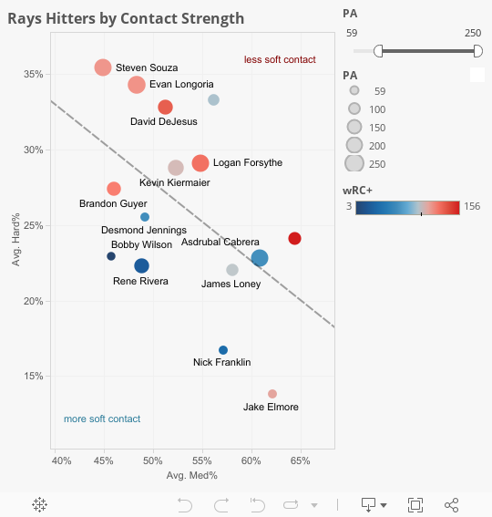
What do I mean? Well, there’s a great example in the newest addition to the FanGraphs suite of data — the contact rate (Soft%, Medium%, and Hard%) numbers. So let’s say I want to present this data* for the Rays hitters. I’m mostly interested in the contact rates, so I could put together a scatterplot of Hard% versus Medium%.

*If you want to play around with the exact same data that I’m using, download this CSV. Otherwise, you data will be different than mine because you, sir or madame, live in the future.

What’s neat about this chart is that, since Soft%, Medium%, and Hard% are mutually exclusive (a batted ball can’t be both hard and medium) and they are collectively exhaustive (there’s no other hit type, only these three; combined, we called this data MECE, mutually exclusive and collectively exhaustive), we can essentially present the three dimensions in a single scatterplot:

With Excel, we can kind of represent three data dimensions (Soft%, Medium% and Hard%), but that's only a happenstance of MECE data.
With Excel, we can kind of represent three data dimensions (Soft%, Medium% and Hard%), but that’s only a happenstance of MECE data.

So let’s say we wanted to add another component of information to this graph. Let’s say I want you to know which dot is which player. Or, perhaps, the amount of plate appearances corresponding to each of these players. In Excel, we could add a data label, but we would need to go through, by hand, and add each player’s name to the corresponding dot. Excel only inherently gives three label options: X labels, Y labels, or Series labels — and none of those are really useful here.

Let’s try this same chart in Tableau. First, though, we’ll need to work on the CSV a little. I’ll show you what I mean.

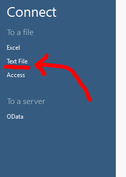
Open Tableau Public (preferably the latest version; I think that’s version 9), and you’ll be prompted to open your data source. Choose “Text File” and then navigate to your CSV file.

If you have a CSV or TXT file, this is the option you want.

I should mention at some point that, in Tableau Public, we rarely create data. It’s more about manipulating and presenting what’s already made. So there’s no option for “Blank Spreadsheet” like there is Excel.

Anyway, after connecting to our CSV, Tableau is going to confirm our data has the right settings. And thank goodness for that, because something’s awry:

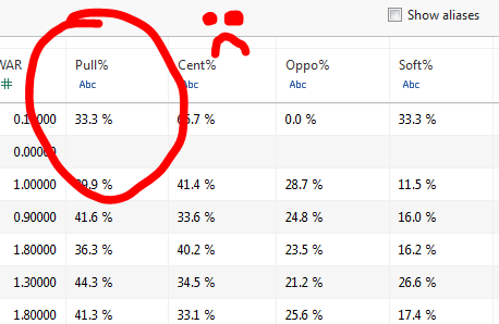
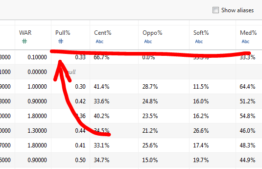
A space between the number and the percent sign caused Tableau to think this was a string (that is, like a word or something). So we need to fix that.

The system sees the space between “33.3” and “%” and thinks it’s a word (because spaces can’t fit into data). That’s what the blue “ABC” icon means.

This problem is easily fixed a variety of ways. One way: You could open the CSV in Excel and save it as an Excel file. That’s a pretty simple fix. Another alternative is just to scrape all those pesky spaces out of there. I prefer to do this with Notepad (or any similar stripped down word processor).

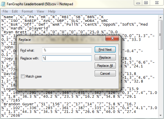
For that method (which is handy if you’re on a computer without Excel), all we need to do is open the file with notepad, hit CTRL+H (to open the “Replace” dialogue) and then choose to replace a space with nothing.

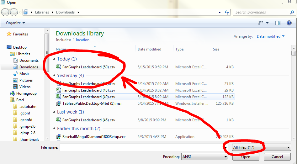
Open Notepad, then open a file and set the file types too "All Files."
Open Notepad, then open a file and set the file types too “All Files.”
Then I type space (" ") then percent sign ("%") and choose to replace all.
Then I type space (” “) then percent sign (“%”) and choose to replace all.

Save it, then bing, bang, bongo, the file is ready to do work. Head back into Tableau, and then ensure the data is showing up correctly. Once again, our data is not defaulting to decimal, so we’ll quickly change these items to decimal numbers (just click the blue “ABC” and choose “Decimal” from the drop down menu).

You will still need to go through and make sure the pertinent columns are being treated as decimal numbers.

After you’ve got your data looking correct, head on over to Sheet 1 (the automatically generated tab in the lower left of the screen). You will now be in the basic worksheet interface.

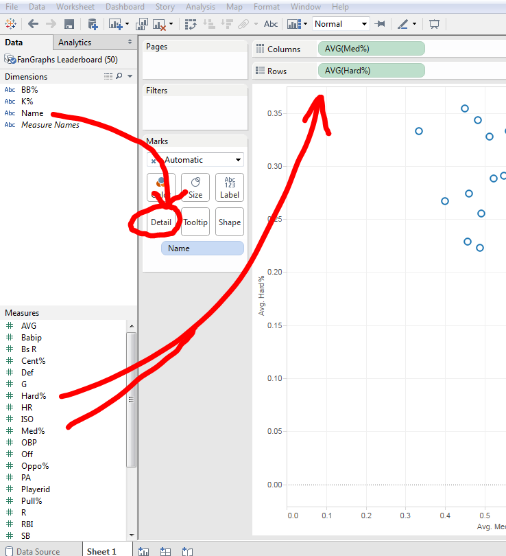
For our purposes, go ahead and drag Med% to the Columns section and Hard% to the Rows. Then, pull the Names dimension onto the Detail section.

From here out, it's pretty much click and drag.
From here out, it’s pretty much click and drag.

NOTE: You may need to click on the “Show Me” button on the top right to change to a scatter plot.

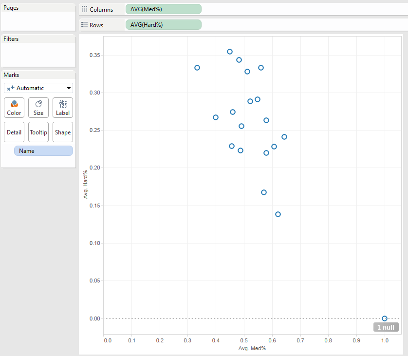
The resulting scatter plot looks pretty similar to — and essentially has the same pieces as — the previous Excel chart we made:

It takes only a few actions to recreate the basic scatter plot we made in Excel.

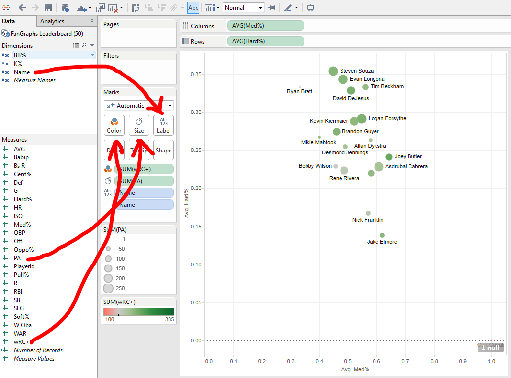
But now let’s expand it with more information. For one, I want the users to know the sample size of each of these dots. I’m looking at all position players on the Rays roster, but that includes even Curt Casali who — at the time of pulling this data — had only 2 PA. To express these differences, we need merely drag the “PA” measure to the “Size” button.

Likewise, I can present how well each of these players is hitting by dropping the “wRC+” measure into the color section. And for even more clarity, I can name each dot with the corresponding player it represents:

Adding different visual manifestations of the data is a simple process in Tableau Public.

None of these dimensions are feasible with an Excel plot, chart, or graph. We would need to make these size, color, and label changes by hand in Excel. But in Tableau, it’s a flick of the wrist.

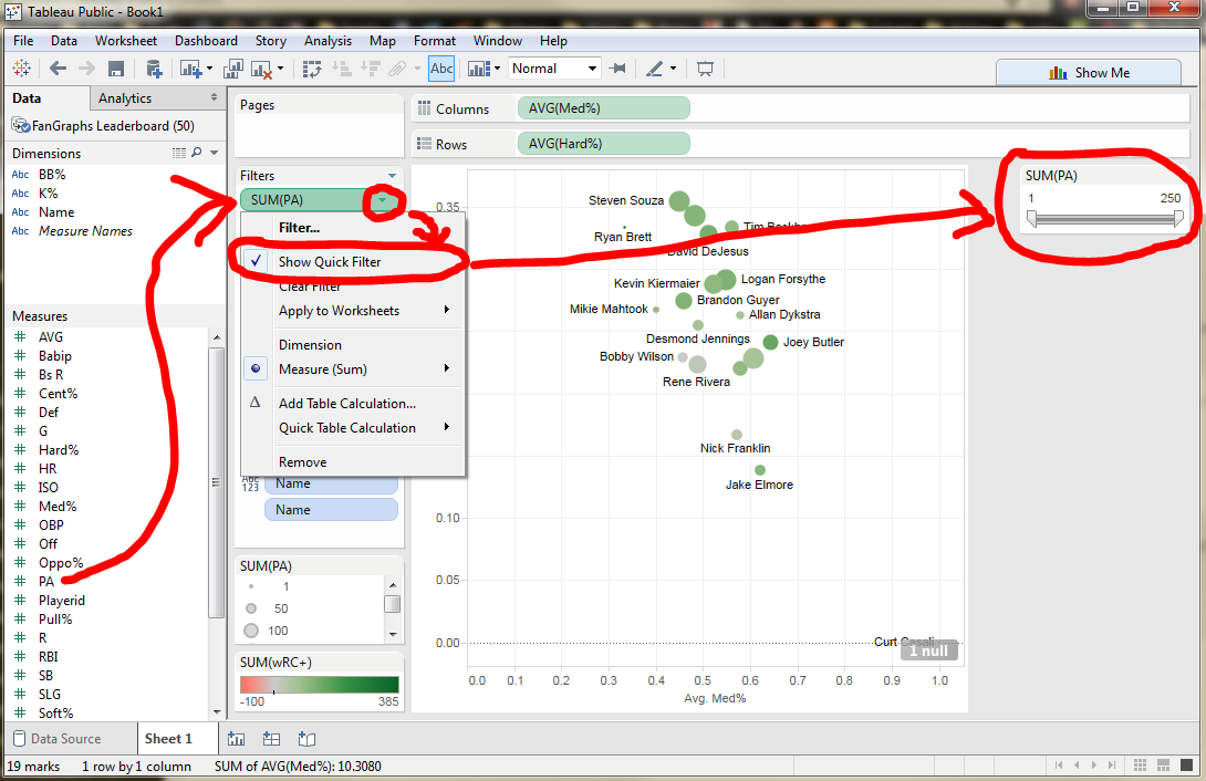
What’s more, we can clean up this data with the addition of a filter — and a quick filter to allow users to manipulate the filter too:

Adding a filter allows not only the Tableau creator, but also the end product user to adjust the featured data.

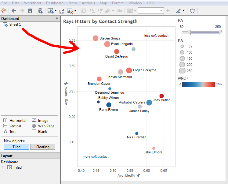
When we get the chart to basically where we want it, we can then throw it into a dashboard. A dashboard is the final shape the worksheet will take. Sometimes I combine multiple worksheets into a single dashboard to present a single idea. Other times I use a single worksheet for a single dashboard. We’ll do the latter in this instance:

Putting the chart into a dashboard will ultimately give us something to embed into a blog post or website. It also gives us keys for the sizes and colors.

The most beautiful thing about using Tableau, of course, is that the end product doesn’t have to be a static image. This allows us to embed even more information into the system — for instance, anything we add to the Detail section will appear in the popup when users hover their mouse over given data points.

After a little spicing up with the formats (such as fixing the dimensions for the X and Y axes, adding a linear regression line, and adding a few text boxes to indicate the general Soft% areas), we get a final version like this:

When we combine all these data points together, we can see interesting oddities in the data. For instance: Rookie Joey Butler is having a great year, hitting a 156 wRC+. But looking at his placement on the graph, we see he has a lot of non-hard contact for a guy with such a high wRC+. Likewise, Tim Beckham — the light blue dot in the top right — has crushed the ball this season, but is not showing a strong wRC+.

I should note the limited forecast value of this kind of data. While fascinating (and a great sample for Tableau to flex some muscles), this data does a much worse job predicting future results than a simple glance at these player’s ZiPS or Steamer projections.

That said: How fun is this chart? I think it’s a blast, and I hope it inspires you to present more dimensions of data — in a neat and understandable way — in your next visualization.

Happy Tableauing!


An “Unsophisticated” Breach is Still Bad News for the Cardinals

(Editor’s note: After this article was published, Jeff Luhnow told Sports Illustrated that he does not believe this issue happened due to the re-use of passwords. As no official report has been presented, we will leave this article up until further evidence is provided.)

Baseball met espionage without the help of Moe Berg on Monday, as news broke that the FBI was investigating the St. Louis Cardinals under allegations that they unlawfully accessed the internal database of the Houston Astros, known as Ground Control. Nathanial Grow did an excellent job going over the legal implications over at the mothersite, so make sure to check that out to get a sense of how badly this could end up breaking for St. Louis. But since we’re cover the tech stuff, I want to talk about how something like this could have happened.

In the New York Times article, specific mention is made that the “intrusion did not appear to be sophisticated” and that law enforcement believes that it was perpetrated by Cardinals front-office employees. This seemed to soften the initial blow a bit, making it clear that St. Louis wasn’t employing black hat hackers to crack Houston’s system. Instead, those responsible seemed to have gained access to passwords used by Jeff Luhnow and those he took with him when he left for St. Louis for the Houston GM job. And while this isn’t a malicious as someone trying to forcefully access Ground Control, it still casts the Cardinals in bad light. Low-level or not, the Houston data breach represents some serious security holes found in the IT practices of the Cardinals.

Let’s get one thing out of the way. Using someone’s old password isn’t really “hacking.” For one:

And secondly (language warning):

No, nothing really got hacked. It just got accessed. If Cardinals officials had passwords, all they needed was the user name of Luhnow or the person in his stable (it’s not clear whose actual account was used). But that doesn’t mean this should have occurred. Actions of some kind were still taken. So, how was it done? Well, there are a few possibilities.

Some Dummy Wrote Their Password Down

The Silicon Valley clip above is jokey, but it’s based on a lot of truth. I’ve worked in IT for over a decade. I’ve seem passwords written on Post-Its — sometimes hidden under keyboards, sometimes attached right to computer monitors. Most companies install policies that users need to change their password every three months or so. This … confuses people. They have trouble remembering. They write passwords down. Those tend to get left around. It’s dumb and a little sad, but it’s very possible that this whole scandal comes down to something like this.

Some Dummmy Shared Their Password

This is also all too common. Passwords get sent to assistants all the time. I’ve talked to executives who didn’t know their passwords at all. Their assistants updated their phones and laptops when the time came to change passwords. People in the same departments share login credentials all the time. “Crap, I can’t login. Jerry, give me your password. I need this spreadsheet.” They’re not looking to cause data breaches, they are just unaware of their actions. If some IT people wanted to get access to Ground Control, it would be very easy to search email logs and dig up some passwords.

The Cardinals Stored User Passwords as Plain Text

During Luhnow’s tenure in the front office, the Cardinals apparently used a system similar to Ground Control called Redbird. This most likely utilized some kind of content management system, which is built on top of a database. These databases have user tables that include things like names, contact info, usernames, and passwords. Ideally, the passwords would be hashed. Simply put, hashing passwords means changing plain passwords like “mypassword” into a bunch of numbers and letters — “mypassword” becomes “ajd923if902rnasdf09992on”. This gibberish is actually what’s stored on the database, and the server never sees the actual password. It keeps the hash translations elsewhere and just uses the hash to authenticate when a user logs in.

But that’s in a perfect world. It doesn’t always happen. This happened to the Sony Playstation Network a while back. It happens lots of places. It’s very feasible that Cardinals officials — whoever they were — simply pulled up a user that left and was able to see their password clear as day.

Whatever happened, I would bet it lies somewhere within these three options. Anything above that — attacks on properly-encrypted passwords through dictionary or rainbow table attacks– not only would infer serious maliciousness, it would mean the passwords were obtained by someone with a great deal of computer savvy.

Remember, the FBI was able to associate the Cardinals with this because the unauthorized access was traced to a home where known Cardinals people lived or hung out or whatever. Anyone with the smarts to properly reverse engineer and encrypted password probably would know that pretty much any time anyone accesses a server (Google, Facebook, Amazon, Twitter), their public IP address is logged. A password hacker would know to go to a library or use Tor or some other IP-masking tool. But this does not absolve the Cardinals in the least, and it probably makes it worse.

If a former Cardinal employee cracked the Redbird database to obtain passwords to use on Ground Control, the Cardinals could easily say that they are sorry and have taken measures to upgrade the security in their corporate offices. But if this all happened due to some low-level password-finding mission, it means that whoever is in charge of IT over there is lazy at best, or just plain unqualified. Or perhaps Redbird fell out of the realm of regular IT functions. Either way, it’s not good.

If a couple of interns could get access to user passwords this easily, imagine what could happen if someone who knew what they were doing gave it a go. Emails, text messages, photo backups, contracts, salary information, social security numbers — all of it could be at risk. You think we got some tasty stuff when the Ground Control documents were leaked? Imagine the field day Deadspin would have if someone managed to get a hold of John Mozeliak’s emails. People would be poised for ridicule, embarrassment, even identity theft, all because a company that operates in a field ripe for corporate espionage wouldn’t take steps to properly protect people’s passwords.

It’s a sign of the times. Database teams within baseball clubs are a fairly new thing. There are still bugs to be worked out — no pun intended. However, if this whole boondoggle doesn’t open the eyes of the other 28 MLB teams (and probably some NFL, NBA, and NHL teams as well), then I don’t know what will. I imagine some memos have been sent out this morning outlining new security policies. Or at least they should. Because while cracking passwords has become harder, simply copying them down never will.

(Header image via Pablo BD)

PSA: MLB.tv is Half Off This Week

If we had an InstaTechGraphs section, this news would go there. However, it is worth noting that MLB.tv is having quite a sale to commemorate Father’s Day. This week, one can purchase MLB.tv for $39.99 or MLB.tv Premium for $49.99. That one-time purchase will give you access for the rest of the season. Yes, the platform has its issues and blackout rules still apply, but this is a pretty tremendous deal for baseball fans. The sale ends this week, so get your finances in order.