Presenting Three or More Dimensions Using Tableau
Whoa! What’s a Tableau, you ask? Well, I have an even more basic Tableau Public tutorial for the likes of questioning minds such as yours. Although, this article is pretty basic too, so either should be decent starting places.
Tableau is a powerful, unique visualization tool. The fact it’s also free is a little unbelieveable. One of the reasons I love Tableau so much is that it allows me to present multiple dimensions of data in a single chart — and do so without ungodly 3D charts.
What do I mean? Well, there’s a great example in the newest addition to the FanGraphs suite of data — the contact rate (Soft%, Medium%, and Hard%) numbers. So let’s say I want to present this data* for the Rays hitters. I’m mostly interested in the contact rates, so I could put together a scatterplot of Hard% versus Medium%.
*If you want to play around with the exact same data that I’m using, download this CSV. Otherwise, you data will be different than mine because you, sir or madame, live in the future.
What’s neat about this chart is that, since Soft%, Medium%, and Hard% are mutually exclusive (a batted ball can’t be both hard and medium) and they are collectively exhaustive (there’s no other hit type, only these three; combined, we called this data MECE, mutually exclusive and collectively exhaustive), we can essentially present the three dimensions in a single scatterplot:

So let’s say we wanted to add another component of information to this graph. Let’s say I want you to know which dot is which player. Or, perhaps, the amount of plate appearances corresponding to each of these players. In Excel, we could add a data label, but we would need to go through, by hand, and add each player’s name to the corresponding dot. Excel only inherently gives three label options: X labels, Y labels, or Series labels — and none of those are really useful here.
Let’s try this same chart in Tableau. First, though, we’ll need to work on the CSV a little. I’ll show you what I mean.
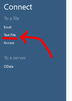
Open Tableau Public (preferably the latest version; I think that’s version 9), and you’ll be prompted to open your data source. Choose “Text File” and then navigate to your CSV file.
I should mention at some point that, in Tableau Public, we rarely create data. It’s more about manipulating and presenting what’s already made. So there’s no option for “Blank Spreadsheet” like there is Excel.
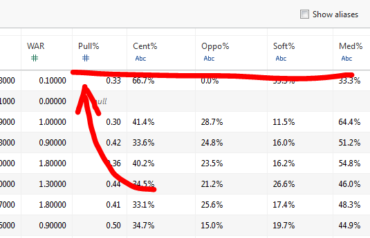
Anyway, after connecting to our CSV, Tableau is going to confirm our data has the right settings. And thank goodness for that, because something’s awry:
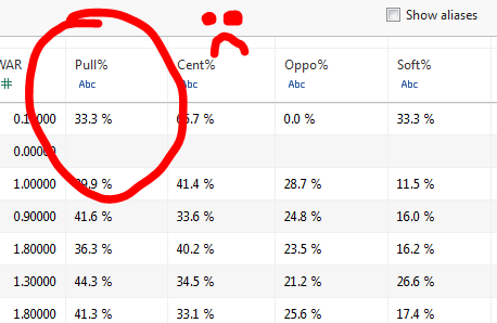
The system sees the space between “33.3” and “%” and thinks it’s a word (because spaces can’t fit into data). That’s what the blue “ABC” icon means.
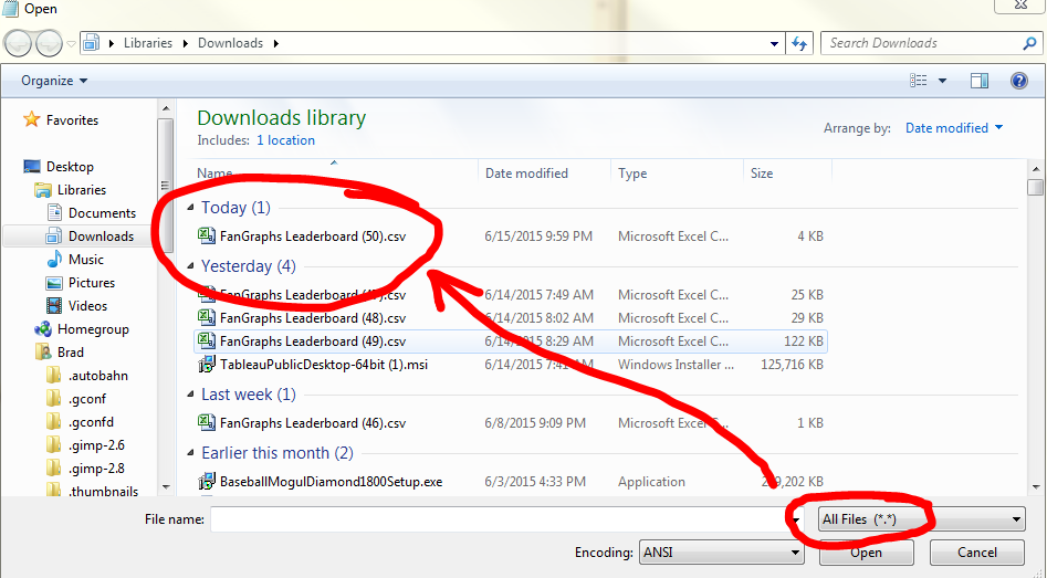
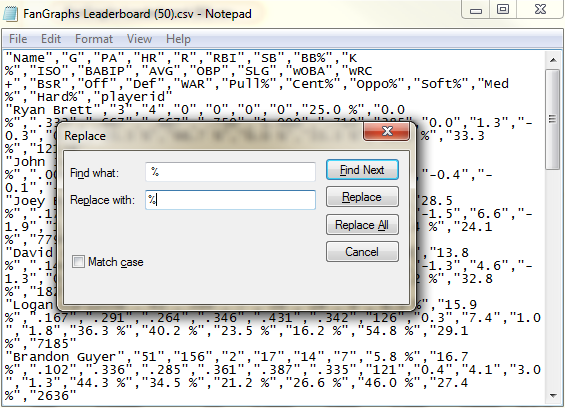
This problem is easily fixed a variety of ways. One way: You could open the CSV in Excel and save it as an Excel file. That’s a pretty simple fix. Another alternative is just to scrape all those pesky spaces out of there. I prefer to do this with Notepad (or any similar stripped down word processor).
For that method (which is handy if you’re on a computer without Excel), all we need to do is open the file with notepad, hit CTRL+H (to open the “Replace” dialogue) and then choose to replace a space with nothing.
Save it, then bing, bang, bongo, the file is ready to do work. Head back into Tableau, and then ensure the data is showing up correctly. Once again, our data is not defaulting to decimal, so we’ll quickly change these items to decimal numbers (just click the blue “ABC” and choose “Decimal” from the drop down menu).
After you’ve got your data looking correct, head on over to Sheet 1 (the automatically generated tab in the lower left of the screen). You will now be in the basic worksheet interface.
For our purposes, go ahead and drag Med% to the Columns section and Hard% to the Rows. Then, pull the Names dimension onto the Detail section.
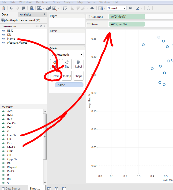
NOTE: You may need to click on the “Show Me” button on the top right to change to a scatter plot.
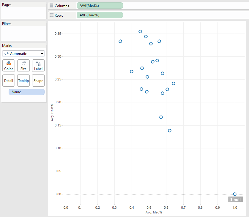
The resulting scatter plot looks pretty similar to — and essentially has the same pieces as — the previous Excel chart we made:
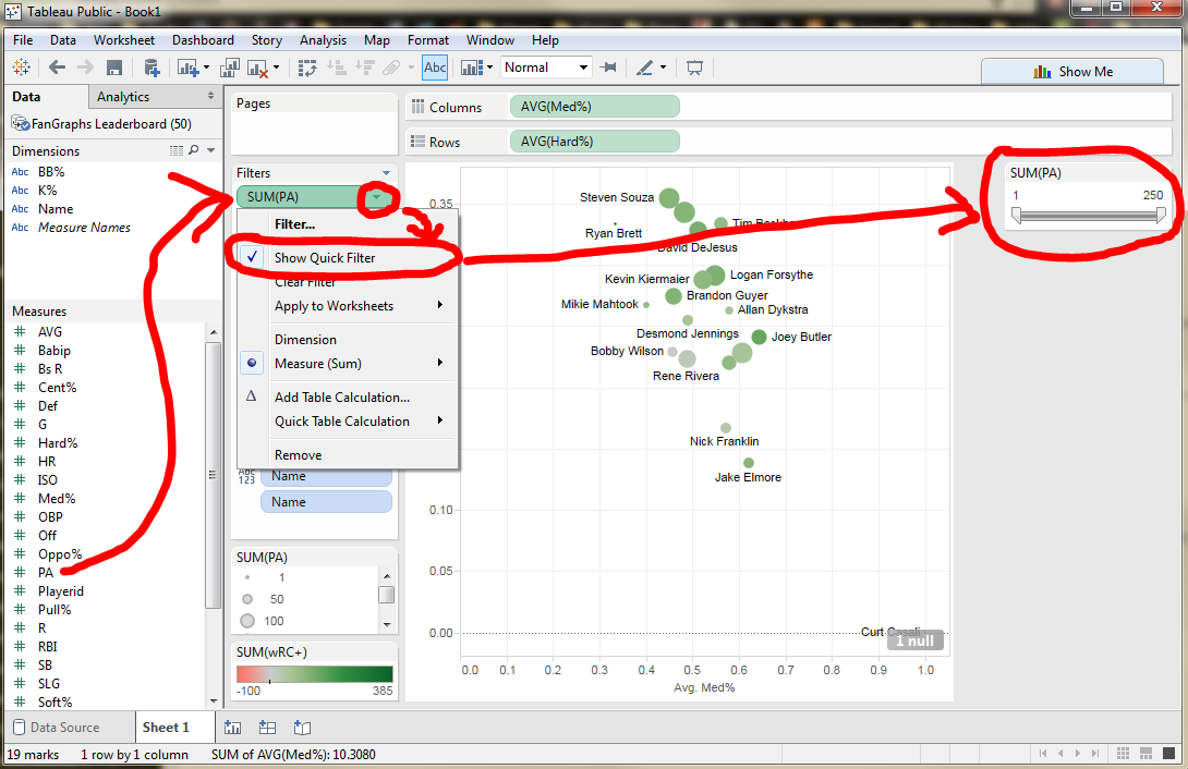
But now let’s expand it with more information. For one, I want the users to know the sample size of each of these dots. I’m looking at all position players on the Rays roster, but that includes even Curt Casali who — at the time of pulling this data — had only 2 PA. To express these differences, we need merely drag the “PA” measure to the “Size” button.
Likewise, I can present how well each of these players is hitting by dropping the “wRC+” measure into the color section. And for even more clarity, I can name each dot with the corresponding player it represents:
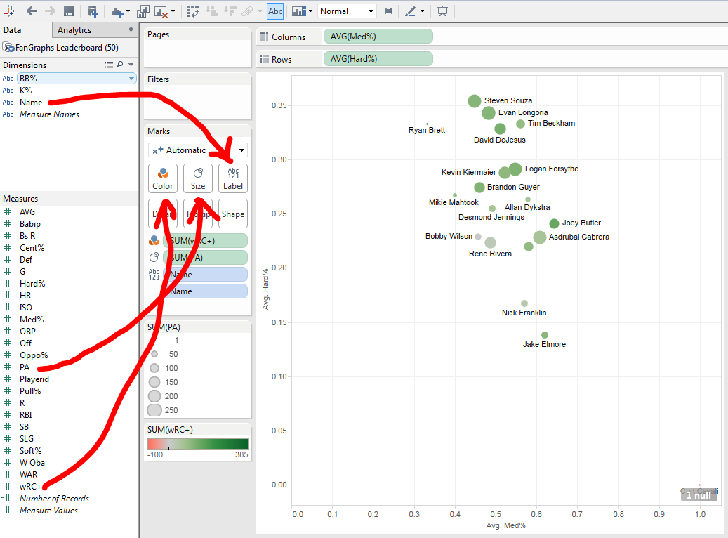
None of these dimensions are feasible with an Excel plot, chart, or graph. We would need to make these size, color, and label changes by hand in Excel. But in Tableau, it’s a flick of the wrist.
What’s more, we can clean up this data with the addition of a filter — and a quick filter to allow users to manipulate the filter too:
When we get the chart to basically where we want it, we can then throw it into a dashboard. A dashboard is the final shape the worksheet will take. Sometimes I combine multiple worksheets into a single dashboard to present a single idea. Other times I use a single worksheet for a single dashboard. We’ll do the latter in this instance:
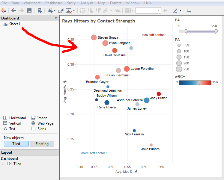
The most beautiful thing about using Tableau, of course, is that the end product doesn’t have to be a static image. This allows us to embed even more information into the system — for instance, anything we add to the Detail section will appear in the popup when users hover their mouse over given data points.
After a little spicing up with the formats (such as fixing the dimensions for the X and Y axes, adding a linear regression line, and adding a few text boxes to indicate the general Soft% areas), we get a final version like this:
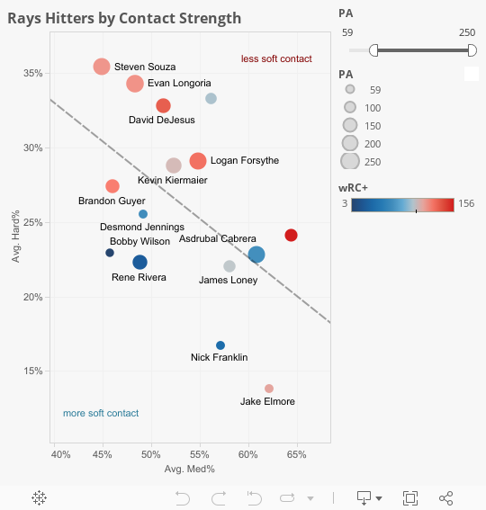
When we combine all these data points together, we can see interesting oddities in the data. For instance: Rookie Joey Butler is having a great year, hitting a 156 wRC+. But looking at his placement on the graph, we see he has a lot of non-hard contact for a guy with such a high wRC+. Likewise, Tim Beckham — the light blue dot in the top right — has crushed the ball this season, but is not showing a strong wRC+.
I should note the limited forecast value of this kind of data. While fascinating (and a great sample for Tableau to flex some muscles), this data does a much worse job predicting future results than a simple glance at these player’s ZiPS or Steamer projections.
That said: How fun is this chart? I think it’s a blast, and I hope it inspires you to present more dimensions of data — in a neat and understandable way — in your next visualization.
Happy Tableauing!
they’re well past v6…they’re up to V9
Right. I must have the number upside-down in my head. Thanks!