Podcasts – like blogs, I suppose – are one of those things that get harder to make well the easier they are to produce. Yes, technology has made it MUCH easier to produce serialized audio content for the Internet, but it’s made it that way for everybody (well, everybody with a couple hundred bucks to spend). In the matter of a few years, the amount of people dipping toes into this pool has exploded. Businesses have been built around podcast hosting. There are now advertising houses that cater specifically to podcasters. There are podcasts about other podcasts. There are podcasts about making podcasts. Earlier this month, I paid $30 to watch three dudes tape a podcast live. Slowly yet surely, this medium is penetrating popular culture.
Recently, a true crime podcast called Serial breached the news cycle. I won’t make my opinions about that program known here, because it’s honestly too late to do that. We’ve all moved on to … I don’t know, something else. But a combination of podcasting’s obscurity and general lazy reporting lead many people to believe that Serial was not only telling an interesting story, but telling it on an entirely new medium. This, of course, is silly. Tell this to Jimmy Pardo or Leo LaPorte or Adam Curry or Jesse Thorn. Hell, most of the people who worked on Serial came from WBEZ’s This American Life, a public radio show that had also been a very successful podcast for years.
Podcasting has served different purposes for different content creators. Popular radio shows will often just release recordings of an episode as a podcast so that people can listen any time they want. Tech journalists got it on podcasting early to enhance their cred by talking nerdy things with other nerds over a nerdy distribution channel. Comedians have used it as an alternative means of creation and self-promotion – sort of a SoundCloud for comedy before SoundCloud existed. And then, there were the sports podcasts.
Podcasting lends itself to sports well for the same reason blogging does – new stuff always happens and everyone has opinions about it. There is never a want for content. There are certainly #HotTakes to be considered, but there is so many other things that can fall within the spectrum. Podcasts can cover a whole sport, a specific team, a specific league, or can attempt to cover all major sports if they so choose. The best thing about sports podcasting is the best thing about podcasting in general – you can kind of do whatever the hell you want.
But just because you can doesn’t mean you should, or, more specifically, doesn’t mean you should without giving it some thought. Yes, podcasts are pretty easy to make now, but anything worth doing is worth a little extra effort. To be honest, there are some pretty sucky sports podcasts out there. Here’s how to make one that doesn’t suck.
A note to begin: While I’m not a famous podcaster by any means, I do kind of know what I’m talking about. I have worked at radio stations. I have created material for national air. I have my own sports podcast that, while episodes come far too sporadically, still gets well-reviewed on iTunes. I’m not an authority by any means. But I listen to a lot of podcasts and make my own and think about it quite a bit. These are suggestions, but they’re still suggestions from a somewhat qualified source.
1. Come Up With a Good Idea
Sports podcasts, not unlike comedy podcasts, are chock full of “two white guys talking”-styled offerings. This is not to say that if you are Caucasian or male that you should just give up, but it’s important to consider what’s out there and what you can do to differentiate. It could be a simple fact of the only current podcasts about Local Sports Team aren’t very smart or well produced or whatever. There’s nothing wrong with just making a better mouse trap. But if you want to discuss or cover a popular topic, you might want to try to break from norms a bit.
Comedy podcasts already saw this coming, and many new ones centralize (even if loosely) around some sort of bit or structure. Professor Blastoff mixes intellectuals and comedians to answer some of life’s biggest questions. Who Charted deals with pop culture charts and a funny and irreverent way. The Adventure Zone features three brothers playing Dungeons and Dragons with their dad.
None of these are really applicable to sports podcasting, but it’s something to think about. Maybe you want to feature reoccurring segments or regular guests or something I haven’t even thought of. It’s about information, but it’s also about entertainment. Never forget that.
Segments and pre-determined topics also help eliminate the awkward “so … yeah”s and “um … what else?”s. Those are show killers. There’s nothing wrong with some natural dead air, but it’s heartbreaking to hear two people dance around the fact that they don’t know what they should be talking about. A little research and a little planning goes a long way.
That being said, if you do something that you later realize isn’t really working, don’t be afraid to jump ship. There’s nothing wrong with ditching a segment or bit that wasn’t really jiving in the first place. Change the format little by little until you find something that works.
2. Make Sure You Really Want to Do This
So you’ve come up with an idea and maybe found a cohost. The plan is to have a one-hour podcast every week. Here’s how a one-hour podcast breaks down.
- The recorded conversation will be at least 90 minutes.
- There will be at least 10 minutes of technical difficulties that need to get ironed out before recording (at least for the first two dozen episodes).
- It will take time to lock down a guest. Between all the emails back and forth, let’s say that counts for 30 minutes of work.
- You’ll need to listen to the whole 90 minutes to make sure no audio weirdness (mic dropouts, lawn mowers, loud cars, babies crying) happens and to find where and when to cut.
- Add 30 minutes to edit, add the intro and outro music, and compress to MP3 form.
- Another 20 minutes to upload and write the description.
Your simple one-hour podcast now takes four and a half hours a week to make, and I didn’t even count the time that goes into research and finding topics. This pushes it to around six hours. My podcast, due to its style and format, takes about three hours just to record and edit a 20-minute episode, and about 10 hours total since there’s a lot of research involved.
This is not meant to be discouraging. It’s meant to show you how much effort this project will take. I’m sure some people don’t spend this amount of time on their sports podcasts, and it honestly shows in most cases. Good content takes time, whether it’s graphic art or writing or podcasting. Be prepared to put in the work. If you’re not prepared to do so, maybe think about doing something else.
3. Have a Decent “Studio”
If this list weren’t in a quasi-chronological order, this section would go first. Even if your format is just two-dudes-rambling-about-Local-Sports-Team, you still have a chance if your show sounds decent.
Microphones
The first thing you need is a decent microphone. You don’t need to break the bank, but a good mic is a MUST if you want your thing to be listenable at all. There are two ways to go about this, and they both deal with analog-to-digital conversion.
The first way is to get a good analog mic and an digital audio interface. The mic goes into the interface via mic cable, the interface goes into your computer via USB. I like this method because it gives you a little more flexibility. For up to two people recording at once, the M-Audio M-Track Plus is a great and affordable option for an interface. You don’t need to splurge on a mic either, especially if you’re just starting out. The SM-57 is a good starting point. I started with (and still occasionally use) the MXL 990 which is even cheaper. I’m not going to get into a whole lecture about microphones, but it’s worth doing a little research. People have tested lots of mics for podcasting and even included audio samples. Google “Best Podcast Mic” and look around.
For a simpler (and most likely cheaper) option, you can also consider USB microphones. These do all the converting in one unit, so all you need to do is plug the mic right into your computer via USB. USB mics have gotten much better as far as sound goes, and it’s hard to go wrong even with a mid-priced one. Again, Googling is recommended, but I’ve had success with the Blue Yeti as I know some other people have.
DO NOT use a cheap gaming headset. DO NOT use the headphone/mic cable that came with your iPhone. DO NOT RECORD USING YOUR WEBCAM SPEAKER. This sounds like garbage.
If it’s hard to hear you, or your mic blows out, people will get tired of listening to you and stop downloading. It’s that simple. I’m not trying to be harsh, but if you don’t invest in marginally decent audio equipment, don’t even bother.
Studio Space
No, you don’t need to rent space in a radio studio or anything, but be aware of your surroundings. You probably will be recording at home, so pick the room in your house with the best chance of giving you good audio. If you are using Skype to record conversations (more on that later) picking a room with hard-line access to your router or at least a strong WiFi signal is encouraged. Dealing with garbled audio and Skype dropouts is annoying. If the neighbor’s dog barks all the time, try and pick a room where that doesn’t leak in too much. Finished basements tend to have a nice sound-deadening quality to them. If the room has windows, thicker curtains are better. This is little stuff and sometimes unavoidable, but try and consider it if you can.
Record Skype Calls the Right Way
Skype has its flaws, but it’s one of the better options for recording podcasts if the hosts aren’t in the same city. (If you are in the same city, please record together in person). The technology to record these calls is fairly straightforward. I use a program called Piezo. It’s easy and affordable. It’s Mac-only, but there are certainly options for PC. It may sound complicated at first, but it’s not too bad. Read the instructions. Look for how-tos on YouTube. Get a friend to help you test it so that you have the optimal settings for good sound quality. Whatever you choose, make sure it has the capability to split the recorded call into two tracks, one for you and one for the guest or cohost. This will allow you to edit both people independently. It’s most useful for cutting out the hiss from the guest’s side when you’re talking. It also makes it easy to get rid of coughs, sneezes, dogs, sirens, etc.
If you have your druthers, have the guest use a decent mic as well. You probably can’t force people to buy stuff, but hopefully they have something that isn’t the webcam microphone. Anything is better than the webcam microphone. A gaming/VoIP headset or even (gulp) iPhone earbuds are a step up.
Depending on the guest, the phone might be the only option. Phones don’t sound great, but a little EQ can make them usable (don’t worry about EQ in recording, it can be done in post). The easiest way is to use Skype to call a phone. It costs a little money ($2.99/month), but it will save you a lot of headaches. If you are interested in the free option, consider signing up for a Google Voice account. You can dial right from Gmail, and still use a program like Piezo to record. It’s slightly less elegant, but it’s pretty workable.
If you are going to have two people talk every episode, it’s a really great idea to have both hosts record separately on their own (nice) mics, then combine the two tracks in post.
Say you and Johnny are cohosts of the podcast. You record both ends of the call (you and him), and Johnny uses simple recording software to record just his voice. When you’re done recording, he plops his track into a Dropbox folder or something, and you copy it to your computer. Now, you have a good-sounding you, an OK-sounding Johnny (from the other end of the Skype call), and a good-sounding Johnny. Use Skype Johnny to match up the tracks, but insert Good Johnny instead. It’s easier than I’m making it out to be, and in the end you’ll have a recording that sounds like both of you were in the same room even though you were talking over Skype. This is what professional podcasts do. This is the poor-man’s version of what public radio does. Otherwise, it always sounds like one host is in the room and the other host is talking through a plastic jug.
Learn Basic Audio Editing
You don’t need a $10,000 ProTools rig to make a decent podcast. If you have a Mac, you already have GarageBand, which actually works pretty nicely for basic stuff. I use a program called Reaper. It works on Mac or PC, comes in at $60 for recreational use (so long as your podcast doesn’t gross $20,000), and has a GREAT support section and user forum for helping you figure everything out. There’s also ProTools, Adobe Audition, and a slew of other options. Many have trials you can play around with.
Whatever you end up with, give yourself time to learn it properly. Learn the keyboard shortcuts to save you time in editing. Take a look at the built-in processing options (EQ, compression, etc.) and which settings make your podcast sound best. EQ will help balance the highs and lows, compression helps handle high volumes and even everything out. These are important things to know, don’t disregard them. One solitary hour of playing around with these will help you a great deal.
Learn the proper way to create fades – fade ins, fade outs, crossfades, etc. Learn how to properly mix in music. Audio program companies spend a ton on R&D to make these programs easy to use. Don’t be scared. Save your files a lot and remember that Ctrl-Z is your friend. Think of ALL the people that do this somewhat successfully. They can’t all be smarter than you, right?
Pick Your Hosting
So you’ve worked out all the bugs, and you have a quality-sounding MP3. Now, you just need to post it somewhere. There are basically two schools of thought on this.
There are companies that will host your podcast for you and give you an RSS feed to use (more on this later). For a fee, you can upload your file and let them do all the rest. Libsyn and PodBean are two popular choices, though SoundCloud just got into the game as well. These products sell you on ease of use, analytics, and reliable uptime. There is cost involved, however. Usually bandwidth is included in any package, you just need to pick the storage space you need. Read the options carefully and start small. You can always upgrade later if you want to post more episodes per week/month.
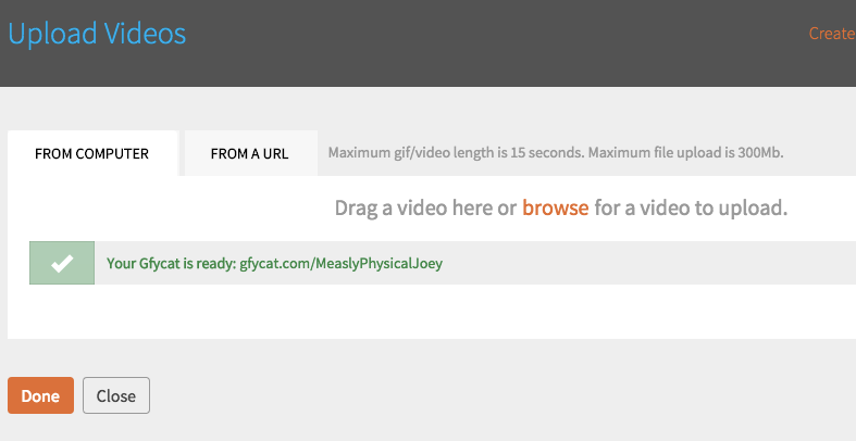
Your other option is to store the files on your own server and create the RSS feed yourself through a platform like WordPress. PowerPress is a popular plugin for creating podcast RSS feeds through WordPress. It’s what we use at The Hardball Times for my podcast. It’s customizable and reliable. The downside here is that you need to host your own files. If you plan to have a corresponding website to go along with your podcast (you should) then you are probably already paying for hosting. Unless your podcast explodes in popularity, whatever hosting package you have should be fine. But beware, if your hosting provider decides that too many people are pulling down files from your server, you may be in line for additional cost. Again, this would most likely be later down the road, but it’s something to think about.
The elephant in the room here is the question of who owns your RSS feed. Your RSS feed is what iTunes and other podcatchers use to see when there are updates to your show. When the program sees an update in the feed, it downloads the new episode. If you host on Libsyn, for example, your feed will be something along the lines of libsyn.com/feeds/yourawesomesportsshow.xml. If you self-host, it will be something like yourawesomesportsshow.com/feeds/yourawesomefeed.xml. If you use the former and decide to move on from Libsyn to another host or self-hosting option, life may become difficult for you. There are ways to “force” podcast apps to update the feed if you change RSS addresses, but it’s not always reliable, and it’s a pain in the ass.
Do your research and make your best educated decision. This is a big question in the world of podcasting, believe it or not, and there’s really no one answer.
And while we’re talking about it, make sure to add your show to iTunes. There are lots of guides for doing so. iTunes is pretty terrible, but it’s still what most people use. In fact, if you’re starting a show, don’t even share via Facebook or Twitter until it’s on iTunes. Wait until people can download the episode. It takes about 48 hours or less to get into the iTunes store assuming you followed all the directions. It’s worth the wait. Hold off on the reveal until you get your podcast into the biggest podcasting platform around.
Listen and Listen and Listen and Listen
If you’re interested in doing this, then chances are you at least have a cursory knowledge of the medium. You probably have listened to a few sports podcasts here and there or may even be a rabid follower of a handful. But even though you want to do a sports podcast, you shouldn’t limit your listening to only that genre. There are lots of great podcasts out there, and some should inspire you and change the way you think about the platform. Don’t limit yourself. Inspiration can come from all sorts of avenues. This is by no means an exhaustive list, but here are some suggestions for non-sports podcasts you should at least check out. See how the other side lives, and all that.
Serial – My reservations not withstanding, podcasters need to hear to at least be part of the conversation. If you say you have a podcast, this is what most people will think of. You should at least know what it is. One million downloaders can’t be wrong, right?
Radiolab – In my opinion, the absolute best radio put out there today. It’s engaging and gorgeous and interesting. And also gorgeous. Please give a listen. One of the hosts won a MacArthur Genius grant for his work on it.
This American Life – The granddaddy of Serial, this show still produces wonderful journalistic storytelling. It’s on the Mount Rushmore of podcasts.
99% Invisible – A podcast about design. It was also behind one of the most successful Kickstarter campaigns of all time – successful enough that they started their own podcast network. It’s a great source of “did you know…” conversation starters.
Love + Radio – From the same network as 99% Invisible. Just immaculate radio. It’s hard to explain, but give it a listen.
Bullseye with Jesse Thorn – originally called The Sound of Young America, Bullseye went from college radio station show to NPR program. If you want a introduction in how to interview a guest, Jesse Thorn will be your professor. He also has a knack for getting the best and brightest in pop culture.
My Brother, My Brother, and Me – This is a great example of what even a loose premise can do for a show. MBMBaM describes itself as an advice show, but it’s really three brothers (Justin, Travis, and Griffin McElroy) riffing and spoofing and transitioning from one bit to another. They are funny guys, but their chemistry is what makes the show. They are cheating because they share DNA, but that’s the way it goes sometimes.
The Todd Glass Show – A master course on how chemistry can help a podcast. There is nothing buy silly banter to go along with Glass insisting they redo bits until they get them right. It’s frantic and disjointed, but it’s always fun and a it’s a good reminder of how strong personalities can steer an otherwise rudderless show.
Good luck to you, future podcaster. It’s a rough world out there, but with some hard work and attention to detail, you could be climbing up the iTunes charts in no time. Put in the time. It will seem dubious at first, because it is. But the finished product will be so much better.
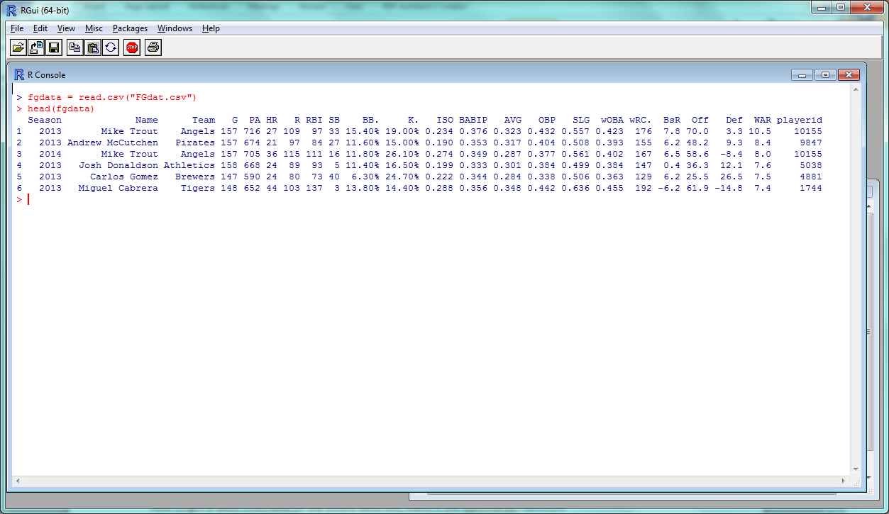
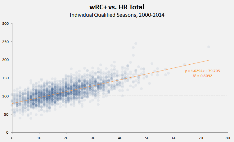
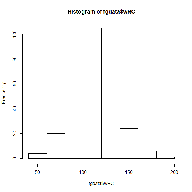 This Instant Histogram(™) displays how many players have a wRC+ in the range a given bar takes up in the x-axis. This histogram looks like a pretty normal, bell-curveish distribution, with an average a bit over 100–which makes sense, since the players with a below-average wRC+ won’t get enough playing time to qualify for our data set.
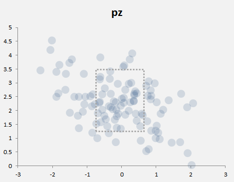
 A bit better, right? The distribution doesn’t look quite as normal now, but it’s still pretty close–we can actually add a bell curve to eyeball far off it is.
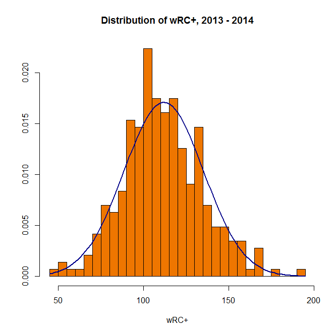
 When you want to save your plots, you can copy them to your clipboard–or create and save an image file directly from R:
 Unsurprisingly, slugging percentage and ISO are fairly well-correlated. Results-wise, we’re starting to push against the limits of our data set–too many of these stats are directly connected to find anything interesting.
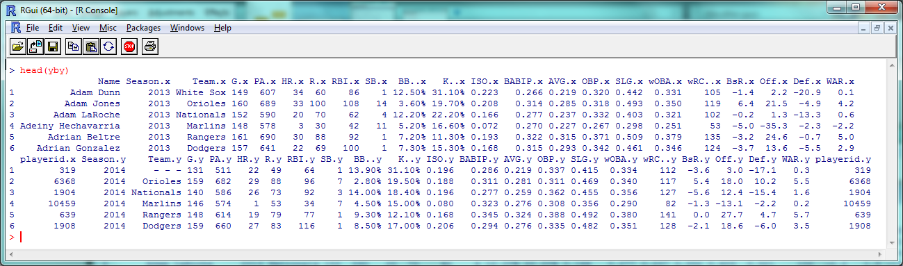 As you can see, 2013 stats have an .x after them and 2014 stats have a .y. So instead of comparing ISO to SLG, let’s see how ISO holds up year-to-year:
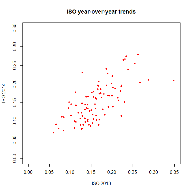 (The ‘pch’ argument sets the shape of the data points; ‘xlim’ and ‘ylim’ set the extremes of each axis.)
 The coefficients, p-values, etc., are interesting and would be worth examining in a more theory-focused post, but you’re looking for the “Multiple R-squared” value near the bottom–turns out to be .4715 here, which is fairly good if not incredible. How does this compare to other stats?
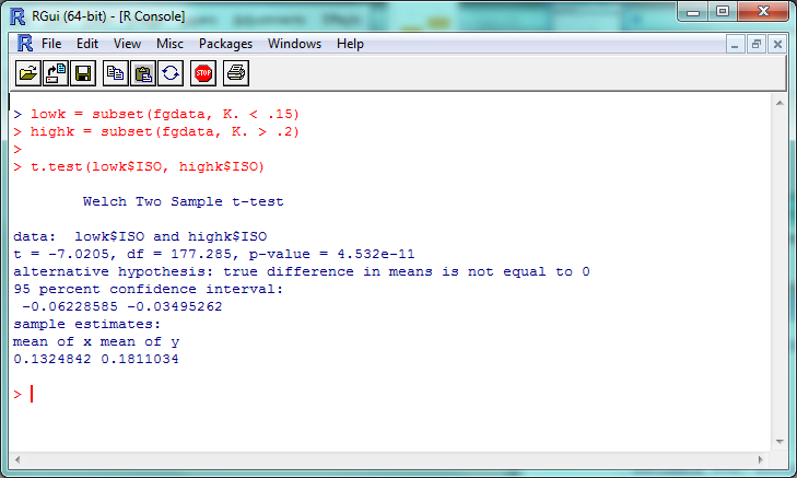 The “p-value” here is about 4.5 x 10^-11 (or 0.000000000045); a p-value less than .05 is generally considered significant, so we can consider this evidence that the ISO of high-K% hitters is significantly different than that of low-K% hitters. We can check this out visually with a boxplot–and you thought we were done with visualization, didn’t you?
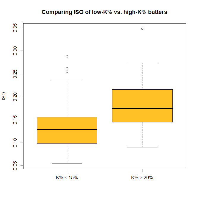 So now you can do some standard statistical tests in R–but be careful. It’s incredibly tempting to just start testing every variable you can get your hands on, but doing so makes it much more likely that you’ll run into a false positive or a random correlation. So if you’re testing something, try to have a good reason for it.