Archive for How To

How To Use R For Sports Stats: Visualizing Projections

If you’re reading TechGraphs right now, there’s a good chance you’re prepping for fantasy baseball, and if you’re doing that, there’s a good chance you’re making use of projection systems like Steamer or ZiPS. In this post, we’ll explore some basic tools that might help you look at these projections in a new way — and brush up on those R skills that you probably haven’t touched since last fall.

(From a skills perspective, this post will assume that you’ve previously read through the “How To Use R For Sports Stats” series. Even if you haven’t, the insights below will hopefully still be worth your while. I’d also be terribly remiss if I didn’t point you towards Bill Petti’s recent THT post unveiling his baseballr R package.)

We’ll use Steamer projections for this post, though the methods we’ll look at can be used with ZiPS, FG Depth Charts, or, for that matter, actual by-season data. Download Steamer’s 2016 batting projections from FanGraphs, rename the file to “steamer16.csv”, and load it up in R. We’ll remove players projected for fewer than 100 AB to clean up the data a bit:

steamer = read.csv("steamer16.csv")
steamer = subset(steamer, PA > 100)

Visualizing Tiers

As fantasy baseball managers, we all have an innate ability to estimate a player’s value from their stats, judging how good a 30/10/.285 player is vs. a 15/15/.280. We get pretty good at this if we want to do well in our leagues — but we can still develop blind spots in our assessments, or hold on to an outdated idea of quality as MLB trends change. (For example, the average AVG in MLB has dropped from the high .260s 10 years ago to the low .250s today; if you’re still thinking a .255 hitter is below average, you might want to reconsider.)

The point, then, is that if you’re getting a sense of how good a player will be by looking at their projections, it can be helpful to step back and recalibrate your thinking from time to time by looking at the broader trends in an image or two.

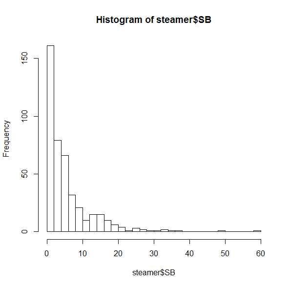
Let’s look at Steamer’s projections for stolen bases, for example. We’ll draw on what we learned back in part 2 to make a quick-and-hasty histogram counting the number of MLB players who are projected for different SB totals:

hist(steamer$SB, breaks = 30)

Basic histograph of SB projections

Most of these players are projected for fewer than 10 SB. This is sort of interesting, but their huge counts are keeping us from seeing the trends on the right side. Let’s zoom in a bit:

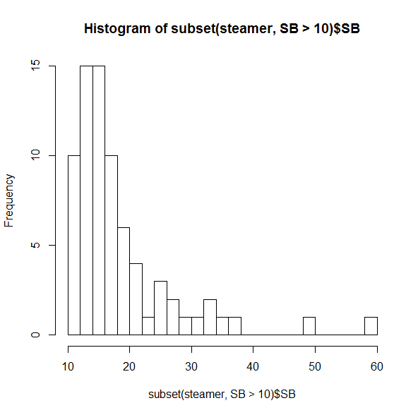
hist(subset(steamer, SB > 10)$SB, breaks=30)

Histograph of SB projections for > 10 SB

Even among this crowd of speedsters, it’s uncommon to see someone projected for more than 20 SB, and incredibly rare to have more than 30.

You probably didn’t need to be reminded that the two folks on the far right (spoiler alert: Billy Hamilton and Dee Gordon) would stand out, though it’s useful to see just how distant they are from everyone else. But if you were thinking that players like Jarrod Dyson (35 projected SB) or Billy Burns (32) are solid, but not elite, on the basepaths, it may be time to reassess. (Did I mention that SB totals in MLB dropped 25% between 2011 and 2015?)

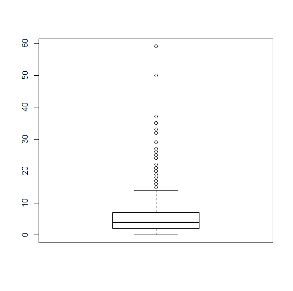
If you’re the kind of person who prefers boxplots instead, R’s got just the thing:

boxplot(steamer$SB)

Boxplot of SB projectionsThis makes it as plain as possible that any player projected for more than about 15 SB is, quite literally, a statistical outlier.

20/20 Vision

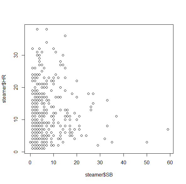
The same idea goes for getting a grasp on multi-category players. Most of us are looking for players who can bring in both HR and SB, but how many of those are really available? Let’s do a quick 2D plot:

plot(steamer$SB, steamer$HR)

Basic plot of HR vs. SB projectionsThis isn’t bad, but unfortunately it doesn’t give us a good sense of how many players fall into each category, since there’s only one dot for all of the 5 HR/3 SB players, one dot for all the 2 HR/4 SB players, etc. A quick workaround for this is the jitter() command, which moves the points around by tiny increments to get rid of some of the overlap:

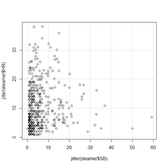
plot(jitter(steamer$SB), jitter(steamer$HR))

And, for good measure, let’s add a grid on top:

grid()

Your plot should now look something like (but not exactly like) this:

Detailed plot of HR vs. SB projections

From the chart, we can see that it’s not impossible to find players projected for 30/10 or 10/30, but it looks like there’s only one 20/20 guy in Steamer’s projections:

subset(steamer, (SB >= 20 & HR >= 20))

            Name   Team  PA  AB   H X2B X3B HR  R RBI BB  SO HBP SB CS X.1   AVG   OBP   SLG   OPS
40 Carlos Correa Astros 636 571 157  33   3 22 80  82 54 110   4 20 11  NA 0.275 0.339 0.458 0.797

Of course. As if being a 21-year-old SS with plus average wasn’t enough.

Fun With Subsets

Let’s close this out by doing a bit more with subset() — possibly one of R’s most useful tools for our purposes because it’s just so much quicker and more customizable than online tools or Excel.

Say you want to find the prospective “five-category players”; you may have a sense of who some of the candidates are, but you might be surprised by what the numbers actually suggest. How many players, for example, are projected to do better than 10/80/80/10/.275?

subset(steamer, (HR > 10 & SB > 10 & R > 80 & RBI > 80 
 & AVG > .275))

               Name         Team  PA  AB   H X2B X3B HR   R RBI  BB  SO HBP SB CS X.1   AVG   OBP   SLG   OPS
1        Mike Trout       Angels 647 542 166  32   5 36 104 104  90 138   8 15  6  NA 0.307 0.410 0.585 0.995
5  Paul Goldschmidt Diamondbacks 652 543 158  36   2 30  93  93 100 142   3 14  7  NA 0.290 0.401 0.531 0.931
7  Andrew McCutchen      Pirates 653 554 165  34   3 23  88  87  84 123   9 12  6  NA 0.297 0.395 0.496 0.891
25    Manny Machado      Orioles 663 597 170  35   2 27  91  87  53  99   4 14  8  NA 0.285 0.345 0.484 0.829

Fewer than you may expect–which could well make them all the more valuable.

Conclusion

Projections, of course, are just projections, and you shouldn’t take one set — or even a combination of sets — to be a true predictor of what will happen this season. But if you typically look up projections player-by-player, or if you’re disinclined to take in a huge wall of stats at a single glance, looking at the broader trends in individual visualizations can help keep you on the right track as you prep for this fantasy season.

Here*, as always, is the code used for this post. If you have anything else you’d like to see us do with R as the new season comes near — or any suggestions with what you’ve used R for — let us know in the comments!

*download the ZIP and extract the R file.

Streamable Introduces Brand New Extension

We here at TechGraphs are pretty big fans of Streamable — one of the latest, and in my opinion best ways of sharing media clips, and they’ve just given us a reason to like them even more. Yesterday the company unrolled a new feature for Google Chrome users, an extension that allows users to clip video (and audio if so desired) directly from YouTube as well as Twitch.tv, and a number of smaller sites.

Being able to grab media files directly from Twitch.tv via a Chrome extension isn’t a particularly new option as Oddshot.tv has specialized in that area for months now, however support for web sites other than the esports-streaming site is a welcome sight. Unfortunately traditional sports sites haven’t caught on just yet — which should not surprise — however I’m looking forward to being able to grab a plate appearance or pitch sequence, or perhaps an incredible soccer cross and goal in near real-time.

The maximum length of the clip is 60 seconds, which is mostly enough time to capture whatever in-game moment you’re attempting to save. For the walk-through, I’ve grabbed a clip of my beloved A’s winning their 20th consecutive game, courtesy of MLB’s YouTube Channel. Before getting too far of ourselves, make sure to install the extension. It’s available for free at the Chrome Web Store and can be found by clicking here.

Once you’ve got it installed, make sure to see the Streamable icon/the infinity symbol. It will pop up on any page that is compatible with the extension, in this case the MLB channel.

streamable2

Now, after finding the clip you want — say, the glory days of seasons past — simply click on the Streamable icon and you’ll open a new page, specifically the editing page for Streamable.

streamable3

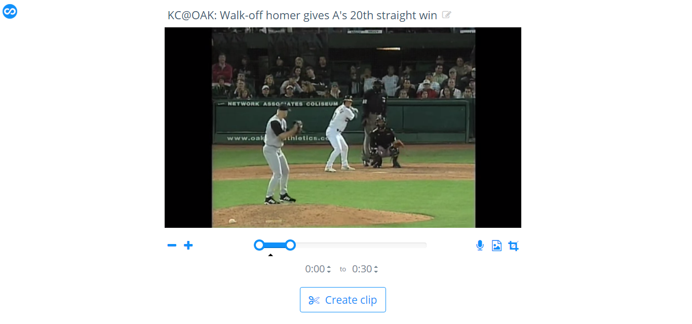
The extension allows users to re-name the clip (YouTube vids retain their name, but you can change it), crop, adjust the speed (as slow as x.50 or s fast as x2 with .25 increments) and to nail down a specific clip to one-tenth of a second of accuracy.

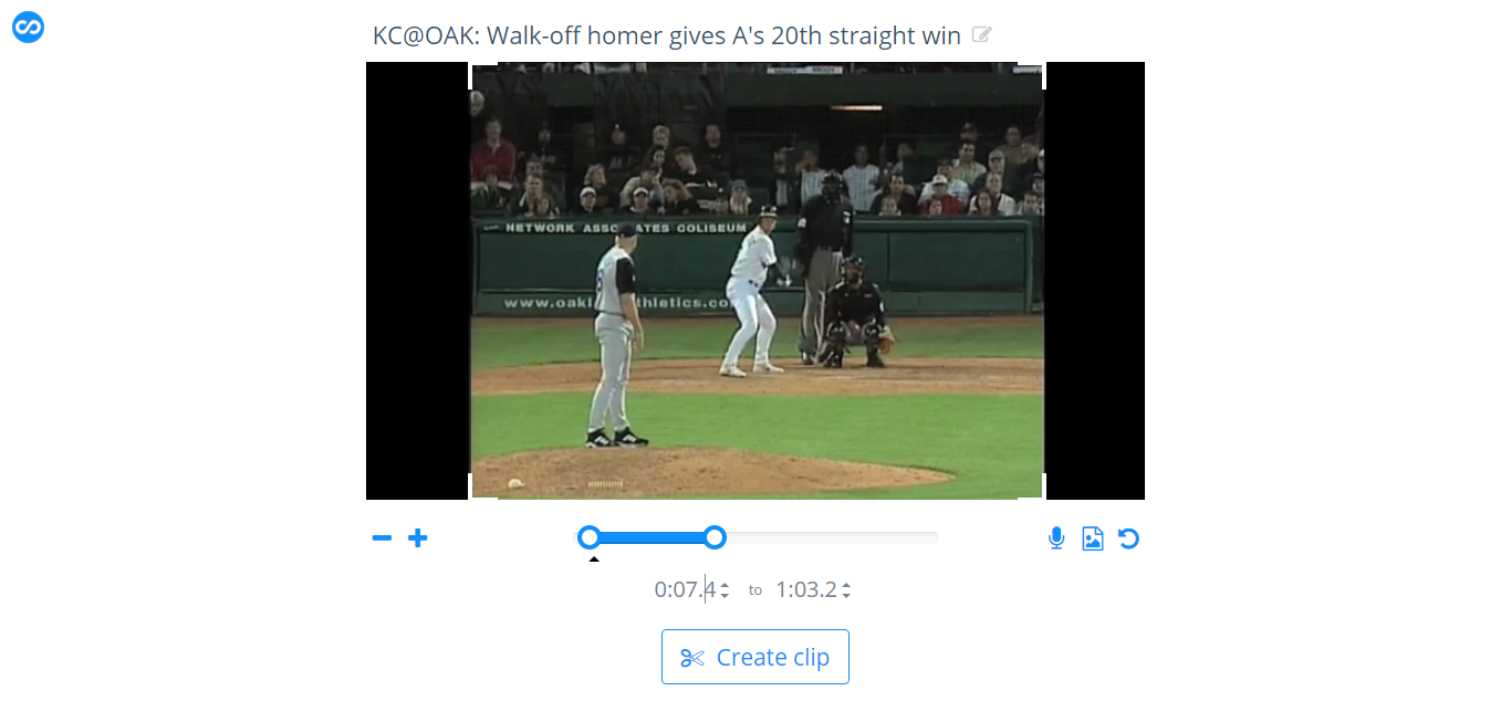
Note the picture below, at first glance it seems like I’m just ripping the clip, but I’ve cropped the black bars out of the original YouTube video and I’ve typed in exactly where in the video I want the clip to begin and end.

streamable4

Once the clip is finished, you’re given the direct URL or you can use an HTML embed code to share. Within the embed code options you can mute the clip, something I prefer doing because loud (not to mention auto-playing) clips are pretty terrible if you’re not expecting it. Don’t worry, muting the clip within the embed code doesn’t lose the audio. It’s just like a Vine or Instagram video where you can tap the speaker icon for the sound and full experience.

Armed with the perfect clip of the video, observe the final product:

Grab the extension and play around with it. You’ll be sharing priceless moments in non-terrible formats in no time.


How To Use R For Sports Stats, Part 3: Projections

In this series, we’ve walked through how exactly you can use R for statistical analysis, from the absolute basics of R coding (in part 1) to visualizing data and correlation tests (in part 2).

Since you’re reading this on TechGraphs, though, you might be interested in statistical projections, so that’s how we’ll wrap this up. If you’re just joining us, feel free to follow along, though looking through parts 1 and 2 first might help everything make more sense.

In this post, we’ll use R to create and test a few different projection systems, focusing on a bare-bones Marcel and a multiple linear regression model for predicting home runs. I’ve said a couple times before that we’re just scratching the surface of what you can do — but this is especially true in this case, since people write graduate theses on the sort of stuff we’re exploring here. At the end, though, I’ll point you to some places where you can learn more about both baseball projections and R programming.

Baseline

Let’s get everything set up. We’ll have to start by abandoning –well, modifying– that test data set that served us so well in Parts 1/2; we’ll add another two years of data (2011-14), trim out some unnecessary stats, and add a few which might prove useful later on. It’s probably easiest just to download this file.

Then we’ll load it:

fouryr = read.csv("FG1114.csv")

convert some of the percentage stats to decimal numbers:

fouryr$FB. = as.numeric(sub("%","",fouryr$FB.))/100
fouryr$K. = as.numeric(sub("%","",fouryr$K.))/100
fouryr$Hard. = as.numeric(sub("%","",fouryr$Hard.))/100
fouryr$Pull. = as.numeric(sub("%","",fouryr$Pull.))/100
fouryr$Cent. = as.numeric(sub("%","",fouryr$Cent.))/100
fouryr$Oppo. = as.numeric(sub("%","",fouryr$Oppo.))/100

and create subsets for each individual year.

yr11 = subset(fouryr, Season == "2011")
colnames(yr11) = c("2011", "Name", "Team11", "G11", "PA11", "HR11", "R11", "RBI11", "SB11", "BB11", "K11", "ISO11", "BABIP11", "AVG11", "OBP11", "SLG11", "WAR11", "FB11", "Hard11", "Pull11", "Cent11", "Oppo11", "playerid11")
yr12 = subset(fouryr, Season == "2012")
colnames(yr12) = c("2012", "Name", "Team12", "G12", "PA12", "HR12", "R12", "RBI12", "SB12", "BB12", "K12", "ISO12", "BABIP12", "AVG12", "OBP12", "SLG12", "WAR12", "FB12", "Hard12", "Pull12", "Cent12", "Oppo12", "playerid12")
yr13 = subset(fouryr, Season == "2013")
colnames(yr13) = c("2013", "Name", "Team13", "G13", "PA13", "HR13", "R13", "RBI13", "SB13", "BB13", "K13", "ISO13", "BABIP13", "AVG13", "OBP13", "SLG13", "WAR13", "FB13", "Hard13", "Pull13", "Cent13", "Oppo13", "playerid13")
yr14 = subset(fouryr, Season == "2014")
colnames(yr14) = c("2014", "Name", "Team14", "G14", "PA14", "HR14", "R14", "RBI14", "SB14", "BB14", "K14", "ISO14", "BABIP14", "AVG14", "OBP14", "SLG14", "WAR14", "FB14", "Hard14", "Pull14", "Cent14", "Oppo14", "playerid14")

(We’re renaming the columns for each subset because the merge() function has some problems if you try to merge too many sets with the same names. If you want to explore the less hacked-together way of reassembling data frames in R, take a look at the dplyr package.)

Anyway, we’ll merge these all back into one set:

set = merge(yr11, yr12, by = "Name")
set = merge(set, yr13, by = "Name")
set = merge(set, yr14, by = "Name")

Still with me? Good. Thanks for your patience. Let’s start testing projections.

Specifically, we’re going to see how well we can use the 2011-2013 data to predict the 2014 data. For simplicity’s sake, we’ll focus mostly on a single stat: the home run. It’s nice to test with–it’s a 5×5 stat, it has a decent amount of variation, it gives us experience with testing counting stats while being more player-controlled than R/RBI… and, come on, we all dig the long ball.

Now when you’re testing your model, it’s nice to have a baseline–a sense of the absolute worst that a reasonable model could do. For our baseline, we’ll use previous-year stats: we’ll project that a player’s 2013 HR count will be exactly what they hit in 2014.

To test how well this works, we’ll follow this THT post and use the mean absolute error–the average number of HRs that the model is off by per player. So if a system projects two players to each hit 10 homers, but one hits zero and the other hits 20, the MAE would be 10.

(If you end up doing more projection work yourself, you may want to try a more fine-tuned metric like r² or RMSE, but I like MAE for a basic overview because the value is directly measurable to the stat you’re examining.)

To find the mean absolute error, take the absolute value of the difference between the projected and actual stats, sum it up for every player, then divide by the number of players you’re projecting:

sum(abs(set$HR13 - set$HR14))/length(set$HR14)
> [1] 6.423729

So the worst projection system possible should be able to beat an average error of about six and a half homers per player.

Marcel, Marcel

Now let’s try a slightly-less-than-absolute-worst model.

Marcel is the gold standard of bare-bones baseball projections. At its core, Marcel predicts a player’s stats using the last 3 years of MLB data. The previous year (Year X) gets a weight of 5, the year before (X-1) gets a weight of 4, and X-2 gets a weight of 3. As originally created, Marcel also includes an adjustment for regression to the mean and an age factor, but we’ll set aside such fancies for this demonstration.

To find Marcel’s prediction, we’ll create a new column in our dataset weighing the last 3 years of HRs. Since our weights are 5 + 4 + 3 = 12, we’ll take 5/12 from the 2013 data, 4/12 from the 2012 data, and 3/12 from the 2011 data. Then we’ll round it to the nearest integer.

set$marHR = (set$HR13 * 5/12) + (set$HR12 * 4/12) + (set$HR11 * 3/12)
set$marHR = round(set$marHR,0)

Voila! Your first (real) projections. How do they perform?

sum(abs(set$marHR - set$HR14))/length(set$HR14)
> [1] 5.995763

Better by nearly half a home run. Not bad for two minutes’ work. 6 HR per player still seems like a lot, though, so let’s take a closer look at the discrepancies. We’ll create another column with the (absolute) difference between each player’s projected 2014 HRs and actual 2014 HRs, then plot a histogram displaying these differences.

set$mardiff = abs(set$marHR-set$HR14)
hist(set$mardiff, breaks=30, col="red")
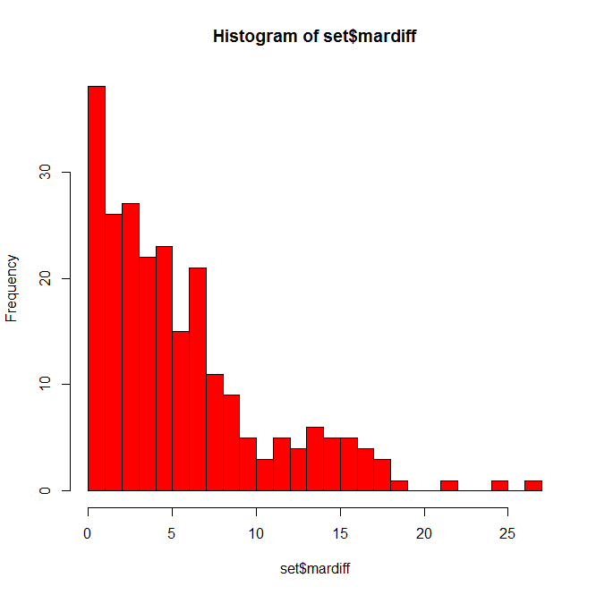
Histogram of Marcel HR errors

Not as bad as you might have thought. Many players are only off by a few home runs, some off by 10+, and a few fun outliers hanging out at 20+. Who might those be?

set = set[order(-set$mardiff),]
head(set[c(1,72,90,91)], n=10)

(In that last line, we’re calling specific column names so we don’t have to search through 100 columns for the data we want when we display this. You can find the appropriate numbers using colnames(set).)
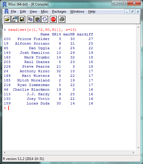
List of players with largest Marcel HR errors

A list headlined by a season-ending injury and two players released by their teams in July; fairly tough to predict in advance, IMO.

While we’re here, let’s go ahead and create Marcel projections for the other 5×5 batting stats:

set$marAVG = (set$AVG13 * 5/12) + (set$AVG12 * 4/12) + (set$AVG11 * 3/12)
set$marAVG = round(set$marAVG,3)
set$marR = (set$R13 * 5/12) + (set$R12 * 4/12) + (set$R11 * 3/12)
set$marR = round(set$marR,0)
set$marRBI = (set$RBI13 * 5/12) + (set$RBI12 * 4/12) + (set$RBI11 * 3/12)
set$marRBI = round(set$marRBI,0)
set$marSB = (set$SB13 * 5/12) + (set$SB12 * 4/12) + (set$SB11 * 3/12)
set$marSB = round(set$marSB,0)

And, for good measure, save it all in an external file. We’ll create a new data frame from the data we just created, rename the columns to look nicer, and write the file itself.

marcel = data.frame(set$Name, set$marHR, set$marR, set$marRBI, set$marSB, set$marAVG)
colnames(marcel) = c("Name", "HR", "R", "RBI", "SB", "AVG")
write.csv(marcel, "marcel.csv")

Before we move on, I want to quickly cover one more R skill: creating your own functions. We’re going to be using that absolute mean error command a couple more times, so let’s create a function to make writing it a bit easier.

modtest = function(stat){
 ame = sum(abs(stat - set$HR14))/length(set$HR14)
 return(ame)
}

The ‘stat’ inside function(stat) is the argument you’ll be including in the function (here, the column of projected data we’re testing); the ‘stat’ shows up inside the bracketed text where your projected data did when we originally used this command. The return() is what your function outputs to you. Let’s make sure it works by double-checking our Marcel HR projection:

modtest(set$marHR)
> [1] 5.995763

Now we can just use modtest() to find the absolute mean error. Functions can be as long or as short as you’d like, and are incredibly helpful if you’re using a certain set of commands repeatedly or doing any sort of advanced programming.

Hold The Line

With Marcel, we used three factors–HR counts from 2013, 2012, and 2011–with simple weights of 5, 4, and 3. For our last projection model, let’s take this same idea, but fine-tune the weights and look at some other stats which might help us project home runs. This, basically, is multiple linear regression. I’m going to handwave over a lot of the theory behind regressions, but Bradley’s how-to from last week does a fantastic job of going through the details.

Remember back in part 2, when we were looking at correlation tests in r² and we mentioned how we were basically modeling a y = mx + b equation? That’s basically what we did with Marcel just now, where ‘y’ was our projected HR count and we had three different mx values, one each for the 2013, 2012 and 2011 HR counts. (In this example, ‘b’, the intercept, is 0.)

So we can then use the same lm() function we did last time to model the different factors that can predict home run counts. We’ll give R the data and the factors we want it to use, and it’ll tell us how to best combine them to most accurately model the data. We can’t model the 2014 data directly in this example–since we’re testing our model against it, it’d be cheating to use it ‘in advance’–but we can model the 2013 HR data, then use that model to predict 2014 HR counts.

This is where things start to get more subjective, but let’s start by creating a model using the last two years (2013/2012) of HR data, plus the last year (2012) of ISO, Hard%, and Pull%. In the lm() function, the data we’re attempting to model will be on the left, separated by a ‘~’; the factors we’re including will be on the right, separated by plus signs.

hrmodel = lm(set$HR13 ~ set$HR12 + set$HR11 + set$Hard12 + set$Pull12 + set$ISO12)
summary(hrmodel)
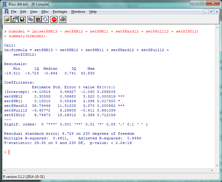
Screenshot of initial linear model

There’s a lot of stuff to unpack here, but the first things to check out are those “Pr(>|t|)” values in the right corner. Very simply, a p-value less than .05 there means that that factor is significantly improving your model. (The r² for this model, btw, is .4611, so this is accounting for roughly 46% of the 2013 HR variance.) So basically, ISO and Pull% don’t seem to add much value to this model, but Hard% does.

It’s generally a good practice to remove any factors that don’t have a significant effect and re-run your model, so let’s do that:

hrmodel = lm(set$HR13 ~ set$HR12 + set$HR11 + set$Hard12)
summary(hrmodel)
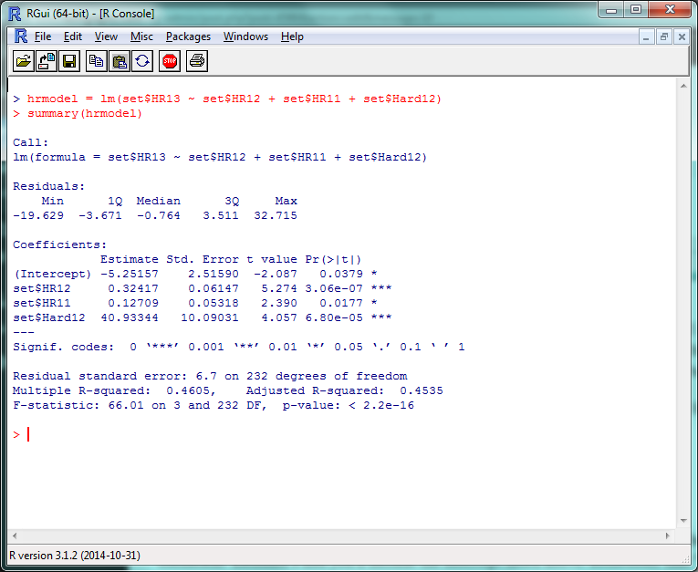
Screenshot of R model with significant factors

And there’s your multiple linear regression model. The format for the actual projection formula is basically the same as what we did for Marcel, except your weights will take the coefficient estimates and you’ll include the intercept listed above them. Remember that “HR12”, “HR11”, etc., are standing in for “last year’s HR total”, “the year before that’s HR total”, etc., so make sure to increment the stats by a year to project for 2014.

set$betHR = (-5.3 + (set$HR13 * .32) + (set$HR12 * .13) + (set$Hard13 * 40))
set$betHR = round(set$betHR,0)

Survey says…?

modtest(set$betHR)
> [1] 5.95339

…oh. Yay. So that’s an improvement of, uh…

modtest(set$marHR) - modtest(set$betHR)
> [1] 0.04237288

1/20th of a home run per player. Isn’t this fun? Some reasons why we might not have seen the improvement we expected:

  • We probably overfit the data. Since we ran the model on 2013 data, it probably did really well on 2013 data, but not as great on 2014. If we check the model on the 2013 data:
set$fakeHR = (-5.3 + (set$HR12 * .33) + (set$HR11 * .13) + (set$Hard12 * 40))
set$fakeHR = round(set$fakeHR,0)
sum(abs(set$fakeHR - set$HR13))/length(set$HR13)
> [1] 4.877119

It runs pretty well.

  • We didn’t include useful factors we could have. We just tested a few obvious ones; maybe looking at Cent% or Oppo% would be more helpful than Pull%? (They aren’t, just so you know.) More abstract factors like age, ballpark, etc., would obviously help–but including these would also require a stronger model.
  • Finally, projections are hard. Even if you have an incredibly customized set of projections, you’re going to miss some stuff. Take a system like Steamer, one of the most accurate freely-available projection tools around. How did their 2014 preseason projections stack up?
steamer = read.csv("steamer.csv")
steamcomp = merge(yr14, steamer, by = "playerid14")
steamcomp$HR = as.numeric(paste(steamcomp$HR))
steamcomp$HR = round(steamcomp$HR, 0)
steamcomp$HR[is.na(steamcomp$HR)] = 0
sum(abs(steamcomp$HR - steamcomp$HR14))/length(steamcomp$HR14)
> [1] 4.892157

That said, the lesson you should not take away from this is “oh, our homemade model is only 1 HR/player worse than Steamer!” Our data set is looking at players for whom we have several seasons’ worth of data —   the easiest players to project. If we had to create a full-blown projection system including players recovering from injury, rookies, etc., we’d look even worse.

If anything, this hopefully shows how much work the Silvers, Szymborskis, and Crosses of the world have put in to making projections better for us all. Here’s the script with everything we covered.

This Is Where I Leave You

Well, that about wraps it up. There’s plenty, plenty more to learn, of course, but at this point you’ll do well to just experiment a little, do some Googling, and see where you want to go from here.

If you want to learn more about R coding, say, or predictive modeling, I’d definitely recommend picking up a book or trying an online class through somewhere like MIT OpenCourseWare or Coursera. (By the end of which, most likely, you’ll be way beyond anything I could teach you.) If there’s anything particular about R you’d still like to see covered, though, let me know and I’ll see if I can do a writeup in the future.

Thanks to everyone who’s joined us for this series — the kudos I’ve read here and elsewhere have been overwhelming — and thanks again to Jim Hohmann for being my perpetual beta tester/guinea pig. Have fun!

How To Use R For Sports Stats, Part 2: Visualization and Analysis

Welcome back! In Part 1 of this series, we went over the bare bones of using R–loading data, pulling out different subsets, and doing basic statistical tests. This is all cool enough, but if you’re going to take the time to learn R, you’re probably looking for something… more out of your investment.

One of R’s greatest strengths as a programming language is how it’s both powerful and easy-to-use when it comes to data visualization and statistical analysis. Fortunately, both of these are things we’re fairly interested in. In this post, we’ll work through some of the basic ways of visualizing and analyzing data in R–and point you towards where you can learn more.

(Before we start, one commenter reminded me that it can be very helpful to use an IDE when coding. Integrated development environments, like RStudio, work similarly to the basic R console, but provide helpful features like code autocompletion, better-integrated documentation, etc. I’ll keep taking screenshots in the R console for consistency, but feel free to try out an IDE and see if it works for you.)

Look At That Data

We’ll be using the same set of 2013-14 batter data that we did last time, so download that (if you haven’t already) and load it back up in R:

fgdata = read.csv("FGdat.csv")

Possibly my favorite thing about R is how, often, all it takes is a very short function to create something pretty cool. Let’s say you want to make a histogram–a chart that plots the frequency counts of a given variable. You might think you have to run a bunch of different commands to name the type of chart, load your data into the chart, plot all the points, and so on? Nope:

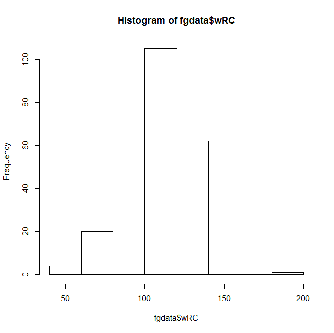
hist(fgdata$wRC)

Basic R histogramThis Instant Histogram(™) displays how many players have a wRC+ in the range a given bar takes up in the x-axis. This histogram looks like a pretty normal, bell-curveish distribution, with an average a bit over 100–which makes sense, since the players with a below-average wRC+ won’t get enough playing time to qualify for our data set.

(You can confirm this quantitatively by using a function like summary(fgdata$wRC).)

The hist() function, right out of the box, displays the data and does it quickly–but it doesn’t look that great. You can spend endless amounts of time customizing charts in R, but let’s add a few parameters to make this look nicer.

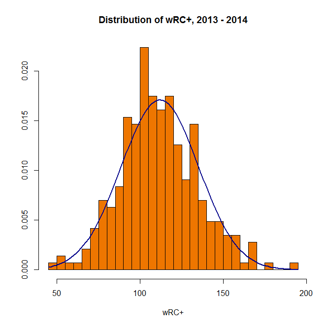
hist(fgdata$wRC, breaks=25, main="Distribution of wRC+, 2013 - 2014", xlab="wRC+", ylab= NULL, col="darkorange2")

In this command, ‘breaks’ is the number of bars in the chart, ‘main’ is the chart title, ‘xlab’ and ‘ylab’ are the axis titles, and ‘col’ is the color. R recognizes a pretty wide range of colors, though you can use RGB, hex, etc. if you’re more familiar with them.

Anyway, here’s the result:

Visually appealing R histogramA bit better, right? The distribution doesn’t look quite as normal now, but it’s still pretty close–we can actually add a bell curve to eyeball far off it is.

hist(fgdata$wRC, breaks=25, freq = FALSE, main="Distribution of wRC+, 2013 - 2014", xlab="wRC+", ylab= NULL, col="darkorange2")
curve(dnorm(x, mean=mean(fgdata$wRC), sd=sd(fgdata$wRC)), add=TRUE, col="darkblue", lwd=2)

Visually appealing R histogram with curve

(In the first line above, “freq = FALSE” indicates that the y-axis will be a probability density rather than a frequency count; the second line creates a normal curve with the same mean and standard deviation as your data set. Also, it’s blue.)

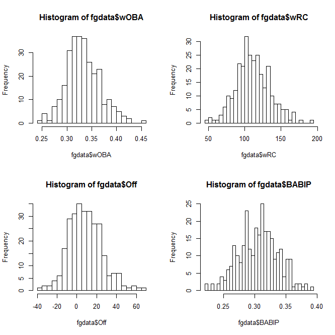
You can also plot multiple charts at the same time–use the par(mfrow) function with the preferred number of rows and columns:

par(mfrow=c(2,2)) 
hist(fgdata$wOBA, breaks=25) 
hist(fgdata$wRC, breaks=25) 
hist(fgdata$Off, breaks=25) 
hist(fgdata$BABIP, breaks=25)

2x2 grid of R histogramsWhen you want to save your plots, you can copy them to your clipboard–or create and save an image file directly from R:

png(file="whatisitgoodfor.png",width=400,height=350)
hist(fgdata$WAR, breaks=25)
dev.off()

(It’ll show up in the same directory you’re loading your data set from.)

So that covers histograms. You can create bar charts, pie charts, and all of that, but you’re probably more interested in everyone’s favorite, the scatterplot.

At its most basic, the plot function is literally plot() with the two variables you want to compare:

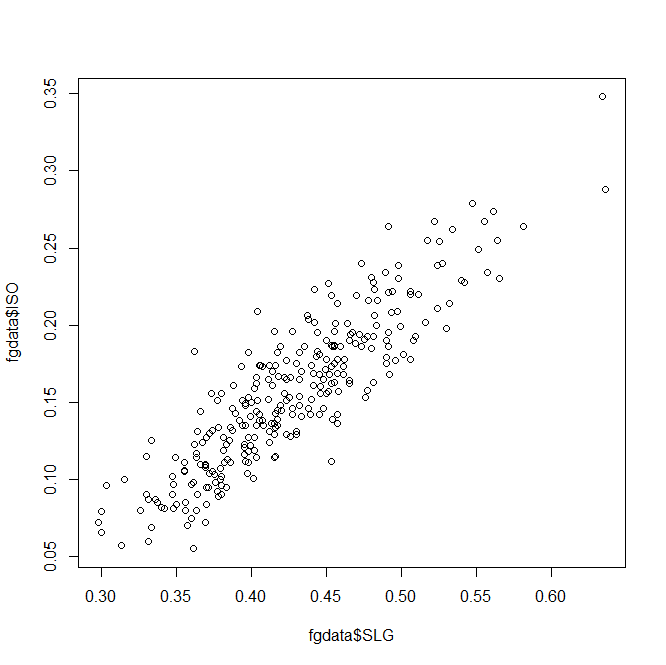
plot(fgdata$SLG, fgdata$ISO)
Basic R scatterplot
Unsurprisingly, slugging percentage and ISO are fairly well-correlated. Results-wise, we’re starting to push against the limits of our data set–too many of these stats are directly connected to find anything interesting.

So let’s take a different tack and look at year-over-year trends. There are several ways you could do this in R, but we’ll use a fairly straightforward one. Subset your data into 2013 and 2014 sets,

fg13 = subset(fgdata, Season == "2013")
fg14 = subset(fgdata, Season == "2014")

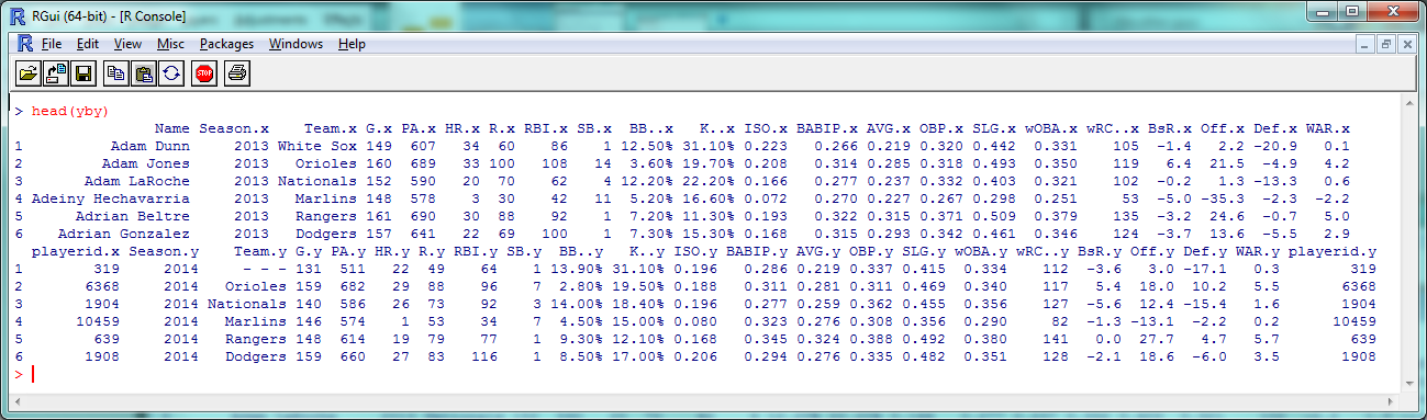
then merge() the two by name. This will create one large dataset with two sets of columns: one with a player’s 2013 stats and one with their 2014 stats. (Players who only appeared in one season will be omitted automatically.)

yby= merge(fg13, fg14, by=("Name"))
head(yby)

Year-by-year dataAs you can see, 2013 stats have an .x after them and 2014 stats have a .y. So instead of comparing ISO to SLG, let’s see how ISO holds up year-to-year:

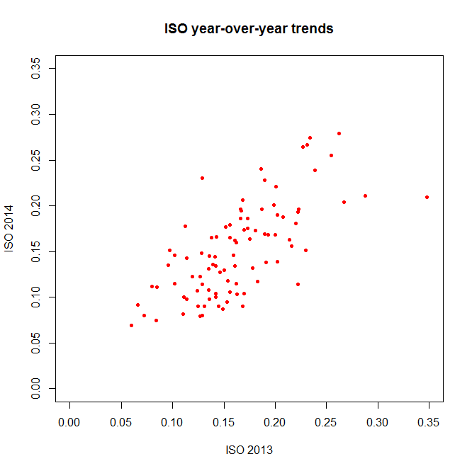
plot(yby$ISO.x, yby$ISO.y, pch=20, col="red", main="ISO year-over-year trends", xlab="ISO 2013", ylab="ISO 2014")

Visually appealing R scatterplot(The ‘pch’ argument sets the shape of the data points; ‘xlim’ and ‘ylim’ set the extremes of each axis.)

Again, a decent correlation–but just *how* decent? Let’s turn to the numbers.

Relations and Correlations

If you’re a frequent FanGraphs reader, you’re probably familiar with at least one statistical metric: r², the square of the correlation coefficient. An r² near 1 indicates that two variables are highly-correlated; an r² near 0 indicates they aren’t.

As a refresher without getting too deep into the stats: when you’re ‘finding the r²’ of a plot like the one above, what you’re usually doing is saying there’s a linear relationship between the two variables, that could be described in a y = mx + b equation with an intercept and slope; the r² is then basically measuring how accurately the data fits that equation.

So to find the r² that we all know and love, you want R to create a linear model between the two variables you’re interested in. You can access this by getting a summary of the lm() function:

summary(lm(yby$ISO.x ~ yby$ISO.y))

R linear model summaryThe coefficients, p-values, etc., are interesting and would be worth examining in a more theory-focused post, but you’re looking for the “Multiple R-squared” value near the bottom–turns out to be .4715 here, which is fairly good if not incredible. How does this compare to other stats?

summary(lm(yby$BsR.x ~ yby$BsR.y))
> Multiple R-squared:  0.4306
summary(lm(yby$WAR.x ~ yby$WAR.y))
> Multiple R-squared:  0.1568
summary(lm(yby$BABIP.x ~ yby$BABIP.y))
> Multiple R-squared:  0.2302

BsR is about as consistent as ISO, but WAR has a smaller year-to-year correlation than you might expect. BABIP, less surprisingly, is even less correlated.

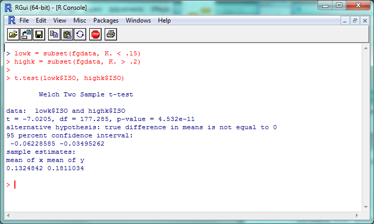
Let’s do one more basic statistical test: the t-test, which is often used to see if two sets of numeric data are significantly different from one another. This isn’t as commonly seen in sports analysis (because it doesn’t often tell us much for the data we most often work with), but just to run through how it works in R, let’s compare the ISO of low-K versus high-K hitters. First, we need to convert the percentages in the K% column to actual numbers:

fgdata$K. = as.numeric(sub("%","",fgdata$K.))/100

then subset out the low-K% and high-K% hitters:

lowk = subset(fgdata, K. < .15)
highk = subset(fgdata, K. > .2)

Then, finally, run the t-test:

t.test(lowk$ISO, highk$ISO)

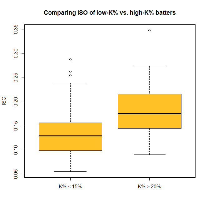
R T-test resultsThe “p-value” here is about 4.5 x 10^-11 (or 0.000000000045); a p-value less than .05 is generally considered significant, so we can consider this evidence that the ISO of high-K% hitters is significantly different than that of low-K% hitters. We can check this out visually with a boxplot–and you thought we were done with visualization, didn’t you?

boxplot(lowk$ISO, highk$ISO, names=c("K% < 15%","K% > 20%"), ylab="ISO", main="Comparing ISO of low-K% vs. high-K% batters", col="goldenrod1")

Visually appealing R boxplotSo now you can do some standard statistical tests in R–but be careful. It’s incredibly tempting to just start testing every variable you can get your hands on, but doing so makes it much more likely that you’ll run into a false positive or a random correlation. So if you’re testing something, try to have a good reason for it.

…And Beyond

We’ve covered a fair amount, but again, this only begins to cover the potential R provides for visual and statistical analysis. For one example of what’s possible in both these areas, check out this analysis of an online trivia league that was done entirely within R.

If you want to replicate his findings, though (which you can, since he’s posted the code and data online!), you’ll need to install packages, extensions for R that give you even more functionality. The ggplot2 package, for example, is incredibly popular for people who want to create especially cool-looking charts. You can install it with the command

install.packages("ggplot2")

and visit http://ggplot2.org/ to learn more. If R doesn’t do something you want it to out of the box, odds are there’s a package out there that will help you.

That’s probably enough for this week; here’s the script with all of this week’s code. In our next (last?) part of this series, we’ll look at taking one more step: using R to create (very) basic projections.


Google Earth Pro is Now Free, Still Useful for Sports Fans

By now there aren’t too many people who haven’t used Google Earth in some capacity. From looking up your house to checking out different monuments or landmarks, Google Earth has been a great and fun addition to the world. Until recently there was a Google Earth Pro edition, going for a pricey $399.00 per year, an option that generally only businesses took advantage of. The Pro version is now available for free as a download with the activation code GEPFREE. Though the lined URL does say free trial, the site itself notes signup, aka payment, is no longer required and shows the free code.

We’ll be taking a closer look at the downloaded version and highlighting some features that the free Google Earth didn’t have. Let’s take a look at Wrigley Field. It’s notorious for almost zero parking — and if you plan to visit, the official site strongly encourages public transit rather driving there yourself — something even the free version of Google Earth shows.

wrigleyparking

If you’re having a hard time picking out parking, it’d be hard to blame you. While both versions show the Free Parking for nights and weekend games, only the Pro version displays other lots (however the Purple, Brown and Irving Lots).

wrigleyparking2

Maybe instead of visiting for a game, you’re interesting in moving to Wrigleyville (or wherever) and are interested in the local demographics. The data is from 2011, but does have the option to show the 2016 projected information on things ranging from income, age, gender, education and marital status.

wrigleydemo

Other options the Pro edition offer is the ability to print pictures at an impressive 4,800 x 3,200 resolution as well as making movies at 1,920 x 1,080. For the true nerds, the Pro also allows spreadsheet imports of up to 2,500 different addresses to get a wide swath of any neighborhood. From planning a trip to moving to a new neighborhood to making a movie of all the places you want to visit, Google Earth Pro’s new price makes it absolutely worth downloading.


Imgur Introduces New Hosted Video-to-GIF Tool

Imgur continues to adapt to the demands of their market, after beginning to switch away from traditional GIF file types for the more efficient GIFVs, they are allowing URL based videos to be used in the creation of the GIF or GIFV. If a file size exceeds 10MB then it will automatically be converted to a GIFV. As a reminder, Imgur accounts are free — though you don’t need one to create the GIF/V — and GIFV files are both cleaner and smaller than the old GIF files.

Creating an embeddable GIF/V is as easy as copy-pasting the URL of the desired video and following the steps. Let’s give it a try.

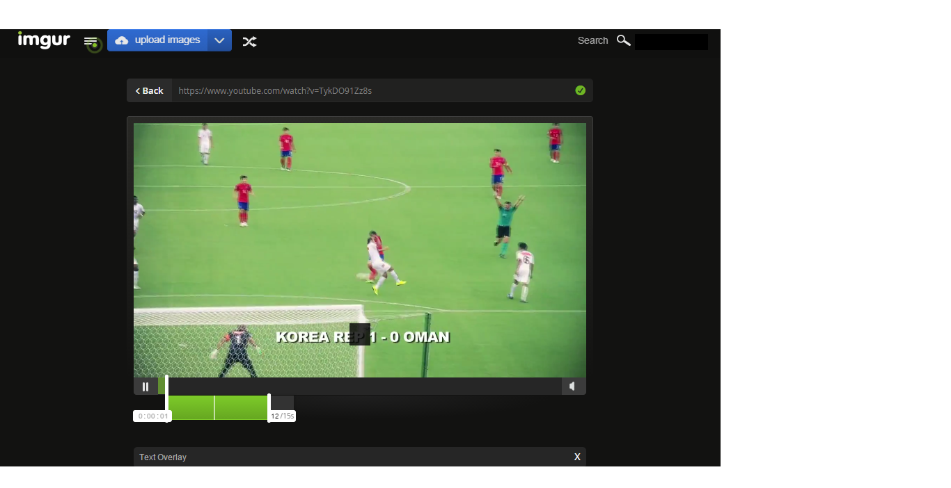
From YouTube, we’ll take a look at South Korea’s run to the finals of the Asian Cup. Choosing where to cut the video on both ends is as simple as clicking on the slider bar at the desired times.

gifv1

Note that Imgur allows the option to embed text directly over the GIFV but be aware that at the time of launch, the text box is unable to be moved.

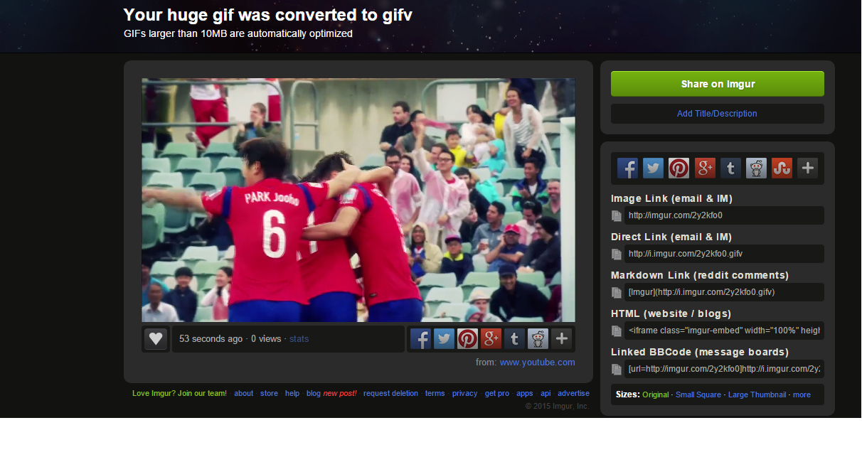
gifv2

Once you have the time of the GIFV down and the text correct, then it is a matter of time letting Imgur untangle everything. When you’re all set, there are options to share directly to Facebook, Twitter, Pinterest, Google+, Tumblr and Reddit as well as a slew of embed and link options.

gifv3The finished product:

Get started right away and bring on the GIFVs!

(Source video courtesy of the official AFC Asian Cup site)

Review: Roxio HD Pro Capture Card

Allow me to start off by apologizing. Thus far I have done two game reviews here at TechGraphs, Madden 15 and FIFA 15, and didn’t have a working capture card for either. Worry no more, dear readers, as from now on I have a smooth running Roxio HD Pro.

There is no shortage of various capture cards, both Amazon and NewEgg have hundreds of search results, however I chose the Roxio brand for a few reasons. Now I’m a fairly technologically-inclined person — I’m sure you’re shocked to hear this — so I don’t shy away from something that could be described as having a difficult installation. Of course, just because I can do something doesn’t mean I want to struggle and get frustrated. One of the biggest selling points for me when deciding which card to get was ease of installation. The only parts I needed to get the Roxio HD Pro up and running on my Xbox 360 were a pair of HDMI cables that ran me about nine bucks.

The instructions contained within the Roxio HD Pro packaging wasn’t at all what I expected. They looked much longer and more intricate than what I planned on.

capcard5

Then I realized I had been looking at the PlayStation setup. The setup guide for the 360 is literally one sentence plus three bullet points for troubleshooting tips.

capcard3

The first thing I did was to make sure my Xbox was off. Next I plugged the USB/power cable from my laptop to the Roxio itself. I then unplugged the AV cable and inserted an HDMI to the 360 and the other to the Roxio. Step three was simply taking the other HDMI cable and plugging it into the other side of the capture card and the back of my TV. The next step was putting the installation CD that came with the card into my computer and installing the necessary software. And that’s it. basically five steps, including just double checking my 360 was turned off.

The whole point of springing for the HD Pro version of the Roxio (other than the ease of installation) rather than the standard version for me was two fold: capture footage in 1080p — only 480p is available on the standard model — and the ability to live stream directly to either a YouTube or a Twitch.tv channel. I don’t play competitive console games (though once Halo: Master Chief Collection comes out that my change…), however the option to stream in real time to viewers all over the world is a pretty cool thing to have ready to go.

Really, that is what video games and to a certain extent sports are about: the thrill of winning, and winning in public fashion. Everything from bragging rights, smack talk to whatever you’d like to call is all part of competitive culture in sports and esports alike. Capture cards give you the ability to grab every moment of action so you never miss a highlight. The free software with the Roxio HD Pro allows for editing — it isn’t Sony Vegas but it is quite nice given the price tag — like changing speed such as slo-mo, adjusting the lighting, frame-by-frame trimming and voice over commentary is great for creating montages.

If you can have video evidence of you crushing your friends 6-1 in FIFA or dropping consecutive 3-pointers on them from just across half court, it’s all part of the fun. I’ve already had a blast just tinkering with the editing options. Perhaps in the coming days I’ll upload more gameplay to my YouTube or Twitch channel, maybe even some footage of me getting stomped by pre-teens on Xbox Live while they hurl insults at my parents. But for now, enjoy me playing as QPR against Fulham:

(Header image via Roxio.c0m)

Using RSS Feeds to Your Advantage

I’ve been fortunate enough to do some traveling recently around the Bay Area. While there, I took the BART system and overheard a conversation unfold that went something like this:

Guy #1: You see (Steph) Curry tear it up in the (basketball) World Cup?

Guy 2: Nah, I don’t have time to follow basketball. Baseball is still going and football just started!

Hard to argue with Guy #2 — it’s hard to justify scrounging every day for every single scrap of news, sports or otherwise. Even on the weekend the 24/7 news cycle makes keeping up difficult. With headlines shifting throughout the day, it is easy to miss what was front page worthy material in the morning by the time noon rolls around.

Read the rest of this entry »


Get Your Classic Sports Games – An SNES Emulator Setup Guide

Few things can flood my memory banks with thoughts of my childhood better than hearing the startup music for certain Super Nintendo Entertainment System (SNES) games. From FIFA Soccer 96 to Cal Ripken Jr. Baseball — and of course other games such as Super Mario World and The Legend of Zelda: A Link to the Past — I have fond and vivid memories of spending hours in front of the TV. I wasn’t fortunate enough to own a SNES, instead I relied on my friends to get my video game fix. Sometimes I would simply watch my friends play and be amazed by what I was seeing on the screen. Those high quality graphics pumping through the 16-bit chipset was something that captivated me. For the first time in my life rather than pretending to be Cobi Jones or Kasey Keller in the backyard, I could pick up a controller and really play as my favorite soccer stars.

Fortunately there is a way to go back in time, at least for video games, and it doesn’t even require a DeLorean. Short of purchasing an older system on eBay or Amazon, the best way to replay those games is to download a system emulator. To be a nine-year-old kid again isn’t something I find particularly appealing, but it would be a lie to say I didn’t occasionally long for the days of playing on a SNES again.
Read the rest of this entry »