You may have been able to plop yourself in your favorite couch these past couple days, but those out and about this weekend might not have that luxury. If you’ll be away from the friendly confines of your living room this Friday, Saturday, or Sunday, you won’t be out of luck if you want to catch the World Series.
For the first time ever, MLB.TV will be streaming the FOX broadcast of the World Series. No blackouts, no weird second-screen nonsense, no trying to set up a proxy on your phone. There are (of course) a couple of catches:
You will need to be a current MLB.TV subscriber. If you aren’t yet, you can pick up a subscription for $9.99. If you pay now, you get a free month of MLB.TV in 2015, for what that’s worth.
You need to log in with a valid TV provider account through one of: DirecTV, Optimum, Time Warner Cable,Verizon FiOS, AT&T U-verse TV, COX, Bright House Networks, Buckeye, Arvig, WOW!, Suddenlink, or Consolidated Communications. Comcast/Xfinity is a glaring omission here, though that could possibly be remedied through the Fox Sports Go app.
The need for a cable/satellite login is off-putting, since FOX broadcasts the games for free over the air anyhow. The good news is that anyone with the above providers can access the games without the need to have special channels or packages.
It’s not perfect, but it’s still a better option than what was available the past few years. Cord-cutters are still left in the cold, but those with even the cheapest cable packages will be all set to go to watch the Fall Classic no matter where they are.
FindTheBest.com is a [re]search engine that aggregates data from on- and off-line to give users detailed overviews of and the ability to compare products, services, industries, employers, and other topics. They structure information in a visually-oriented way with lots of graphs, charts, and tables. It’s aesthetically engaging and easy to use. More about what they do, per their About page:
There’s a tremendous amount of information on the web, but no way to know it all and be confident that you’ve reached the best conclusion. Search engines and topic-specific websites are great at returning facts, but not so much at providing knowledge. We’re collecting, structuring, and connecting all the world’s data so you have everything you need to research with confidence.
It’s a pretty useful tool for comparing hotels in an area, airlines, or even colleges, among other things. But it appears that the company’s ambition extends far beyond that. When I first happened upon FindTheBest, being a dutiful baseball nerd, I immediately started to explore their MLB player pages.
Those wanting access to video training and analysis tool Ubersense no longer have to switch platforms, as the company has announced that an Android version of their popular mobile app is now available. Ubersense uses your devices camera to capture high-speed video of your performance for later reviewing. It offers slow-motion playback and drawing tools to break down movement frame by frame and help understand body position and angles. Ubersense claims it’s had over 2.5 million downloads since its inception from athletes in over 50 sports. Ubersense has even been used by US Olympic bobsledders.
The sport independence of Ubersense was always its selling point. While specific tools and apps for golfers and tennis players have been around for some time, Ubsersense doesn’t differentiate. It can be used by baseball players, bowlers, track and field competitors, and even dancers. Anyone who wants to take a look at themselves or their students in a hyper-specific manner can use the app.
Now, Ubersense can also boast platform independence. The Android offering comes in lockstep with their acquisition by Hudl, a similar app that focuses more on the coaching side of the sport.
Ubersense is a free download on either the iOS or Android stores, with a monthly or yearly charge for Ubersense Elite, which offers the ability to upload videos to online storage and sync across multiple devices.
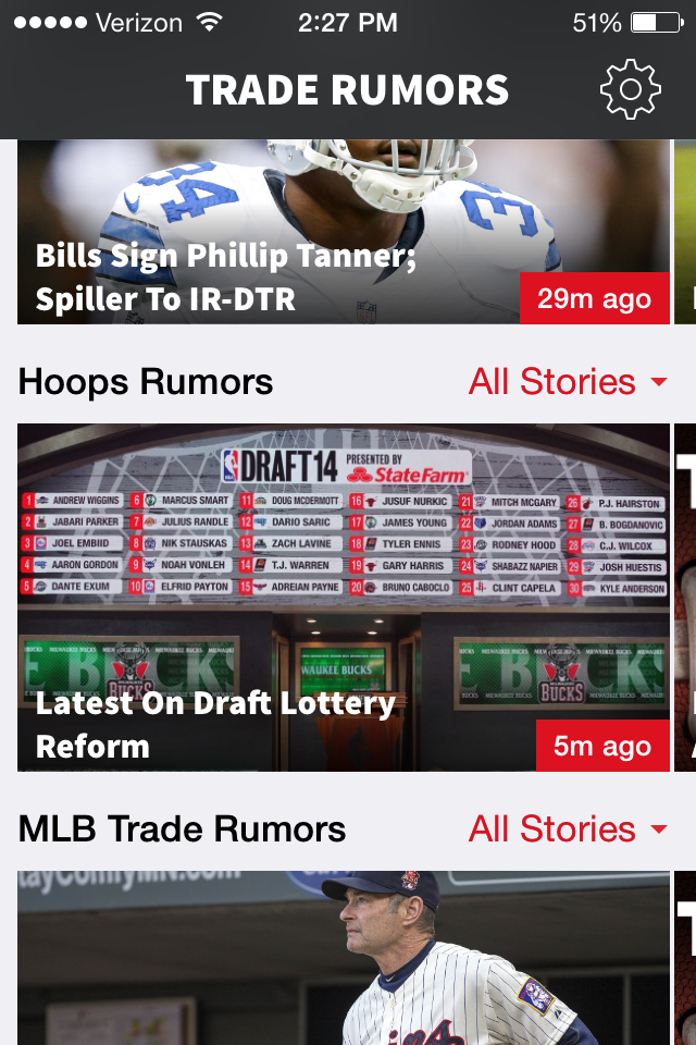
The wonderful folks who run the Trade Rumors websites launched their latest app today. Rather than individual apps for MLB, Hoops and NFL goings on, now all three are together in a single free download for iOS and Android users.
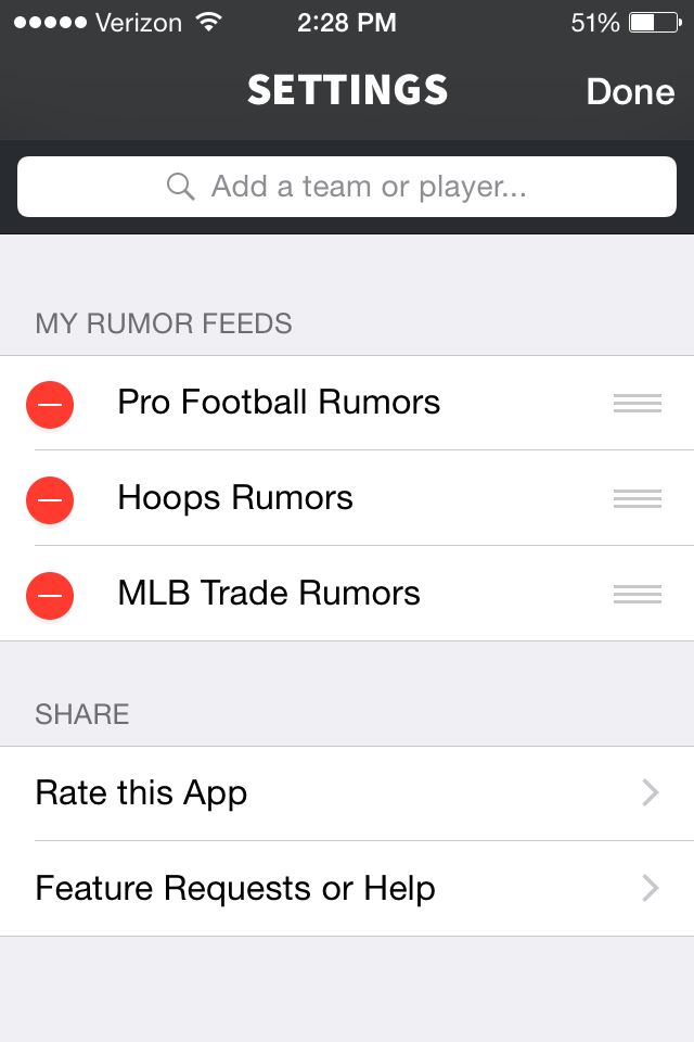
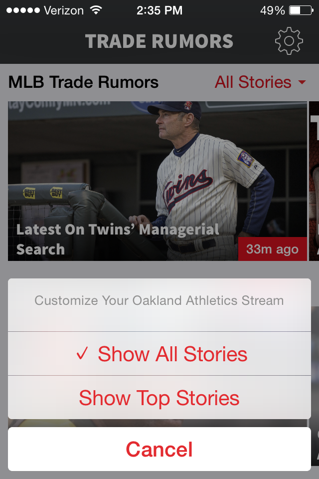
The welcome screen loads all three sports at once, however a simple touch of the settings button allows the user to toggle which rumors they’d prefer to see. Running all three sports took a moment to load, so I decided to parse down the content.
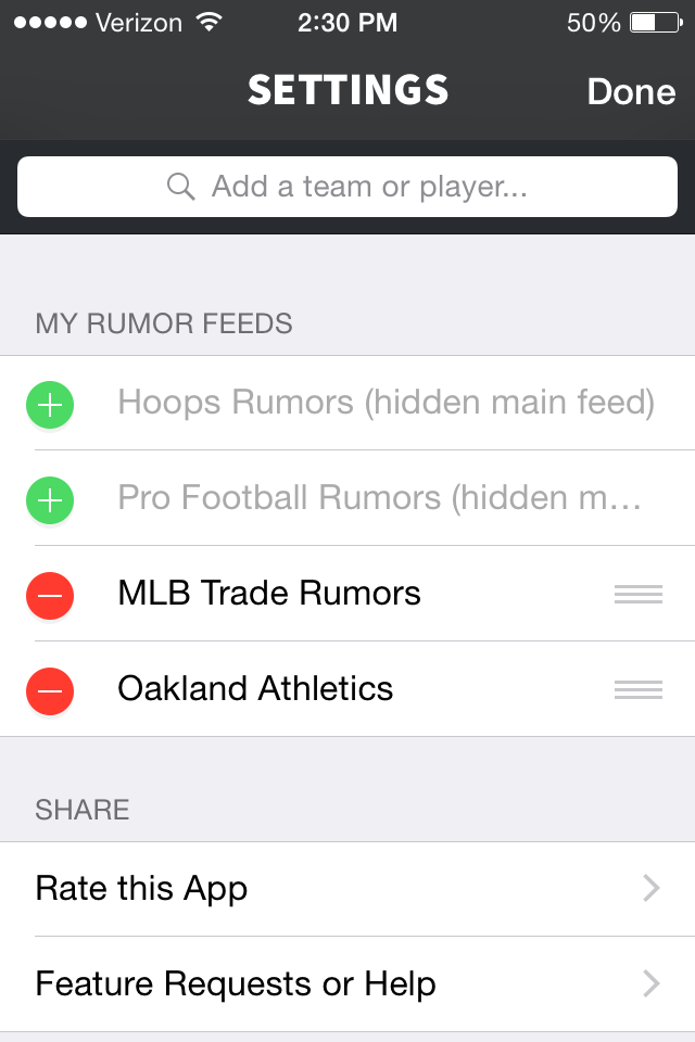
As a baseball fan — the only football I follow is fútbol — fan I decided to hide both Hoops and NFL news. Upon narrowing the field down to only MLB news, I added my beloved Oakland Athletics.
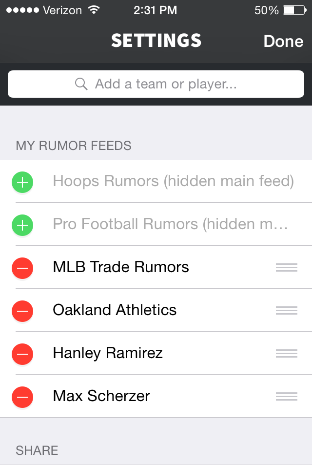
Rather than just teams, the minds behind the app also allow the user to add news updates for specific players. If you’re looking for news on free agents, say, Hanley Ramirez or Max Scherzer, it’s as simple as typing their name in the search field.
In addition to customizable players and teams, you’re also given the option to filter All Stories or just Top Stories within each field. It’s impossible to tell what constitutes a Top Story, so it seems prudent to leave the default All Stories on.
The free app does a perfect job of keeping people up to date on trades, signings and the like. It’s a condensed version of their full site, and that is a compliment. Trade Rumors is basically an RSS feed for whichever team or player you could want, without the need to set up a real RSS feed. Given the quality of work from the Trade Rumors people over the years, it should be no surprise to see their latest project work so well.
We’ve been trying to predict baseball since baseball became a thing. Whether its preseason predictions on who would win the divisions or guesses at who win the Series, we love to take a crack at playing fortuneteller. Some people look at recent performances, some look at pitching matchups or bullpen strength. Heck, some might flip a coin. One gaming company tried to leverage their very powerful software to try and pick a World Series winner this year, and the results are really close.
Out of the Park Baseball (OOTP) is a simulation-based baseball game for computers and mobile devices. The game doesn’t let you aim a pitch or swing a bat, it instead gives you control over a franchise on a extremely granular level — drafting players, signing free agents, hiring/firing coaches, constructing lineups — at every level of competition from Single-A up. Games can use current MLBers, historical teams, or a pool of randomly-generated players to create a realistic simulations over one season or the course of many seasons. Our own Bradley Woodrum wrote a complete review of the game for NotGraphs in April.
OOTP takes great pride in their simulations software, and they put that software to the test recently. On their official blog, they outline their methodology and results for the five-series simulation. You can check out the blog for the full rundown — they even provide a nice spreadsheet for quick analysis — but their numbers show the Royals as their favorite by a very slim margin.
To celebrate the upcoming fun, OOTP is also offering a 50% discount on their game during the World Series and offering the mobile version for a buck. If you haven’t picked the game up yet, now’s a great time as OOTP is a perfect remedy for the throws throes of winter. Plus, if you’re not a Giants or Royals fan, you can take a crack at controlling your favorite team and try and get them into the World Series for your own bit of manufactured joy.
Modern spreadsheet programs are powerful. Compared to what our ancestors had to deal with — pen and paper spreadsheets — Excel, Google Spreadsheets, and LibreOffice / Open Office type programs are basically alien. And I mean that both in the utility and the intuitiveness of these programs. While they are incredibly useful in combing data for information, they are also full of hidden treasures — and a productivity program should never have hidden anythings.
Each of these programs has a little gem called “vlookup.” The vlookup function stands for “vertical lookup.” As we might expect, there is also a “horizontal lookup,” which is basically the same thing, but it scans columns instead of rows. The vlookup function is especially useful for when we want to combine information from across two tables. But first we need a question. Playing with data for the sake of playing with data is not super helpful — usually.
So here’s our question: Who is the most important hitter to any given team?
There are a lot of ways to approach this question, but since we want to use vlookups, let’s further this inquiry by asking: Which player has the highest wRC+ relative to the rest of his team? The weighted runs created plus (wRC+) statistic is great because it measures a players total offensive output, but it also controls for era, stadium, and league.
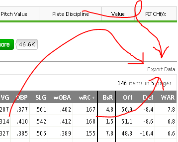
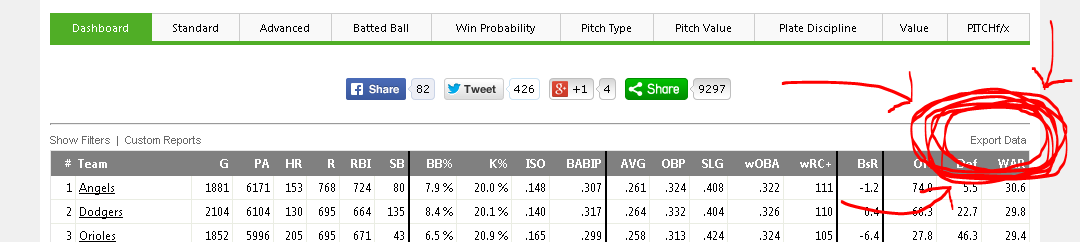
In order to answer this second question, we will need to know our data. We can get each individual player’s wRC+ from the FanGraphs leaderboard here. Using the Export Data button, we can get a CSV of each leaderboard page in an instant.
Here’s the button that makes FanGraphs leaderboards so nifty for outside data analysis programs like Excel or Tableau.
Then, we want the team data. Navigate over to the Teams tab and choose the “NP” or non-pitchers button. This gives the team-level offensive numbers without those nasty pitchers gumming up the data with their strike outs and pop outs and trickle outs.
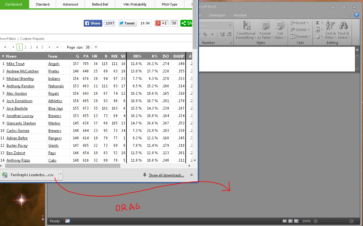
After we’ve exported both data, we can open them either by navigating to the Downloads folder and opening them with Excel, or just clicking the download icon in Chrome or Firefox or Internet Explorer if you’re stuck at work and it’s 1997. I oftentimes have multiple instances of Excel open (for my multi-monitor madness) and so I like to drag the download icon into the Excel window.
I’m a dragger. I like to drag the downloaded files. And if you have multiple Excel windows running (which isn’t necessary for this, but — what the hay? — we all need to look busy at work, right?), then dragging should be a preferred method.
Now we have all the data we want; we just need to combine it. Enter vlookups.
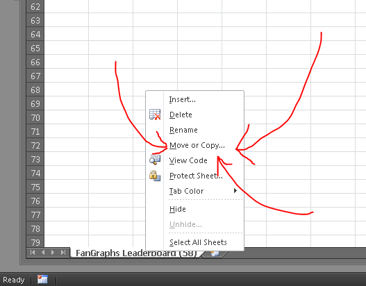
To keep things neat, let’s combine our two separate workbooks. This isn’t a necessary step, but it will help our formula bars be more readable. Right click the tab of one of the worksheets (it doesn’t matter which) and choose Move or Copy…. This will open a dialogue asking where you want to move the worksheet. Using the drop down menu, choose the other workbook and click okay. This should combine the two disparate worksheets into a single workbook. (I’d also go ahead and rename them too, just for whatever’s sake.)
Combining the two worksheets is not a necessary step, but it can simplify the formulas later. Also: It keeps all your data in one place, which is good for later when you reopen the stuff.
I’ve renamed my two worksheets (or tabs) as “Players” for the first set of data and “Teams” for the data we took from the teams leaderboard. On the players tab, we’ll want to add a column called “Team wRC+”. So in cell W1, I write just that, and then in cell W2 I begin to type the vlookup formula by writing =vlookup(.
lookup_value: What do I want Excel to use to find something? What is the key to unlock the information door? In this case, I want Excel to find the team wRC+ by using a player’s listed wRC+, so the lookup_value needs to be B1, which is where the column “Team” is in this particular spreadsheet. (Now press comma.)
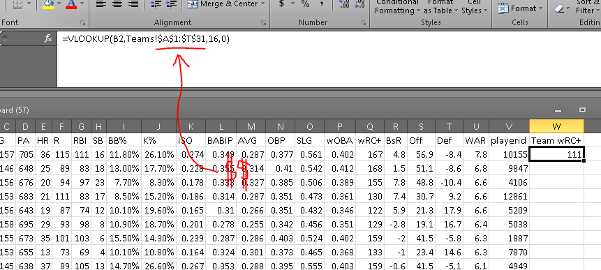
table_array: Where is the data? Or where is the doorway for the aforementioned key? The answer to this question is the data that is in my “Teams” tab — the team totals data from our second CSV download. I’ll navigate to the Team tab, click in cell A:1 and drag until you’ve selected the whole table. Now, we don’t want this selection to move later on (because this table is not moving; it’s dead), so press F4 to add cashmoney symbols in front of your cell references. (Now press comma.)
col_index_num: In which column will Excel find the desired data? Or where in the room is the prize? For this, we need to find which column the team wRC+ is listed in. That’s column P, which is the 16th column in our table_array (because we count every column, including the first). So here, we’ll write 16. (Now press comma.)
range_lookup: Do we want Excel to find an exact match for the lookup_value? OF COURSE. DON’T BE SO FREAKIN’ LAZY, EXCEL. YOU’RE A ROBOT, YOU DON’T GET TIRED. Type a 0 (zero) or FALSE in here. (Now close the parenthesis and hit enter.)
Look at that! If all has gone according to plan, you should have a number populating that W2 cell (probably a “111” if Mike Trout is at the top of your list and you’re using the 2014 season data). If there is a problem and we’re getting an error message, we can always find out where that particular error is occurring by using the Evaluate Formula function (Formulas > Evaluate Formula).
Your formula, en totale, should look something like this:
This is what your formula and result should ultimately look like. Make sure to have the dollar signs in their, which will make it an absolute reference rather than a relative reference.
Now we need to apply that formula to all the cells in the column. We can drag that bottom right corner of that “111” cell, or copy and then paste on the empty cells, or whatever the hell we want.
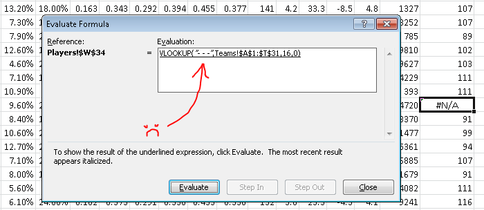
If all goes well, you should get a few #N/As. These mean that something went wrong in the formula. Let’s use the Evaluate Formula button (Formulas > Evaluate Formula) to find out what went wrong. If you’re using the same data as me, go to the first #N/A, which should be Chase Headley at W34.
The Evaluate Formula pop up window will then walk us through the steps of the formula and we can see the point at which it all goes terribly wrong. Clicking “Evaluate” one time shows us this:
Unless we add a “- – -” value to the Teams page, this will always return an “#N/A” result.
The problem here is that the formula is looking for a team named “- – -” in the Teams tab. That’s because the Padres traded Headly to the Yankees in 2014, so he has two teams on record. There’s a variety of ways to work around this (the most easy method being: check the box marked “Split Teams” on the FanGraphs leaderboard), but I just wanted to should have Evaluate Formula can be useful.
Anyway, to finish out our question (“Which hitters meant the most to their teams?”), we need some more calculations. For the ease of viewing, let’s add another column to this data. (Normally, I’d just thrust these additional calculations into the formula I’ve already got going, but that has the downside of looking complex and hiding additional errors.)
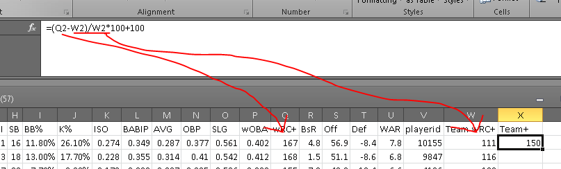
In order to get a Team+ stat (that’s the name we’ll use for our wRC+ applied to the team level), we’ll need to find the players’ differences from their team’s wRC+ and index them, the way wRC+ does. The formula for that would be something like:
Applying that Mike Trout’s 167 wRC+ and the Angels’ 111 wRC+, the formula would look like:
Putting that into Excel, we’ll get something along the lines of this:
If all goes well, it will output a number. I like to take away the decimal places because science.
Where Q2 is the wRC+ column (Q) and Mike Trout Row (2), and W2 is the Team wRC+ column (W) and the Mike Trout row (2). For the 2014 data, this should result in Mike Trout having a 150 Team+ or thereabouts.
After applying the formula to the remaining players, we get a top five Team Most Valuable Hitters of:
Well done, Mr. Rookie! Jose Abreu may not have had as strong a season as Andrew McCutchen — the league’s top hitter — but nobody meant more to his lineup than Abreu, according to the measures we’re using here.
I hope this instruction was helpful. Let me know if you have additional questions.
At Salt River Fields at Talking Stick, the Arizona Fall League’s Salt River Rafters play their home games with NBA-style shot clocks installed on the field: one in the outfield, two on the backstop, and one in each dugout. All of this is part of MLB’s pace of game initiative intended to shorten the total time of a game.
The rules are simple enough. According to the AFL media guide, pitchers have 20 seconds to throw a pitch. If a pitcher holds the ball for more than 20 seconds without throwing it, a ball will be called. A batter must stay in the box during those 20 seconds, prepared for the pitch; if the batter steps out of the box during that period without calling time, the pitcher may throw the ball and an umpire can call it a strike. The 20 second rule begins once the pitcher is in possession of the ball.
In addition to the 20 second rule, there is a maximum inning break of two minutes and five seconds. The batter must enter the box by the 1:45 mark, otherwise, umpires will call an automatic strike. If the pitcher doesn’t throw the ball by the time the 2:05 is up, the umpire will call an automatic ball.
For pitching changes, there is a 2:30 clock that starts once the new pitcher steps onto the warning track or crosses the foul line. An automatic ball may be called if the new pitcher does not throw before the 2:30 is up.
There is also a maximum of three time outs allowed in a game, called by either player, coach, or manager (such as a visit to the mound). This excludes coaching visits due to an injury or an emergency.
Tyler Heineman, a catcher in the Houston Astros organization, said that players still have to get used to the rules being enforced. As of publish date, there have only been two games played with the clocks in use.
“I thought the pace of game was alright,” Heineman said. “A couple times, we got messed up with a couple of ball ones starting off the inning. Other than that, it was fine.”
Arizona Diamondbacks outfield prospect Evan Marzilli said that the rules change everything.
“It’s not something you’re used to,” Marzilli said. “I mean, I guess if we’re gonna have to implement them, we’re gonna have to go through them.”
Both Heineman and Salt River manager Andy Haines noted that the clocks may force pitchers to rush their routine a bit to get warmup pitches in before the 2:30 concludes.
“It might take away from their first couple of pitches because they’re out of gas,” Heineman said.
Haines added, “I know you see guys kinda jog or walk from the pen. That’s definitely different. There is no jogging or walking or else you won’t be able to throw any warmups. It’s definitely a sense of urgency to get out there.”
A lot of the changes being made are more of a mental challenge for players than anything. Heineman said that he thinks pitchers are trying to zone it out as much as possible.
“In the beginning of the innings, it might speed up their routine a little bit, but in between pitches, the 20 seconds really has no effect on them,” Heineman said.
Marzilli agreed that the 20 second rule doesn’t affect him.
“The between pitches [clock] doesn’t really bother me too much,” Marzilli said. “But definitely being in the outfield, coming in, having to run, and kinda rush, it’s something you’re not used to.”
Pitchers throwing within the 2:05 and 2:30 periods is something that they noted they needed to work on, with the Rafters’ starting pitcher Mark Appel being caught going past the time mark and starting off the count at 1-0.
“We saw [the differences] tonight, with a bunch of balls being called that guys weren’t even throwing them,” Marzilli said. “It is different, but we’ll see how it works out.”
Prior to the beginning of the AFL season, Haines said that the Salt River club ran simulated games where they would time the pitchers from the bullpen.
“Just to give them a heads up of where they were, that you were on schedule, you’re a little slow,” Haines said, “so they weren’t totally thrown off guard when they got out here, so they got a little bit of a heads up.”
Testing the initiative in the Fall League is something that makes the most sense, according to Haines.
“I don’t think any of us want them to try to experiment at the major league stadium,” Haines said. “They need to experiment; this is certainly the place to do it. I don’t think that’s even debatable.”
Haines respects Major League Baseball for the initiative itself, calling it something that they’re doing that is best for the game, even if it is a short period of time to test it in the Fall League. Haines also does not think that it will affect players negatively — in fact, it would only help them in the long run.
“If they do want to implement this, these players here will have an advantage because they’ll be conditioned a little bit,” Haines said. “I think that’s the way to look at it. I don’t see it being a disadvantage besides the fact that they’re just gonna have to run out there instead of walk or whatever their routine is, and just be aware of it. It’s a short window. They’re not asking us to do this for six months. It’s a six-week season. And it’s limited exposure for the players as far as this goes. And we’re getting good feedback. If they make a mistake, it’s ball one, it’s not the end of the world. We’ll learn from it.”
It’s Postseason time and you want to put some baseball in your face. But what if you are on a plane during the game? What if your TV exploded? What if your dumb boss is forcing you to work the weekend? What if your significant other is making you go to a farm to pick apples or decorative gourds? Well, believe it or not, it will actually be easier to (legally) stream playoff baseball this year. Please notice my use of the word easier in the previous sentence, and how I did not use the word easy. MLB is offering many of their games to stream through MLB.tv, assuming you have the proper cable/satellite subscription. The games not offered by MLB.tv, those playing on Fox Sports 1, can also be streamed if you have the proper cable/satellite subscription, but the way the provider/subscriber deals work out, there is actually very little overlap. For a five spot, you can subscribe to Postseason.tv, which offers “alternate” — read: bad — views of the ALDS and ALCS games, and an Gameday Audio subscription should give you the ability to stream the radio broadcasts. Otherwise, if you just can’t park your butt on the couch this weekend, here’s your guide for streaming the Postseason this weekend.
(EDIT: Intrepid reader Micah pointed out that he was able to watch Friday’s early game through TBS.com, which allows subscribers of other providers like Dish, Xfinity, and COX to watch as well. This may be an option for AL games tomorrow. I’ll edit this post if that is the case. Thanks Micah!)
(Followup: It does appear you can stream these via TBS.com, but the option is only available for computers, not mobile devices.)
NLDS Game 2 (SFN @ WAS)
You can only stream this game on mobile devices or the web, not through connected devices (game systems, Roku, etc.)
You can only stream this game through the Fox Sports Go App
You must subscribe to Fox Sports 1, and provide a valid login to one of the following TV providers (some smaller providers not listed):
AT&T U-Verse
Bright House
Cox
Mediacom
Time Warner Cable
Xfinity (Comcast)
Optimum
Suddenlink
NLDS Game 2 (SLN @ LAD)
You can stream this game on mobile devices, the web, or on connected devices
You can only stream this game through the MLB At Bat app or on MLB.tv
You must provide a valid MLB.tv login
You must subscribe to MLB Network, and provide a valid login to one of the following TV providers:
DirecTV
Optimum
Time Warner Cable
Verizon FiOS
Bright House
Buckeye
ALDS Game 3 (BAL @ DET)
You can only stream this game on mobile devices or the web
You can only stream this game through the MLB At Bat app or on MLB.tv
You must provide a valid MLB.tv login
You must subscribe to TBS, and provide a valid login to one of the following TV providers:
DirecTV
Optimum
Verizon FiOS
Buckeye
ALDS Game 3 (LAA @ KCA)
You can only stream this game on mobile devices or the web
You can only stream this game through the MLB At Bat app or on MLB.tv
You must provide a valid MLB.tv login
You must subscribe to TBS, and provide a valid login to one of the following TV providers:
DirecTV
Optimum
Verizon FiOS
Buckeye
Clear as mud? That’s what I thought. Of course, if you have a decent cable/satellite package or can get to a local watering hole with a bank of TVs, you should be set. Stay tuned for another steaming guide on Monday to get you through the week. In the meantime, enjoy some weekend baseball.
Real-life Tony Stark — Telsa and SpaceX founder Elon Musk — is in the news again on the merit of a recent and fascinating Aeon Magazine article. The article sums up some of Musk’s recent Mars ambitions, and by way of recap: His original call for an 80,000-person colony has expanded to a 1-million-person civilization. And in case we might suspect the idea is discovery-driven, we should know the emphasis actual orbits the concept of survival.
And, oddly enough, it makes some sense. What he’s saying is:
There are no other civilizations networked across the known galaxy;
so barring any unknown unknowns, there’s either no life by Earth life or all other single-planet civs died off;
so what the hell? Let’s build a second Earth in case we break this one a little earlier than expected.
And since every science fiction movie ever includes Earth either being destroyed or being wasted via pollution, then I’d say we pretty much need to make that Mars colony right now. Read the rest of this entry »
If written words aren’t really your jam, then check out this fast-paced, edge-of-the-seat Tableau Public high-speed thriller of a film I made. For bonus points, listen for my cat in the background:
Ask yourself:
• Do I want to use data as evidence for a claim?
• Do I want to present my data in way other than a table?
• Do I want the user to be able to interact with my data?
If the answers to these questions are “yes,” then I cannot more highly recommend using the free program Tableau Public for creating a visualization for your data. Of course, the answer to these questions should not always be yes. Sometimes a contingency table is sufficient, and sometimes all you need is an Excel graph (which does not allow for user interaction). The temptation we have to resist is thinking: Well, Tableau makes it pretty and interactive, so let’s use Tableau every time.
I have used tables, GIFs, word diagrams, and interactive tables to communicate data-driven ideas, but nothing has been more fantastic — or easier to learn — than Tableau Public. The first thing you’ll need is not the program, but a question. If you don’t have a question, then you don’t need Tableau. Good questions lead to good articles and good Tableaus, but if you just want to dump data into a program, then the interest in your product will be limited.
Let’s, together, ask this question: What is the relationship between a team’s hitting and it’s win-loss record?
This is a great and basic baseball question — and it is one we can transmute into other sports easily, if’n baseball isn’t your thing (i.e. What is the relationship between field goal percentage / points per drive / shooting percentage to an NBA / NFL / NHL team’s W-L record?). We start by getting some data. For my baseball questions, I usually grab data from the FanGraphs SQL server (which is proprietary) as well as the FanGraphs Leaderboard.
The FanGraphs Leaderboards are magnificent and David Appelman (hi, boss!) has done a double-bang-up job making them highly functional. Sometimes the Sports-Reference Play Index tools answer some of my more unusual questions (like: What is the average team record in 1-run games?), but about 60 to 80 percent of my questions can be answered via the FanGraphs leaderboard (which has wOBA, WAR, wRC+, and PITCHf/x data, making it especially useful for advanced analytics questions). There’s a lot of great things you can do with drop-menus and filters on the FG leaderboards, but for now, let’s just use this handy Export Data link here:
Midway down the page, we find the magic Make a CSV button!
Your browser will now download a .csv file (a comma-separated values file, basically a text document version of an Excel spreadsheet). This is our data.
Now we have a question and we have data. Next we need Tableau Public. Download the appropriate file (Windows or Mac), and then install it. If you are using Linux, you’ll want to download the .exe file and install it using Wine. In order to save and to publish any of your work with Tableau, you will need to set up an account with their cloud server. They will probably send you and email from time to time, but in my experience, it has been the good kinds of email — y’know, actual people asking you what they think of their product.
Let me know in the comments if you are having any trouble at this stage, and I will go into more detail with regards of how to install and set up Tableau Public. I’m assuming most people intimidated by this program are not blocked by the installation process, but the data manipulation side of things, so I’ll focus there.
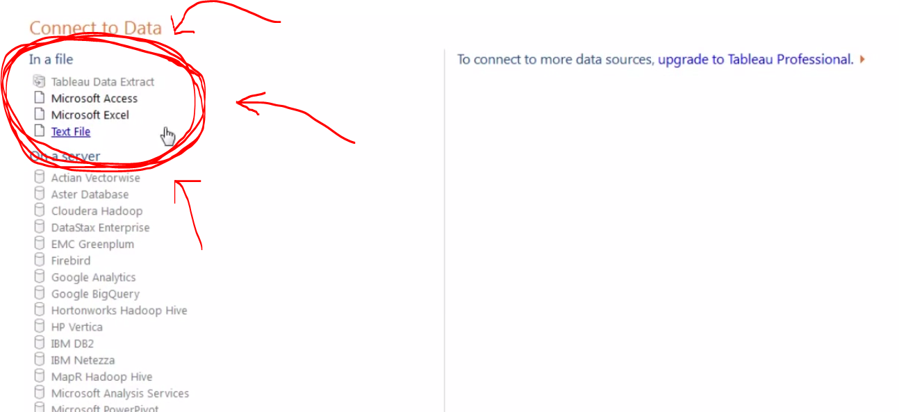
Once you install and open Tableau, you will land on a screen with a big orange button that says “Open Data.” That will take you to this screen, whereupon you can choose your data source:
I typically use Excel files because I will usually want to alter the data a bit before creating a visualization.
We can select our CSV file from our downloads folder, or we can open an Excel file from this screen. Personally, I like dropping the data in Excel first (as seen in the video above) to be sure I’ve got all the right data. Also, Tableau Public does not always love working with CSV files for whatever reason.
Anyway, once we select our data source, a window pops up asking us some specifics about the data. I’d suggest reading the options in here, but for the most part, we can just hit okay and go on living our lives.
With the data loaded, we finally reach Tableau’s sheet view. This is where we will construct charts and graphics, as well as embeddable HTML for blog posts and the like — this, in other words, is where the magic happens.
The Tableau sheet view has a great drag and drop interface.
Our main three areas, at least at first, will be the (1) Measures and Dimensions panel on the left, (2) the Marks panel in the middle, and (3) the Columns and Rows panels across the top. Just dragging and dropping items between these three areas, we can make a whole Tableau document.
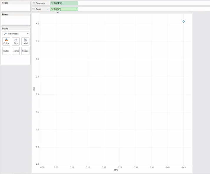
Let’s start by dragging two measures into the columns and rows sections. When we do that, we — disappointingly — get this:
With the data types set to incorrect formats, we can end up with disappointing results. Trial and error is your friend here.
So we obviously didn’t want just a single point in our scatterplot. This is a side effect of wrong data types. Tableau is treating my two inputs (ISO and SB%, which I calculated in Excel as SB/PA) as continuous variables. That means it is summing up all the ISOs and SB-rates in the league, but I want each team to have it’s own individual point in the plot.
By clicking that little green arrow inside my variable icons, I can play around with the data types until I finally have a scatter plot that is scatter plottish.
The green arrow inside the variable icon allows us to tweak the data types.
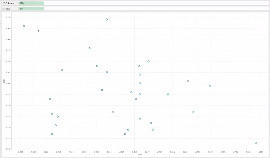
Once we have both variables switched to, in this case, “dimension,” we can then see a proper scatter plot forming:
Scatter plots tend to be my favorite form of data representation, and with Tableau, we can cleanly add more than just two dimensions of information into a scatter plot.
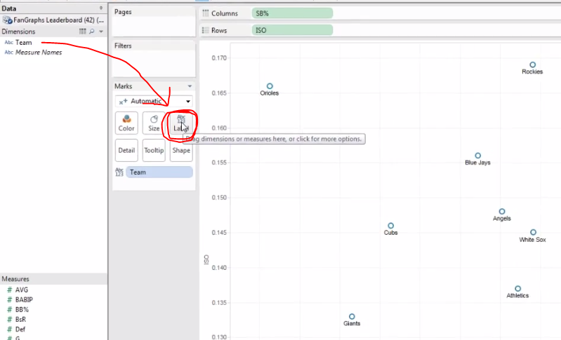
Now we can play around with the presentation — and this is where Tableau really separates itself from Excel. In Excel, if I add labels or colors to my icon, I cannot do so with a third information element. In other words, if I have a plot comparing SB-rate and ISO and then ask Excel to add labels, it’s going to use the Y-axis to automatically populate the label names. That’s no good if I want my dots to represent specific teams.
With Tableau, I can just drag the Teams dimension into the Label square and then Presto-Magnifico, I’ve got my dots labeled appropriately:
Another nifty thing: Tableau does a great job of arranging labels to avoid annoying overlap.
I cannot recommend highly enough the value of playing around with the Marks section. Just drag and drop different Measures and Dimensions into those little rounded squares. As you get more comfortable with these tools, you will start to see the great depth of Tableau’s functionality.
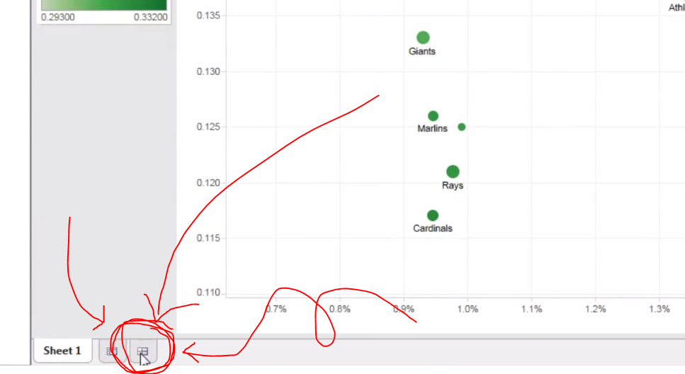
When you have finished getting your plot to where you want it, you’ll want to create a new dashboard. The dashboards are where you can combine multiple graphics (say, a scatter plot and bar graph) as well as organize your keys and color scales and whatnots. To create a new dashboard, click on the new tab icon on the bottom that so happens to look like the Chinese character for field or farm, 田:
Click this little icon to create a new dashboard. You’ll probably want a dashboard if you’re planning on embedding your plot into an HTML blog post.
Like before, everything is click-and-drag in the dashboard view, and if you want any extra formatting options, just right-click something. When you have arranged your dashboard how you like it (and the video above goes into greater detail about this), then you will want to save you project. (Yikes! We waited this long to save?!)
When you save, you are not saving to your hard drive, but Tableau’s cloud. This is both a blessing and a bummer. This means you can access your Tableau biz from all manner of computers — which has proved handy for that last-minute correction — but also means Tableau kinda controls and distributes your work as it so pleases. So, in other words, don’t go around making charts of your friend’s personal cycles on Tableau, lest that kind of info go accidentally public.
Of course, if you’re using Tableau for just sports research, as I do, then you will probably like the extra exposure your hard work gets from, say, appearing on their occasional list of most popular Tableaus (a list I have appeared on a few times, thanks to FanGraphs readership, but would not have otherwise known about had someone not congratulated me). Moreover, the people at Tableau seem genuinely interested in improving their product and have in the past contacted me about questions I had. I imagine if I have serious concerns about my data going public (which, again, why would be using Tableau Public?) then the people Tableau would work with me to find a better fit.
Anyway, once you save your data, a new window will popup. I usually click the “Open in a Web Browser” button at the bottom of the screen and then grab the embed code from the bottom of the page that opens up. I can go into more detail on the embedding process in later articles.
I hope this was helpful! Let me know if you would like more of these or if you feel like I’ve just crushed your soul, wasted your life, or skipped too many steps.