Archive for July, 2015

How to Make a Poor Man’s Heat Map

Presumably you’ve got some data. Maybe it’s PITCHf/x data, maybe it’s just a bunch of data points, and you want those represented in a heat map. How do you make this happen? Well, in the spirit of leading with the lede:

Just make a scatterplot and reduce the opacity of the dots.

Yeah, it’s not elegant and it’s not truly a heat map — not algorithmically calculated like the fancy stuff Jeff makes at Baseball Heatmaps or the complex zone-grids over at FanGraphs. But, hey, for many people, it should be enough.

Let’s go ahead and make a faux heat map together!

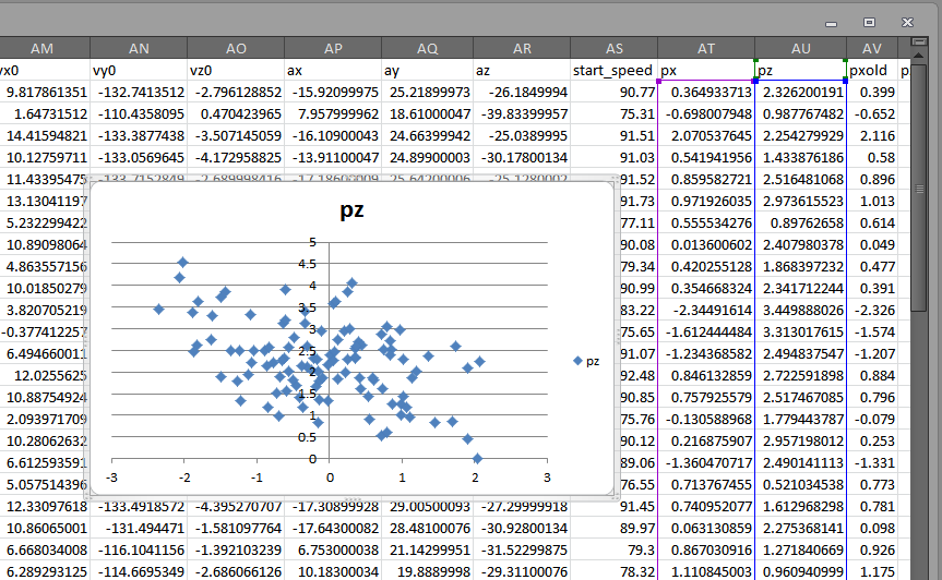
Let’s start by ripping out some Expanded Tabled Data from Brooks Baseball and pasting that data in Excel.

For the sake of this post, we’re looking at Chris Heston’s no-hitter from June 9, 2015. Once we plop that data into Excel, we’ll want to cruise on down to the columns titled “px” and “pz.” Highlight these columns and plop in a scatterplot:

It's hideous right now, but we'll make it beautiful.
It’s hideous right now, but we’ll make it beautiful.

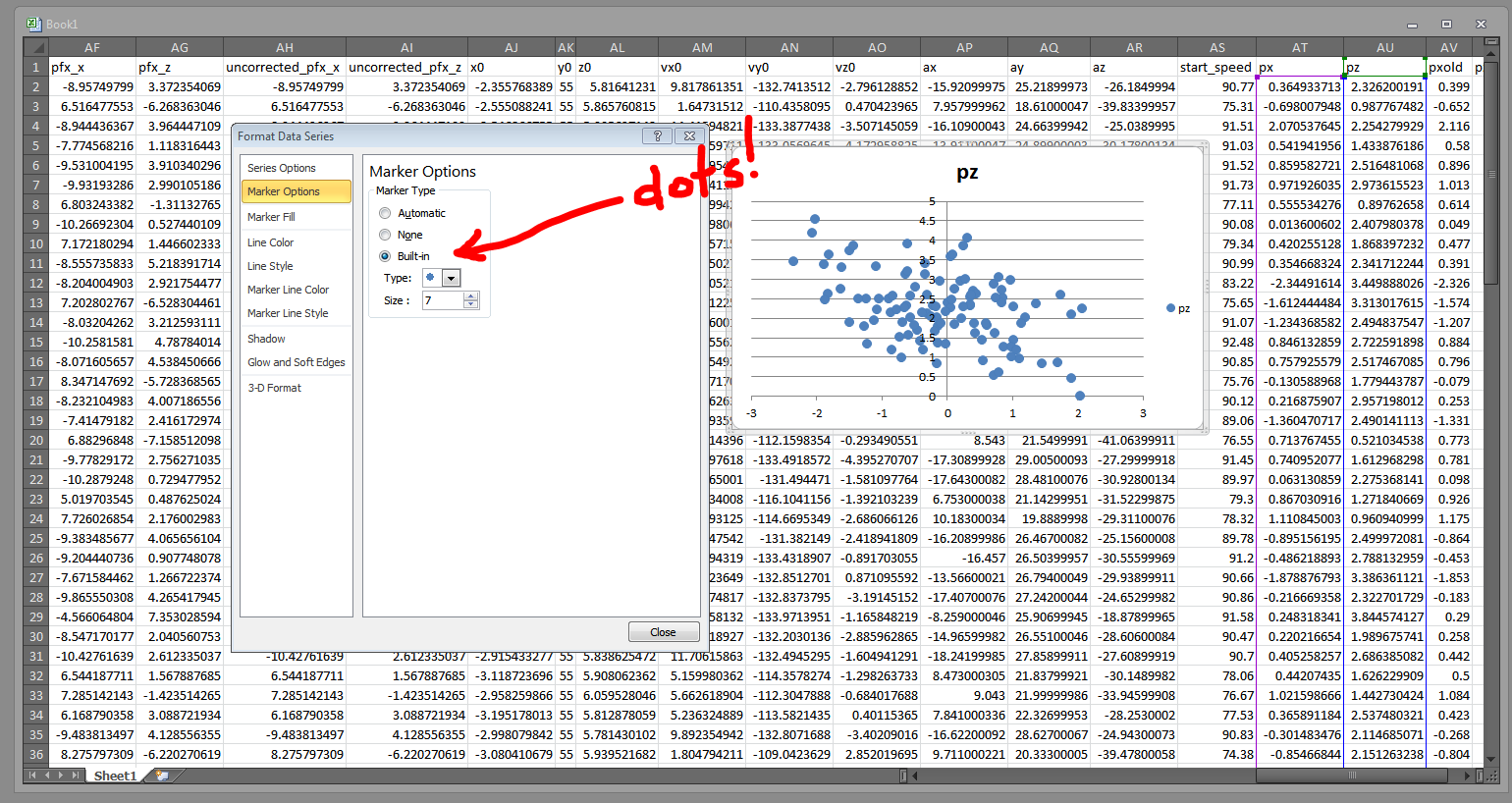
Right click on those blue diamonds and choose “Format Data Series.” Then, in the ensuing popup, browse to the “Marker Options” tab and change the markers to circles:

Circle icons are not only best for faux heat maps, they are also just more appropriate (especially for baseball) in general.

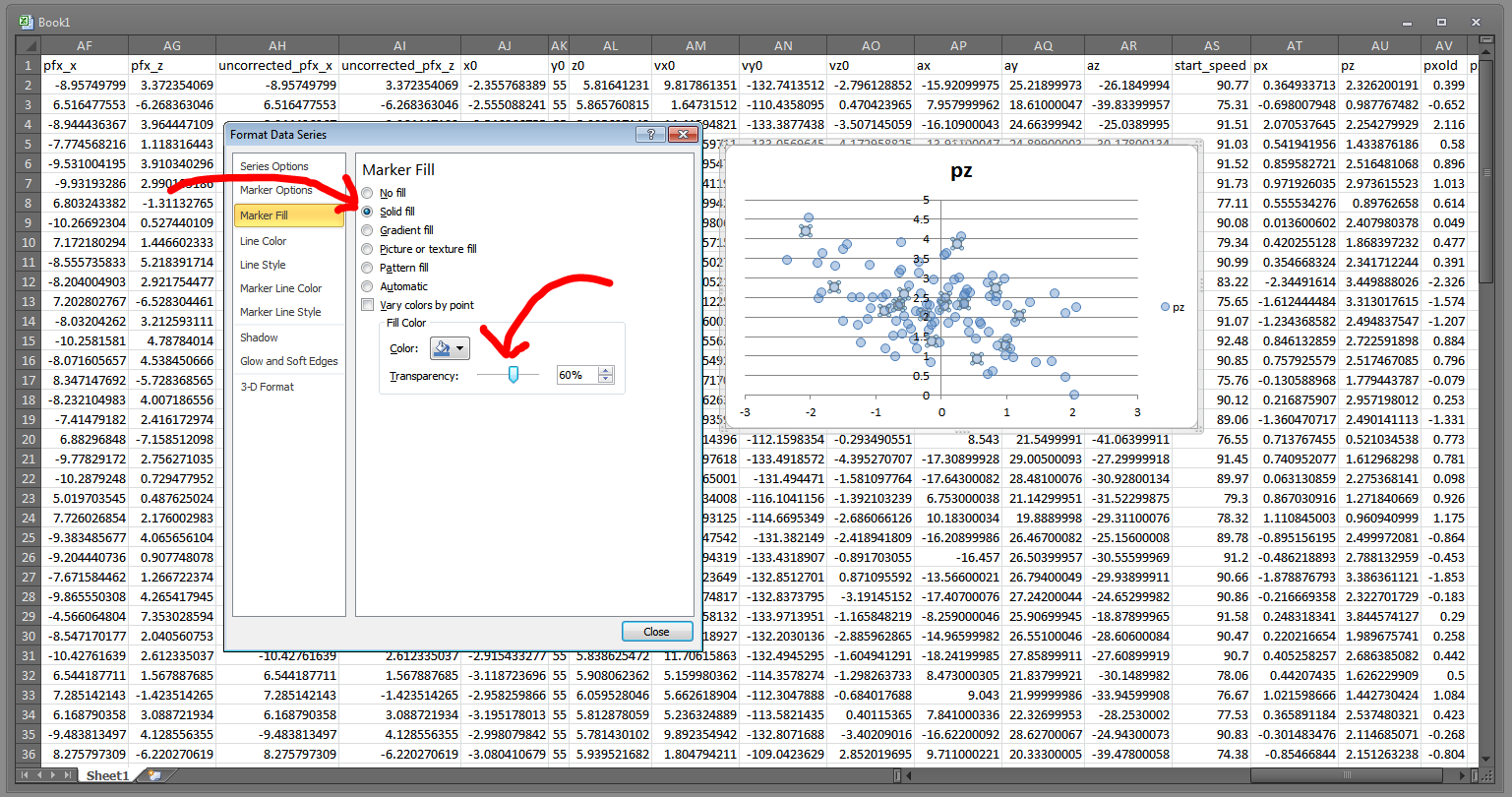
Then go to the “Marker Fill” section and choose “Solid fill.” We can then crank that transparency down:

You will want the dots pretty close to fully transparent, though this will depend on the amount of data points you have. Here, we only have about 100 and they are pretty widely dispersed, so we'll go with 60% transparent.
You will want the dots pretty close to fully transparent, though this will depend on the amount of data points you have. Here, we only have about 100 and they are pretty widely dispersed, so we’ll go with 60% transparent.

Now we need to get rid of the pesky blue outline on each of the data points. Head to “Marker Line Color” and change that to “No line.”

Without the marker outlines, the chart looks a lot more heat map-ish.

So we’ve effectively got a heat map now. With a little bit of tweaking (moving the Y-axis to the left, changing the background color, making the markers bigger, and adding a quick little strikezone box — pretty much all of which you can accomplish through the Format Data Series window), we can get something like this:

The transparency causes overlapping data points to appear darker, which is the key component of a heat map.

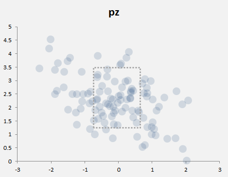
I should mention the strike zone is just a rectangle shape I inserted, and is not necessarily accurate. I set the fill to No Fill and made the border a hashed line. For specific guidance on where to put the strike zone, I suggest using Mike Fast’s article here, and then just eyeballing a shape like I did here.

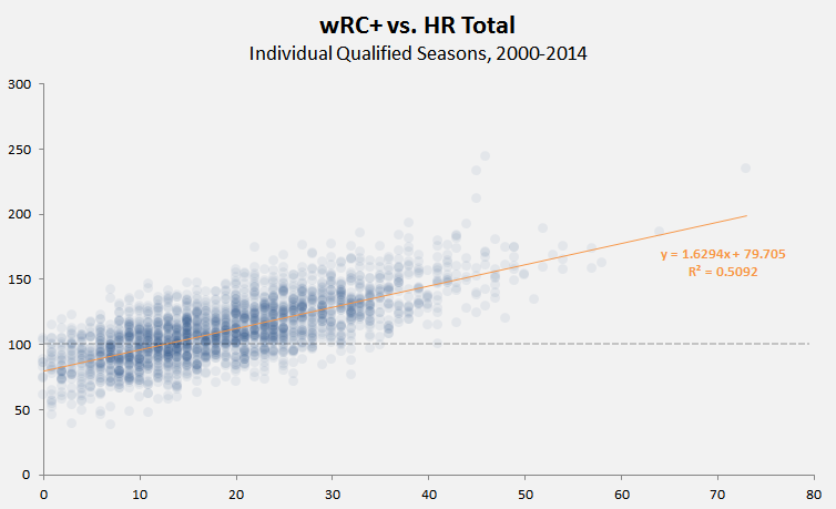
Heat maps are really most useful when you have many hundreds of data points, not just one hundred. For instance, here’s a little heat map (took less then three minutes to make) that shows the correlation between HR totals and wRC+ (offensive production) for individual hitters’ seasons from 2000 through 2014. I threw in a reference line for 100 wRC+ (league average) and a linear regression trendline (in the Chart Tools > Layout section):

The heat map style here let's us see how the majority of hitters are clustered 6 and 32 homers, and between 74 and 148 wRC+.
The heat map style here let’s us see how the majority of hitters are clustered 6 and 32 homers, and between 74 and 148 wRC+.

Here’s another one. This one took more time to cook up, but it’s 1494 records — every NFL quarterback season since 1920 who’s thrown at least 10 touchdowns. So that’s a line for every QB for every season, thus Drew Brees — for his 2009 and 2011 seasons — occupies the top two spots in the completion percentage column.

Anyway, a heatmap here really helps us see the clustering around the middle:

The trend line show a weak correlation, but the heat map tells us where the data is clustered -- and how small sample sizes and random data points might be throwing  off the calculation.
The trend line show a weak correlation, but the heat map tells us where the data is clustered — and how small sample sizes and random data points might be throwing off the calculation.

The transparency on the markers is at 91% (you’ll want higher transparencies for certain colors and for more data).

It’s not technically a heat map, but if you need to throw together some data to make or display a point, the built-in tools in Excel will certainly work in a pinch.


TechGraphs News Roundup – 7/10/2015

Let’s kick the tires and light the fires, it’s the TechGraphs News Roundup. Here are the sports-tech stories we found interesting this week.

In case you somehow missed it, the Los Angeles Clippers and Dallas Mavericks both made serious plays for free-agent center DeAndre Jordan. It got weird. And emoji we involved, for some reason.

We take saving video game progress for granted, but back in the NES days, it was actually pretty special. FTW tells you the details of how you could save your Tecmo Super Bowl domination.

Speaking of video games, OOTP Baseball 16 is on sale! We’re big fans of the game here at TechGraphs. If haven’t gotten your own copy yet, here’s your chance.

Yahoo! is now offering daily fantasy. We previewed it a little on this very site, but expect a more in-depth review soon.

Unofficial friend of the FanGraphs family and overall stats warlock Daren Willman was profiled over at Rolling Stone. Check it out. He’s very modest about creating a sabermetric juggernaut.

Fitness trackers are nice, but don’t forget that’s tracking more than you might realize. Pro tip – leave it at home if you plan on committing a crime.

That’s all for this week. Have a good weekend, and be excellent to each other.


Jason Pierre-Paul Didn’t Start the Fire: How Athletes Could Lose Control Over Their Health Data

Like many of us, NFL defensive end Jason Pierre-Paul spent last weekend launching fireworks in the course of celebrating America’s birthday. Unlike most of us, hopefully, Pierre-Paul injured himself in the course of his combustible activities. While the extent of his injury, reported to be to one of his hands, initially was unknown, that quickly changed on Wednesday afternoon, when ESPN’s Adam Schefter posted a photograph purporting to be of a Pierre-Paul medical record, which indicated, among other things, that doctors had amputated one of the football player’s fingers.

The news of Pierre-Paul’s digital truncation would have come out before long– it’s difficult for linemen to hide severe hand injuries– even if Schefter’s source didn’t leak it, but in an era of ostensible medical privacy, Schefter’s tweet still was a bit stunning to see. Though laws such as the Health Insurance Portability and Accountability Act do not apply to journalists, Schefter’s actions still cross a line of decency and ethics.

One of the central concepts here is authorization, and as we move away from a time in which the bulk of athlete health information exists in conventional medical records and into a reality in which people, including those involved with sports teams, are embracing wearable athletic technology with the capability of pervasively gathering vast amounts of biometric data, authorization may become a moot issue for the monitored athletes. Seeing Pierre-Paul’s records pop up on Twitter struck some as “creepy” and “invasive,” but we may not be far from a situation in which athletes are indirectly pressured or directly asked to authorize broad disclosure of their health information.

In examining the “explosion of data and data collection” in the NBA for an ESPN The Magazine last fall, Pablo S. Torre and Tom Haberstroh wrote that

The boom officially began during work hours. Before last season, all 30 arenas installed sets of six military-grade cameras, built by a firm called SportVU, to record the x- and y-coordinates of every person on the court at a rate of 25 times a second . . . .

But to follow this logic to its conclusion is to understand why the scope of this monitoring is expanding, and faster than the public knows. Teams have always intuited that on-court productivity could be undermined by off-court choices — how a player exhausts himself after hours, for instance, or what he eats and drinks. Now the race is on to comprehensively surveil and quantify that behavior. NBA executives have discovered how to leverage new, ever-shrinking technologies to supervise a player’s sleeping habits, record his physical movements, appraise his diet and test his blood. . . .

“We need to be able to have impact on these players in their private time,” says Kings general manager Pete D’Alessandro. “It doesn’t have to be us vs. you. It can be a partnership.”

A lovely sentiment, at least in theory. But how long will it be until biometric details impact contract negotiations? How long until graphs of off-court behavior are leaked to other teams or the press? How long until employment hinges on embracing technology that some find invasive?

Baseball fans benefit from the deepening analysis of the sport by writers at places like FanGraphs, who can easily query in-game data troves like PITCH/fx and Statcast to support their work, and recent work on this site highlights the leading edge of wearable technology designed for baseball applications. Will data from players’ heart-rate monitors and FitBits ever be publicly searchable on BaseballSavant? Probably not. Will they be leaked when the player is in the midst of contract negotiations, as Pierre-Paul is, like drug test results and Wonderlic scores already are? The mere existence of the data certainly allows for that possibility.

Reports indicate that Pierre-Paul still plans to play football this season, although it’s unclear whether he will do so as a New York Giant. Even a strong season, wherever he winds up playing, is unlikely to make him the most accomplished nine-fingered performer in recent memory. As we sit on the cusp of the “explosion of data and data collection” in sports, though, we nevertheless may remember the leak of Pierre-Paul’s medical records as marking an important transition point on the path toward the more all-encompassing biometric-data-gathering world. And also the part about blowing off his finger with fireworks.

(Header image via maf04)

Yahoo! Is Now in the Daily Fantasy Business

You didn’t seriously expect Yahoo Sports to ignore the daily fantasy boom, did you?

That’s the first line of Yahoo!’s introduction to their newly-announced daily fantasy offering. It’s bluntness leans on the cute side, but it’s now without merit. Daily fantasy sports (DFS) seem to be exploding in popularity, and the funding numbers certainly back that up.

Yahoo! is going up against two well-established DFS platforms — FanDuel and DraftKings. Each have their own strengths and weaknesses, but what they both possess is strong market saturation. FanDuel, especially, has been making a huge push in partnerships of late, teaming up with both Major League Baseball and NASCAR. And it’s become increasingly difficult to watch any kind of sporting event without seeing commercials for either DraftKings or FanDuel. Yahoo! has an uphill climb ahead of them if they plan on making a big dent in the DFS market. But they do have a few aces up their sleeve.

Their first advantage is that that are already a huge player in the fantasy sports market. It’s true that their reputation has taken some hits as of late, but they’re still one of the big providers. Millions of traditional fantasy players are already visiting Yahoo! on a frequent basis. All Yahoo! has to do is entice them to give DFS a try (or seven). Whereas FanDuel or DraftKings have to either pay for advertising or enter in partnerships if they want exposure on the popular fantasy sites. Yahoo! has it all baked right in. They just have to convince people it’s worth a shot.

While it hasn’t been up long enough to do a full review, a quick glance at the new DFS site shows a nice, clean interface. The nuts and bolts of it work much like DraftKings or FanDuel, but Yahoo! is taking a different approach with their salary caps. Instead of working within a $50,000 cap, Yahoo! works within a $200 limit. Of course, everything is prorated. Instead of dropping $9,500 on a top-notch player, Yahoo! users would spend something like $60 within their lower cap limit. This is most likely a stab at simplicity — making the the financials easier to manage across a whole roster. It’s a novel idea, one that separates them from the rest of the field. We’ll have to see how it plays out as the season goes on.

yahoofantasy2

The first game of the NFL season comes on September 10th. The second half of the baseball season is clearly the proving grounds for Yahoo!’s new platform — a time to iron out all the bugs before the real money starts rolling in. Whether it works or not, you have to give Yahoo! credit for trying. DFS is eating into their user base and they’re making a move to try and stop the bleeding. Perhaps they can leverage their place in the market into some higher revenues. They certainly have the foothold. Being valued at $40 billion probably doesn’t hurt, either.


Brentford FC’s Stats-Friendly Owner

Brentford FC has been making waves in the ocean of soccer nerds over the past several seasons, most notably due to their owner — Matthew Benham — being a leading advocate for mathematical modeling in soccer. Benham is a nerd after my own heart, a man who studied at Oxford and eventually created his own betting company, Smartodds. Prior to Benham’s purchasing the team after the 2011-12 season, Brentford had been a third tier league, finishing in the middle of the pack of League One, two levels of competition below the English Premier League.

Since taking over ownership duties, Benham has influenced the club’s overall philosophy with his statistical stylings, including publicly acknowledging a head coaching change was partly due to philosophical differences. The coach in question, Mark Warburton, was at the helm as the club ascended from the third tier to the second tier of competition. Despite the success, Warburton found his contract was not to be renewed after the 2014-15 season. With Benham influencing the decision making process and Warburton handling the field level duties of a manager, Brentford managed to escape the third tier after being there for five seasons (2009-10 through 2013-14). The Bees broke through to the Championship, England’s second tier behind the EPL. More success followed in the 2014-15 season as Brentford finished fifth in the Championship and thus found themselves in the playoffs for the right to join the big clubs in arguably the best league in the world. While their playoff run ended earlier than The Bees would have liked, their overall success is not to be discounted.

Though the Bees fell short in the playoffs, their rapid ascent has made people take note, including their fans. Benham made time for a Q&A session last year on the Griffin Park Grapevine fan forum, and some of his answers were on point. In order to read the entire session you’ll have to register a free account on GPG, however below are just a few snippets of the Q&A (click to embiggen each picture).

qa1

As one would suspect, Benham is reluctant to give any details about the models and math at work, however his pasta preference is certainly concerning given penne reigns supreme.

qa2

Benham again doesn’t give away anything telling, but he quick to give traditional scouting and reports respect.

qa3

The context behind this answer is quite interesting given the history between Benham and Comolli. Damien Comolli came up as a scout with Arsenal, then worked his way up to director of football for Tottenham, in a similar way a baseball scout would climb the front office ladder. Comolli was dismissed after being at Tottenham for three seasons, landing as sporting director at Saint-Étienne. By the time he was relieved of duties there, Liverpool beckoned and he was appointed director of football strategy in November of 2010. After catching criticism regarding his negotiating abilities more than his scouting talents, Comolli and The Reds parted ways with the club near the end of 2011-12 season. The story, as written in Calvin’s book, is that Benham met with Comolli and was not impressed by any of the numbers Comolli showed him. Benham was also shocked at how Comolli asserted that his numbers and nothing else could be correct. Disagreements among analysts is nothing new, just look at the Red Sox and Mike Gimbel. He served as a specialist and consultant to then general manager Dan Duquette before Gimbel was, in his own words, used as a whipping boy.

Benham has generated his wealth using the best tools available to create the model in order to most accurately project outcomes. The best publicly available stats still leave much to be desired, however given Benham’s background, perhaps he and his team of analysts at Smarodds have broken down some of the walls surrounding statistics in soccer. While not a general manager or coach, as owner of a second-tier English soccer team, he certainly could be a pivotal character in the soccer realm. Just as Billy Beane came under fire for a number of his decisions, Benham has also been a target of the media. As the line near the end of Moneyball states, the first guy through the wall always gets bloodied. Always.

(Header image via Wikipedia)

TechGraphs News Roundup: 7/6/2015

The FanGraphs family took July 3rd off, so the News Roundup is appearing on your screens a little later than usual today. Here are some of the most interesting sports-tech tidbits we found this week.

Valve’s biggest DOTA 2 tournament, known as The International, announced that it will be offering $15 million in prize pool money. A challenging and leveling system being employed means that the total could actually go higher. This is where I would insert some overdone joke about nerds needing to do their hand stretches, but I feel like $15 million is an amount of money that prohibits me from making these comments anymore. Get that money, dorks.

Speaking of gamers, they will now be able to share their favorite frags and long-range, no-scope headshots to mobile YouTube users in their beloved 60fps format. This feature has been available on the desktop for a bit of time, but now anyone with a modern iOS or Android device can enjoy the carnage (or Minecraft videos) in their preferred frame rate.

Kansas City’s Kaufmann Stadium got a major WiFi network upgrade during the end of last season, and just in time to see the baseball club take the World Series to seven games. That postseason traffic proved to be a great test, it seems, and the Royals are seeing the benefits this season. Promotion of the new network is going strong, and new features like a parking payment system have been added.

Dish’s new Sling TV platform showed signs of promise when we saw it at CES, and the potential to be a real disruptor is still there. However, if more major outages keep happening, Dish will start having customer retention issues before their platform is even fully off the ground.

This technically counts as sports-tech news because tennis is a sport and slow-motion video utilizes technology, but I mostly just want to make sure all of you see what really happens to a tennis ball when a racket hits it.

The San Antonio Spurs’ Matt Bonner thinks he gave himself tennis elbow by upgrading to the iPhone 6 Plus. Seriously.

GoPro has announced their newest offering, the Hero 4 Session, and it looks pretty rad. It’s basically a waterproof cube camera that packs many of the features a modern GoPro has, but in a much smaller and lighter package. Gizmodo had a chance to play with an early-release version, and the reviews and results seem quite positive.

That’s it for this (last week). We’ll have another news roundup on Friday to get back on the regular schedule. Until then, be excellent to each other.


BU and edX Are Bringing Back their Sabermetrics 101 Course

Let’s be honest. Learning new stuff as an adult is hard. Without the regiment of formal schooling (and without curriculum provided by experienced professionals), getting a grasp on a new topic can be very challenging. This might be more true of the technology field than any other. If you want to bone up on your history or math skills, many times you can pick up a few books and gain knowledge. But unless you’re researching the history of BASIC, books aren’t always the most helpful thing for learning new technologies. Sure, I can buy a few books that promise to teach me Python (I have) and do all the exercises (I have), but the subject matter is so wide, it’s hard to feel like you have a real good grasp on the subject (I don’t) even after you’ve finished the books. That’s why places that offer Massive Open Online Courses (MOOC) like edX are so great. You get curriculum and direct instruction and are able to interact with other students and instructors when you get stuck.

Learning the underlying technology of baseball analytics is no easy task either. There’s scripting and database work involved. You need a firm grasp on SQL and R and other languages to be able to do what you want. It’s easy to get stuck, and that’s assuming you knew where to start in the first place. Well, edX has a solution for that as well. Boston University is once again offering their Sabermetrics 101 course through edX, and it’s the perfect place to start your understanding of everything that goes into being a good baseball analyst. Oh, and you can take it for free.

Our FanGraphs colleague/spirit animal Paul Swydan did a great writeup of the course when it was offered the first time around. The course starts with some history and basics of sabermetrics, and then moves on to teaching some of the technological tools needed to do one’s own research. You will learn the basics of SQL and R, but, more importantly, how to use these languages for the specific needs of baseball research. Though I didn’t have the bandwidth to take the course the first time around, I did poke around a little, and the offerings are both in depth yet totally approachable for seemingly anyone. All it takes is (very basic) computer skills and a willingness to learn.

Dr. Andy Andres, a senior lecturer at BU and the instructor for the course, told me that even more is in store for version two.

“We have re-vamped the second half of the course, making sure we do justice to WAR as much as we can in an introductory course — we cover not just hitting now, but cover the basics of fielding and pitching. And we have completely re-worked our R curriculum, hopefully having more success is learners getting through some intro programming skills.”

A while back, I presented some how-tos on getting a Retrosheet SQL database onto your machine. Many of you asked for help in querying the thing, which is a reasonable request. However, every time I tried to write one, I got stuck. Sure I could have supplied some sample queries, but to really be able to use the database, one needs understanding of how SQL structure works. If you got through building the database, but still aren’t quite sure how to use it, this is the course for you.

If you didn’t build a database, you can still use the course, however. One of the best parts about Sabermetrics 101 is that all work is done in hosted sandboxes. You don’t need SQL or R installed on your computer to partake in the learning. edX hosts the necessary machines for you. All you need is an internet browser. Sure, you can work on the exercises on your local machine if you wish, but the sandboxing option ensures that any user has access to the proper tools and takes away any apprehension one might have of wrecking their system while they’re trying out new things.

Class starts on July 7, and is certainly worth a look for anyone looking to improve their baseball analysis skills. You can take the course for free, or pay $25 if you want to receive the verified certificate. You won’t learn everything (Andres says that a 201 course is in the works), but you will walk away confident enough to use Google and other tools to find answers that actually make sense.

I encourage any and every TechGraphs reader to take part. I’m fully committing to this session and look forward to seeing all of you in the forums.