Archive for Excel

How to Get the Most Out of “Format as a Table”

One of the Excel features that I feel too many people ignore is the “Format as a Table” tool. Let’s say we’ve got this data, 2014 team defense data from Pro-Football-Reference.com. I’ve cleaned it up a little — gotten rid of the totals at the bottom and consolidated the headers into one row — but it should still be a fairly recognizable table.

File -> PFR2014.csv

The process of formatting data as a table is really stupidly simple. Click anywhere within the table’s data (so anywhere from A1 to Z33). Now choose “Format as a Table” from the Home tab:
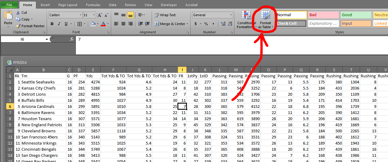
A variety of designs will appear when you click the button. They all have the same functionality, and you can change the colors easily at any time, so just pick one.

I am going to select the third from the top red design because red is the greatest color. When I do pick that design, I get a popup and a blinking border around my data:
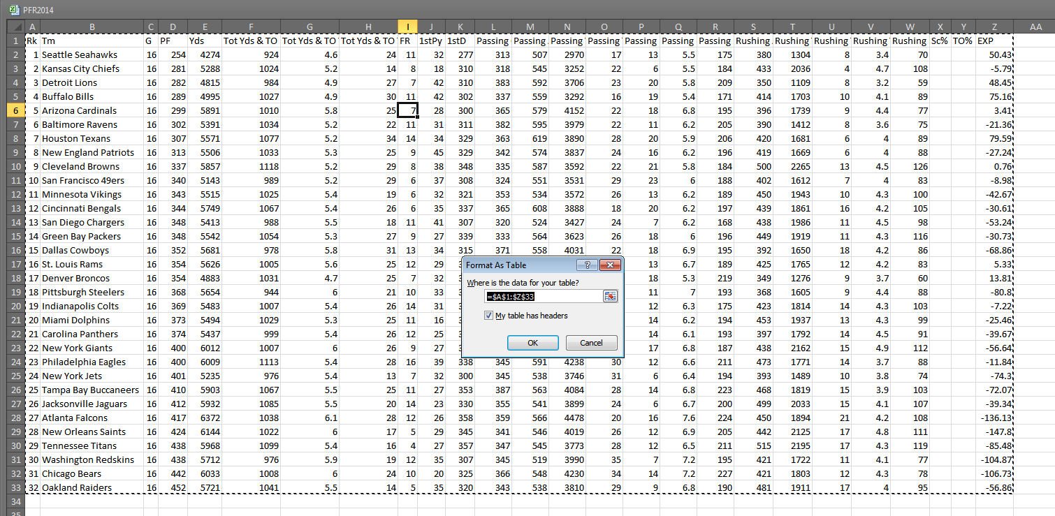
Excel, being full of magical and distressing insights, knows where my data begins and ends. So all I need to do is make sure the "My table has headers" button is checked (it is) and then press "OK."
Excel, being full of magical and distressing insights, knows where my data begins and ends. So all I need to do is make sure the “My table has headers” button is checked (it is) and then press “OK.”

Presto magnifico, I have a table!

“But Bradley, you had a table all along.”

Shut up, and yes, I did — but this one is better. Lemme show you why.

The first thing I like to do is enable “Wrap Text” on the header row (select the top row, then Home > Wrap Text). It allows me to see the whole table much better. (This is a simple operation, but if you’re confused, Professor Google should have a plethora of resources on the matter.)

The second thing I like to do is rename this table — especially if I’m going to do work with multiple tables. To rename the table, head to Formulas > Name Manager. The name manager popup window should have only one table in it — Table1. Double click that line, and a subsequent pop up will enable us to edit the name:

Let's rename this one "Defense."
Let’s rename this one “Defense.” If we ever want to rename the table, we can follow these same steps without any harm to formulas throughout the spreadsheet.

Once you choose a name, click OK then Close. Now when we select all the data in the table, it will highlight the name “Defense” in a names drop-down menu:

Conversely, when we select "Defense" from the names drop-down menu, Excel will highlight the table data.
Conversely, when we select “Defense” from the names drop-down menu, Excel will highlight the table data.

Of course, we can name a table without it being formatted through the “Format as Table” function. But what’s nice about the “Format” table is that if I add a row or a column, the named table “Defense” automatically expands. Let’s try this out.

Go to cell AA1 and type “Pass – Rush AVG” (we’re going to create a new column). Excel will automatically create and format a new column, like this:
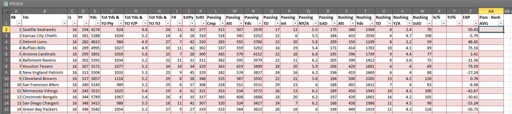
The new column will automatically carry the formatting to the end of the table.

Now, I’m going to type a new formula into it:

=[Passing NY/A]-[Rushing Y/A]

Whoa! That’s not a normal Excel formula! That’s right. It’s a table formula. Now that we have a named table, we can use the column names to complete formulas within (and without) the table. More on that in a second.

Depending on your settings, the formula may have automatically filled to the bottom of the spreadsheet. If it didn’t, just click on the autofill icon that appeared at the bottom left corner, and choose to allow the formula to overwrite the contents of the column:
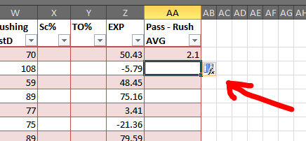
No need to click and drag a formula to the end of a spreadsheet. This is particularly useful with lots of data.
No need to click and drag a formula to the end of a spreadsheet. This is particularly useful when you have many rows of data.

And hey, remember that strange formula we made a second ago? Let’s do something similar on a different tab. I’m going to add another sheet, Sheet2, and type into any cell:

=AVERAGE(Defense[Pass - Rush AVG])

That’s a basic =AVERAGE formula, but because of the named table “Defense” and the named column “Pass – Rush AVG,” I’m able to write the formula without using the mouse or worrying about cells moving or data changing. In fact, I can go back and change the name of that column to “Net Pass AVG” and guess what happens to my formula? It changes automatically to:

=AVERAGE(Defense[Net Pass AVG])

One of the biggest advantages to using named tables (and editing those table names) is that when formula get REALLY complicated, you can read something that’s close to English, not a collection of meaningless cell references (“Wait, was A1:D22 the running data? Or was that in F2:Y54?” as opposed to “Oh, I have Running[AVG] not Running[Data] selected. Oops!”).

Consider this formula from my Scoresheet dataset:

=IF(VLOOKUP(CONCATENATE([@firstName]," ",[@lastName]),FGDC,19,0)=0,"",VLOOKUP(CONCATENATE([@firstName]," ",[@lastName]),FGDC,19,0))

“FGDC” is data pulled from the FanGraphs Depth Charts leaderboard. I have that data on a separate tab. Here’s how the above formula would look without named sections:

=IF(VLOOKUP(CONCATENATE(Combined!G2:G1010," ",Combined!H2:H1010),'FG DC'!A2:X1141,19,0)=0,"",VLOOKUP(CONCATENATE(Combined!G2:G1010," ",Combined!H2:H1010),'FG DC'!A2:X1141,19,0))

Both formulas are unwieldy, but at least the first one is intrinsically sensible. I’m combining the column “firstName” with “lastName” and looking them up in table FGDC. If I don’t find them, then I want Excel to put nothing into the cell (i.e. print “”).

If you want to learn more about structured references, I recommend this rundown of the syntax and various uses of structured refs.

It’s also important to note a named table automatically adds filters and applies those filters even to new columns and rows.
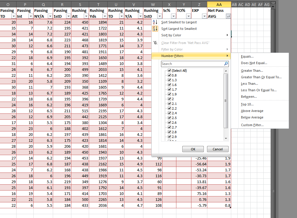
Filters allow us to sort and sift through the data much more easily.

Another small, but useful component of tables is that the jump shortcuts (e.g. CTRL+→) will jump to the end of the table, even if the row or column is empty. In other words, in the empty Sc% column, if we press CTRL+↓, the cursor will move to X33 instead of X1048576, which is where it would normally and uselessly end.

There’s a multitude of other little handy features when it comes to structured tables, like being able to neatly and easily select whole columns of data without also selecting the header and the empty cells beneath the data. But for now, I hope this is enough to get the Excel newbie started with exploring this surprisingly robust feature.
How To Run Sports Data Regressions in Microsoft Excel

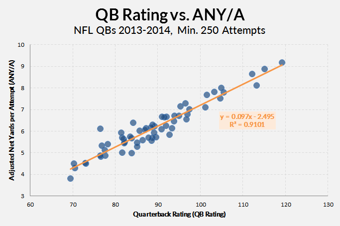
The shorthand description of a regression: It’s the best possible trend line between a scatter of dots. Like this:

The orange line (and the connected equation) represent the most basic idea of a regression.

One of the fun things about regressions is that they give us formulas — line equations, specifically. So if we have a quarterback with a 100 QB rating, we can plug his 100 into our formula (y = 0.097 * 100 – 2.495) and get a reasonable estimation of what his Adjusted Net Yards per Pass Attempt (ANY/A) would be (about 7.2). The R2 tells us essentially how reliable the regression is — or, more specifically, how much of the variation in QB Rating is explained by ANY/A.

Of course, the problem with the data here (which I just kind of threw together as an example) is that QBR and ANY/A use almost the same inputs and attempt to do the same thing. It’s nice to see they have about 91% overlap (it basically says they’re just about interchangeable), but no one is going to use QB rating to derive or forecast a ANY/A.

Regressions are more useful when we start with something small and reliable, then move our way to more all-encompassing but volatile stats. This is like how we use contact or plate discipline data (small and reliable) to expand into an xBABIP calculator (big and more meaningful).

There are two ways to run some regressions in Excel:

  1. Use the scatterplot tool (as above) and create a simple, two-variable regression.
  2. Use the Data Analysis ToolPack to run a more complete and useful regression.

The first method is the easiest, but it doesn’t output the peripheral data that is essential to fully understanding a regression’s findings.

The Scatterplot Regression

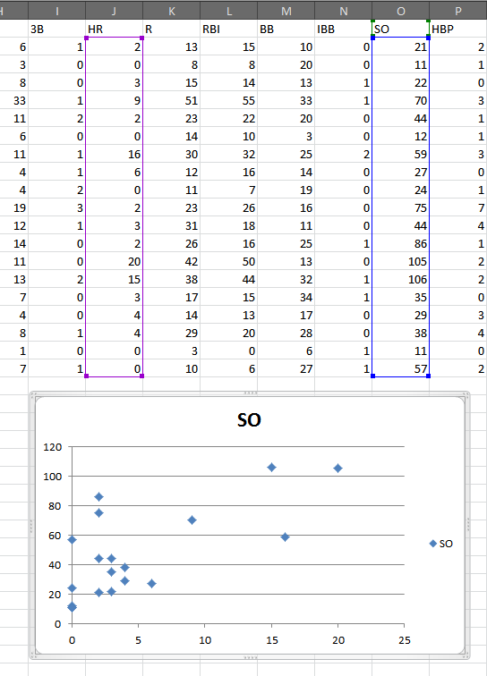
For the first method, just select two columns of data and make a scatterplot (Insert > Scatter). That will give you something like this:

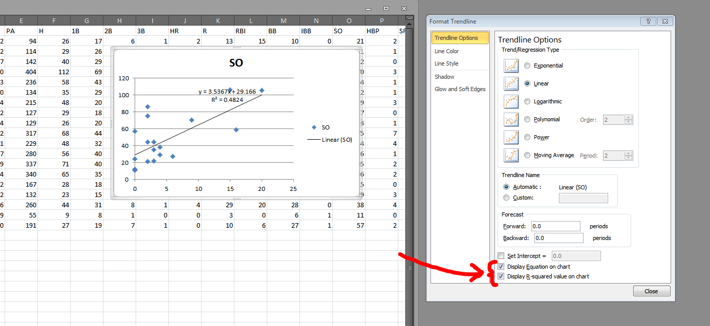
Here's a scatterplot of the 2015 Durham Bulls' strikeout and home run totals.
Here’s a scatterplot of the 2015 Durham Bulls’ strikeout and home run totals, min. 50 PA.

With the chart selected, choose to add a linear trendline (Layout > Trendline > Linear Trendline):

Adding a linear trendline will create a basic linear regression.

Now double-click the trendline to produce the “Format Trendline” window. In that menu, check the boxes for “Display Equation on chart” and “Display R-squared on chart”:

These two boxes give you the bare minimum of data necessary to interpret a regression.

So now we have a regression! The formula (HR = 3.5367 * SO + 29.166) tell us there is a positive connection between home run totals and strikeout totals. And the R2 tells us the relationship between HR and SO explains 48% of the variation between the two of them.

What this regression doesn’t tell us:

  • What direction, if any, is the causality? Are homers causing players to strikeout? Or do more strikeouts make more homers?
  • Are their peculiarities in the residuals? This article does a great job of teaching how to interpret residuals plots.
  • Does the regression fit the data? And ANOVA analysis can be useful in augmenting what the R2 tells us.

The first issue is a matter of deeper research. A regression won’t tell us direction of causality. But we can still answer those other two questions — as well as add more variables — using Excel data Analysis ToolPack. The first thing we’ll need to do is enable that ToolPack.

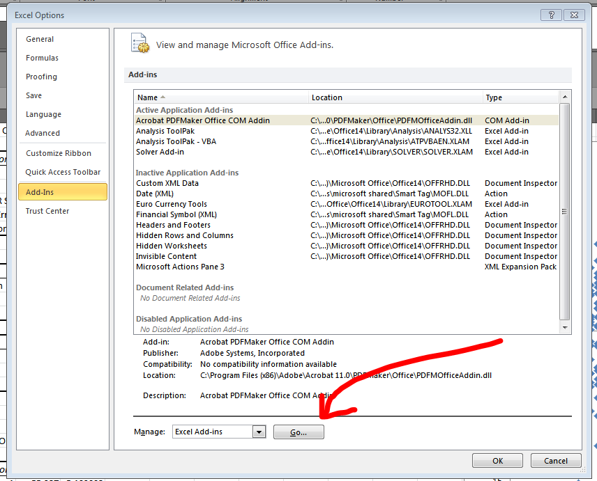
In the File > Options > Add-Ins section, you’ll notice a “Go…” button at the bottom of the window.

This button opens a dialogue that allows us to turn on the data Analysis ToolPack. Why is this not enabled by default? Who knows? Maybe Bill Gates.

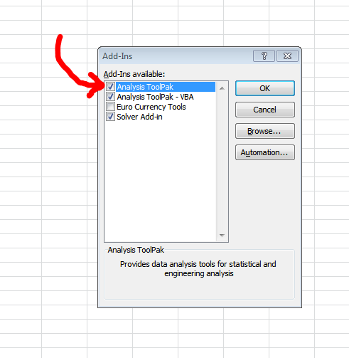
Select the top option in the available Add-Ins (“Analysis ToolPack”) and then click “OK.”

You can also add in these other ones if you're feeling frisky. I rarely use them, though.
You can also add in these other ones if you’re feeling frisky. I rarely use them, though.

Now, after this first step, you should have a new option in your Data tab. Let’s explore that. Go to Data > Data Analysis. That will open a simple dialogue with a list of various operations. Choose “Regression” and click “OK”.

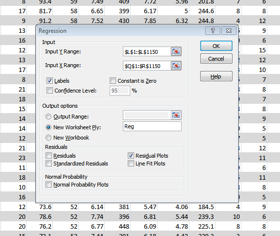
You should then get this screen:

The Y Range will be what you are regression against, so to speak.

In the Y Range text box, you will want to add only a single column of data. I prefer to include the column headings so that the output screen will be more easily understood. In this instance, I’m choosing a big column of completions percentage data from Pro-Football-Reference.com (from this data: NFL QB seasons since 1969 with min. 10 TD). I’m regression this Cmp% data against the quarterbacks sack total and yards per attempt (Y/A) total.

In short, I’m asking: Can Y/A and sack totals predict a QB’s accuracy?

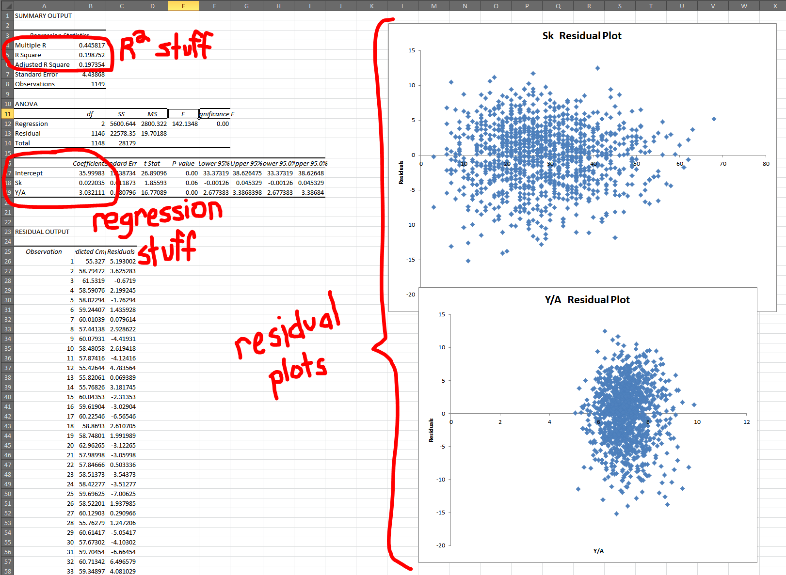
So in the X Range, I’m going to select the Q and R columns (titles and all). The output is something like this:

Here are the big three components of a regression.

So this is kinda what it will look like after a regression. Let’s break down the three big areas one at a time, in the typical order I look at them:

  1. Residual Plots: These look good! You want a shotgun blast looks. If you start to see anything other than a circle, in any of your residual plots, then you’ll need to rework your regression. (See that above article for more details.)
  2. R2 Results: What is a good R2? Well, higher is always (well, usually) better, but there’s no clear perfect R2. Truth is, we have to be as intellectually honest as possible and determine how much explanation is the right amount of explanation. With multiple variables, it’s important to look at Adjusted R2 because it helps combat the unintentional increase in R2 caused by just adding more data. In this case, though, R2 and Adjusted R2 are about the same, so whutevz.
  3. Coefficients: The coefficients tell us both the formula of the regression (Cmp% = 36 + 0.02 * Sacks + 3.03 * Y/A) but also the strength of the variables involved. And it doesn’t take much work realized which variable is more important. Even a QB who has been sacked will only see his Cmp% moved by 1.5%. What’s more: It increases 1.5%. That’s a red flag right there for a bad variable. Maybe Sack% would be a more useful tool because the sack totals are merely telling us he played more (and QBs who played more probably had better performances because otherwise they would have been benched).

Anyway, I hope this has been helpful. I encourage readers to learn more about regression before attempting any, as they are a complicated and tricky tool and can lead a researcher astray quickly if used incorrectly.

NOTE: For those wondering why I haven’t gone into detail about significance testing for P-values, it’s because I believe that field of statistical study is generally arbitrary and altogether intellectually bankrupt. But there are dozens of great tutorials out there on the subject. I just can’t in good ethical faith write one.


All the Things You Wanted to Know About Conditional Formatting in Excel

What are conditional formats? Simply put: They make a wall of data more readable. Tell me which dataset can you more quickly identify the best player:

Not only do the conditional formats catch the reader's attention, they also help us see the outlier data more easily.
Not only do the conditional formats catch the reader’s attention, they also help us see the outlier data more easily.

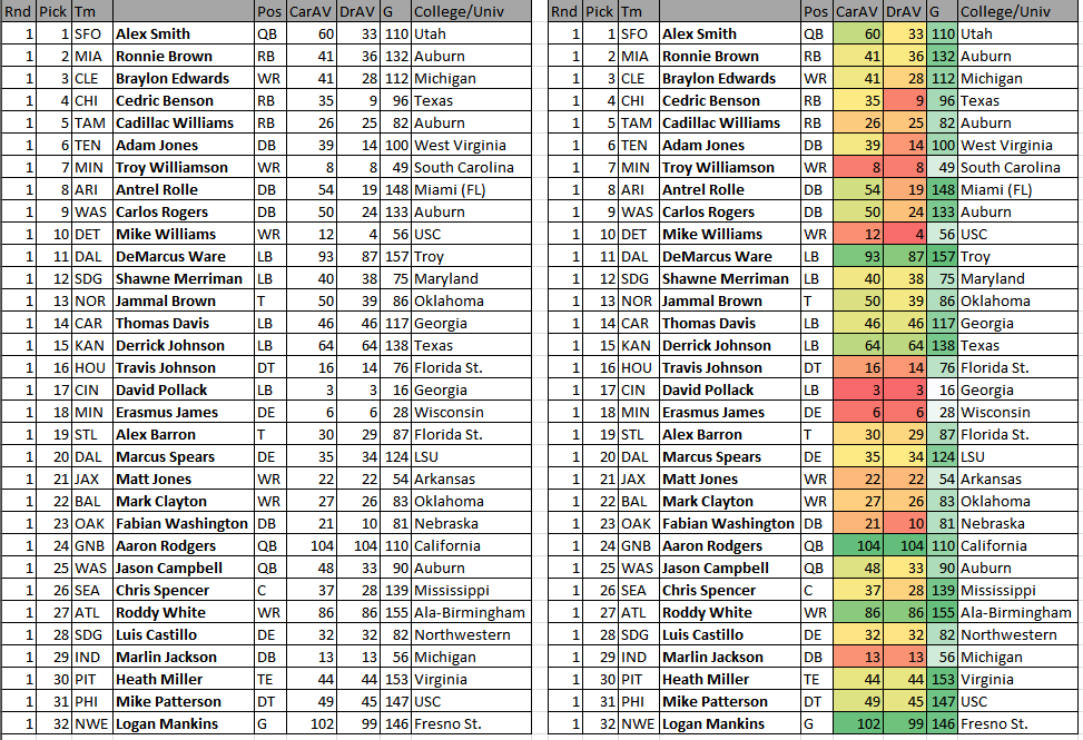
Here’s a great example of a time where conditional formating helps a lot. We’re looking at the 2005 NFL Draft. It makes sense to organize it by the order the players were picked, but our emphasis is on Career Average Value (CarAV) and Drafted Team Average Value (DrAV) — two simple, but useful stats that Pro-Reference-Football.com provides to estiamte a player’s total worth.

The conditional formatting immediately draws our attention to DeMarcus Ware, Aaron Rodgers, and Logan Mankins — the three most valuable players from the first round. And the conditional formatting draws our attention to these players while also helping us notice — immediately — that neither Rodgers nor Mankins were top picks.

The NFL Draft is a great example of when conditional formatting helps most. If I just wanted to compare the Career AV numbers of all the players who entered the league in 2005, irrespective of draft location, then I’d probably make a simple list and sort it large to small. But when we want to preserve a specific order of the data — or want to represent multiple components at once — conditional formatting does a stalwart job.

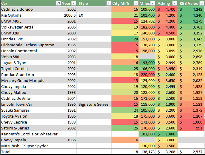
Here’s another instance, this one unrelated to sports — my spreadsheet for looking for a second car on Craigslist:

Conditional formatting can also stay within a boundary, so to speak, so unlike denominations can be compared side-by-side.

Here, I care mostly about the Kelley Blue Book value of the vehicle (“KBB Value”), but I also want to know about gas mileage and the other facts of the car. I’ve set up the color coding, though, so that I don’t have to worry about 28 MPG throwing off a $4,000 asking price. Also, the higher the value of the car the more green it is, but the more expensive the asking price, the more red it is.

In other words, I just look for as much green as possible, and that’s my best bet.

So let’s talk about setting up our own table with conditional formatting. First, we need data pertinent for conditional formatting. Let’s go with 2014 NFL Team Efficiency stats from Football Outsiders.

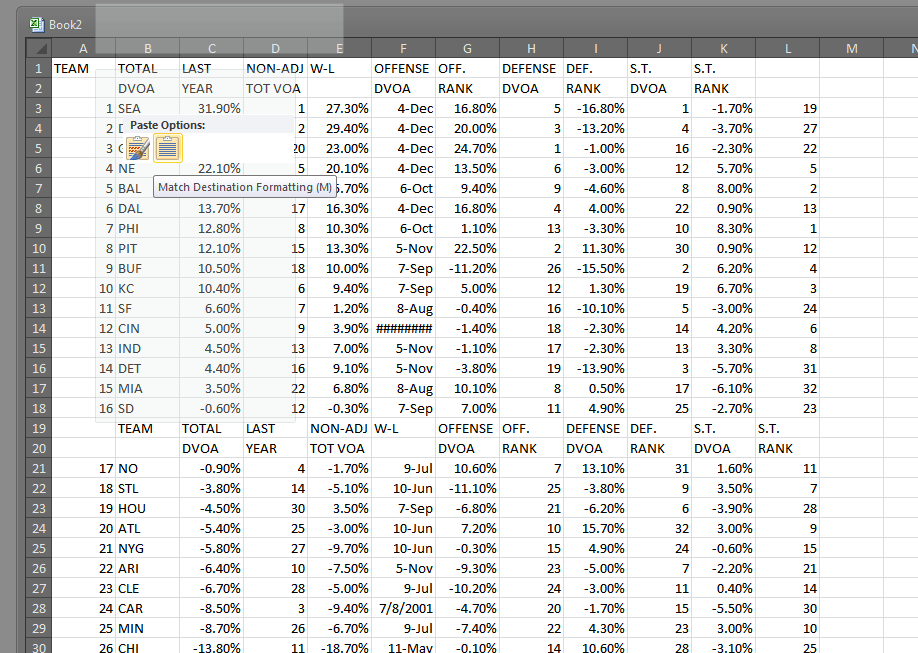
First, I scrape the data with a little copy/paste action. Just highlight the table area in the middle and paste it into your Excel document. I recommend pasting without formatting. To do this, just right click on the spreadsheet and choose the special paste icon:

Pasting without formatting keeps the spreadsheet simple and readable.

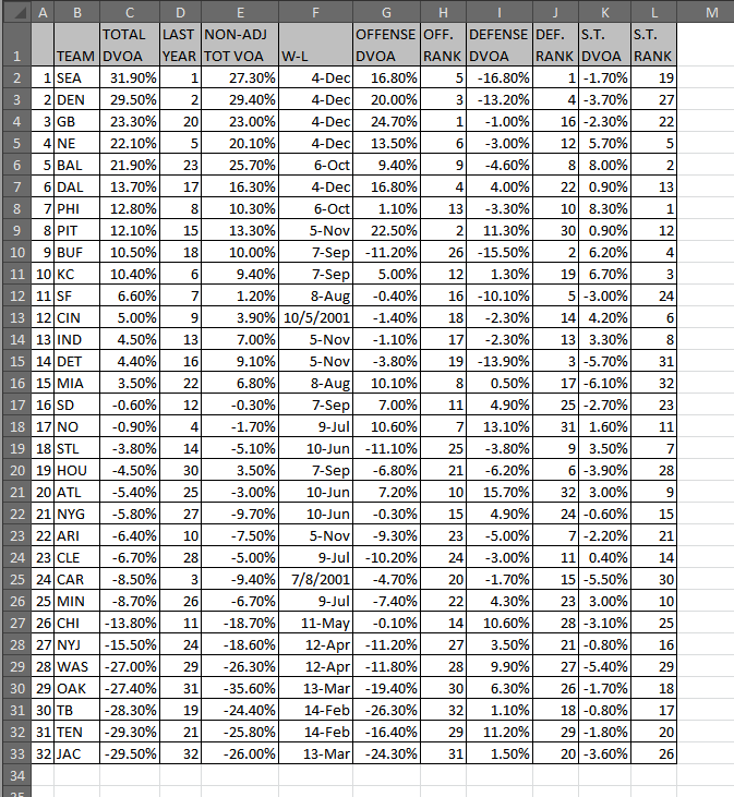
Now, after a little cleaning up — deleting those extra headers in the middle of the data, combining the two-line headers into a single line, and moving those headers above the appropriate column — we have something like this:

Now our data is neater, but it's still too much to digest in one glance.
Now our data is neater, but it’s still too much to digest in one glance.

This is another ordinal setup — except we’re not looking at draft positions, but DVOA* rankings.

*DVOA stands for Defense-adjusted Value Over Average. It’s Football Outsider’s total value measurement, much like WAR is for Baseball-Reference and FanGraphs.

But one of the big problems with an ordinal ranking is that the space between No. 1 and No. 2 may not be the same as between No. 2 and No. 3. So conditional formatting helps us see tiers and groupings much more easily.

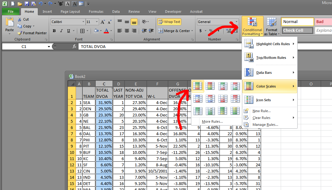
In order to add a conditional format to this data, we just need to highlight the C column and choose Conditional Formatting > Color Scales > the appropriate color scale.

Color scales are the most typical conditional format -- and they tend to be the most useful.
Color scales are the most typical conditional format — and they tend to be the most useful.

Even though we highlighted the entire column, only the rows with data in them show the conditional format.

So that’s how you set up a basic conditional format! You can play around with the different format types and see which ones you like. There’s no harm in slapping a conditional format on top of another conditional format — as long as you have the same cells selected, it will just delete the old format and apply the new one.

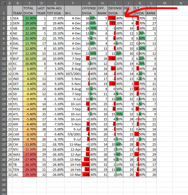
But let’s say you have an issue like we have in Column I:

A negative DVOA on defense is actually a good thing. So I'd rather have those bars appear green.
A negative DVOA on defense is actually a good thing. So I’d rather have those bars appear green.

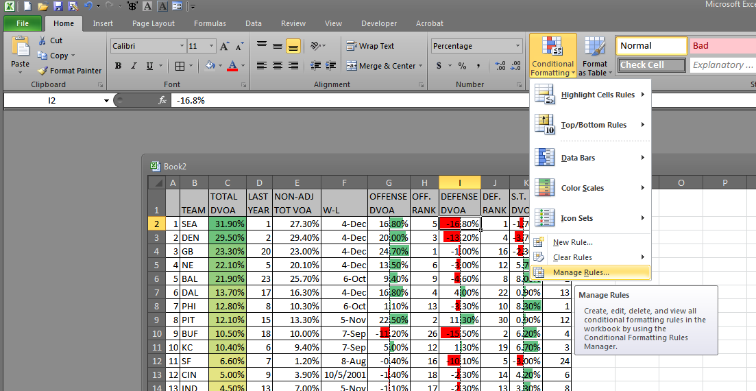
If you ever have a format that’s not working quite right, just click wherever the format is looking weird, and choose “Manage Rules…” from the Conditional Formatting drop down:

If a format is giving you guff, head to the "Manage Rules..." area.
If a format is giving you guff, head to the “Manage Rules…” area.

If you have the delinquent cells selected (and your Conditional Formatting Rules Manager is set to show “Current Selection” rules), you should see the formatting rules in the window:

This is kind of the go-to place for adjusting conditional formats and making really fun and unique formats.

If you double-click on the format name (“Data Bar” in this instance), you will open the “Edit Formatting Rule” window. This window (and the windows nested inside it) allow us to do a lot of fun stuff.

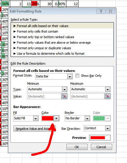
I’m presently happy with most of what’s going on in Column I, so I really only want to change two things: The positive color and the negative color. So in the Edit Formatting Rule window, I will change the bar color to red:

This allows me to change the default bar color. I want red because a positive defensive DVOA is a bad thing.

And then, right beneath that, I’m going to click the “Negative Value and Axis…” in order to change the red bars to green:

After you apply these changes on the Conditional Formatting Rules Manager window, the column should update.

But let’s say I want to do something even more complicated. Let’s say I want to highlight the teams with bad special teams — and I don’t want to just highlight the special teams column. I want the whole row to broadcast the shame of their punters and kickers.

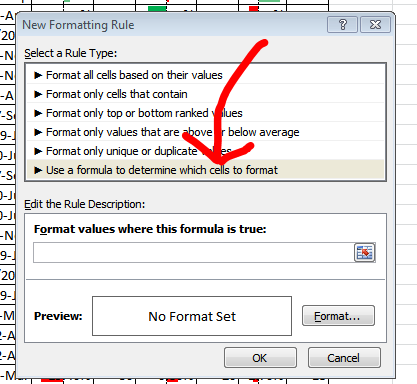
So I’m going to create a special conditional format. First, I’ll highlight the entire table other than the titles (from A2 to L33). Then, I’ll click Conditional Formatting > “New Rule…” to open the New Formatting Rule window.

More complicated conditional formatting will often require formulas.

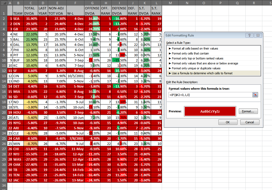
So, because we want everything to look at the K column and change its format based on what’s in the K column, I’m going to write a formula that says:

=IF($K<0,1,0)

All this formula says is:

  • =IF: This creates an IF formula. The syntax asks for (1) a formula that can be proved true or false, (2) a value for if the formula proves true, and (3) a value for if the formula proves false.
  • $K2<0: I’m telling Excel to stay in Column K — that’s what the $ in front of $K means. So if the K columns is negative (<0), then the formula is true. The conditional formatting is going to start with the highest row in the selected area, so since our selection begins with A2, we’ll reference $K2 because that’s on the same row. (If we put $K3, it would look at the row beneath the current row.)
  • 1,0: If the formula is true, then 1. If false, then 0. This tells Excel to apply the conditional format (1) if the formula is true (if Column K is negative), and to not format (0) if the formula is false.

After I enter the desired formula, I will set the formatting. Do whatever you want here. Change the fill. Change the font color. Make it bold. The pop up in the “Format…” window is just a typical Excel formatting window, so it should be easy to navigate.

I went ahead and set the format to a dark red fill and a bold white font. This will make the formatted rows very obvious, but also make the the table really busy visually — but I’m doing this for the learning, not for the beauty.

Anyway, we get this:

NOTE: You will need to hit "OK" and then "Apply Changes" or "OK" before the new format appears.
NOTE: You will need to hit “OK” and then “Apply Changes” or “OK” before the new format appears.

Let’s do one final this: Change format priorities. Notice how our conditional formatting in Column C is getting smushed by our new special teams formatting? Well, that’s no good.

So let’s open the “Manage Rules…” dialogue. then, look at the formatting rules for “This Worksheet”:

Regardless of what cells you have selected, looking at "This Worksheet" will show all the conditional formats on the present tab.
Regardless of what cells you have selected, looking at “This Worksheet” will show all the conditional formats on the present tab.

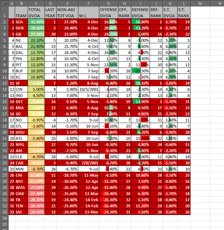
Then, with the special teams format select, let’s press the down button (note the second red arrow above) until it’s at the bottom of the list. Hit Apply or OK and you should get something like this:

Uh oh! The special teams format changed the fonts in Column C too!

This is a good cautionary tale about changing font colors and formats. Since we’re using a simple conditional format for Column C (as in, not a formula-based format), we can’t edit the fonts in that column. So the only real solution is to change the special teams font — or to selectively apply that format.

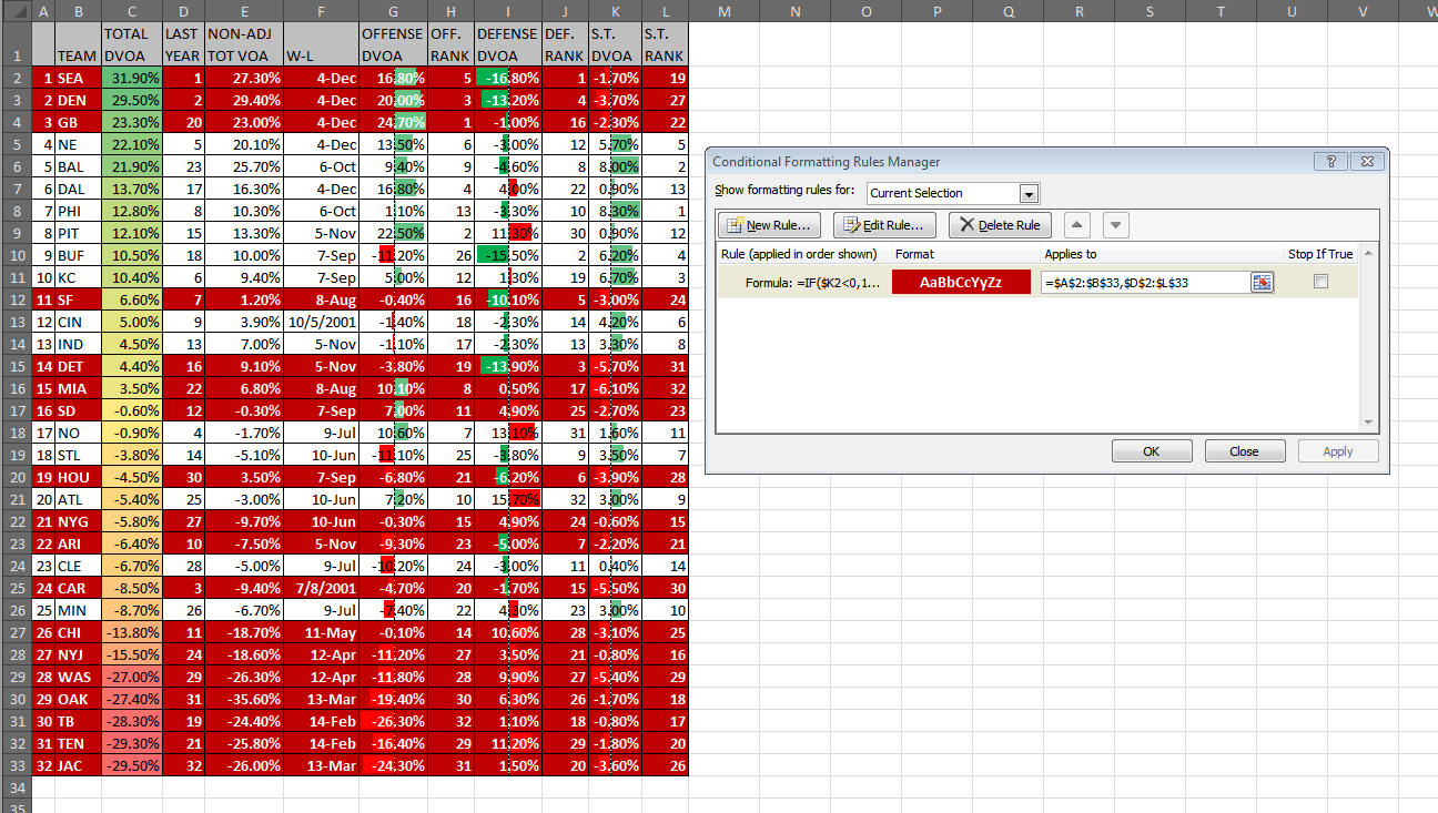
The second option is simple enough. Just open the “Manage Rules…” window and change the selection area for the format:

We can type in the selected areas and separate the selections with a comma, or we can click and drag to select the first area, then -- hold CTRL -- click and drag to select the second area.
We can type in the selected areas and separate the selections with a comma, or we can click and drag to select the first area, then — hold CTRL — click and drag to select the second area.

All we need to do is change the “Applies to” textbox. Once we select the A2 to B33 area and the D2 to L33 area, the weird formatting disappears from Column C.

The final step to using conditional formatting is presenting that data. Microsoft has done a good job catching up with Google Drive and the sort, allowing us to post table and the sort online. Using File > “Save & Send” should direct you to the SkyDrive services that will enable you to post the spreadsheet online. If there’s enough interest, I can walk through the process for this as well.

Anyway, I hope this has been interesting and useful. Happy Exceling!