Archive for Baseball

How To Use R For Sports Stats, Part 2: Visualization and Analysis

Welcome back! In Part 1 of this series, we went over the bare bones of using R–loading data, pulling out different subsets, and doing basic statistical tests. This is all cool enough, but if you’re going to take the time to learn R, you’re probably looking for something… more out of your investment.

One of R’s greatest strengths as a programming language is how it’s both powerful and easy-to-use when it comes to data visualization and statistical analysis. Fortunately, both of these are things we’re fairly interested in. In this post, we’ll work through some of the basic ways of visualizing and analyzing data in R–and point you towards where you can learn more.

(Before we start, one commenter reminded me that it can be very helpful to use an IDE when coding. Integrated development environments, like RStudio, work similarly to the basic R console, but provide helpful features like code autocompletion, better-integrated documentation, etc. I’ll keep taking screenshots in the R console for consistency, but feel free to try out an IDE and see if it works for you.)

Look At That Data

We’ll be using the same set of 2013-14 batter data that we did last time, so download that (if you haven’t already) and load it back up in R:

fgdata = read.csv("FGdat.csv")

Possibly my favorite thing about R is how, often, all it takes is a very short function to create something pretty cool. Let’s say you want to make a histogram–a chart that plots the frequency counts of a given variable. You might think you have to run a bunch of different commands to name the type of chart, load your data into the chart, plot all the points, and so on? Nope:

hist(fgdata$wRC)
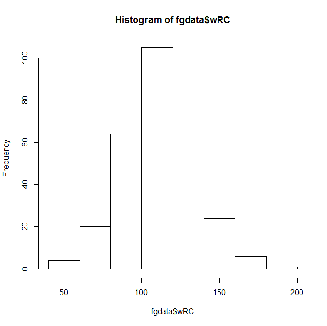
Basic R histogramThis Instant Histogram(™) displays how many players have a wRC+ in the range a given bar takes up in the x-axis. This histogram looks like a pretty normal, bell-curveish distribution, with an average a bit over 100–which makes sense, since the players with a below-average wRC+ won’t get enough playing time to qualify for our data set.

(You can confirm this quantitatively by using a function like summary(fgdata$wRC).)

The hist() function, right out of the box, displays the data and does it quickly–but it doesn’t look that great. You can spend endless amounts of time customizing charts in R, but let’s add a few parameters to make this look nicer.

hist(fgdata$wRC, breaks=25, main="Distribution of wRC+, 2013 - 2014", xlab="wRC+", ylab= NULL, col="darkorange2")

In this command, ‘breaks’ is the number of bars in the chart, ‘main’ is the chart title, ‘xlab’ and ‘ylab’ are the axis titles, and ‘col’ is the color. R recognizes a pretty wide range of colors, though you can use RGB, hex, etc. if you’re more familiar with them.

Anyway, here’s the result:

Visually appealing R histogramA bit better, right? The distribution doesn’t look quite as normal now, but it’s still pretty close–we can actually add a bell curve to eyeball far off it is.

hist(fgdata$wRC, breaks=25, freq = FALSE, main="Distribution of wRC+, 2013 - 2014", xlab="wRC+", ylab= NULL, col="darkorange2")
curve(dnorm(x, mean=mean(fgdata$wRC), sd=sd(fgdata$wRC)), add=TRUE, col="darkblue", lwd=2)
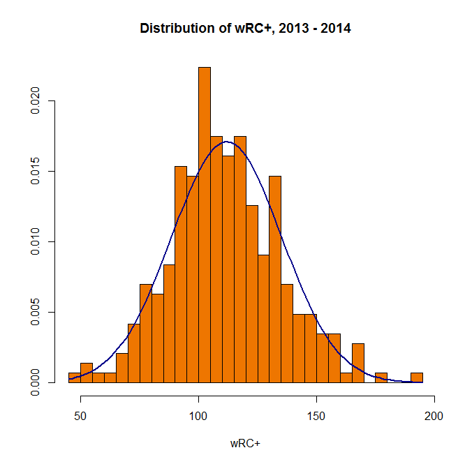
Visually appealing R histogram with curve

(In the first line above, “freq = FALSE” indicates that the y-axis will be a probability density rather than a frequency count; the second line creates a normal curve with the same mean and standard deviation as your data set. Also, it’s blue.)

You can also plot multiple charts at the same time–use the par(mfrow) function with the preferred number of rows and columns:

par(mfrow=c(2,2)) 
hist(fgdata$wOBA, breaks=25) 
hist(fgdata$wRC, breaks=25) 
hist(fgdata$Off, breaks=25) 
hist(fgdata$BABIP, breaks=25)
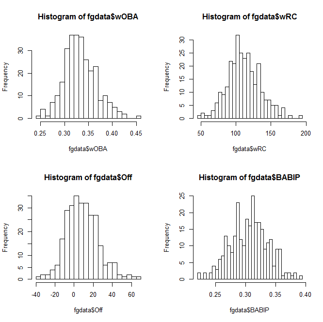
2x2 grid of R histogramsWhen you want to save your plots, you can copy them to your clipboard–or create and save an image file directly from R:

png(file="whatisitgoodfor.png",width=400,height=350)
hist(fgdata$WAR, breaks=25)
dev.off()

(It’ll show up in the same directory you’re loading your data set from.)

So that covers histograms. You can create bar charts, pie charts, and all of that, but you’re probably more interested in everyone’s favorite, the scatterplot.

At its most basic, the plot function is literally plot() with the two variables you want to compare:

plot(fgdata$SLG, fgdata$ISO)
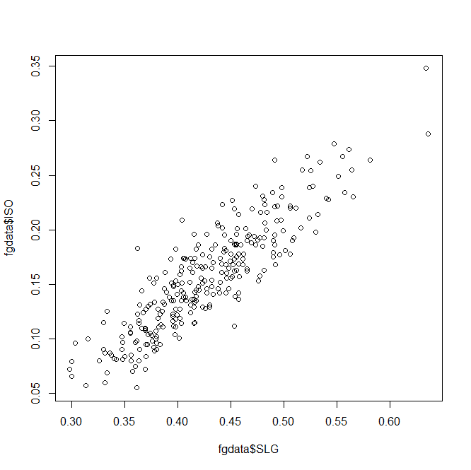
Basic R scatterplot
Unsurprisingly, slugging percentage and ISO are fairly well-correlated. Results-wise, we’re starting to push against the limits of our data set–too many of these stats are directly connected to find anything interesting.

So let’s take a different tack and look at year-over-year trends. There are several ways you could do this in R, but we’ll use a fairly straightforward one. Subset your data into 2013 and 2014 sets,

fg13 = subset(fgdata, Season == "2013")
fg14 = subset(fgdata, Season == "2014")

then merge() the two by name. This will create one large dataset with two sets of columns: one with a player’s 2013 stats and one with their 2014 stats. (Players who only appeared in one season will be omitted automatically.)

yby= merge(fg13, fg14, by=("Name"))
head(yby)
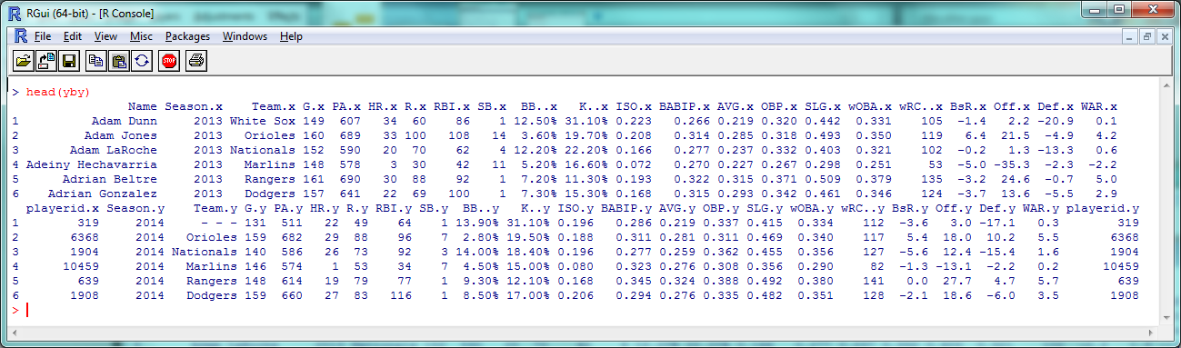
Year-by-year dataAs you can see, 2013 stats have an .x after them and 2014 stats have a .y. So instead of comparing ISO to SLG, let’s see how ISO holds up year-to-year:

plot(yby$ISO.x, yby$ISO.y, pch=20, col="red", main="ISO year-over-year trends", xlab="ISO 2013", ylab="ISO 2014")
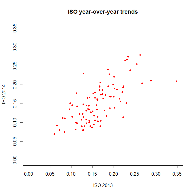
Visually appealing R scatterplot(The ‘pch’ argument sets the shape of the data points; ‘xlim’ and ‘ylim’ set the extremes of each axis.)

Again, a decent correlation–but just *how* decent? Let’s turn to the numbers.

Relations and Correlations

If you’re a frequent FanGraphs reader, you’re probably familiar with at least one statistical metric: r², the square of the correlation coefficient. An r² near 1 indicates that two variables are highly-correlated; an r² near 0 indicates they aren’t.

As a refresher without getting too deep into the stats: when you’re ‘finding the r²’ of a plot like the one above, what you’re usually doing is saying there’s a linear relationship between the two variables, that could be described in a y = mx + b equation with an intercept and slope; the r² is then basically measuring how accurately the data fits that equation.

So to find the r² that we all know and love, you want R to create a linear model between the two variables you’re interested in. You can access this by getting a summary of the lm() function:

summary(lm(yby$ISO.x ~ yby$ISO.y))

R linear model summaryThe coefficients, p-values, etc., are interesting and would be worth examining in a more theory-focused post, but you’re looking for the “Multiple R-squared” value near the bottom–turns out to be .4715 here, which is fairly good if not incredible. How does this compare to other stats?

summary(lm(yby$BsR.x ~ yby$BsR.y))
> Multiple R-squared:  0.4306
summary(lm(yby$WAR.x ~ yby$WAR.y))
> Multiple R-squared:  0.1568
summary(lm(yby$BABIP.x ~ yby$BABIP.y))
> Multiple R-squared:  0.2302

BsR is about as consistent as ISO, but WAR has a smaller year-to-year correlation than you might expect. BABIP, less surprisingly, is even less correlated.

Let’s do one more basic statistical test: the t-test, which is often used to see if two sets of numeric data are significantly different from one another. This isn’t as commonly seen in sports analysis (because it doesn’t often tell us much for the data we most often work with), but just to run through how it works in R, let’s compare the ISO of low-K versus high-K hitters. First, we need to convert the percentages in the K% column to actual numbers:

fgdata$K. = as.numeric(sub("%","",fgdata$K.))/100

then subset out the low-K% and high-K% hitters:

lowk = subset(fgdata, K. < .15)
highk = subset(fgdata, K. > .2)

Then, finally, run the t-test:

t.test(lowk$ISO, highk$ISO)
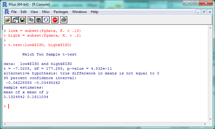
R T-test resultsThe “p-value” here is about 4.5 x 10^-11 (or 0.000000000045); a p-value less than .05 is generally considered significant, so we can consider this evidence that the ISO of high-K% hitters is significantly different than that of low-K% hitters. We can check this out visually with a boxplot–and you thought we were done with visualization, didn’t you?

boxplot(lowk$ISO, highk$ISO, names=c("K% < 15%","K% > 20%"), ylab="ISO", main="Comparing ISO of low-K% vs. high-K% batters", col="goldenrod1")
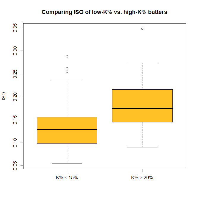
Visually appealing R boxplotSo now you can do some standard statistical tests in R–but be careful. It’s incredibly tempting to just start testing every variable you can get your hands on, but doing so makes it much more likely that you’ll run into a false positive or a random correlation. So if you’re testing something, try to have a good reason for it.

…And Beyond

We’ve covered a fair amount, but again, this only begins to cover the potential R provides for visual and statistical analysis. For one example of what’s possible in both these areas, check out this analysis of an online trivia league that was done entirely within R.

If you want to replicate his findings, though (which you can, since he’s posted the code and data online!), you’ll need to install packages, extensions for R that give you even more functionality. The ggplot2 package, for example, is incredibly popular for people who want to create especially cool-looking charts. You can install it with the command

install.packages("ggplot2")

and visit http://ggplot2.org/ to learn more. If R doesn’t do something you want it to out of the box, odds are there’s a package out there that will help you.

That’s probably enough for this week; here’s the script with all of this week’s code. In our next (last?) part of this series, we’ll look at taking one more step: using R to create (very) basic projections.

Independent Baseball’s Newest Umpire Isn’t Human

A simple Twitter search of #RobotUmpsNow or #UmpShow will show fans have been clamoring for an electronic umpire for the strike zone — among other things — for some time. While major league baseball isn’t quite ready to make that jump just yet — nor are any affiliated minor league clubs — there is one hero ball club we can turn to. The vaunted San Rafael Pacifics of the Pacific Associate of Professional Baseball are set to debut a strictly PITCHf/x umpire for tonight’s and tomorrow’s game.

SportsVision, creators and owners of PITCHf/x, are working alongside the Pacifics in handing off the task of calling balls and strikes to the system, though former major league player Eric Byrnes will be on hand for assistance should either team object to the system’s judgement. The two-game affair is designed to raise money for the Pat Tillman Foundation and for each called ball or strikeout, Byrnes will donate $100 to the foundation. If either coach disagrees with the strike zone, Byrnes has the option to eject a player or manager, and in doing so would then donate $10,000 to the foundation for each person tossed from the game.

Given PITCHf/x’s enormous popularity among statistically-inclined baseball fans — including but not limited to Brooks Baseball, Baseball Heat Maps, Texas Leaguers and Baseball Savant — seeing progression towards a computerized  strike zone, even in a charitable role, is amazing. The three camera system on hand for the Pacifics is set to capture a triangulated zone, and since three cameras are better than two eyes, we’ll see an automated strike zone for the first time in organized baseball.

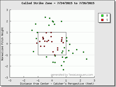
The need for an automated zone is pretty clear, especially when we have the technology to review missed calls in near real time. For example look no further than Jeff Sullivan’s posts on The Worst Called Strike/Ball of the First Half, or more recently, let’s observe one of Sunday’s games. Danny Salazar of the Cleveland Indians started the game, and according the PITCHf/x system over at Texas Leaguers, he may have been robbed of a handful of calls at a very important point in the game.

salazar

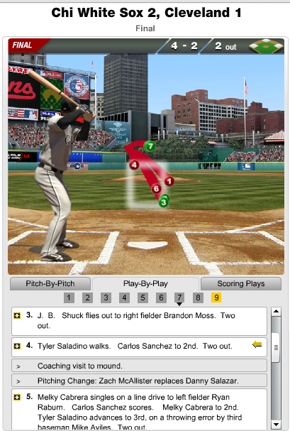
It looks as though three pitches touched the strike zone that were called a ball with an additional trio of pitches in the zone that were called balls. It’s hard to boil down a game to a single pitch, however one pitch can be the difference between walking back to the dugout after the third out or being lifted with two outs and runners on. The latter situation actually happened, and thanks to MLB’s Gameday, we can see the events unfold.

salazar1

Salazar gets ahead of Tyler Saladino 0-1 before the second and third pitches, both appearing to be in the strike zone get called balls. Salazar does well to even things a 2-2, however he probably should have been out of the inning with the score still tied at one apiece. The calls don’t go his way and Zach McAllister comes on to relieve Salazar, who was at 113 pitches, and promptly gave up the tying run. Again, it’s one pitch, but it was arguably the sequence of events that decided the game.

The Indians and the White Sox are both likely outside of the playoff picture at this point, however that shouldn’t be the focus. Given that we have the technology to get the calls correct, it’s awfully disappointing to only see Independent baseball willing to go with an automated system. As Ken Jennings once wrote, I for one, welcome our new computer overlords.

(Header image via the Pacifics’ website)

How To Use R For Sports Stats, Part 1: The Absolute Basics

If you’ve spent a sufficient amount of time messing around with sports statistics, there’s a good chance the following two things have happened, in order:

  1. You probably started off with Excel, because Excel does a lot of stuff pretty easily and everyone has Microsoft Office.
  2. At some point, you mentioned to someone that you use Excel to do statistical analysis and got a response along the lines of, “Oh, that’s cool, but you should really be using R.”

Politeness issues aside, they might well be right.

R is a programming language and software platform commonly used, particularly in research and academia, for data analysis and visualization. Because it’s a programming language, the learning curve is a bit steeper than it is for something like Excel–but if you dig into it, you’ll find that R makes it possible to do a wider variety of tasks more quickly. If you’re interested in finding interesting insights with just a few lines of code, if you want to easily work with large sets of data, or if you’re interested in using most any statistical test known to man, you should take a look at R.

Also, R is totally free, both as in “open-source” and as in “costs no money”. So that’s nice.

In this series, we’ll learn the basics of working in R with the goal of exploring sports data—baseball, in particular. I’m going to presume that you have no background whatsoever in coding or programming, but to keep things moving, I’ll try not to get too bogged down in the details (like how “=” does something different from “==”) unless absolutely necessary. This guide was made using R on Windows 7, but most everything should be the same on whatever OS you use.

Okay, let’s do this.

Getting Started

You can download R from https://cran.rstudio.com/.

You’ll have to click on a few links (you want the ‘base’ install) and actually install R, but once that’s done you should have a screen that looks like:

Screenshot #1: R consoleThe “R console” is where your code is soon going to run–but first, we need some data. Let’s take FanGraphs’ standard dashboard data for qualifying MLB batters in 2013 and 2014. Save it as something short, like “FGdat.csv”. (If you have a custom FG dashboard or just want to take a shortcut, you can just download the data we’ll be using here.)

In R, we’ll be focusing mostly on functions (that look like, say, function(arg1, arg2)), which are what actually do things, and naming the output of these functions so we can refer back to it later. For example, a line of R code might look like this:

fgdata = read.csv("FGdat.csv")

The function here is the read.csv(), which basically means “read this CSV file into R”, and the argument inside is the file that we want to read. The left part (fgdata =) is us saying that we want to take the data we’re reading and name it “fgdata”.

This is, in fact, the first line we want to run in R to load our data, so type/paste it in and hit Enter to execute it.

(You may get an error like cannot open file ‘FGdat.csv’: No such file or directory; if you do, you likely need to change the directory that R is trying to read files from. Go to “File” -> “Change dir”, and change the working directory to the folder you saved the CSV in, or just move the CSV to the folder R has listed as the working directory.)

If you didn’t get an error and R simply moves on to the next line, you should be good to go!

Basic Stats

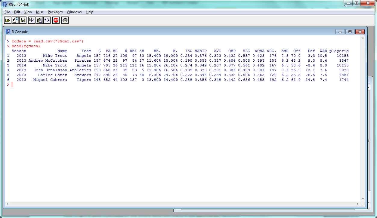
The head() function returns the first 6 rows of data; since our data set is named “fgdata”, we can try this out with the line of code:

> head(fgdata)

R Screenshot #2: head(fgdata)And to get a basic overview of the entire data set, there’s the summary() function:

> summary(fgdata)

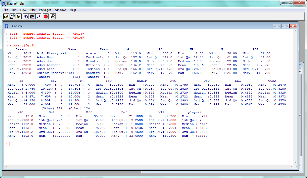
R Screenshot #3: summary(fgdata)See! Already, data on 20 variables in the blink of an eye.

“1st Qu.” and “3rd Qu.” are the first and third quartiles; the mean, median, minimum and maximum should be self-explanatory. So we can see that the average player in this data set had roughly a .270 average with 17 dingers and 10 steals in 146 games–not far from Alex Gordon’s 2014, basically.

Want to compare how the 2013 and 2014 stats stack up? R makes it pretty easy to pick out subsets of data. It’s called, reasonably, the “subset” function, and all you need to include is the data set you’re taking a subset of and the criteria the subset data should conform to.

Since we have “Season” as a field in the table, we just need to say “Season == “2013”” to get the 2013 players and “Season == “2014”” to get the 2014 players. We’ll name these new data sets ‘fg13’ and ‘fg14’:

> fg13 = subset(fgdata, Season == "2013")
> fg14 = subset(fgdata, Season == "2014")

A quick check should confirm that, yes, the data did subset correctly:

> summary(fg13)

R Screenshot #4: summary(fg13)and now we can do some basic statistical comparisons, like comparing the mean BABIPs between 2013 and 2014. (To single out a specific column in a data set, use the $ symbol.)

> mean(fg13$BABIP)
> mean(fg14$BABIP)

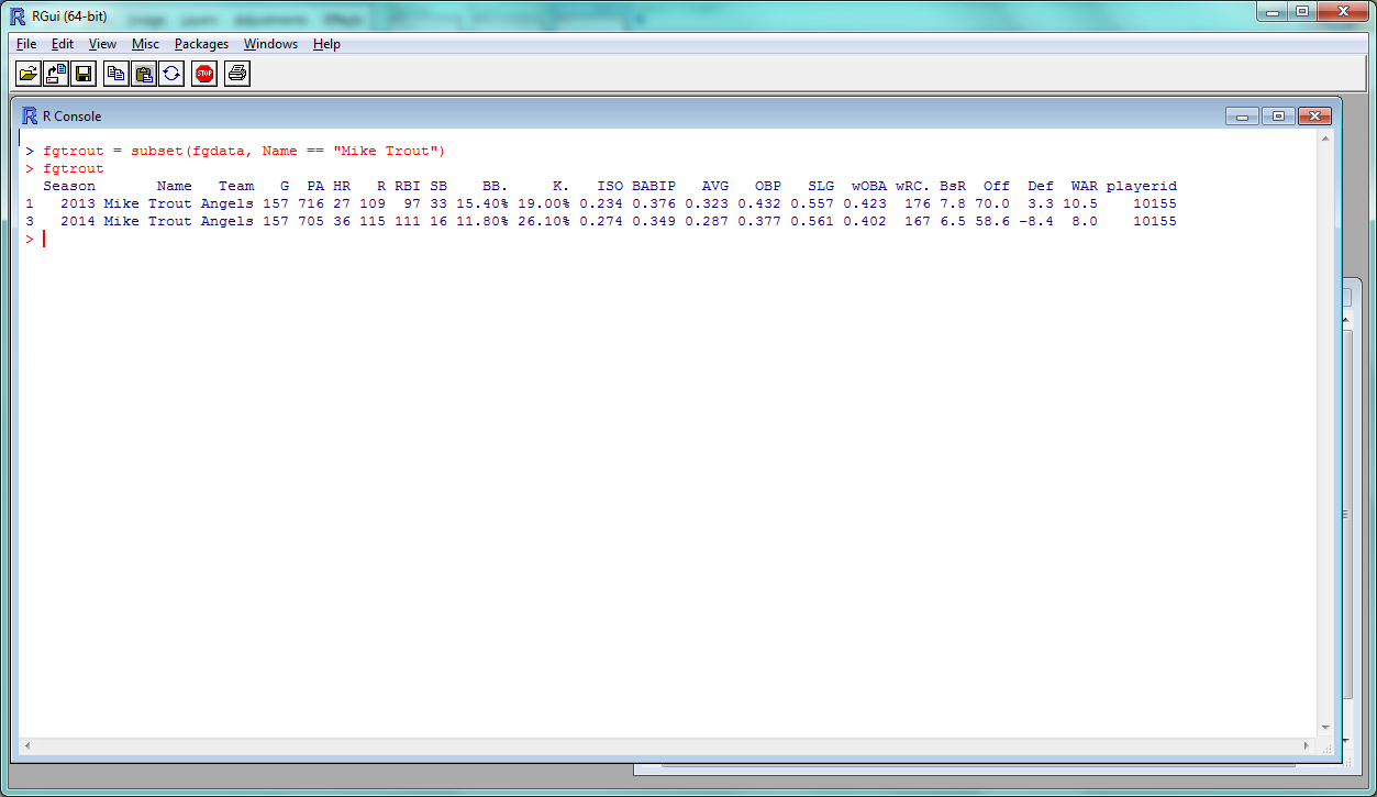
You can do whatever basic statistical tests you like–sd() for the standard deviation, et cetera–and pull out different subsets of the data based on whatever criteria you like. So “HR > 20” for all players who hit more than 20 home runs, or “Player == “Mike Trout”” to get data for all players named Mike Trout:

> fgtrout = subset(fgdata, Name == "Mike Trout")
> fgtrout

R Screenshot #5: fgtroutLastly, it’s not too common to need to reorder your data in R, but if you do, you can do so with the order() function. This line sorts the data by wRC+, ascending order:

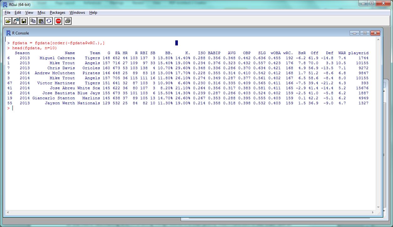
> fgdata = fgdata[order(fgdata$wRC.),]

then returns the top 10 rows:

> head(fgdata, n = 10)

You can sort in descending order by placing a minus sign before the column:

> fgdata = fgdata[order(-fgdata$wRC.),]

R Screenshot #6: head(fgdata, n = 10)And, as you’ve probably noticed, most of these functions can be tweaked or expanded depending on the different arguments you use–adding “n = 10” to head(), for example, to view 10 rows instead of 6. One of the more fascinating and infuriating things about R is that pretty much every function is like that–but at least they’re all documented!

And, of course, you can access the documentation through a function. Use help() (help(head), help(summary), etc.) and a page will pop up with the arguments, and more additional details than you probably ever wanted.

Wrap-up

One final note: typing code directly into the console is fine, but it gets a bit annoying if you want to write more than a line or two. Instead, you can create a new window within R to load, edit and run scripts. In Windows, use “Ctrl+N” to open a new script window. Type some code; to run it, highlight the lines you want to run and hit “Ctrl+R”.

You can also use these windows to save your R script in R files–as I’ve done here for all the code used in this article. Feel free to download and start tinkering.

So those are the basics of R; not enough to really show its potential, but enough to start experimenting and exploring as you wish. For Part 2, we’ll start some data plotting and correlation tests, and in Part 3 we’ll try to recreate some basic baseball projection models. I actually haven’t done this before in R, so it should be interesting. Stay tuned!

(Thanks to Jim Hohmann for helping test this article.)


Review: Motus Global’s mThrow

When Motus Global’s sleeve was announced last spring, it was supposed to save baseball, stemming the flood of Tommy John surgeries plaguing the majors. Now, the device that teams have been using to study their pitchers’ mechanics since last fall is available to the public. The mThrow has been on sale through the Motus website since March, and began shipping in early May. Eager to see what the device had to offer, I plunked down the $150 (plus $20 for an additional compression sleeve) and waited anxiously.

The box that the mThrow comes in is taken up mostly by the compression sleeve. The actual IMU — the sensor that actually tracks the arm’s motion — is a tiny blue thing, about the size and shape of a circus peanut*. The IMU charges by induction, so all the user has to do is plug in the charging station, place the sensor on top of the station, and wait about an hour.

* – But slightly better-tasting.

Pairing the sensor is simple, too, taking just a few taps of the smartphone app. The hardest part of setting the thing up is probably wedging the sensor into its little pocket in the compression sleeve, and then pulling the sleeve on so that the sensor rests over the infamous ulnar collateral ligament. In fact, the design might be overly simplified. In an effort to make the sensor more water-resistant, there are no lights on the sensor to tell the user of the charge level. The only way to check is to pair the sensor with the smartphone app; if the app doesn’t recognize the sensor, it probably needs to be re-charged.

The app is currently available only for the iPhone; an updated version was approved this week. The software now computes five metrics from the sensor data: pitch count; maximum arm speed, a rotational velocity measured in revolutions per minute; arm slot at release; maximum shoulder rotation relative to initial position; and, of course, torque on the UCL. These are then combined into three headline numbers: performance, a measure of mechanical consistency; workload, currently an additive function of elbow torque; and a “throw meter,” an energy bar that drains from blue to orange as the workload increases and consistency decreases.

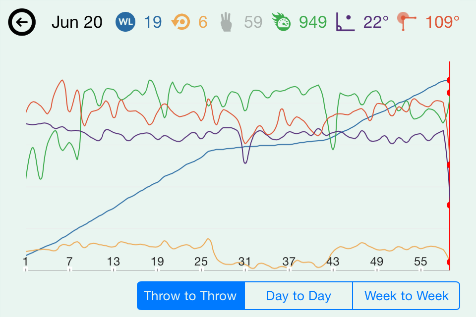
I ran some preliminary testing of the mThrow, connecting it to an iPhone 4S and throwing 17 fastballs, 17 changeups, and 17 curveballs to the best of my extremely limited ability; all but six throws were recorded. Even if there’s no difference between their speeds and movement, you can still see a difference between my initial warmup tosses (the first dozen, with much lower arm speeds), fastballs (about 13-25), curveballs (26-43, with much lower torque values), and changeups (44 onward, with decreased arm speeds).

image2
This simple relationship was confirmed with a second test using a HitTrax system, which can track speed and late break of pitches as they cross the plate. My subject was a 45-year-old with some collegiate pitching experience who threw ten fastballs and ten curveballs. By comparing the HitTrax velocity report (right) to the mThrow statistics (left), we can see the correlation between the decrease in arm speed and the decrease in velocity as the subject switched from fastball to curves.

donfrancesco
Lastly, I brought the sleeve to a local high school (Blackstone Valley Tech, Upton, MA) to get some insights from active players. Assistant coach John Burke, pitcher Nick Laren, shortstop Joe Corsi, and catcher Jack Lynch took turns throwing an assortment of pitches from a number of release points, seeing how their throwing motions stacked up. The session supported some beliefs — for instance, that the quick motion Lynch uses to throw out would-be base stealers puts more torque on the elbow than a standard pitching delivery. But others were surprisingly contradicted: despite everyone’s belief that sidearm throws put less stress on the elbow than an over-the-top delivery, the app didn’t seem to report a relationship between arm slot and torque.

Chief technology officer Ben Hansen says the mThrow is still in its infancy, and says that the device’s official consumer launch is not scheduled until later this summer. The app currently relies on data compiled from Motus Global’s work with MLB prospects at last fall’s instructional league to generate its workload number, but Hansen and his team are working to produce more meaningful metrics from a more complete data set.

“We’re just capturing as much data as we can to see what’s normal,” Hansen said. “We also have controlled studies going on at every level. We have [NCAA] D1, D3, high school, and Little League players wearing it religiously.”

At this early stage, the app seems to be designed more for Motus’s professional clients than for public users. Maybe the best example of this is the tagging feature, which allows users to tag individual throws as belonging to bullpen sessions, long toss, or game action, and to further break throws down by pitch type. But at the moment, the tags are unavailable to the user after selection, getting passed on to Motus Global with the sensor data but not visible on any of the trend screens. Hansen confirmed that the tags were being used in the company’s research for their MLB clients, however.

“Every week we send reports broken down by tags where we compared each pitcher to the league averages for that pitch type,” Hansen said. “The teams love using the tags and breaking things down into the different pitch types.”

It’s a tantalizing view of an exciting feature that could still be a couple years away. And it’s not just super dorks like me who would find those analytics useful. The key to a good changeup is matching the same arm speed used to throw a fastball, so it’s easy to see coaches like Burke using the arm speed metric to give feedback to young pitchers just learning to throw the pitch. But without any way to divide pitches into different categories, this sort of feedback isn’t possible yet.

“We are looking into a web portal to give users more in-depth analytics,” Hansen said. “But right now we’re focused on getting the analytics right before we move on to other platforms.”

It’s probably still too early to judge the mThrow fairly, and I’m almost definitely not the right person to do it (sabermetrically-inclined tech geeks who can’t pitch are not Motus’s target market). And it’s true that more research could produce findings that actually help young pitchers stay on the field and off the operating table. But as currently constructed, the mThrow raises more questions than it answers, and left me wanting more. Like a top pitching prospect, the technology needs some time to mature before it can make a meaningful contribution.


KinaTrax Gives Rays In-Game Markerless Motion Capture Data

In an effort to keep their pitchers healthy, the Tampa Bay Rays have enlisted the services of markerless motion capture company KinaTrax. As Jeff Passan of Yahoo! Sports reported Monday, the Rays are the first team to partner with the Philadelphia-based company.

When asked about the technology Tuesday, KinaTrax founder Michael Eckstein was reluctant to reveal much of the technology that drove his company’s system. Images from “multiple cameras” positioned throughout the ballpark (an earlier test used eight) are stitched together to create an unobstructed, 360-degree view of the pitcher. Eckstein compared his system to the commercially-available Microsoft Kinect, which uses infrared and sonar tracking to capture a user’s position for video gaming or other applications.

“The Kinect has a focal length of 8 to 14 feet, and captures 30 frames per second,” Eckstein said. “The challenge is, how do you scale that up to an MLB stadium, where you have to capture 275 to 300 frames per second from 350 feet away?”

Once the data is collected and uploaded to cloud storage, “proprietary algorithms” are then used to identify the position of body landmarks like joints and calculate the distances, angles, velocities, and accelerations between the various body segments. In an earlier talk at the 2013 SABR Conference in Philadelphia, Eckstein claimed that the positions measured by the system were accurate to within 1.5 centimeters.

It is probably no surprise that capturing such detailed visual information hundreds of times per second is a costly process. Eckstein estimates that a typical game could produce up to 1.4 terabytes of data. The data is owned by the teams — since it identifies each pitcher and is thus considered medical information, even KinaTrax can’t access it without permission once it’s collected. For teams unable to work with the raw data, KinaTrax can also develop reports on key metrics; Eckstein said in his 2013 presentation his system was capable of generating these reports overnight.

“Some teams have the ability and the staff to say, ‘We want these kinds of reports, and these kinds of analytics,’ and then we can go out and produce them,” Eckstein said. “And then if teams have very qualified staff, they’ll get the raw data to work with themselves.”

Although KinaTrax worked with the Mets in 2013 to develop their system, Tampa Bay is the first major-league team to install the system and collect game data. And while it’s too early to draw any conclusions from the data collected by the system, Eckstein is happy with KinaTrax’s early performance.

“We’ve successfully recorded thousands of pitches, and the system is working as expected,” he said.

According to Eckstein, KinaTrax had discussed possible arrangements with 17 MLB teams between the Winter Meetings, Cactus League, and Grapefruit League before finally coming to an agreement with the Rays. Eckstein was excited about working with the Rays, praising their front office acumen and even the symmetrical shape of Tropicana Field (which made camera installation easier).

“The Rays are among those top major-league teams that understand what we’re doing and have an understanding of big data,” Eckstein said. “We couldn’t ask for a better team for our pilot.”

Teams have already proposed a number of different uses for the system. For major league pitchers, teams could use the system to demonstrate “best practices,” and highlight the subtle changes in mechanics that could separate a great outing from a poor one. But Eckstein also discussed the possibility of installing the cameras in minor-league parks, allowing teams to better teach proper mechanics to young arms while also developing “longitudinal patient records” of changes to a pitcher’s kinematics over time.

“All of the teams we’re speaking to want them in their major league stadiums,” Eckstein said. “But the really innovative teams tell me, ‘Where we will get the most benefit out of this is with our Single-A or Double-A teams.'”

Once installed, the system can also be adjusted to capture mechanics in bullpen sessions, and could be modified to track hitters’ swing mechanics. For now, though, KinaTrax is primarily focused on the action on the pitcher’s mound.

“There’s a consensus among teams about this anecdotal evidence of pitchers who are great in their bullpens but then lose it on the mound,” Eckstein said. “But truth be told, it’s the in-game information that managers, coaches, and scouts are after.”

Before founding KinaTrax, Eckstein worked in the technology sector for 25 years, helping companies figure out how to use technology to develop competitive advantages. A baseball fan, Eckstein found himself at a lunch with a Phillies senior executive in 2012, and the conversation turned to Roy Halladay’s early-season struggles.

“He said, ‘Wouldn’t it be great if we had a way to measure his mechanics and see what he’s doing wrong?'” Eckstein said. “And I said, ‘Oh, this will be easy. We’ll go to Microsoft and they’ll come up with something.'”

It wasn’t that easy, of course. The leap from the existing technology to in-game motion capture from hundreds of feet away required the development of an entirely new technology platform, which became the basis for KinaTrax.

Before Monday, KinaTrax first announced itself at the 2013 SABR Conference in Philadelphia, where Eckstein gave a talk and brief demonstration on his system. At the time, KinaTrax had persuaded the Mets to let them test their camera system in Citi Field. The eight-camera test was successful, but no actual game data were recorded.

Now that the word is out on KinaTrax, Eckstein plans to return to the Winter Meetings and put his newly-tested product before the decision-makers in MLB front offices.

“We’re going to have serious discussions with teams about agreements for the 2016 season,” he said.

But go on the company’s website and you’re greeted not by a picture of a Major Leaguer or of Tropicana Field but by a youth baseball pitcher. This is not just a nice image: Eckstein said KinaTrax is planning to scale its system down for college, high school, and even youth-level teams.

“Clearly the arm motion is very different for an eight or 12-year-old versus a major league pitcher,” Eckstein said. “But we feel that with the nuggets we’ve learned, and with cameras that don’t have to capture 275 to 300 frames per second and don’t have to be 350 feet away, we can bring the price of the system down to that level.”


Blast Motion Sensor Augments Metrics with Adaptive Video

The first thing to keep in mind about Blast Motion’s sensor is that it’s not just designed for baseball. Yes, like the Diamond Kinetics SwingTracker, you can attach the sensor to the end of a bat to track swing speed and direction. And like the Zepp sensor, the Blast sensor can also be used to track a golf swing. But Blast’s approach revolved around designing a high-quality, general purpose sensor, and then building specific applications for baseball, basketball, golf, action sports, and athletic performance around it.

“We didn’t approach this as trying to design a swing sensor or a specific sport product,” senior director of marketing Donovan Prostrollo said. “What we designed it to do was to be a natural motion capture product, and then we applied that to different sports, so it doesn’t pigeonhole our product.”

At the heart of the Blast sensor are inertial measurement units (IMUs), the combination of accelerometers, gyroscopes, and magnetometers that have become ubiquitous in devices like smartphones and tablets. But Blast has made two improvements to make the device more accurate. First, Blast Motion uses multiple IMU chips (although they wouldn’t disclose how many) to capture a wider range of movements. Second, the Blast sensor was also designed to use what founder Mike Bentley referred to as “tactical-grade” technology, a combination of more precise sensors, more processing power, and on-the-fly calibration that improves the device’s accuracy and consistency from one movement to the next.

But despite the intense technological focus, both Bentley and Prostrollo stressed the importance of keeping their outputs simple for the end user.

“You’ll find other solutions out there really overwhelm users with numbers, which is both good and bad, because if users don’t know which number to focus on, you’re not really helping them, you’re actually potentially making it worse,” Prostrollo said.

“At the end of the day, [the athletes] would love the technology to just completely disappear,” Bentley added. “And that’s one of the goals of Blast is how do we make the device disappear.”

When compared to other bat sensor apps, Blast lacks the three-dimensional rendering of the swing. Instead, the Blast app revolves around video, typically captured by setting the device on a tripod and automatically clipped so that only the events of interest are included. Prostrollo argued that the focus on video gave Blast an edge in capturing the entire movement, not just key metrics.

“We decided from the beginning to capture video and do it natively as part of the app so it’s really integrated into our DNA,” Prostrollo said. “And the cool thing about that is when you pair video and you compare the level of consistency out of our product it really does an amazing job.”

And Blast recently announced an adaptive slow-motion feature that adjusts the playback speed around the event.

“Basically, we know exactly when the impact occurred, when the swing started, and when the swing ended, and based on that we can speed up and slow down the video,” Prostrollo said. “We can also take the metrics and overlay them on top to get this dynamic fill, so it’s not just a metric in isolation.”

Blast verified the accuracy of its metrics using motion capture systems. As an example, Prostrollo said the system was within 1 mph of the motion capture system “85 percent of the time” and Bentley claimed that the Blast system “outperforms our optical system when you talk about rotational velocity” as verified by higher-end devices more commonly used to test aeronautical and military-grade IMUs.

Bentley and Prostrollo stressed not only the device’s accuracy but also the device’s consistency, so that identical swings or jumps would produce identical sensor readings. They attributed this consistency to improvements in their manufacturing process, and claimed it made a big difference to the professional athletes they collaborated with.

“The challenge is pro athletes absolutely can recognize that day one, the amateur athletes won’t necessarily realize that a product’s not as accurate as they want until it’s too late: they’ve purchased it, they’ve gone out, they’ve tried it, and they wonder why their swing speed varies by 6 mph when it’s all the same,” Prostrollo said.

Despite being a relatively new company, the founders of Blast Motion have been in the inertial sensor business for a quarter of a century. Before entering the sports world, their focus included military and medical products.

“This is not the first sensor we’ve ever manufactured,” Bentley said. “When we originally designed the sensors, it wasn’t for a single application. We wanted to be able to use the sensor and cross-pollinate across all applications.”

As Blast Motion began adapting its offerings for new markets, it worked with coaches, professionals, and other subject matter experts to design useful applications. But Bentley said there was a lot of overlap between the biomechanical elements underlying the different sports. Even more surprising, he said, was the overlap between social circles across different sports.

“What’s pretty unique about when you do get into the inertial world of working with different professional teams, how many baseball players work with professional golfers, and how many golfers play with hockey players,” Bentley said. “So the world is pretty small, and when you get a pretty exciting product, the word travels pretty fast in those worlds.”

The company currently works with a number of action sports ambassadors including Mike “Hucker” Clark and Greg Lutzka, as well as some NBA and MLB players they declined to name, citing confidentiality. And Blast Motion is working closely with bat manufacturer Easton as it gears up to release the Easton Power Sensor this summer. Little information is currently available about the project, but judging from the screenshots in the iTunes App Store, the interface at least will be very similar to Blast’s Baseball Replay app.

Looking to the future, Prostrollo said the biggest change would be not on the technological side but rather on the adoption side, as wearable sensors like Blast become more and more ubiquitous among both amateurs and pros.

“We’re at the point now where the average consumer has access to this technology, it’s no longer the pro athlete,” Prostrollo said. “What you’re going to see is a whole new generation of athletes leveraging the data and the technology, having a history to go back on, and really be able to do something very meaningful and different with that.”


MLB Network Announces New Streaming Option

Major League Baseball gets a lot things right. Their Advanced Media department, the group in control of MLB.com and MLB.TV, have now updated their At-Bat app. In addition to watching games — which are still subject to local blackouts — the app now allows for constant viewing of the MLB Network’s round the clock channel. Unfortunately unlike Pinocchio, there remain strings attached to this deal.

A qualifying cable subscription is required to view the MLB Network live stream. The stream is available on iOS and Android phones or tablets as well as Mac and PCs. As noted by the crew over at Awful Announcing, the initial group of cable providers who have agreed to support the stream does not include Comcast. In addition to missing what Wikipedia calls the number one (by subscriber count) provider in the United States, those who use Charter Communications — number six by subscriber count — such as myself, are also left out.

After logging into my app, I was sad to see I was one of the million of baseball fans left out of the ability to stream the show.

mlbapp

The upshot is this means people on the go (or at work) have the option to view MLB Network shows, interviews and even out-of-market games while away from their televisions. Perhaps even more importantly is the inclusion of playoff and preseason games. Being able to catch a spring training game after a long winter or watching a potential series-defining game when not at home and without paying for any extra add-ons is a great move for baseball.

Last season MLB Network claimed two playoff games, Game 2 of the NLDS between the Dodgers and the Cardinals and Game 3 of the NLDS with the Nationals and Giants. In 2013 there were also two DS games shown, one from the NL and another from the AL. The same format of MLB Network getting two DS games stretches back to 2012. Given that MLB, ESPN, Fox and TBS came to an eight-year, $12.4 billion broadcast agreement that runs through 201, count on continuing to be able to see at least two playoff games per year via MLB Network’s online stream.

Even with the blackouts and the restrictions due to cable companies, this 24/7 streaming of a major sport offering represents a first in the world of sports. Yes, the NBA, NHL and NFL all have their own channels however none are simulcast in the same way MLB Network is. This move seems like a way to meet the old crowd and the new generation in the middle. More traditional TV subscribers may not find a ton of use for it and dedicated cord cutters will likely wish MLB Network didn’t require a cable package. Of course, with such a lukewarm offering, it’s hard to imagine this move generating a lasting effect. Perhaps as the NFL embraces the online streaming realm and as more and more people cut the cord, eventually a non-subscription version may arrive at some point.


Kitman Labs’ Profiler Helps Keep Athletes on the Field

Sports analytics has moved on from the days when an ambitious amateur could fire up Excel or a relational database and make earth-shattering discoveries. Modern front offices must incorporate not only on-field performance but also medical histories, training results, biomechanics data, and a host of other sources into their decision making. To help teams better manage and access that mountain of data, Dublin-based Kitman Labs has developed the Profiler, a system that combines disparate data sources into analytics describing player health and injury risk.

Chief product officer Stephen Smith described Kitman Labs’ offering as “the operating system for sports teams.” The strength of the system is in its ability to combine data from multiple areas — including medical, biomechanical, and on-field sources — to produce more holistic analytics that can better inform team decision making regardingl athlete training and injury prevention. Smith said he was first inspired to create the system while working as an athletic trainer for Leinster, an Irish rugby team.

“One of the biggest challenges I had as a practitioner was that all the fitness data was held in one area, all the medical data was held in one area, and all the performance analytics were held in another area,” Smith said. “That just made it very hard to understand what any of the information actually meant.”

An example of the power of Profiler is demonstrated through a software application that allows users to collect markerless, three-dimensional biomechanical data from an off-the-shelf Microsoft Kinect. The software can calculate select joint angles from an athlete a few feet away — even during rapid dynamic movements, such as running, kicking, or throwing a pitch. And although Smith insisted that the Kinect software was “probably five percent of what we actually do,” he was enthusiastic about its ability to make motion-capture based analysis more accessible.

“Biomechanical information that you would garner in a normal professional sports environment would take you hours to actually get because the downtime is huge, and the cost of that is pretty difficult, and you just can’t access that day to day because it takes too long,” Smith said. “The software that we’ve created jumps professional sports teams into the next generation of real-time technology.”

When interviewed, Smith refused to name the specific organizations that have partnered with his companies.

“We definitely don’t like to speak about our clients because a lot of the information we’re housing, as you can imagine, is very sensitive data on very high-profile athletes,” he said.

But some of his clients have been less tight-lipped about their relationship. In March, The Los Angeles Dodgers announced that they would be partnering with Kitman Labs in their farm system, declaring themselves “the first American sports team” to sign with the company. Across the pond, Kitman Labs works with British Premier League squad Everton, along with a number of Irish rugby teams. Other organizations, including the San Francisco Giants, have also tested this system.

When Kitman Labs signs a new client, the two first collaborate to determine which data and which metrics are most important to the organization, and what sources of information the organization already collects. Kitman’s sports scientists then work with the coaches and training staff to demonstrate how to use the system and understand the analytics the system produces.

“We have a very experienced team of sport scientists who all understand the individual nature of each sporting discipline that we work with, and the uniqueness of each club, team, and athlete,” Smith said. “Those sports scientists will actually be on the ground with teams for a number of days actually helping them to get up to speed.”

Smith says he understands that his company offers an appealing solution to clubs looking to maximize the return on their sizable investments in player salaries, not to mention strength and conditioning, coaching, and other aspects.

“I presume that [general managers] want tools to ensure that they can get the best value from their athletes,” Smith said. “I think the clubs just love the idea of being able to try and maximize on that by being sure they can keep the athletes on the field.”

But the growth of biomechanics data has led to rumblings in some quarters. Some have expressed concerns that medical data which suggests an injury risk could be used against athletes during negotiations. (An example can be seen in the controversy surrounding the Houston Astros’ dealings with top overall pick Brady Aiken last summer.) Despite this, Smith said he hasn’t seen any pushback from athletes on teams using this product, and insists that the system was designed primarily with athlete wellbeing in mind.

“One of the largest driving forces for us in doing this is that we want to protect athlete welfare, we want to improve the standard of care that is given to athletes worldwide,” Smith said. “It’s there purely for the team to use that information to empower their decision making, and that way they can ensure the athlete makes it onto the field in the best possible shape.”

Kitman Labs was born out of Smith’s postgraduate research into injury risk factors, as well as his professional experience as an athletic trainer. The company was founded in October 2012, with its first product offering coming online in June 2013. By early 2014, Kitman Labs had signed their first partnerships with soccer and rugby teams, and were looking to expand into the American market.

“We kind of expected that the market over here would be pretty far ahead of what was going on in Europe,” Smith said. “But when we came over, we realized that it didn’t look like there was anybody else trying to do something like what we were doing.”

The company opened its first American office in Menlo Park, California, in September 2014. Since the MLB season was just wrapping up, Kitman Labs initially focused on expanding into baseball to coincide with teams’ buying cycles. Kitman Labs is now looking to expand into other sports, developing new applications in both professional and collegiate sports leagues.

“We’ve had early success with baseball in the U.S., but we’re actively working with NBA teams, NFL teams, and we’re actually now branching into the NHL as well,” Jeff Eckenhoff, a member of the Business Development team, said. “We’re pretty sport agnostic.”

And with the expansion into new sports comes an expansion of staff, as Kitman Labs looks to add sports scientists and engineers that can help them adapt their solutions for new clients. Smith said his company is actively looking to fill eight vacancies.

“We need industry experts from basketball, football, and baseball to come and be part our team, and to help us solve the largest problems for each of these sports so that we can truly help these teams to uncover the sources of injuries,” Smith said.

Still, Smith insisted that his company’s expansion would not come at the expense of Kitman’s current offerings.

“We don’t want to be a company that walks into a market and grabs a huge collection of customers and then walks away with their checks in our back pocket,” Smith said. “We want to change the face of sports science and sports medicine and we’re going to do that by incredible focus and by being extremely diligent.”


HitTrax System Makes Batting Practice Perfect

Professional baseball is a grind, with daily games and countless hours of batting practice for hitters. But younger hitters working in a batting cage lack the feedback of seeing how that last hit would have traveled on the diamond. To help hitters get that experience, the company InMotion has developed the HitTrax system, capable of tracking batted ball speed, launch angle, and a number of other parameters that tell hitters how far each ball would have traveled during an actual game.

The system consists of separate hardware and software components. The hardware, encased in the rectangular white box seen above, consists of three near-infrared cameras and two near-infrared LED arrays that better illuminate the ball. Like other motion-capture systems, multiple cameras track the ball as it crosses the camera volume. The location of the ball in each camera’s field of vision, combined with the known distances between each camera, are combined to measure the position of the ball in three dimensions.

The box containing the cameras is positioned inside the cage, a few feet behind the batter and just in front of the plate, in a fixed position for both right- and left-handed batters. You typically wouldn’t want to stand by the box when someone is in the cage, of course, but the hardware is still well-protected from foul balls: the LED arrays are behind bulletproof glass, and the front of the box is “made from the same material as hockey boards,” according to Tom Stepsis, InMotion Systems’s director of marketing.

The tracking data is then fed into a physics engine to project the distance each hit would travel in the real world. But in addition to distance and trajectory, HitTrax also estimates whether each batted ball would result in a hit or an out. The fielders’ ability has been programmed to match the hitter’s, so high school hitters will face high school fielders, whereas more skilled fielders and deeper fences await older hitters.

InMotion, based in Northborough, Mass., claims that the speeds reported by the HitTrax system are accurate to within one mile per hour, as compared with conventional radar guns. Stepsis also claimed the distances reported were accurate to within five percent of the actual distance, as measured manually with a tape measure. The system does not track the ball’s spin (which has been shown to have an important impact on the distance a fly ball travels) but instead makes its calculation based on the first few feet of trajectory captured by the cameras.

The HitTrax software is controlled by a touchscreen, where the user can enter personal information, change settings, or switch between training and game mode. In training mode, the system can produce detailed spray charts, strike zone “hot and cold” zones, and trajectory data such as launch angle and exit velocity. Reports and leaderboards are available online so players can track their performance and get a sense of how a change to their swing mechanics might translate to in-game performance.

But game mode, Stepsis said, was entirely separate. Here, hitters can compete in home run derbies and on teams in simulated games. The system also includes fun features, like power boosts, to affect trajectories.

Despite its name, the HitTrax system is also capable of tracking pitchers. The system tracks the horizontal and vertical break of the ball, the “end speed” as the pitch crosses the plate, and where in the strike zone the pitch was located. Because the cameras are fixed in front of home plate, however, more in-depth statistics like release point, starting speed, and a more detailed trajectory of the ball’s path to home plate, are not available.

Prior to founding InMotion, the company’s founders had decades of experience with motion tracking technologies and a passion for baseball. It took InMotion “a solid two years” to develop the HitTrax system to the point where it was ready to be sold. Stepsis said that, because the product was so unlike other available offerings, the initial marketing focused on showing potential customers how to use the system.

“When we introduced this, part of the hurdle was explaining what it was to people,” Stepsis said. “And seeing is believing, so we did a lot of demos. And then once people saw it, word of mouth started to spread, and things really took off.”

The system is now in facilities across North America, along with some high schools, colleges, and the occasional private residence. For those in publicly-accessible facilities, the price for a session can vary widely.

“There are some places that charge over $100, there are some places that just put this in a coin-op [batting cage] and just charge double, so instead of $1 for 20 balls, it’s $2,” Stepsis said.

InMotion has gotten positive feedback from players, coaches, and facility owners as a training tool, but Stepsis said some users were also using it for tryouts or scouting purposes.

“Some of our customers who own facilities are also MLB scouts, and they love it,” Stepsis said. “They feel like the data we’re providing them just paints this elaborate picture of what the player’s like.”

As InMotion grows and HitTrax becomes more popular, Stepsis hopes that his company will be able to give players and coaches instant access to the type of data that will allow them to monitor their progress and quantify the effect of any changes in their swings.

“We’re not coaches. We just want to be data providers,” Stepsis said. “It’s all about making the indoor training environment more engaging and more beneficial.”


An Analog Approach to Enjoying Baseball

It’s Baseball Week on TechGraphs. Our writers have been describing tools they use to keep up with the baseball season. Bryan Cole’s is below.

Look, I get it. Technology makes baseball better. There’s no question. I’m not going to sit here and pretend that being able to flip between any MLB game happening live anywhere around the world*, with a little pull-up menu that instantly that shows how your fantasy teams are doing isn’t amazing. It is.

* – Certain blackout restrictions apply.

If you wanted to follow the 1912 World Series, here’s what you did: you went down to the newspaper office and you stood outside and you watched an electronic scoreboard with mechanical players that operators updated every time they got a telegraph from the stadium. This sounds like an “uphill-both-ways-in-the-snow” style exaggeration, but this really happened. Some people paid as much as 50 cents — the same price as a bleacher seat at the actual Series! — to watch these scoreboards.

Still, baseball is one big nostalgia trip for me: listening to the game on the radio, scoring the game on paper, saving ticket stubs to commemorate the games you went to. But there are still ways to bring some of these parts of the experience into the 21st century.

Radio Broadcasts

We’ll get the easy one out of the way first. An MLB.tv subscription of course includes the home and away audio broadcasts of all games, and you can get an audio-only subscription for just $20 all season. If you speak Spanish (or want to learn the extremely hard way), those broadcasts are available too. If you want still more people talking about baseball, there are a number of baseball-centric podcasts* that go incredibly deep on virtually every aspect of the game.

* – I’ve been looking for a daily baseball podcast on the level of The Basketball Jones for a couple years now, but I still haven’t found anything quite like that.

Keeping Score

Baseball Reference is a thing of wonder. Your dad can start reminiscing about this time he saw Yaz play a doubleheader against the Senators when he was in elementary school and boom, you can tell him who the winning pitchers were before he gets to the part where their car overheated in traffic on the way home.

Before then, the only way to get those details was to keep score with paper and pencil (or a pen, if you felt confident). There are a number of different scorekeeping guides and books, with varying levels of complexity. If you want to just mark down whether a player reached base safely or not, that’s fine. If you want to track balls and strikes, cool. If you want to try to indicate where the ball was hit on that tiny little diamond they give you, go for it.

My only advice is to get one that’s wider than it is tall. Most of the books available in sporting goods stores are designed for Little League coaches, so they have something like 16 lineup slots and only nine innings. But if you happen to be scoring an extra-inning game, your choices are either (a) stop keeping score at the most interesting part, or (b) copy all of the lineup information over again only to have the lead-off hitter hit a walk-off homer in the bottom of the 10th.

Obviously you don’t have to do this to enjoy a baseball game. At the professional level, you don’t even have to do this if you want to see how your favorite player is doing, since it’s usually a couple of smartphone clicks away. But it does give you something tangible to remind you of the game you went to and that, yes, Dad, Tim Wakefield did give up six homers in that game.

Paper Tickets

The ticket stub is a built-in souvenir, a reminder of the specific game you went to (so you can look it up later on Baseball-Reference). And recent tickets — the ones with photos on the front — tell you even more: a generic shot of the stadium or fans cheering tells you that team probably wasn’t very good. But teams have stopped mailing out those admittedly easy-to-lose pieces of paper, instead sending a PDF fans can print at home. And that’s great, and they’re actually really convenient if you’re meeting up with people, but no one’s going to pay for a super-sized PDF printout to hang on their wall.

For once, technology actually offers ways to counter this. Apple’s Passbook can be used in a number of MLB parks and lets you hang on to past tickets, meaning you can actually take your collection with you. Then again, when you think about the phone you were using ten years ago, you realize these digital tickets might not be with you for as long as you’d think.

The fundamental language of baseball is one of tradition, of grizzled scouts and outdated equipment and 60-year-old men wearing uniforms and suboptimal strategies because That’s How It’s Always Been Done. It’s ridiculous, sure, but if you squint (or if your vision is going), you can convince yourself that Ted Williams and Babe Ruth and Sandy Koufax could actually still survive in this game, giving it a link to the past none of the other sports really enjoy. In a few minutes, the nostalgia will pass, and I’ll be back to looking at StatCast data while watching two games at once.

Until then, get off my lawn. I just found the tickets from that road trip I took to see Pedro Martinez pitch against the Braves in Shea Stadium.

(Photo by Scott A. Thornbloom/U.S. Navy)