Archive for June, 2015

Who Are These Golf Tracking Devices For?

There are basically two types of sports tracking technology, when you boil it all down. There’s the Big Data sector, which consists of things like StatCast, SportVu, and the like. These technologies grab gigabytes and gigabytes of data which can be then queried, filtered, paired with video, and massaged into useful points that can be digested by both players and team-employed statisticians.

But the other sector, while perhaps getting a little less press, is growing at a great pace. This is, of course, the private, small-data, consumer space. These are the things we strap to both our sports equipment and ourselves. Fitness bands have been around for some time (in the context of this technology, at least), but lately there has been a big push into the realm of stuff we clip on to our stuff — our skateboards, our tennis rackets, and our golf clubs.

Companies that make golf tracking devices have an upper hand in that people fricking love spending money on golf. It’s an expensive game by itself, but it also has the inherent advantage of being incredibly difficult to play. Ergo, people spend hundreds of dollars on swing trainers, books, videos, new clubs, and any other gizmo or gadget that they think will help their game. I am no different. Is this money better spent on good old fashioned lessons? Most certainly, but that’s for another article. The truth is, most people don’t improve their handicaps. They reach a certain level and stay the same, or even get worse. This makes these golf tracking technologies somewhat perplexing. It doesn’t have to do with the fact that they purport to help you better your game. It has to do with the methods involved.

Some of these devices help more in the general sense. The Microsoft Band’s new updates for golf a fairly straight forward. It helps you keep track of your shots (replacing that archaic pencil and paper method, I guess) and tells you how far you walked on the course and how many calories you burned golfing. It also gives you notes on how much time you spent in the fairway and how you did on the greens. The best part is, after loading the course on your Band, the technology is hands off. No need to grab the smartphone or tag clubs. It’s a passive golf aid. While I don’t have experience with it yet, I plan to sometime this season.

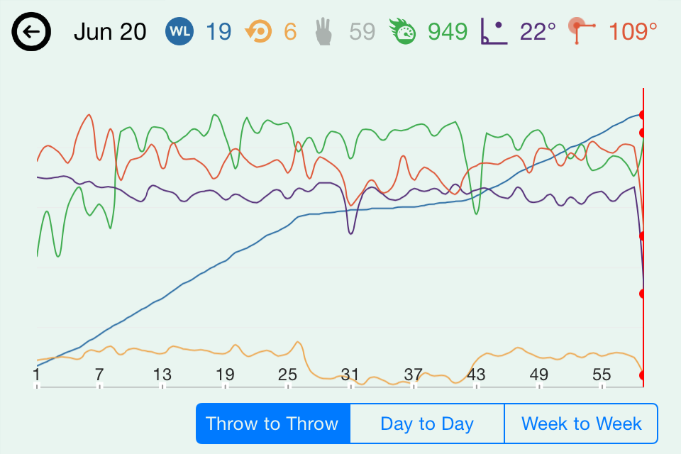
Many other golf aids/trackers offer more features, but many features aren’t always a good thing for everyone. Take trackers like Game Golf or Arccos. Both feature the same type of technology. Sensors are attached to the end of your clubs, and are paired either with a device worn on the belt (Game) or your smartphone (Arccos). Course GPS data is loaded into the respective devices and the club sensors track where on the course you are when you hit your shots and what clubs you swung. Some simple math is done and when the data is all uploaded, the software tells you how far you hit your clubs, how many greens you reached in regulation, and what your sand save percentage was, among other things.

The company PIQ offers the same thing, but in a sensor that clips to your golf glove. PIQ takes it one step further, allowing wearers to see more advanced metrics like swing speed, tempo, and clubhead path. One of their bigger advantages is showing golfers distances to the front, middle, and backs of greens. Game and Arccos don’t offer this feature (though Microsoft Band does).

All of these things are well and good, assuming the average golfer knows what to do with them. Frankly, they don’t. Say you’re a high or even mid-handicapper. You are on a longer par 4 and need a six-iron to reach the green. You fan it into the woods and the ball ends up going 120 yards total. If you tracked the shot, that goes against your average six-iron distance when you upload your round. Shank your long irons? That’s getting added to the distance average, too. Now, what was supposed to be a point of knowledge has become a point of confusion. If you muff a chip, that shot counts. But all the data is telling you is that you muffed the chip, it doesn’t tell you why.

(Note: I’ve used Game Golf in the past, and the putt tracking technology is actually helpful. When I see my putts-per-round spike, I know it’s time to hit the practice green again, because putting is one of the things I can work on and actually get better at.)

Knowing your swing speed and clubhead path can be beneficial, as long as you know what your ideal swing speed and clubhead path should be. Should you be swinging 85 or 90 miles per hour? Should you be concentrating on more of an inside takeaway or an outside takeaway? Only those with specific instructions or an intimate knowledge of their swing will be able to answer this.

Anyone looking to gain an advantage from these kinds of technologies would either be a good golfer in their own right, or taking instruction from one. That doesn’t mean that this kind of tech is useless — far from it. But in the hands of the uninitiated, it’s no better than a butt-load of SportsVu data being dumped on a GM’s desk without anyone there to help him parse through it.

All these companies have some really cool tech — tech that could help a good or coached golfer improve. They are capturing metrics that are important to understand if one wants to lower scores. But on their own, they’re a key without a lock. Golfers need to know the puzzle before they try solving it. Once they understand the important keystones of their improvement, these kinds of technologies can help be the coach away from the lessons.

(Image via PIQ)


All England Club Dot Net: Wimbledon in the Royal Age of Technology

Generally regarded as the most formal of tennis’ Grand Slam tournaments, Wimbledon– pardon, The Championships, Wimbledon– famously features players tarnishing the courts’ grass surfaces in mandated all-white apparel and an only recently lifted requirement that the participants bow or curtsy in deferential acknowledgment of attending members of British royalty.

The 2015 tournament is underway, and so too is the eldest Slam’s grappling with technological developments. Perhaps most visible is the tournament’s improved website. The homepage, Wimbledon.com links to a live blog, which consists of a stream of updates including summarized match results, video and images from social media, and player comments. Live video and radio streams are available directly through the site, as is a video archive, and current weather, time, and ticket queue information appear on the face of the landing page. (Live video streaming also is available to cable subscribers from ESPN3/WatchESPN.)

wimb

Behind the scenes, longtime tournament partner IBM has driven these updates to Wimbledon.com and informational mobile apps (for iOS and Android users), which will have an offline mode to permit ongoing operation where wireless service is unavailable. IBM also is leveraging its Watson computing technology in an effort to deliver analytical information to fans with greater speed.

While official digital coverage of Wimbledon appears to be at an all-time high, fan-generated content is a different matter. Wimbledon’s tournament directors, including Alexandra Willis, Head of Digital and Content, have taken a more actively-hostile stance toward the use of mobile streaming services like Periscope, although Willis admitted that her team would be experimenting with the technology. Willis’ focus is less on the technology’s ability to sidestep conventional broadcast channels– like others, she does not view it as a viable threat in that regard– and more on protecting the live experience for attending fans and players. The prohibition on video streaming is a natural extension of the preexisting rule against mobile telephone use during matches, which, in case anyone thought this somehow would fly, includes selfie sticks too. And speaking of flying, drones aren’t allowed either. Police already have seized one and released a statement explaining the legal basis for their action.

What effect will these mobile technology restrictions have on spectators? Automotive manufacturer Jaguar may be able to deliver at least a partial answer. By equipping some fans with wearable biometric monitors (focused on heart-rate variability), installing atmospheric sensors around the courts, and tracking social media activity, their hope is to be able to measure emotion, excitement, mood, and energy. The results are charted in real time to an interactive graph on Wimbledon.com. What value, if any, this meta-analysis provides remains unknown, of course, but it is nice to see one of sports’ most buttoned-up events stride into the digital realm without infringing upon the simple elegance that makes Wimbledon a perennial classic.

(Header image via scohoust)

All the Things You Wanted to Know About Conditional Formatting in Excel

What are conditional formats? Simply put: They make a wall of data more readable. Tell me which dataset can you more quickly identify the best player:

Not only do the conditional formats catch the reader's attention, they also help us see the outlier data more easily.
Not only do the conditional formats catch the reader’s attention, they also help us see the outlier data more easily.

Here’s a great example of a time where conditional formating helps a lot. We’re looking at the 2005 NFL Draft. It makes sense to organize it by the order the players were picked, but our emphasis is on Career Average Value (CarAV) and Drafted Team Average Value (DrAV) — two simple, but useful stats that Pro-Reference-Football.com provides to estiamte a player’s total worth.

The conditional formatting immediately draws our attention to DeMarcus Ware, Aaron Rodgers, and Logan Mankins — the three most valuable players from the first round. And the conditional formatting draws our attention to these players while also helping us notice — immediately — that neither Rodgers nor Mankins were top picks.

The NFL Draft is a great example of when conditional formatting helps most. If I just wanted to compare the Career AV numbers of all the players who entered the league in 2005, irrespective of draft location, then I’d probably make a simple list and sort it large to small. But when we want to preserve a specific order of the data — or want to represent multiple components at once — conditional formatting does a stalwart job.

Here’s another instance, this one unrelated to sports — my spreadsheet for looking for a second car on Craigslist:

Conditional formatting can also stay within a boundary, so to speak, so unlike denominations can be compared side-by-side.

Here, I care mostly about the Kelley Blue Book value of the vehicle (“KBB Value”), but I also want to know about gas mileage and the other facts of the car. I’ve set up the color coding, though, so that I don’t have to worry about 28 MPG throwing off a $4,000 asking price. Also, the higher the value of the car the more green it is, but the more expensive the asking price, the more red it is.

In other words, I just look for as much green as possible, and that’s my best bet.

So let’s talk about setting up our own table with conditional formatting. First, we need data pertinent for conditional formatting. Let’s go with 2014 NFL Team Efficiency stats from Football Outsiders.

First, I scrape the data with a little copy/paste action. Just highlight the table area in the middle and paste it into your Excel document. I recommend pasting without formatting. To do this, just right click on the spreadsheet and choose the special paste icon:

Pasting without formatting keeps the spreadsheet simple and readable.

Now, after a little cleaning up — deleting those extra headers in the middle of the data, combining the two-line headers into a single line, and moving those headers above the appropriate column — we have something like this:

Now our data is neater, but it's still too much to digest in one glance.
Now our data is neater, but it’s still too much to digest in one glance.

This is another ordinal setup — except we’re not looking at draft positions, but DVOA* rankings.

*DVOA stands for Defense-adjusted Value Over Average. It’s Football Outsider’s total value measurement, much like WAR is for Baseball-Reference and FanGraphs.

But one of the big problems with an ordinal ranking is that the space between No. 1 and No. 2 may not be the same as between No. 2 and No. 3. So conditional formatting helps us see tiers and groupings much more easily.

In order to add a conditional format to this data, we just need to highlight the C column and choose Conditional Formatting > Color Scales > the appropriate color scale.

Color scales are the most typical conditional format -- and they tend to be the most useful.
Color scales are the most typical conditional format — and they tend to be the most useful.

Even though we highlighted the entire column, only the rows with data in them show the conditional format.

So that’s how you set up a basic conditional format! You can play around with the different format types and see which ones you like. There’s no harm in slapping a conditional format on top of another conditional format — as long as you have the same cells selected, it will just delete the old format and apply the new one.

But let’s say you have an issue like we have in Column I:

A negative DVOA on defense is actually a good thing. So I'd rather have those bars appear green.
A negative DVOA on defense is actually a good thing. So I’d rather have those bars appear green.

If you ever have a format that’s not working quite right, just click wherever the format is looking weird, and choose “Manage Rules…” from the Conditional Formatting drop down:

If a format is giving you guff, head to the "Manage Rules..." area.
If a format is giving you guff, head to the “Manage Rules…” area.

If you have the delinquent cells selected (and your Conditional Formatting Rules Manager is set to show “Current Selection” rules), you should see the formatting rules in the window:

This is kind of the go-to place for adjusting conditional formats and making really fun and unique formats.

If you double-click on the format name (“Data Bar” in this instance), you will open the “Edit Formatting Rule” window. This window (and the windows nested inside it) allow us to do a lot of fun stuff.

I’m presently happy with most of what’s going on in Column I, so I really only want to change two things: The positive color and the negative color. So in the Edit Formatting Rule window, I will change the bar color to red:

This allows me to change the default bar color. I want red because a positive defensive DVOA is a bad thing.

And then, right beneath that, I’m going to click the “Negative Value and Axis…” in order to change the red bars to green:

After you apply these changes on the Conditional Formatting Rules Manager window, the column should update.

But let’s say I want to do something even more complicated. Let’s say I want to highlight the teams with bad special teams — and I don’t want to just highlight the special teams column. I want the whole row to broadcast the shame of their punters and kickers.

So I’m going to create a special conditional format. First, I’ll highlight the entire table other than the titles (from A2 to L33). Then, I’ll click Conditional Formatting > “New Rule…” to open the New Formatting Rule window.

More complicated conditional formatting will often require formulas.

So, because we want everything to look at the K column and change its format based on what’s in the K column, I’m going to write a formula that says:

=IF($K<0,1,0)

All this formula says is:

  • =IF: This creates an IF formula. The syntax asks for (1) a formula that can be proved true or false, (2) a value for if the formula proves true, and (3) a value for if the formula proves false.
  • $K2<0: I’m telling Excel to stay in Column K — that’s what the $ in front of $K means. So if the K columns is negative (<0), then the formula is true. The conditional formatting is going to start with the highest row in the selected area, so since our selection begins with A2, we’ll reference $K2 because that’s on the same row. (If we put $K3, it would look at the row beneath the current row.)
  • 1,0: If the formula is true, then 1. If false, then 0. This tells Excel to apply the conditional format (1) if the formula is true (if Column K is negative), and to not format (0) if the formula is false.

After I enter the desired formula, I will set the formatting. Do whatever you want here. Change the fill. Change the font color. Make it bold. The pop up in the “Format…” window is just a typical Excel formatting window, so it should be easy to navigate.

I went ahead and set the format to a dark red fill and a bold white font. This will make the formatted rows very obvious, but also make the the table really busy visually — but I’m doing this for the learning, not for the beauty.

Anyway, we get this:

NOTE: You will need to hit "OK" and then "Apply Changes" or "OK" before the new format appears.
NOTE: You will need to hit “OK” and then “Apply Changes” or “OK” before the new format appears.

Let’s do one final this: Change format priorities. Notice how our conditional formatting in Column C is getting smushed by our new special teams formatting? Well, that’s no good.

So let’s open the “Manage Rules…” dialogue. then, look at the formatting rules for “This Worksheet”:

Regardless of what cells you have selected, looking at "This Worksheet" will show all the conditional formats on the present tab.
Regardless of what cells you have selected, looking at “This Worksheet” will show all the conditional formats on the present tab.

Then, with the special teams format select, let’s press the down button (note the second red arrow above) until it’s at the bottom of the list. Hit Apply or OK and you should get something like this:

Uh oh! The special teams format changed the fonts in Column C too!

This is a good cautionary tale about changing font colors and formats. Since we’re using a simple conditional format for Column C (as in, not a formula-based format), we can’t edit the fonts in that column. So the only real solution is to change the special teams font — or to selectively apply that format.

The second option is simple enough. Just open the “Manage Rules…” window and change the selection area for the format:

We can type in the selected areas and separate the selections with a comma, or we can click and drag to select the first area, then -- hold CTRL -- click and drag to select the second area.
We can type in the selected areas and separate the selections with a comma, or we can click and drag to select the first area, then — hold CTRL — click and drag to select the second area.

All we need to do is change the “Applies to” textbox. Once we select the A2 to B33 area and the D2 to L33 area, the weird formatting disappears from Column C.

The final step to using conditional formatting is presenting that data. Microsoft has done a good job catching up with Google Drive and the sort, allowing us to post table and the sort online. Using File > “Save & Send” should direct you to the SkyDrive services that will enable you to post the spreadsheet online. If there’s enough interest, I can walk through the process for this as well.

Anyway, I hope this has been interesting and useful. Happy Exceling!


TechGraphs News Roundup: 6/26/2015

Here comes the News Roundup, back with a fresh batch of sports-tech stories we found interesting this week.

The Women’s World Cup is well-underway across Canada, where the quarterfinals begin today. While Americans generally haven’t been on fire for their successful team to this point, in contrast to their comparatively middling men’s squad, the playing surface sure feels like it has. The widely panned artificial turf distributes rubber pellets to the players faster than the referees can issue yellow cards, and there is some limited evidence suggesting that these pellets, which might remain embedded in the players’ clothing and bodies for longer than some teams’ tournament runs, present health risks to the players. When still a part of the turf, the pellets’ capacity for heat-absorption can render the playing surface extremely hot. (Female footballers’ male counterparts, meanwhile, play on natural grass.)

Lexus claims to be making substantial progress toward a “real, rideable” hoverboard. Prototype testing remains ongoing, which is okay for now; the automobile manufacturer still has a few months to prepare the world for Marty McFly’s arrival.

With the Sprint Cup series in Sonoma, California this week, Microsoft announced a multi-level partnership with NASCAR. One of the most immediately visible aspects of this partnership will be Microsoft’s primary sponsorship of Dale Earnhardt Jr.’s ride at this Sunday’s race. The timing is coordinated with the release of Windows 10, which will become the official operating system of both NASCAR and Hendrick Motorsports, the race team for which Earnhardt drives. Last year, Microsoft developed a mobile inspection app for NASCAR officials, the use of which led to significant decreases in time spent inspecting vehicles prior to races.

Before NBA arenas were outfitted with arrays of motion-tracking cameras and smart analysts spoke in terms of player efficiency ratings and usage rates, there was Harvey Pollack. Pollack, who died this week at the age of ninety-three, began working in the NBA in 1946, the league’s inaugural year. As the director of statistical information for the Philadelphia 76ers, he played a leading role in developing the sport’s statistical foundation on a granular level, eventually providing the basis for today’s tech-driven approach to player evaluation. Along the way, he reportedly coined the term “triple-double,” and he employed a rudimentary piece of technology to help create one of the sport’s most memorable images.

Daily fantasy sports site DraftKings had an up-and-down week. While the site scored a victory in striking an exclusive agreement with ESPN to become the official daily fantasy sports provider for all of the Worldwide Leader’s platforms, it missed out on a potential $250 million investment from Disney, the sports network’s parent company. Daily fantasy rival FanDuel, meanwhile, has been busy snapping up exclusive partnerships with NBA franchises.

The week is almost done, and so is this News Roundup. Enjoy the weekend, and, in the readily typeable words of our Managing Editor, David G. Temple, be excellent to each other.


Review: Motus Global’s mThrow

When Motus Global’s sleeve was announced last spring, it was supposed to save baseball, stemming the flood of Tommy John surgeries plaguing the majors. Now, the device that teams have been using to study their pitchers’ mechanics since last fall is available to the public. The mThrow has been on sale through the Motus website since March, and began shipping in early May. Eager to see what the device had to offer, I plunked down the $150 (plus $20 for an additional compression sleeve) and waited anxiously.

The box that the mThrow comes in is taken up mostly by the compression sleeve. The actual IMU — the sensor that actually tracks the arm’s motion — is a tiny blue thing, about the size and shape of a circus peanut*. The IMU charges by induction, so all the user has to do is plug in the charging station, place the sensor on top of the station, and wait about an hour.

* – But slightly better-tasting.

Pairing the sensor is simple, too, taking just a few taps of the smartphone app. The hardest part of setting the thing up is probably wedging the sensor into its little pocket in the compression sleeve, and then pulling the sleeve on so that the sensor rests over the infamous ulnar collateral ligament. In fact, the design might be overly simplified. In an effort to make the sensor more water-resistant, there are no lights on the sensor to tell the user of the charge level. The only way to check is to pair the sensor with the smartphone app; if the app doesn’t recognize the sensor, it probably needs to be re-charged.

The app is currently available only for the iPhone; an updated version was approved this week. The software now computes five metrics from the sensor data: pitch count; maximum arm speed, a rotational velocity measured in revolutions per minute; arm slot at release; maximum shoulder rotation relative to initial position; and, of course, torque on the UCL. These are then combined into three headline numbers: performance, a measure of mechanical consistency; workload, currently an additive function of elbow torque; and a “throw meter,” an energy bar that drains from blue to orange as the workload increases and consistency decreases.

I ran some preliminary testing of the mThrow, connecting it to an iPhone 4S and throwing 17 fastballs, 17 changeups, and 17 curveballs to the best of my extremely limited ability; all but six throws were recorded. Even if there’s no difference between their speeds and movement, you can still see a difference between my initial warmup tosses (the first dozen, with much lower arm speeds), fastballs (about 13-25), curveballs (26-43, with much lower torque values), and changeups (44 onward, with decreased arm speeds).

image2
This simple relationship was confirmed with a second test using a HitTrax system, which can track speed and late break of pitches as they cross the plate. My subject was a 45-year-old with some collegiate pitching experience who threw ten fastballs and ten curveballs. By comparing the HitTrax velocity report (right) to the mThrow statistics (left), we can see the correlation between the decrease in arm speed and the decrease in velocity as the subject switched from fastball to curves.

donfrancesco
Lastly, I brought the sleeve to a local high school (Blackstone Valley Tech, Upton, MA) to get some insights from active players. Assistant coach John Burke, pitcher Nick Laren, shortstop Joe Corsi, and catcher Jack Lynch took turns throwing an assortment of pitches from a number of release points, seeing how their throwing motions stacked up. The session supported some beliefs — for instance, that the quick motion Lynch uses to throw out would-be base stealers puts more torque on the elbow than a standard pitching delivery. But others were surprisingly contradicted: despite everyone’s belief that sidearm throws put less stress on the elbow than an over-the-top delivery, the app didn’t seem to report a relationship between arm slot and torque.

Chief technology officer Ben Hansen says the mThrow is still in its infancy, and says that the device’s official consumer launch is not scheduled until later this summer. The app currently relies on data compiled from Motus Global’s work with MLB prospects at last fall’s instructional league to generate its workload number, but Hansen and his team are working to produce more meaningful metrics from a more complete data set.

“We’re just capturing as much data as we can to see what’s normal,” Hansen said. “We also have controlled studies going on at every level. We have [NCAA] D1, D3, high school, and Little League players wearing it religiously.”

At this early stage, the app seems to be designed more for Motus’s professional clients than for public users. Maybe the best example of this is the tagging feature, which allows users to tag individual throws as belonging to bullpen sessions, long toss, or game action, and to further break throws down by pitch type. But at the moment, the tags are unavailable to the user after selection, getting passed on to Motus Global with the sensor data but not visible on any of the trend screens. Hansen confirmed that the tags were being used in the company’s research for their MLB clients, however.

“Every week we send reports broken down by tags where we compared each pitcher to the league averages for that pitch type,” Hansen said. “The teams love using the tags and breaking things down into the different pitch types.”

It’s a tantalizing view of an exciting feature that could still be a couple years away. And it’s not just super dorks like me who would find those analytics useful. The key to a good changeup is matching the same arm speed used to throw a fastball, so it’s easy to see coaches like Burke using the arm speed metric to give feedback to young pitchers just learning to throw the pitch. But without any way to divide pitches into different categories, this sort of feedback isn’t possible yet.

“We are looking into a web portal to give users more in-depth analytics,” Hansen said. “But right now we’re focused on getting the analytics right before we move on to other platforms.”

It’s probably still too early to judge the mThrow fairly, and I’m almost definitely not the right person to do it (sabermetrically-inclined tech geeks who can’t pitch are not Motus’s target market). And it’s true that more research could produce findings that actually help young pitchers stay on the field and off the operating table. But as currently constructed, the mThrow raises more questions than it answers, and left me wanting more. Like a top pitching prospect, the technology needs some time to mature before it can make a meaningful contribution.


A La Carte Sports Watching Is En Route

The NBA Finals have been wrapped up for just one week, but already the association is looking to the 2015-16 season. Even before the Golden State Warriors were crowned champions, the NBA announced a major change to their streaming League Pass service. Beginning next season, you’ll be given the option to purchase individual games or team packages, provided you’re out of the team’s local market.

As presently designed, the new League Pass will be compatible with computers — Windows and Mac — as well as Android and iOS devices. For those with Fire, Windows, Blackberry or other operating systems, you may be on the outside looking in. The NBA Game Time app (which is required to view League Pass on mobile devices) does support Amazon Fire devices, but support for Game Time was dropped for Windows devices in July of last year.

The importance of the NBA deciding to offer a more a la carte style cannot be understated, as now more light is cast on other sports leagues, particularly the NFL. As Engadget notes, the NFL is currently fighting a lawsuit from a fan regarding the limits of their Sunday Ticket service, specifically being forced to pay hundreds of dollars to see their favorite team 16 games per year even though they live thousands of miles away from the team’s location.

The murky waters of territorial or cable blackouts has been explored before, just ask a local Dodgers fan, and as Time Warner continues to lose money, it seems possible the 25-year and $8.3 billion dollar deal could get reworked. With sports fans and non-sports fans alike clamoring for an a la carte service, the answer could come not from a cable provider, but rather a group who knows a few things about entertainment in Sony.

During the Electronic Entertainment Expo this year, Sony announced an option purchase specific channels on their Playstation Vue services. It is an ambitious undertaking and perhaps Sony is simply dipping their toes in the water rather than diving right in the streaming market. Right now their Vue service is available in just five cities in the United States: Los Angeles, San Francisco, Chicago, Philadelphia and New York. Playstation 3 and 4 owners in those cities who are tired of the paying a cable bill can pick up a number of individual channels — or a more traditional package — including Fox Soccer, Showtime and Machinima for prices ranging from $3.99 to $14.99.

Given the push for a la carte services, a recent poll conducted by DigitalSmiths and posted via DSLReports shows an interesting trend. If sports fans are the driving force of streaming or pay-as-you-go streaming options, the survey had an interesting way of showing it.

alacarte

ESPN ranked 20th among preferred channels, behind non-sports channels such as Animal Planet, Food Network and the History Channel. ABC and CBS ranked first and third respectively, however it would be a stretch to call those sports channels given their diverse programming. The same could be said for NBC (4th), Fox (7th), TBS (15th) and TNT (17th). Where ESPN was the first sports exclusive channel, both Fox Sports 1, NBC Sports, NFL Network, MLB Network plus the Golf Channel and Tennis Channel managed to make the list.

Kudos to the NBA for seizing an opportunity to gain new fans after a strong ratings performance in the finals. Perhaps more professional leagues or streaming service options will follow suit and offer a more personalized option.

(Header image via Wikipedia)

TechGraphs News Roundup: 6/19/2015

The News Roundup is back to try to fill you up and never let you down with the sports-tech stories we found interesting this week.

As we near the end of bracket play in the College World Series, two of the biggest winners of the first week in Omaha have been the Vanderbilt Commodores and UmpCam. This video from the SEC Network reviews the history of umpire-mounted cameras, discusses the process of incorporating the new technology into the umpires’ equipment and the television broadcast, and gauges fan and player reactions. If nothing else, it’s nice to see the continuing influence of the XFL across the sporting landscape.

The U.S. Open golf tournament, which began yesterday in Tacoma, Washington, also is seeking to enhance the fan experience, and we aren’t even talking about the legal marijuana. Fox Sports has installed microphones inside each of the tournament’s eighteen holes with the goal of capturing “the atmosphere around the green.” Golf Hole Mic’s manufacturer estimates a useful pickup range of approximately 100 feet, which should be sufficient to allow us to hear what Jordan Spieth is telling his ball while putting.

Epson, “a brand best known for its ink cartridges computer printers,” is entering the retail sports technology market with a line of sports watches and an endorsement from distance runner Meb Keflezighi. Geared toward runners and golfers, the watches dispense with the need for often-cumbersome chest straps by using an optical light sensor to monitor heart rate, and they sync biometric data with Epson’s own app and popular third-party apps. Meanwhile, Microsoft and TaylorMade have collaborated on a golf app for the Microsoft Band, a wrist-borne device that promises to be slightly more helpful than a magnetic ion bracelet and a real threat to caddies everywhere.

From technology created for athletes to athletes using technology to create things, TechCrunch reports that Derek Jeter’s athlete-voiced website, The Players’ Tribune, recently received $9.5 million from a group of outside investors led by NEA, one of the earliest investors in BuzzFeed. Regardless of who’s actually creating the content at The Players’ Tribune, the site’s demonstrated ability to draw large-scale investments means it’s unlikely to fade away anytime soon.

Finally, while Major League Baseball is a proving ground for some of the most advanced sports technology available (and the management responsibility that comes along with access to that technology), it is nice to be reminded from time to time that the entire endeavor fundamentally relies upon a simple network of land line telephones.

That’s all of our time for this week. Enjoy the weekend, and, in the readily endorsable words of our Managing Editor, David G. Temple, be excellent to each other.


KinaTrax Gives Rays In-Game Markerless Motion Capture Data

In an effort to keep their pitchers healthy, the Tampa Bay Rays have enlisted the services of markerless motion capture company KinaTrax. As Jeff Passan of Yahoo! Sports reported Monday, the Rays are the first team to partner with the Philadelphia-based company.

When asked about the technology Tuesday, KinaTrax founder Michael Eckstein was reluctant to reveal much of the technology that drove his company’s system. Images from “multiple cameras” positioned throughout the ballpark (an earlier test used eight) are stitched together to create an unobstructed, 360-degree view of the pitcher. Eckstein compared his system to the commercially-available Microsoft Kinect, which uses infrared and sonar tracking to capture a user’s position for video gaming or other applications.

“The Kinect has a focal length of 8 to 14 feet, and captures 30 frames per second,” Eckstein said. “The challenge is, how do you scale that up to an MLB stadium, where you have to capture 275 to 300 frames per second from 350 feet away?”

Once the data is collected and uploaded to cloud storage, “proprietary algorithms” are then used to identify the position of body landmarks like joints and calculate the distances, angles, velocities, and accelerations between the various body segments. In an earlier talk at the 2013 SABR Conference in Philadelphia, Eckstein claimed that the positions measured by the system were accurate to within 1.5 centimeters.

It is probably no surprise that capturing such detailed visual information hundreds of times per second is a costly process. Eckstein estimates that a typical game could produce up to 1.4 terabytes of data. The data is owned by the teams — since it identifies each pitcher and is thus considered medical information, even KinaTrax can’t access it without permission once it’s collected. For teams unable to work with the raw data, KinaTrax can also develop reports on key metrics; Eckstein said in his 2013 presentation his system was capable of generating these reports overnight.

“Some teams have the ability and the staff to say, ‘We want these kinds of reports, and these kinds of analytics,’ and then we can go out and produce them,” Eckstein said. “And then if teams have very qualified staff, they’ll get the raw data to work with themselves.”

Although KinaTrax worked with the Mets in 2013 to develop their system, Tampa Bay is the first major-league team to install the system and collect game data. And while it’s too early to draw any conclusions from the data collected by the system, Eckstein is happy with KinaTrax’s early performance.

“We’ve successfully recorded thousands of pitches, and the system is working as expected,” he said.

According to Eckstein, KinaTrax had discussed possible arrangements with 17 MLB teams between the Winter Meetings, Cactus League, and Grapefruit League before finally coming to an agreement with the Rays. Eckstein was excited about working with the Rays, praising their front office acumen and even the symmetrical shape of Tropicana Field (which made camera installation easier).

“The Rays are among those top major-league teams that understand what we’re doing and have an understanding of big data,” Eckstein said. “We couldn’t ask for a better team for our pilot.”

Teams have already proposed a number of different uses for the system. For major league pitchers, teams could use the system to demonstrate “best practices,” and highlight the subtle changes in mechanics that could separate a great outing from a poor one. But Eckstein also discussed the possibility of installing the cameras in minor-league parks, allowing teams to better teach proper mechanics to young arms while also developing “longitudinal patient records” of changes to a pitcher’s kinematics over time.

“All of the teams we’re speaking to want them in their major league stadiums,” Eckstein said. “But the really innovative teams tell me, ‘Where we will get the most benefit out of this is with our Single-A or Double-A teams.'”

Once installed, the system can also be adjusted to capture mechanics in bullpen sessions, and could be modified to track hitters’ swing mechanics. For now, though, KinaTrax is primarily focused on the action on the pitcher’s mound.

“There’s a consensus among teams about this anecdotal evidence of pitchers who are great in their bullpens but then lose it on the mound,” Eckstein said. “But truth be told, it’s the in-game information that managers, coaches, and scouts are after.”

Before founding KinaTrax, Eckstein worked in the technology sector for 25 years, helping companies figure out how to use technology to develop competitive advantages. A baseball fan, Eckstein found himself at a lunch with a Phillies senior executive in 2012, and the conversation turned to Roy Halladay’s early-season struggles.

“He said, ‘Wouldn’t it be great if we had a way to measure his mechanics and see what he’s doing wrong?'” Eckstein said. “And I said, ‘Oh, this will be easy. We’ll go to Microsoft and they’ll come up with something.'”

It wasn’t that easy, of course. The leap from the existing technology to in-game motion capture from hundreds of feet away required the development of an entirely new technology platform, which became the basis for KinaTrax.

Before Monday, KinaTrax first announced itself at the 2013 SABR Conference in Philadelphia, where Eckstein gave a talk and brief demonstration on his system. At the time, KinaTrax had persuaded the Mets to let them test their camera system in Citi Field. The eight-camera test was successful, but no actual game data were recorded.

Now that the word is out on KinaTrax, Eckstein plans to return to the Winter Meetings and put his newly-tested product before the decision-makers in MLB front offices.

“We’re going to have serious discussions with teams about agreements for the 2016 season,” he said.

But go on the company’s website and you’re greeted not by a picture of a Major Leaguer or of Tropicana Field but by a youth baseball pitcher. This is not just a nice image: Eckstein said KinaTrax is planning to scale its system down for college, high school, and even youth-level teams.

“Clearly the arm motion is very different for an eight or 12-year-old versus a major league pitcher,” Eckstein said. “But we feel that with the nuggets we’ve learned, and with cameras that don’t have to capture 275 to 300 frames per second and don’t have to be 350 feet away, we can bring the price of the system down to that level.”


Presenting Three or More Dimensions Using Tableau

Whoa! What’s a Tableau, you ask? Well, I have an even more basic Tableau Public tutorial for the likes of questioning minds such as yours. Although, this article is pretty basic too, so either should be decent starting places.

Tableau is a powerful, unique visualization tool. The fact it’s also free is a little unbelieveable. One of the reasons I love Tableau so much is that it allows me to present multiple dimensions of data in a single chart — and do so without ungodly 3D charts.

What do I mean? Well, there’s a great example in the newest addition to the FanGraphs suite of data — the contact rate (Soft%, Medium%, and Hard%) numbers. So let’s say I want to present this data* for the Rays hitters. I’m mostly interested in the contact rates, so I could put together a scatterplot of Hard% versus Medium%.

*If you want to play around with the exact same data that I’m using, download this CSV. Otherwise, you data will be different than mine because you, sir or madame, live in the future.

What’s neat about this chart is that, since Soft%, Medium%, and Hard% are mutually exclusive (a batted ball can’t be both hard and medium) and they are collectively exhaustive (there’s no other hit type, only these three; combined, we called this data MECE, mutually exclusive and collectively exhaustive), we can essentially present the three dimensions in a single scatterplot:

With Excel, we can kind of represent three data dimensions (Soft%, Medium% and Hard%), but that's only a happenstance of MECE data.
With Excel, we can kind of represent three data dimensions (Soft%, Medium% and Hard%), but that’s only a happenstance of MECE data.

So let’s say we wanted to add another component of information to this graph. Let’s say I want you to know which dot is which player. Or, perhaps, the amount of plate appearances corresponding to each of these players. In Excel, we could add a data label, but we would need to go through, by hand, and add each player’s name to the corresponding dot. Excel only inherently gives three label options: X labels, Y labels, or Series labels — and none of those are really useful here.

Let’s try this same chart in Tableau. First, though, we’ll need to work on the CSV a little. I’ll show you what I mean.

Open Tableau Public (preferably the latest version; I think that’s version 9), and you’ll be prompted to open your data source. Choose “Text File” and then navigate to your CSV file.

If you have a CSV or TXT file, this is the option you want.

I should mention at some point that, in Tableau Public, we rarely create data. It’s more about manipulating and presenting what’s already made. So there’s no option for “Blank Spreadsheet” like there is Excel.

Anyway, after connecting to our CSV, Tableau is going to confirm our data has the right settings. And thank goodness for that, because something’s awry:

A space between the number and the percent sign caused Tableau to think this was a string (that is, like a word or something). So we need to fix that.

The system sees the space between “33.3” and “%” and thinks it’s a word (because spaces can’t fit into data). That’s what the blue “ABC” icon means.

This problem is easily fixed a variety of ways. One way: You could open the CSV in Excel and save it as an Excel file. That’s a pretty simple fix. Another alternative is just to scrape all those pesky spaces out of there. I prefer to do this with Notepad (or any similar stripped down word processor).

For that method (which is handy if you’re on a computer without Excel), all we need to do is open the file with notepad, hit CTRL+H (to open the “Replace” dialogue) and then choose to replace a space with nothing.

Open Notepad, then open a file and set the file types too "All Files."
Open Notepad, then open a file and set the file types too “All Files.”
Then I type space (" ") then percent sign ("%") and choose to replace all.
Then I type space (” “) then percent sign (“%”) and choose to replace all.

Save it, then bing, bang, bongo, the file is ready to do work. Head back into Tableau, and then ensure the data is showing up correctly. Once again, our data is not defaulting to decimal, so we’ll quickly change these items to decimal numbers (just click the blue “ABC” and choose “Decimal” from the drop down menu).

You will still need to go through and make sure the pertinent columns are being treated as decimal numbers.

After you’ve got your data looking correct, head on over to Sheet 1 (the automatically generated tab in the lower left of the screen). You will now be in the basic worksheet interface.

For our purposes, go ahead and drag Med% to the Columns section and Hard% to the Rows. Then, pull the Names dimension onto the Detail section.

From here out, it's pretty much click and drag.
From here out, it’s pretty much click and drag.

NOTE: You may need to click on the “Show Me” button on the top right to change to a scatter plot.

The resulting scatter plot looks pretty similar to — and essentially has the same pieces as — the previous Excel chart we made:

It takes only a few actions to recreate the basic scatter plot we made in Excel.

But now let’s expand it with more information. For one, I want the users to know the sample size of each of these dots. I’m looking at all position players on the Rays roster, but that includes even Curt Casali who — at the time of pulling this data — had only 2 PA. To express these differences, we need merely drag the “PA” measure to the “Size” button.

Likewise, I can present how well each of these players is hitting by dropping the “wRC+” measure into the color section. And for even more clarity, I can name each dot with the corresponding player it represents:

Adding different visual manifestations of the data is a simple process in Tableau Public.

None of these dimensions are feasible with an Excel plot, chart, or graph. We would need to make these size, color, and label changes by hand in Excel. But in Tableau, it’s a flick of the wrist.

What’s more, we can clean up this data with the addition of a filter — and a quick filter to allow users to manipulate the filter too:

Adding a filter allows not only the Tableau creator, but also the end product user to adjust the featured data.

When we get the chart to basically where we want it, we can then throw it into a dashboard. A dashboard is the final shape the worksheet will take. Sometimes I combine multiple worksheets into a single dashboard to present a single idea. Other times I use a single worksheet for a single dashboard. We’ll do the latter in this instance:

Putting the chart into a dashboard will ultimately give us something to embed into a blog post or website. It also gives us keys for the sizes and colors.

The most beautiful thing about using Tableau, of course, is that the end product doesn’t have to be a static image. This allows us to embed even more information into the system — for instance, anything we add to the Detail section will appear in the popup when users hover their mouse over given data points.

After a little spicing up with the formats (such as fixing the dimensions for the X and Y axes, adding a linear regression line, and adding a few text boxes to indicate the general Soft% areas), we get a final version like this:

When we combine all these data points together, we can see interesting oddities in the data. For instance: Rookie Joey Butler is having a great year, hitting a 156 wRC+. But looking at his placement on the graph, we see he has a lot of non-hard contact for a guy with such a high wRC+. Likewise, Tim Beckham — the light blue dot in the top right — has crushed the ball this season, but is not showing a strong wRC+.

I should note the limited forecast value of this kind of data. While fascinating (and a great sample for Tableau to flex some muscles), this data does a much worse job predicting future results than a simple glance at these player’s ZiPS or Steamer projections.

That said: How fun is this chart? I think it’s a blast, and I hope it inspires you to present more dimensions of data — in a neat and understandable way — in your next visualization.

Happy Tableauing!


An “Unsophisticated” Breach is Still Bad News for the Cardinals

(Editor’s note: After this article was published, Jeff Luhnow told Sports Illustrated that he does not believe this issue happened due to the re-use of passwords. As no official report has been presented, we will leave this article up until further evidence is provided.)

Baseball met espionage without the help of Moe Berg on Monday, as news broke that the FBI was investigating the St. Louis Cardinals under allegations that they unlawfully accessed the internal database of the Houston Astros, known as Ground Control. Nathanial Grow did an excellent job going over the legal implications over at the mothersite, so make sure to check that out to get a sense of how badly this could end up breaking for St. Louis. But since we’re cover the tech stuff, I want to talk about how something like this could have happened.

In the New York Times article, specific mention is made that the “intrusion did not appear to be sophisticated” and that law enforcement believes that it was perpetrated by Cardinals front-office employees. This seemed to soften the initial blow a bit, making it clear that St. Louis wasn’t employing black hat hackers to crack Houston’s system. Instead, those responsible seemed to have gained access to passwords used by Jeff Luhnow and those he took with him when he left for St. Louis for the Houston GM job. And while this isn’t a malicious as someone trying to forcefully access Ground Control, it still casts the Cardinals in bad light. Low-level or not, the Houston data breach represents some serious security holes found in the IT practices of the Cardinals.

Let’s get one thing out of the way. Using someone’s old password isn’t really “hacking.” For one:

And secondly (language warning):

No, nothing really got hacked. It just got accessed. If Cardinals officials had passwords, all they needed was the user name of Luhnow or the person in his stable (it’s not clear whose actual account was used). But that doesn’t mean this should have occurred. Actions of some kind were still taken. So, how was it done? Well, there are a few possibilities.

Some Dummy Wrote Their Password Down

The Silicon Valley clip above is jokey, but it’s based on a lot of truth. I’ve worked in IT for over a decade. I’ve seem passwords written on Post-Its — sometimes hidden under keyboards, sometimes attached right to computer monitors. Most companies install policies that users need to change their password every three months or so. This … confuses people. They have trouble remembering. They write passwords down. Those tend to get left around. It’s dumb and a little sad, but it’s very possible that this whole scandal comes down to something like this.

Some Dummmy Shared Their Password

This is also all too common. Passwords get sent to assistants all the time. I’ve talked to executives who didn’t know their passwords at all. Their assistants updated their phones and laptops when the time came to change passwords. People in the same departments share login credentials all the time. “Crap, I can’t login. Jerry, give me your password. I need this spreadsheet.” They’re not looking to cause data breaches, they are just unaware of their actions. If some IT people wanted to get access to Ground Control, it would be very easy to search email logs and dig up some passwords.

The Cardinals Stored User Passwords as Plain Text

During Luhnow’s tenure in the front office, the Cardinals apparently used a system similar to Ground Control called Redbird. This most likely utilized some kind of content management system, which is built on top of a database. These databases have user tables that include things like names, contact info, usernames, and passwords. Ideally, the passwords would be hashed. Simply put, hashing passwords means changing plain passwords like “mypassword” into a bunch of numbers and letters — “mypassword” becomes “ajd923if902rnasdf09992on”. This gibberish is actually what’s stored on the database, and the server never sees the actual password. It keeps the hash translations elsewhere and just uses the hash to authenticate when a user logs in.

But that’s in a perfect world. It doesn’t always happen. This happened to the Sony Playstation Network a while back. It happens lots of places. It’s very feasible that Cardinals officials — whoever they were — simply pulled up a user that left and was able to see their password clear as day.

Whatever happened, I would bet it lies somewhere within these three options. Anything above that — attacks on properly-encrypted passwords through dictionary or rainbow table attacks– not only would infer serious maliciousness, it would mean the passwords were obtained by someone with a great deal of computer savvy.

Remember, the FBI was able to associate the Cardinals with this because the unauthorized access was traced to a home where known Cardinals people lived or hung out or whatever. Anyone with the smarts to properly reverse engineer and encrypted password probably would know that pretty much any time anyone accesses a server (Google, Facebook, Amazon, Twitter), their public IP address is logged. A password hacker would know to go to a library or use Tor or some other IP-masking tool. But this does not absolve the Cardinals in the least, and it probably makes it worse.

If a former Cardinal employee cracked the Redbird database to obtain passwords to use on Ground Control, the Cardinals could easily say that they are sorry and have taken measures to upgrade the security in their corporate offices. But if this all happened due to some low-level password-finding mission, it means that whoever is in charge of IT over there is lazy at best, or just plain unqualified. Or perhaps Redbird fell out of the realm of regular IT functions. Either way, it’s not good.

If a couple of interns could get access to user passwords this easily, imagine what could happen if someone who knew what they were doing gave it a go. Emails, text messages, photo backups, contracts, salary information, social security numbers — all of it could be at risk. You think we got some tasty stuff when the Ground Control documents were leaked? Imagine the field day Deadspin would have if someone managed to get a hold of John Mozeliak’s emails. People would be poised for ridicule, embarrassment, even identity theft, all because a company that operates in a field ripe for corporate espionage wouldn’t take steps to properly protect people’s passwords.

It’s a sign of the times. Database teams within baseball clubs are a fairly new thing. There are still bugs to be worked out — no pun intended. However, if this whole boondoggle doesn’t open the eyes of the other 28 MLB teams (and probably some NFL, NBA, and NHL teams as well), then I don’t know what will. I imagine some memos have been sent out this morning outlining new security policies. Or at least they should. Because while cracking passwords has become harder, simply copying them down never will.

(Header image via Pablo BD)