Heart Rate Sensor Assists U.S. Women’s National Team

The United States women’s national team won their third World Cup title this summer in Canada. That same Women’s World Cup, along with this summer’s Under 20 World Cup in New Zealand, marked the first time FIFA allowed players to wear tracking devices during game action. The success of the devices during these events led FIFA to greenlight the use of wearables in future competitions, subject to the approval of individual leagues.

Part of the team’s success was the players’ dedication to the training plans developed by strength and fitness coach Dawn Scott.

“I think it’s a testament to the players that they trusted us and stuck to the program, and did what they needed to even when they had their commitments with their [club] teams,” Scott said in a previous interview.

An earlier Wired article discussed the USWNT’s relationship with Polar Global devices. When reached for comment, Polar Global’s Josh Simonsen confirmed that the players were wearing the H7 heart rate monitor on the pitch, and using M400 GPS watches in training sessions. Simonsen, the company’s national training resource specialist for the U.S., said the Finnish company had worked with Scott and the USWNT since 2010.

“What that gave Dawn was the ability to track speed, distance, and activity of the athlete while they’re away,” Simonsen said. “And they were able to send it her in a much easier environment than the previous models.”

The H7, the heart rate monitor worn during the games, consists of a strap worn across the chest and a small transmitter a few inches wide. The strap contains an electrode that collects the ECG signal from the athlete; after some basic processing, the transmitter then sends out a Bluetooth signal. The system reports heart rate on a per-second basis, using only basic peak-to-peak measurements, which are less susceptible to the kind of movement artifacts you would expect with an athlete wearing the device during competitions.

Polar’s top-of-the-line system, the Team Pro, also includes a GPS and IMU sensor. Switching to Bluetooth Smart also allows the transmitters to communicate directly with a tablet. But Simonsen said the USWNT was still using the older Team2 solution this summer.

“They didn’t want to transition prior to the World Cup,” he said.

The company has a long history with heart rate sensors, having built the first monitor for an athlete in 1977. But it was not until the early 2000s that Polar began developing systems for whole teams, rather than for individuals.

“Essentially the coach would log into the software and each player would have their own page, but they really weren’t able to compare the team as a whole,” Simonsen said. “We couldn’t look at the big picture.”

This functionality would not become available until Polar’s Team2 system was introduced in 2009. Unlike their previous offerings, Team2 allowed coaches to collect and analyze data in much less time. The addition of Bluetooth transmitters also allowed coaches to monitor their players in real time.

“[Team2] was like a 50 percent cut in time that it took to do everything,” Simonsen said. “Everything was exponentially faster.”

The Team2 system is currently used by “about 450 teams” in the U.S., and Simonsen said new coaches are typically surprised by the feedback provided by the data.

“A lot of the time they’re just blown away at how long things were or how hard things truly are,” he said. “Or that their easy day really wasn’t that easy, or that their hard day was a lot harder than they really thought it was.”

Simonsen argues that this experience in the field is what separates Polar Global from the plethora of other companies offering heart rate monitors.

“We created heart rate,” Simonsen said. “And with us using HR from the beginning, accuracy is always our number one thing.”


Could MLBAM Be Making a Push to Become the Next Sling TV?

By now, you may have heard that the NHL has partnered up with MLB Advanced Media (MLBAM) in a new distribution deal. It’s a bold move for both leagues, and one that shows that the NHL is serious about increasing their online presence and offerings. But hidden in the details are even bigger revelations about the future of MLBAM. From the CBS article:

NHL COO John Collins would not confirm these figures, but word is the league valued the deal at $200 million per year.

The annual breakdown: a $100M rights fee to the NHL, $20M in savings from the league not having to invest in the capital resources/expertise it would take to go on its own, and $80M in equity in MLBAM’s technology business.

The equity portion may not figure in revenue calculations for the purposes of the salary cap. “We were told to expect $120M per year in added revenue… $4M per team,” one governor said.

This new deal is indicative of a fairly serious pivot. MLBAM made a name for itself as a content partner — a company that provided the infrastructure for those who wished to offer online content streaming. The massive system that they built to host their MLB.tv service was essentially leased out to the likes of ESPN, HBO, and WWE.

But with the NHL deal, MLBAM is no longer serving as the back end. They aren’t the ones being paid for hosting, they are paying for distribution rights. And they are buying everything lock, stock, and barrel. Besides being in charge of streaming NHL Center Ice, MLBAM is taking over NHL Network, NHL.com, and individual team web sites. Basically, if you want to view NHL content online, you have to go through MLBAM.

And there’s more. According to Forbes:

Along with the deal, the NHL would have equity in what is now called BAM Tech, a wholly new digital company that will be spun-off of MLB Advanced Media.

There’s the other shoe. What once started as a distribution channel for baseball games has become a lucrative technology business.

But I doubt this is the end for BAM Tech. They could certainly take their subscription fees from baseball and hockey fans along with their licensing fees from HBO and be content being a very profitable company for some time. But if that was the plan, they would have just taken the NHL’s money for distribution rather than paying them for the rights. Sure, they’ll make money from Center Ice and the NHL Network, but it could be indicative of a bigger move.

The “problem” with MLBAM’s business model is that it’s easily repeatable. Any company with enough capital and infrastructure can get in on the action. What MLBAM has that others don’t is partnerships. Right now, it works with two major sports leagues, *edit: I originally neglected to mention that MLBPA also hosts streaming for the PGA*, the biggest name in professional wrestling, the largest sports media company in the world, and the most popular premium cable channel. If one were inclined to, say, start their own over-the-top online TV provider, this would be a pretty good start.

It’s speculation at this point, but it wouldn’t be surprising to see a BAM app available on smartphones and set-top boxes in the near future. While they’d be competing against the likes of Sling TV and PlayStation Vue, the already-formed partnerships along with their world-class technology platform would certainly make them a formidable opponent. And don’t forget that HBO owns Cinemax and is a subsidiary of Time Warner (which just merged with Charter)*, while ESPN happens to be owned by Disney. There are a lot of fingers in a lot of pies here.

* – a studious commenter pointed out my mistake here.

Say you want to pay $120 for MLB.tv. What if BAM Tech could offer that plus HBO, NHL games, the Disney channel, and ESPN offerings for an extra $40 a month? Would the availability of live sports be enough to convince you to cut the cord?

MLBAM already built the gun, and now they’re starting to buy the bullets. There isn’t much stopping the once-quaint sports video service from becoming one of the biggest players in TV.


Bundesliga Gaining Traction in Attendance and Streaming Services

Things are on the rise in the top German soccer league, the Bundesliga. Not just the level of play, but the depth of teams as well as popularity have been trending upwards for several years now. The Union of European Football Association (UEFA) noticed the league’s rising talent as well, increasing their bids to the UEFA Champions League — the highest level of international club play in Europe — to three automatic slots plus one playoff bid.

With local fans already showing up to more Bundesliga games in person more than any other sport save for the NFL in the world, it’s hard to understate the league’s current impact and potential growth. Via Statista, the graph below displays the 2013-14 average game attendance for the 11 top ranking leagues.

statistic_id270301_average-attendance-of-major-sports-leagues-around-the-world-2013-14

Not even the English Premier League juggernauts of Manchester United, Arsenal Man City or Liverpool nor Spanish La Liga one-two punch of Barcelona and Real Madrid could draw more fans than the Bundesliga’s top draw in the 2013-14 season. Somewhat surprising, Borussia (there is a typo in the table below) leads all soccer clubs in Europe for attendance.

statistic_id382940_european-football-clubs-average-attendance-2013-14

Beyond local fans and UEFA, Fox Soccer has also taken note of the German league. The broadcasting network already streamed some Bundesliga fixtures on the Fox Soccer 2Go platform, but never all 306 matches. In addition to streaming every single league match, Fox has doubled down on the league by adding televised games as well. A total of 58 matches will be shown on TV on the Fox Sports 1, 60 on Fox Sports 2 and the final 188 games being shown on Fox Sports Plus.

The United States Men’s National Team (USMNT) has also seen an increased presence in Germany as six active members are currently on Bundesliga squads, with three more US players currently on clubs rating in Germany’s second tier. The German league is has the most US players in foreign leagues, barely edging out the Championship, England’s second tier, and trailing only Mexico’s Liga MX that boasts seven US capped players.

According to the Fox Soccer schedule, the opening match will be three time reigning champion Bayern Munich against the near-relegated Hamburg side. The match is set to be broadcasted on Fox Sports 2 at 2:30 pm eastern on Friday, August 14. While up-and-coming 20-year-old USMNT member Julian Green is under contract with Bayern until 2017, it’s possible, albeit unlikely, he could make an appearances and further boost the Bundesliga’s profile in the United States. If you happen to be busy on that Friday, tune in the next day as Werder Bremen just signed USMNT striker Aron Johannssen. Werder is set to kick off at 9:30 eastern on Saturday the 15th. While causation does not determine correlation, the United States has seen the the profile of the national men’s team rise in recent years, possibly due to Tim Howard, Clint Dempsey and Landon Donovan all crossing the ocean to play in the Premier League. Hopefully a similar level of fan interest will happen with the Bundesliga.

(Header image via Wikipedia)

How To Use R For Sports Stats, Part 2: Visualization and Analysis

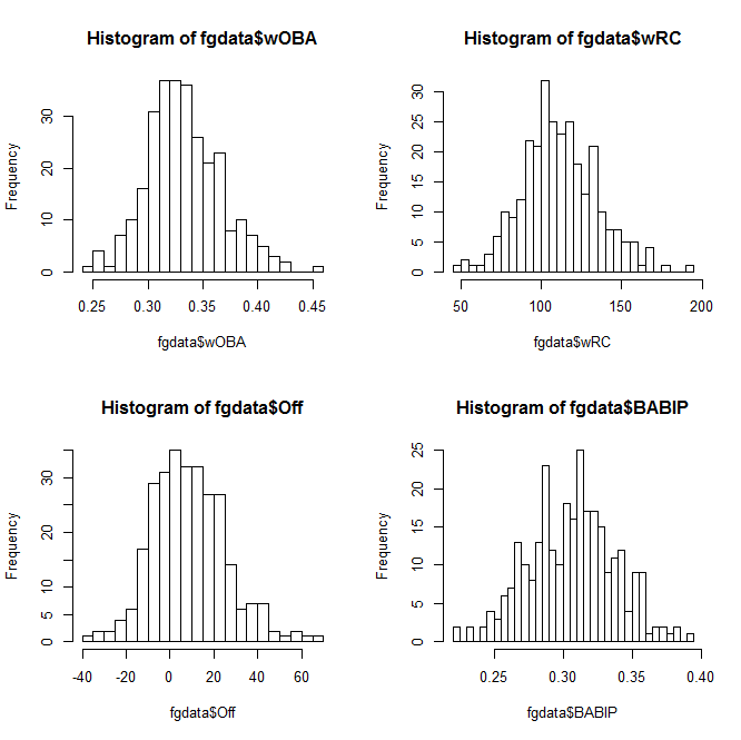
Welcome back! In Part 1 of this series, we went over the bare bones of using R–loading data, pulling out different subsets, and doing basic statistical tests. This is all cool enough, but if you’re going to take the time to learn R, you’re probably looking for something… more out of your investment.

One of R’s greatest strengths as a programming language is how it’s both powerful and easy-to-use when it comes to data visualization and statistical analysis. Fortunately, both of these are things we’re fairly interested in. In this post, we’ll work through some of the basic ways of visualizing and analyzing data in R–and point you towards where you can learn more.

(Before we start, one commenter reminded me that it can be very helpful to use an IDE when coding. Integrated development environments, like RStudio, work similarly to the basic R console, but provide helpful features like code autocompletion, better-integrated documentation, etc. I’ll keep taking screenshots in the R console for consistency, but feel free to try out an IDE and see if it works for you.)

Look At That Data

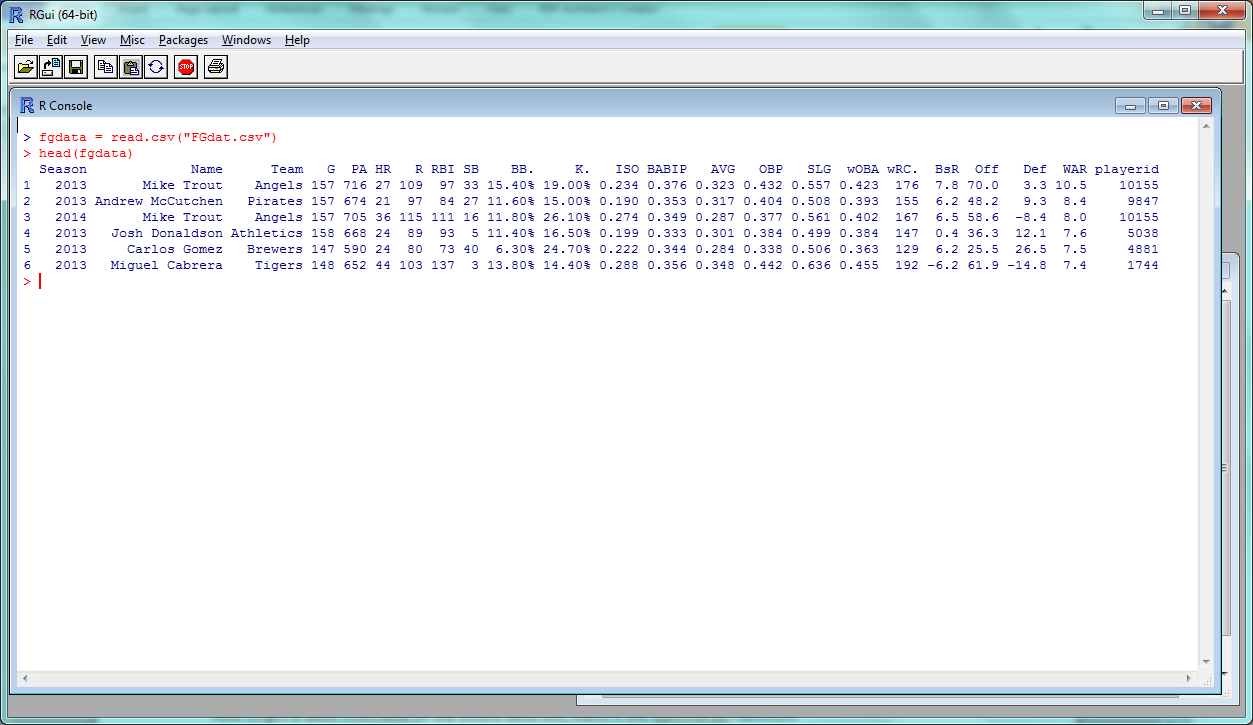
We’ll be using the same set of 2013-14 batter data that we did last time, so download that (if you haven’t already) and load it back up in R:

fgdata = read.csv("FGdat.csv")

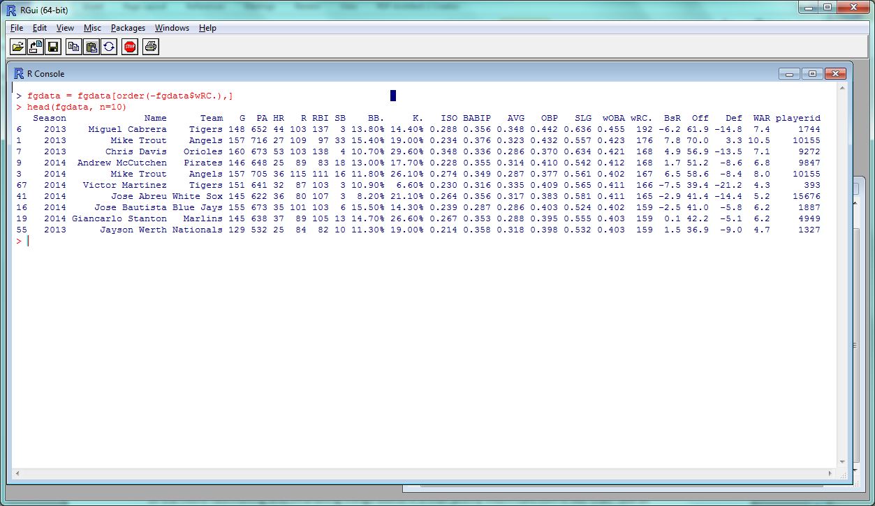
Possibly my favorite thing about R is how, often, all it takes is a very short function to create something pretty cool. Let’s say you want to make a histogram–a chart that plots the frequency counts of a given variable. You might think you have to run a bunch of different commands to name the type of chart, load your data into the chart, plot all the points, and so on? Nope:

hist(fgdata$wRC)

Basic R histogramThis Instant Histogram(™) displays how many players have a wRC+ in the range a given bar takes up in the x-axis. This histogram looks like a pretty normal, bell-curveish distribution, with an average a bit over 100–which makes sense, since the players with a below-average wRC+ won’t get enough playing time to qualify for our data set.

(You can confirm this quantitatively by using a function like summary(fgdata$wRC).)

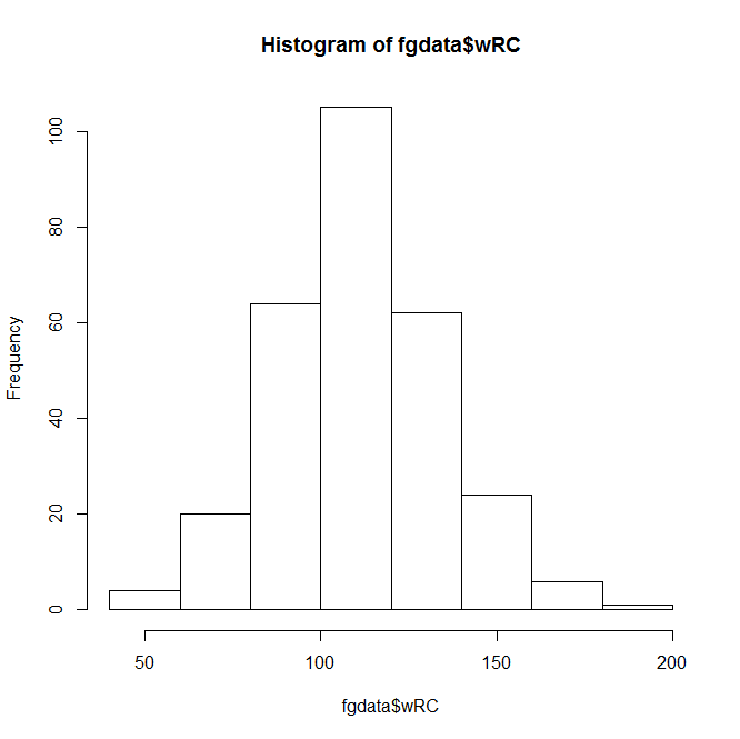
The hist() function, right out of the box, displays the data and does it quickly–but it doesn’t look that great. You can spend endless amounts of time customizing charts in R, but let’s add a few parameters to make this look nicer.

hist(fgdata$wRC, breaks=25, main="Distribution of wRC+, 2013 - 2014", xlab="wRC+", ylab= NULL, col="darkorange2")

In this command, ‘breaks’ is the number of bars in the chart, ‘main’ is the chart title, ‘xlab’ and ‘ylab’ are the axis titles, and ‘col’ is the color. R recognizes a pretty wide range of colors, though you can use RGB, hex, etc. if you’re more familiar with them.

Anyway, here’s the result:

Visually appealing R histogramA bit better, right? The distribution doesn’t look quite as normal now, but it’s still pretty close–we can actually add a bell curve to eyeball far off it is.

hist(fgdata$wRC, breaks=25, freq = FALSE, main="Distribution of wRC+, 2013 - 2014", xlab="wRC+", ylab= NULL, col="darkorange2")
curve(dnorm(x, mean=mean(fgdata$wRC), sd=sd(fgdata$wRC)), add=TRUE, col="darkblue", lwd=2)

Visually appealing R histogram with curve

(In the first line above, “freq = FALSE” indicates that the y-axis will be a probability density rather than a frequency count; the second line creates a normal curve with the same mean and standard deviation as your data set. Also, it’s blue.)

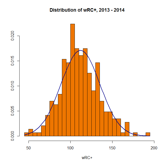
You can also plot multiple charts at the same time–use the par(mfrow) function with the preferred number of rows and columns:

par(mfrow=c(2,2)) 
hist(fgdata$wOBA, breaks=25) 
hist(fgdata$wRC, breaks=25) 
hist(fgdata$Off, breaks=25) 
hist(fgdata$BABIP, breaks=25)

2x2 grid of R histogramsWhen you want to save your plots, you can copy them to your clipboard–or create and save an image file directly from R:

png(file="whatisitgoodfor.png",width=400,height=350)
hist(fgdata$WAR, breaks=25)
dev.off()

(It’ll show up in the same directory you’re loading your data set from.)

So that covers histograms. You can create bar charts, pie charts, and all of that, but you’re probably more interested in everyone’s favorite, the scatterplot.

At its most basic, the plot function is literally plot() with the two variables you want to compare:

plot(fgdata$SLG, fgdata$ISO)
Basic R scatterplot
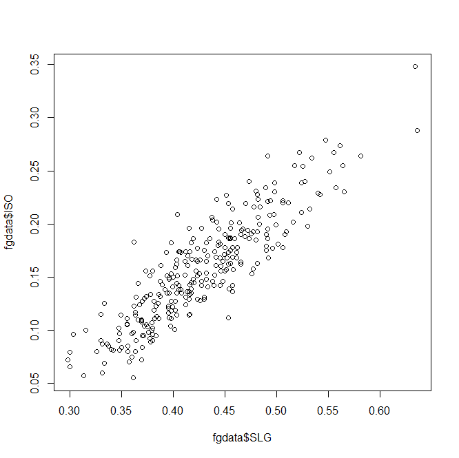
Unsurprisingly, slugging percentage and ISO are fairly well-correlated. Results-wise, we’re starting to push against the limits of our data set–too many of these stats are directly connected to find anything interesting.

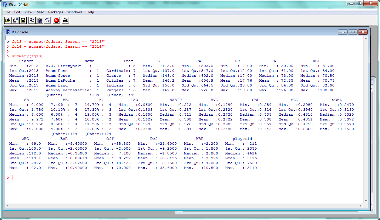
So let’s take a different tack and look at year-over-year trends. There are several ways you could do this in R, but we’ll use a fairly straightforward one. Subset your data into 2013 and 2014 sets,

fg13 = subset(fgdata, Season == "2013")
fg14 = subset(fgdata, Season == "2014")

then merge() the two by name. This will create one large dataset with two sets of columns: one with a player’s 2013 stats and one with their 2014 stats. (Players who only appeared in one season will be omitted automatically.)

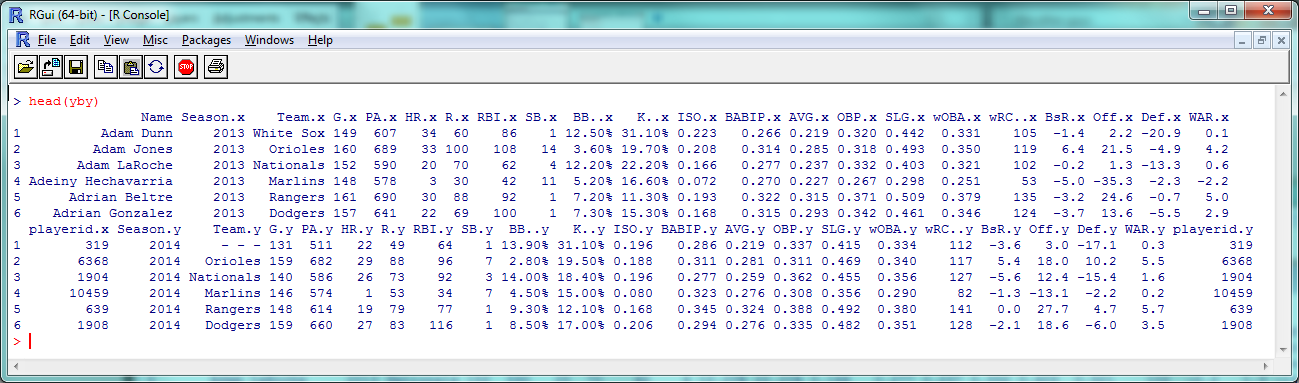
yby= merge(fg13, fg14, by=("Name"))
head(yby)

Year-by-year data
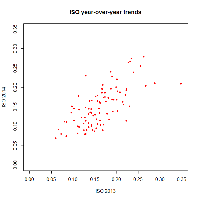
As you can see, 2013 stats have an .x after them and 2014 stats have a .y. So instead of comparing ISO to SLG, let’s see how ISO holds up year-to-year:

plot(yby$ISO.x, yby$ISO.y, pch=20, col="red", main="ISO year-over-year trends", xlab="ISO 2013", ylab="ISO 2014")

Visually appealing R scatterplot(The ‘pch’ argument sets the shape of the data points; ‘xlim’ and ‘ylim’ set the extremes of each axis.)

Again, a decent correlation–but just *how* decent? Let’s turn to the numbers.

Relations and Correlations

If you’re a frequent FanGraphs reader, you’re probably familiar with at least one statistical metric: r², the square of the correlation coefficient. An r² near 1 indicates that two variables are highly-correlated; an r² near 0 indicates they aren’t.

As a refresher without getting too deep into the stats: when you’re ‘finding the r²’ of a plot like the one above, what you’re usually doing is saying there’s a linear relationship between the two variables, that could be described in a y = mx + b equation with an intercept and slope; the r² is then basically measuring how accurately the data fits that equation.

So to find the r² that we all know and love, you want R to create a linear model between the two variables you’re interested in. You can access this by getting a summary of the lm() function:

summary(lm(yby$ISO.x ~ yby$ISO.y))

R linear model summaryThe coefficients, p-values, etc., are interesting and would be worth examining in a more theory-focused post, but you’re looking for the “Multiple R-squared” value near the bottom–turns out to be .4715 here, which is fairly good if not incredible. How does this compare to other stats?

summary(lm(yby$BsR.x ~ yby$BsR.y))
> Multiple R-squared:  0.4306
summary(lm(yby$WAR.x ~ yby$WAR.y))
> Multiple R-squared:  0.1568
summary(lm(yby$BABIP.x ~ yby$BABIP.y))
> Multiple R-squared:  0.2302

BsR is about as consistent as ISO, but WAR has a smaller year-to-year correlation than you might expect. BABIP, less surprisingly, is even less correlated.

Let’s do one more basic statistical test: the t-test, which is often used to see if two sets of numeric data are significantly different from one another. This isn’t as commonly seen in sports analysis (because it doesn’t often tell us much for the data we most often work with), but just to run through how it works in R, let’s compare the ISO of low-K versus high-K hitters. First, we need to convert the percentages in the K% column to actual numbers:

fgdata$K. = as.numeric(sub("%","",fgdata$K.))/100

then subset out the low-K% and high-K% hitters:

lowk = subset(fgdata, K. < .15)
highk = subset(fgdata, K. > .2)

Then, finally, run the t-test:

t.test(lowk$ISO, highk$ISO)

R T-test results
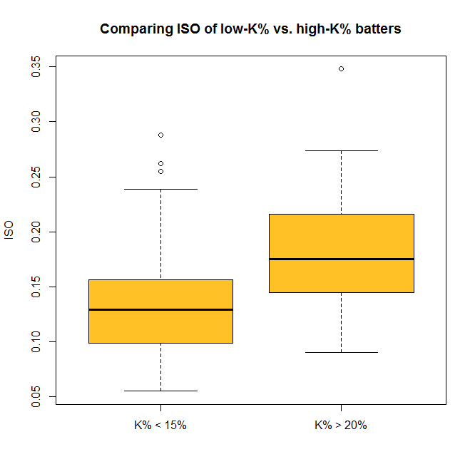
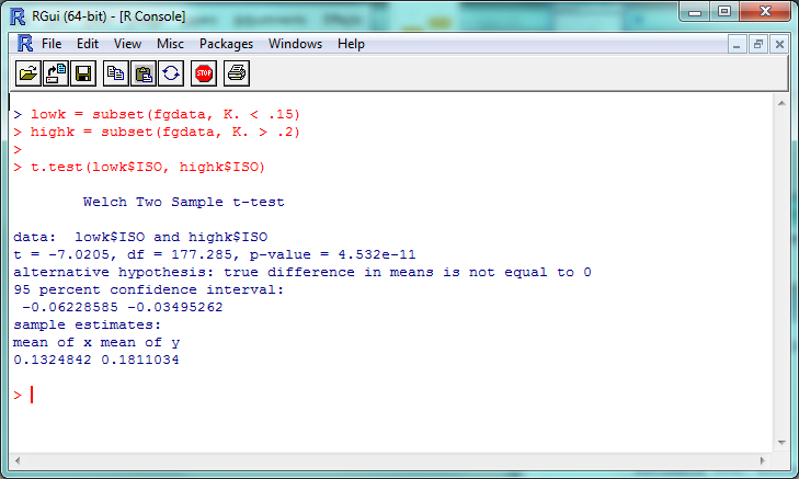
The “p-value” here is about 4.5 x 10^-11 (or 0.000000000045); a p-value less than .05 is generally considered significant, so we can consider this evidence that the ISO of high-K% hitters is significantly different than that of low-K% hitters. We can check this out visually with a boxplot–and you thought we were done with visualization, didn’t you?

boxplot(lowk$ISO, highk$ISO, names=c("K% < 15%","K% > 20%"), ylab="ISO", main="Comparing ISO of low-K% vs. high-K% batters", col="goldenrod1")

Visually appealing R boxplotSo now you can do some standard statistical tests in R–but be careful. It’s incredibly tempting to just start testing every variable you can get your hands on, but doing so makes it much more likely that you’ll run into a false positive or a random correlation. So if you’re testing something, try to have a good reason for it.

…And Beyond

We’ve covered a fair amount, but again, this only begins to cover the potential R provides for visual and statistical analysis. For one example of what’s possible in both these areas, check out this analysis of an online trivia league that was done entirely within R.

If you want to replicate his findings, though (which you can, since he’s posted the code and data online!), you’ll need to install packages, extensions for R that give you even more functionality. The ggplot2 package, for example, is incredibly popular for people who want to create especially cool-looking charts. You can install it with the command

install.packages("ggplot2")

and visit http://ggplot2.org/ to learn more. If R doesn’t do something you want it to out of the box, odds are there’s a package out there that will help you.

That’s probably enough for this week; here’s the script with all of this week’s code. In our next (last?) part of this series, we’ll look at taking one more step: using R to create (very) basic projections.


TechGraphs News Roundup: 7/31/2015

The MLB trade deadline has delayed us a bit, but we’re back to talk about all the sports-tech news we found interesting this week.

Engadget has a nice writeup regarding the money involved in esports these days. Want a hint? It’s a lot.

PGA Tour Live debuted this week. The new streaming service will allow golf fans to stream Thursday and Friday rounds of PGA events that usually aren’t aired on TV. It works on most devices out of the box. It’s a young technology, but it will be interesting to see where it goes.

It sounds like some prominent DOTA 2 players got their Steam accounts hacked. It doesn’t appear to be a wide-spread attack, but you might want to change your password anyway.

DraftKings — you guessed it — raised MORE money, and is looking to spend a bunch of it with FOX Sports. The NFL season is just around the corner, so expect to see a nauseating amount of ads running during games this year.

We talked a little about the use of robot umpires this week, and Wired has some more details.

Remember those new Converse Chuck Taylors that Nike is releasing? Well, it turns out they may be pretty great.

Nike is also working on some soft of hood that athletes can wear to keep themselves cool. It looks weird as Hell, but athletes might not care if it helps prevent overheating.

It appears that nothing is sacred these days. Technology is even sliding into the world of fishing. And it’s not just for the pros either. Amateurs can get in on the game.

That’s all for this week. Have a good weekend. Be excellent to each other.


The Technology Behind the U.S. Women’s National Team’s World Cup Victory

The United States women’s national team went into the 2015 FIFA Women’s World Cup with a chip on their shoulder, trying to avenge a heartbreaking finals loss in 2011. But eagle-eyed viewers might have also noticed the chips the women wore under their shirts as well, as Will Carroll pointed out on Twitter.

The objects were Polar Global’s H7 heart rate sensors as suggested by this Wired article and confirmed by Polar Global. The USWNT is also listed as a client of Catapult, an Australian-based company that combines GPS and inertial measurement units (IMU) into a single sensor.

Strength and fitness coach Dawn Scott confirmed that her team uses heart rate sensors and GPS systems to monitor player performance. However, because the team does not have a formal relationship with either company, she could not discuss the specific devices she uses in detail. Nevertheless, she was still happy to answer general questions about how she and the rest of the American coaching staff used the devices.

The GPS system and heart rate monitor produce a wide range of metrics. Head coach Jill Ellis and her staff were mostly interested in measures of intensity, rather than total distance covered. Scott specifically discussed the percentage of high-speed running (running faster than 11 mph) and distance covered during high-speed running.

“For me they’re the main factors that then show how much a player’s involved in the high-intensity activities,” Scott said. “[That means] overlapping for your midfield player, making high-intensity runs into the box. For defenders, [it means] having to recover.”

But not every position calls for such high-intensity bursts. For those players, the coaching staff relies on meterage — a player’s average speed in meters per minute.

“So say a Lauren Holiday, who isn’t necessarily doing a lot of sprints when she’s in a holding midfield position, but she’s one of the ones who does the highest meterage, so for her, that is more of a marker of her work rate,” Scott said. “In one of the games where she was pushed into the attacking midfield role, she suddenly had a lot of max sprints.”

The games presented an additional set of challenges. Although this tournament marked the first time FIFA allowed players to wear monitoring devices on the pitch, FIFA retained the regulations prohibiting the use of technology on the sidelines. This prevented the coaching staff from using these systems to guide their in-game decision making.

“I don’t always see the purpose of real time [monitoring],” Scott said. “Sometimes in training we’ll take out the real time system, but for me that’s only if we want to get a certain physical output from a fitness point of view.”

Making matters more difficult, several of the stadiums in this summer’s World Cup were domed (like Montreal’s Olympic Stadium) or had large roofs overhanging the field (like Vancouver’s BC Place). This meant the team’s GPS-based systems were much less accurate during games.

“The interpretation of that data is crucial, especially when you’re giving that back to players and the coaches who are interested in that feedback,” Scott said.

Scott doesn’t rely on a single number to judge player performance, instead adjusting her expectations and the numbers she looks at based on the game plan for that particular match.

“It’s knowing your team, your opposition, it’s knowing your own players, and what their physical capabilities are as well,” Scott said. “Carli Lloyd’s numbers were very different in the first three games from the final three games when her role was very different.”

But unlike a coach for a club team, who can monitor their players’ workouts year round, Scott had the added challenge of making things as simple as possible for her players after their training session ended. That meant shelving the more complicated GPS monitors and giving each player a wrist-worn heart rate sensor to wear during training. To their credit, though, the players diligently stuck to the team’s training plan — and just as diligently sent the data back to Scott.

“The players were very good at giving us updates in terms of their heart rate loads,” Scott said. “And they also logged into an online training diary or physical monitoring system, where every single day they would log in, answer five questions about how they feel physically, and so I can then log in and see where a player’s physical state is.”

Scott traveled across the country, working with coaches for every National Women’s Soccer League (NWSL) team to come up with a plan that kept the national squad healthy without hindering their club’s chances of winning. Scott was quick to praise her NWSL counterparts for their cooperation.

“The clubs were given guidelines in terms of when we want to train, when we want the players to have a day off, and also ideally how long the training session should be with the player,” Scott said “And to be fair to the clubs, in that crucial period in the leadup to the World Cup, they stuck to the programs we sent.”

Off the field, Scott is working towards a doctorate from the University of Western Sydney. Unsurprisingly, Scott’s research focuses on the physical demands and training loads of elite female athletes, with a focus on soccer players. Scott’s research relies on the hundreds of hours of game data she has collected from USWNT athletes since 2012.

“The main focus is going to be to develop a training model, so looking at what are the physical demands of women’s football,” Scott said. “And then with that, we look at what is the training intervention is to prepare the players physically for those demands,” Scott said.

But not all Scott’s methods are quite so high-tech. During March’s Algarve Cup in Portugal, players complained about stiff necks and poor sleep. So before this summer’s Women’s World Cup, each player was given an allowance to buy their own pillow to take on the road with them. The result, Scott said, the team was better rest and improved performance.

“When I first suggested it, people looked at me like I’d gone mad,” Scott said. “But the players appreciated it, because it just meant something they had at every single hotel.”

(Header image via GoToVan)

Independent Baseball’s Newest Umpire Isn’t Human

A simple Twitter search of #RobotUmpsNow or #UmpShow will show fans have been clamoring for an electronic umpire for the strike zone — among other things — for some time. While major league baseball isn’t quite ready to make that jump just yet — nor are any affiliated minor league clubs — there is one hero ball club we can turn to. The vaunted San Rafael Pacifics of the Pacific Associate of Professional Baseball are set to debut a strictly PITCHf/x umpire for tonight’s and tomorrow’s game.

SportsVision, creators and owners of PITCHf/x, are working alongside the Pacifics in handing off the task of calling balls and strikes to the system, though former major league player Eric Byrnes will be on hand for assistance should either team object to the system’s judgement. The two-game affair is designed to raise money for the Pat Tillman Foundation and for each called ball or strikeout, Byrnes will donate $100 to the foundation. If either coach disagrees with the strike zone, Byrnes has the option to eject a player or manager, and in doing so would then donate $10,000 to the foundation for each person tossed from the game.

Given PITCHf/x’s enormous popularity among statistically-inclined baseball fans — including but not limited to Brooks Baseball, Baseball Heat Maps, Texas Leaguers and Baseball Savant — seeing progression towards a computerized  strike zone, even in a charitable role, is amazing. The three camera system on hand for the Pacifics is set to capture a triangulated zone, and since three cameras are better than two eyes, we’ll see an automated strike zone for the first time in organized baseball.

The need for an automated zone is pretty clear, especially when we have the technology to review missed calls in near real time. For example look no further than Jeff Sullivan’s posts on The Worst Called Strike/Ball of the First Half, or more recently, let’s observe one of Sunday’s games. Danny Salazar of the Cleveland Indians started the game, and according the PITCHf/x system over at Texas Leaguers, he may have been robbed of a handful of calls at a very important point in the game.

salazar

It looks as though three pitches touched the strike zone that were called a ball with an additional trio of pitches in the zone that were called balls. It’s hard to boil down a game to a single pitch, however one pitch can be the difference between walking back to the dugout after the third out or being lifted with two outs and runners on. The latter situation actually happened, and thanks to MLB’s Gameday, we can see the events unfold.

salazar1

Salazar gets ahead of Tyler Saladino 0-1 before the second and third pitches, both appearing to be in the strike zone get called balls. Salazar does well to even things a 2-2, however he probably should have been out of the inning with the score still tied at one apiece. The calls don’t go his way and Zach McAllister comes on to relieve Salazar, who was at 113 pitches, and promptly gave up the tying run. Again, it’s one pitch, but it was arguably the sequence of events that decided the game.

The Indians and the White Sox are both likely outside of the playoff picture at this point, however that shouldn’t be the focus. Given that we have the technology to get the calls correct, it’s awfully disappointing to only see Independent baseball willing to go with an automated system. As Ken Jennings once wrote, I for one, welcome our new computer overlords.

(Header image via the Pacifics’ website)

How To Use R For Sports Stats, Part 1: The Absolute Basics

If you’ve spent a sufficient amount of time messing around with sports statistics, there’s a good chance the following two things have happened, in order:

  1. You probably started off with Excel, because Excel does a lot of stuff pretty easily and everyone has Microsoft Office.
  2. At some point, you mentioned to someone that you use Excel to do statistical analysis and got a response along the lines of, “Oh, that’s cool, but you should really be using R.”

Politeness issues aside, they might well be right.

R is a programming language and software platform commonly used, particularly in research and academia, for data analysis and visualization. Because it’s a programming language, the learning curve is a bit steeper than it is for something like Excel–but if you dig into it, you’ll find that R makes it possible to do a wider variety of tasks more quickly. If you’re interested in finding interesting insights with just a few lines of code, if you want to easily work with large sets of data, or if you’re interested in using most any statistical test known to man, you should take a look at R.

Also, R is totally free, both as in “open-source” and as in “costs no money”. So that’s nice.

In this series, we’ll learn the basics of working in R with the goal of exploring sports data—baseball, in particular. I’m going to presume that you have no background whatsoever in coding or programming, but to keep things moving, I’ll try not to get too bogged down in the details (like how “=” does something different from “==”) unless absolutely necessary. This guide was made using R on Windows 7, but most everything should be the same on whatever OS you use.

Okay, let’s do this.

Getting Started

You can download R from https://cran.rstudio.com/.

You’ll have to click on a few links (you want the ‘base’ install) and actually install R, but once that’s done you should have a screen that looks like:

Screenshot #1: R consoleThe “R console” is where your code is soon going to run–but first, we need some data. Let’s take FanGraphs’ standard dashboard data for qualifying MLB batters in 2013 and 2014. Save it as something short, like “FGdat.csv”. (If you have a custom FG dashboard or just want to take a shortcut, you can just download the data we’ll be using here.)

In R, we’ll be focusing mostly on functions (that look like, say, function(arg1, arg2)), which are what actually do things, and naming the output of these functions so we can refer back to it later. For example, a line of R code might look like this:

fgdata = read.csv("FGdat.csv")

The function here is the read.csv(), which basically means “read this CSV file into R”, and the argument inside is the file that we want to read. The left part (fgdata =) is us saying that we want to take the data we’re reading and name it “fgdata”.

This is, in fact, the first line we want to run in R to load our data, so type/paste it in and hit Enter to execute it.

(You may get an error like cannot open file ‘FGdat.csv’: No such file or directory; if you do, you likely need to change the directory that R is trying to read files from. Go to “File” -> “Change dir”, and change the working directory to the folder you saved the CSV in, or just move the CSV to the folder R has listed as the working directory.)

If you didn’t get an error and R simply moves on to the next line, you should be good to go!

Basic Stats

The head() function returns the first 6 rows of data; since our data set is named “fgdata”, we can try this out with the line of code:

> head(fgdata)

R Screenshot #2: head(fgdata)And to get a basic overview of the entire data set, there’s the summary() function:

> summary(fgdata)

R Screenshot #3: summary(fgdata)See! Already, data on 20 variables in the blink of an eye.

“1st Qu.” and “3rd Qu.” are the first and third quartiles; the mean, median, minimum and maximum should be self-explanatory. So we can see that the average player in this data set had roughly a .270 average with 17 dingers and 10 steals in 146 games–not far from Alex Gordon’s 2014, basically.

Want to compare how the 2013 and 2014 stats stack up? R makes it pretty easy to pick out subsets of data. It’s called, reasonably, the “subset” function, and all you need to include is the data set you’re taking a subset of and the criteria the subset data should conform to.

Since we have “Season” as a field in the table, we just need to say “Season == “2013”” to get the 2013 players and “Season == “2014”” to get the 2014 players. We’ll name these new data sets ‘fg13’ and ‘fg14’:

> fg13 = subset(fgdata, Season == "2013")
> fg14 = subset(fgdata, Season == "2014")

A quick check should confirm that, yes, the data did subset correctly:

> summary(fg13)

R Screenshot #4: summary(fg13)and now we can do some basic statistical comparisons, like comparing the mean BABIPs between 2013 and 2014. (To single out a specific column in a data set, use the $ symbol.)

> mean(fg13$BABIP)
> mean(fg14$BABIP)

You can do whatever basic statistical tests you like–sd() for the standard deviation, et cetera–and pull out different subsets of the data based on whatever criteria you like. So “HR > 20” for all players who hit more than 20 home runs, or “Player == “Mike Trout”” to get data for all players named Mike Trout:

> fgtrout = subset(fgdata, Name == "Mike Trout")
> fgtrout

R Screenshot #5: fgtroutLastly, it’s not too common to need to reorder your data in R, but if you do, you can do so with the order() function. This line sorts the data by wRC+, ascending order:

> fgdata = fgdata[order(fgdata$wRC.),]

then returns the top 10 rows:

> head(fgdata, n = 10)

You can sort in descending order by placing a minus sign before the column:

> fgdata = fgdata[order(-fgdata$wRC.),]

R Screenshot #6: head(fgdata, n = 10)And, as you’ve probably noticed, most of these functions can be tweaked or expanded depending on the different arguments you use–adding “n = 10” to head(), for example, to view 10 rows instead of 6. One of the more fascinating and infuriating things about R is that pretty much every function is like that–but at least they’re all documented!

And, of course, you can access the documentation through a function. Use help() (help(head), help(summary), etc.) and a page will pop up with the arguments, and more additional details than you probably ever wanted.

Wrap-up

One final note: typing code directly into the console is fine, but it gets a bit annoying if you want to write more than a line or two. Instead, you can create a new window within R to load, edit and run scripts. In Windows, use “Ctrl+N” to open a new script window. Type some code; to run it, highlight the lines you want to run and hit “Ctrl+R”.

You can also use these windows to save your R script in R files–as I’ve done here for all the code used in this article. Feel free to download and start tinkering.

So those are the basics of R; not enough to really show its potential, but enough to start experimenting and exploring as you wish. For Part 2, we’ll start some data plotting and correlation tests, and in Part 3 we’ll try to recreate some basic baseball projection models. I actually haven’t done this before in R, so it should be interesting. Stay tuned!

(Thanks to Jim Hohmann for helping test this article.)


TechGraphs News Roundup: 7/24/2015

It’s been a busy week for sports-tech news, so let’s jump right into it. Here are the stories we found interesting this week.

If you don’t plan on subscribing to NBA League Pass next year, but worry that you really might want to see a random out-of-market game, the NBA has you covered now. You will be able to purchase single games, a la carte, from League Pass starting next season. This is good news! The not-so-good news is that single games will run you $7 a pop. Still, it’s nice to know the feature is available, and it might come in handy for the diehard fans who take a random trip but still want to catch their team’s games.

In a similar, but more stripped-down note, the NFL announced a new video service called Game Pass. Don’t get too excited — you won’t be able to stream regular-season games live with it. You do get to live-stream preseason games, and have access to full replays of past games, for what it’s worth. But that’s kind of it. Replays will be available right after the game ends, and fans can tap any prior game for any team all the way back to 2009. It’s like NFL Rewind, basically, but it will be available on pretty much all your devices.

The EA Sports Hockey League was one of the big missing features from NHL 15, but NHL is bringing it back for 16, and fans can sign up for the public beta to help test it out. Check the last link for all the details, but the skinny is that EASHL is getting a pretty big revamp. In a possible face-saving push, EA is issuing the beta as part of a campaign to involve more user feedback. It’ll be available July 30th if you have NHL 15 for either Xbox One or PS4.

You know how EA’s NCAA Football didn’t use player names, but pretty much copied everything else they could from the player to use in their game without paying the athletes? Well, they got sued for it, and EA shut down production of the game in 2013. Fast-forward to now, and the players won their $60 million settlement. If they file for compensation, they’ll receive some cash. Good job, U.S. District Judge Claudia Wilken.

Speaking of, NCAA teams might be making a comeback to 2K basketball games soon, though the scope isn’t quite known yet.

Something I didn’t know: Nike has been making the classic Converse Chuck Taylor shoe since 2003. Nike acquired Converse after the former went bankrupt. Hmm, the more you know. Anyway, the Chuck is getting a revamp, but only on the inside. Nike is using some of their shoe tech to make the Chucks more comfortable. Same classic look, more comfortable shoe. Cream on the inside, clean on the outside, if you will.

We talk about GoPros a bit on this site. We also talk about live-streaming apps like Meerkat a lot. So when it’s announced that people can now stream on Meerkat using their GoPros, it seems relevant to our interests.

We recently mentioned how drugs like Adderall were being used as PEDs in eSports. Well, some major eSports leagues are instituting drug testing now. I’m not quite sure how it will work for players with real-world needs for the drugs, but it’s a step in the right direction for those who care about that kind of thing.

Speaking of gaming, popular game-streaming site Twitch is ditching Flash for HTML5. This is good news for anyone who likes stable performance, secure computing, or living in the year 2013.

If you buy Madden NFL 16 for the Xbox One, you’ll get a year of EA Access, which is sort of like Netflix for EA games.

Because it seems there’s always Daily Fantasy Sports news, FanDuel has purchased the company that made their apps, and DraftKings will pay $250 million over the next two years to advertise on ESPN.

That’s all for this week. Enjoy your summer weekend, and be excellent to each other.


GoPro Might Pay You for Your Extreme Videos

The GoPro camera can be used for recording virtually anything, but the original market for the small waterproof shooter was for action sports. GoPro gave surfers, skateboarders, skiers, bikers, bungee jumpers, and all kinds of extreme athletes the ability to easily record (and share) unique views of their sport. Now, we mount them on our cars and our dogs. I mount mine on my golf bag to record driving range sessions. You can find GoPro footage of nearly anything these days, and GoPro is looking to turn the best footage out there into cash for them and the creator.

The newly-launched Premium Content Licensing Portal is GoPro’s take on the Getty licensing model. Essentially, GoPro is selling a service to ad producers, movie makers, journalistic organizations, or anyone else with enough money that will allow them to buy the rights to interesting footage shot on GoPro cameras. The companies pay GoPro, GoPro pays the video makers. It seems like a no-brainer for content producers. As Mashable puts it:

… high-quality original footage is costly and difficult to produce, so advertisers are more than willing to shell out the money to buy licenses. Thanks to the durability of the devices and savvy ties with extreme sporting, GoPro users have created a wealth of first-person action footage that’s hard to get otherwise.

While, at least at the moment, it seems unlikely that GoPro users could use the service as a full-time job, it seems like getting offered some cash for their cool videos would be a win for them, as well. Everyone likes a little extra money, and they’d also get the thrill of possibly seeing their footage on TV or the web. They’re going to do parkour on high buildings or surf giant waves anyway — might as well make a little money off it.

The new service is also an interesting fork in the business model for GoPro. They’ve made a lot of money on their cameras and accessories, and the company is valued at almost $4 billion. But we’re seeing more and more that creating cool hardware isn’t enough. Look at Apple. They’ve sold unseemly amounts of their devices, but as the iterations offer fewer and fewer new features, customers become reluctant to pay for upgrades. The jump from the original iPhone to the iPhone 3GS was huge — much bigger than the jump from the iPhone 5 to the iPhone 6. Apple caught this early, and that’s where the App Store came in. It’s another revenue model built on the backbone of their successful hardware. GoPros are built to last. It’s one of their main selling points, but could also mean a longer window of time between repeat sales. If the hardware market gets too saturated, they have to turn elsewhere for revenue. Now a hardware company is also a media company. It’s not a pivot, it’s diversification.

The site is already up and running, so we may very well see more GoPro footage in our TV and online streaming ads. And since GoPro is acting as the gatekeeper for what’s interesting and engaging, chances are good that the footage we see will be the cream of the crop. It’s a smart move for GoPro. They make a little extra money, and might even convince buyers on the fence to pick up one of their cameras. Whether it works or not, the move shows that GoPro is looking to get ahead of the curve, rather than waiting for camera sales to drop before trying to play catchup.

(Image via chriscom)