I’ve worked in technology pretty much all my life, but my first job was on the support desk of a software company. It was consumer software, too, so anybody and everybody called in — professionals, novices, little kids, people who wanted to learn, people who wanted us to do their work for them, and people who didn’t understand how computer mice worked. It was challenging. But I think the hardest part was that our department didn’t have remote software. This meant that every time a person had a problem, they had to just explain it to us. We couldn’t see what was happening, so we had to trust what the person was saying was accurate. Everybody sees a computer screen differently. Very rarely did a customer see it in the same fashion I was used to seeing it.
When I published the first two parts of this Retrosheet series (Part 1 | Part 2), I did not monitor the comments well enough. I apologize for that. Some people had legitimate questions and I wasn’t there to answer them. I also learned that I was making all of you trust my explanations of things. I was making you see everything through my eyes, and some people got a little confused. This stuff happens. I’m hoping to fix that here.
I also promised a way for Mac people to have access to this, so I’m doing that as well. This article/video is for:
1. Mac (and Linux) users
2. Windows users who had trouble with the first two parts
Some caveats for Windows users looking to use this method:
1. The whole point of the first two parts was to show how the SQL files can get made using Chadwick. The idea being that you could grab the 2015 (and all subsequent season) data when that became available. The method mentioned in this article involves installing one flat file. That means that you’ll need to delete all the data and reload it for 2015 next season. I have no problem making this file for you folks, and will continue to do so as long as TechGraphs and I are around. It’s not a big deal, it’s just a different approach and I wanted to be transparent about that. Mac users basically have to do this method since the Chadwick tools aren’t available for OSX.
2. The video walks Mac users through installing and setting up a MySQL database. Your method differs, and it was explained in parts one and two linked above. I try to make it clear about when I’m dealing only with Mac users, but I wanted to give you a heads up on that.
Everyone using this method will need to download this file. Just save it to the desktop. The video will walk you through the rest.
You will also need these two lines of code. The video will tell you how to do it.
cd /usr/local/mysql/bin
./mysqladmin -u root password ‘password’
I will be monitoring the comments more closely, so let me know if you have any questions. Thanks, and good luck.
The PivotTable can be — in the right hands — one of the most powerful and useful tools available to an Excel Wizard. What does a PivotTable do? It reorganizes raw data into malleable tables. This allows us to look at the same data, but through a different lens.
It’s kind of like the difference between a cup of cold froyo in its original form — with a layer of peanuts, a layer of chocolate- and marshmallow-flavored froyo, and a layer of chocolate syrup — and a cup of froyo stirred and mixed up so that the sauce and nuts and yogurt are more integrated. It’s all the same components, the same flavor, but in one form, you can see them more clearly.
Before we can use a PivotTable, we need a question and a dataset that requires a PivotTable. (Throwing a PivotTable at a random problem will do you nothing.) The typical question I have that requires a PivotTable: Who performed best over the last three seasons?
And the question is more complicated than just “let’s add up data from 2012 through 2014.” I want to weight the years 5-4-3, meaning 2014 — being more recent — is 1.25 time more important than 2013, and 2013 is 1.3 times more important than 2012. This is a common weighting that Tom Tango uses a lot, most notably in his Marcel projections.
So let’s use a PivotTable with my Ottoneu fantasy team’s data so I can best predict my targets for the upcoming year. I’m going to head to my Ottoneu league’s home screen and then browse to the “Sortable Stats” section, but just about everything here can be replicated with the FanGraphs leaderboards and WAR instead of fantasy points.
I’m going to next choose to look at split season from 2012 through 2014:
This will return a single line per player per season.
Then we export the data to a CSV:
We can open the resulting CSV with Excel.
Opening that data, we get a bare bones spreadsheet somewhat like this:
Here’s what a spreadsheet looks like.
Then in the Insert section on the top ribbon, choose PivotTable:
Insert > PivotTable
You will then receive a popup window titled “Create PivotTable.” I never use the first section, but will typically leave the second section alone too. Basically, if you want, you can keep the PivotTable in the same sheet/tab, or you can have it create its own new tab. Since PivotTables frequently change shape, I rarely want it anywhere near my raw data because it could accidentally overwrite key stuff.
So hit “OK.”
This will result in something this-ish:
Sometimes the field list will be docked against the side of the spreadsheet. It just depends on what your default or previous settings are.
My original question is: “Who performed the best over the last three years?” That means I want my rows to be each individual player. To do this — and avoid problems like having two players with the same name — I will drag the “playerid” field to the “Row Labels” section:
The “playerid” field as a unique FanGraphs ID for each player. Baseball-Reference, MLBAM, and other sources have their own unique naming systems too, and it’s important to use those when possible.
You should now have something unhelpful looking like this:
Now the rows are each identified by a player’s unique FanGraphs number.
Now we need to add the column headings (“Season”) and the data we want displayed (“FPTS”). Again, this is just a simple drag and drop operation:
This will rearrange the raw data into a more helpful form.
So we end up with something like this:
Now the fantasy points (FPTS) are displayed by player and divided by year.
This is great! But let’s get those names in there now. Drag the “Name” field into the Row Labels sections, adding it just underneath the “playerid” field. This should result in a real messy display where the names appear under the numbers and have completely unnecessary subtotals.
Head to the “PivotTable Tools” and the tab “Design.” Here, we can rearrange the look and feel of the PivotTable. Under Subtotals, choose “Do Not Show Subtotals.” Under “Report Layout,” click “Show in Tabular Form.”
By removing the subtotals and changing to a tabular layout, we can see the player names neatly lined beside the unique playerid numbers.
Now our data is in good shape. We’ve isolated the position player fantasy points by season, and now we just need to create a formula that will weight recent performances in favor of older stats.
The finished PivotTable should look something like this.
So now, in order to jam in my own little formula, I will copy the data (CTRL+A then CTRL+C) and paste the values into a new tab or spreadsheet (so CTRL+V to paste it, then CTRL then V to paste just the values). Now that I’ve got raw numbers organized the way I want them, I will delete the top row (which does nothing for me) and then format the data as a table:
After massaging this data a little bit, we should be ready to create our fun little formula.
First, I’m going to use the filter buttons to get rid of any players who had blank years. Not only do these guys complicate the following math, but they also invariably do not qualify for my question concerning most fantasy points over the preceding three seasons.
After I filter out the “(Blank)” items in the each year column, I should have something like this:
Note how there are no hitters with missing years.
Then I just create a formula that multiplies each year by the appropriate 5-4-3 weight, adds the results, and then divides that sum by the sum of the weights (12). That formula is specifically this:
=([@2014]*5+[@2013]*4+[@2012]*3)/12
NOTE: These previous two steps could go in either order, really.
Then, for fun, I’ll format the final column to look a little nicer, maybe throw in a conditional formatting here or there, and then I’ve got a nifty little tool for for my first year draft. Of course, if I were using this data for a draft in an old league, I would have filtered down to just Free Agents — either in the Sortable Stats page, or within the PivotTable:
The filter tool can allow me to pick which fantasy team I want to look at. In the case of an old league, I’d want to look at “Free Agents.” Obviously though, in a first-year draft, everyone is a Free Agent.
So, after all that work, I finally get my sweet, delicious prize:
Tasty, tasty data.
With a little bit of formula athletics, we can expand this data to look at everyone, even if they have missed a season. This would allow us to allow put rookies and sophomores into the table. But since this is a PivotTable article, I’ll save that for another time.
By now there aren’t too many people who haven’t used Google Earth in some capacity. From looking up your house to checking out different monuments or landmarks, Google Earth has been a great and fun addition to the world. Until recently there was a Google Earth Pro edition, going for a pricey $399.00 per year, an option that generally only businesses took advantage of. The Pro version is now available for free as a download with the activation code GEPFREE. Though the lined URL does say free trial, the site itself notes signup, aka payment, is no longer required and shows the free code.
We’ll be taking a closer look at the downloaded version and highlighting some features that the free Google Earth didn’t have. Let’s take a look at Wrigley Field. It’s notorious for almost zero parking — and if you plan to visit, the official site strongly encourages public transit rather driving there yourself — something even the free version of Google Earth shows.
If you’re having a hard time picking out parking, it’d be hard to blame you. While both versions show the Free Parking for nights and weekend games, only the Pro version displays other lots (however the Purple, Brown and Irving Lots).
Maybe instead of visiting for a game, you’re interesting in moving to Wrigleyville (or wherever) and are interested in the local demographics. The data is from 2011, but does have the option to show the 2016 projected information on things ranging from income, age, gender, education and marital status.
Other options the Pro edition offer is the ability to print pictures at an impressive 4,800 x 3,200 resolution as well as making movies at 1,920 x 1,080. For the true nerds, the Pro also allows spreadsheet imports of up to 2,500 different addresses to get a wide swath of any neighborhood. From planning a trip to moving to a new neighborhood to making a movie of all the places you want to visit, Google Earth Pro’s new price makes it absolutely worth downloading.
Imgur continues to adapt to the demands of their market, after beginning to switch away from traditional GIF file types for the more efficient GIFVs, they are allowing URL based videos to be used in the creation of the GIF or GIFV. If a file size exceeds 10MB then it will automatically be converted to a GIFV. As a reminder, Imgur accounts are free — though you don’t need one to create the GIF/V — and GIFV files are both cleaner and smaller than the old GIF files.
Creating an embeddable GIF/V is as easy as copy-pasting the URL of the desired video and following the steps. Let’s give it a try.
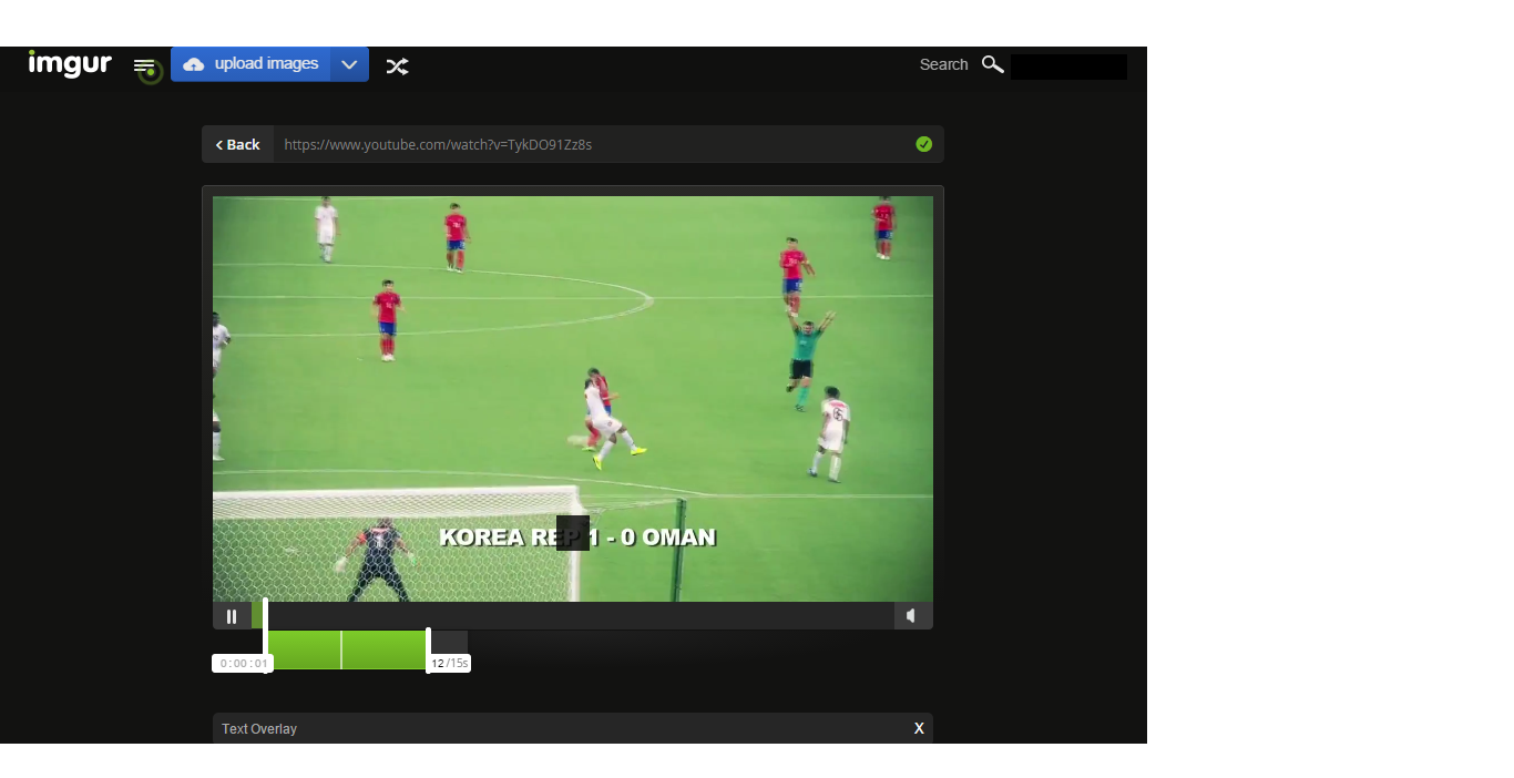
From YouTube, we’ll take a look at South Korea’s run to the finals of the Asian Cup. Choosing where to cut the video on both ends is as simple as clicking on the slider bar at the desired times.
Note that Imgur allows the option to embed text directly over the GIFV but be aware that at the time of launch, the text box is unable to be moved.
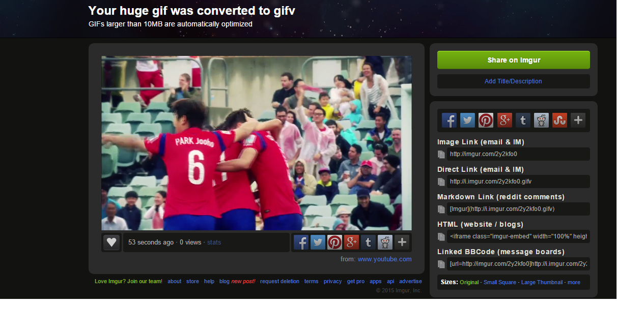
Once you have the time of the GIFV down and the text correct, then it is a matter of time letting Imgur untangle everything. When you’re all set, there are options to share directly to Facebook, Twitter, Pinterest, Google+, Tumblr and Reddit as well as a slew of embed and link options.
That magical time of year has come again. Yes, the very fine folks over at Retrosheet have updated their game files once again, and the new batch includes (among other updates) the play-by-play files for every baseball game in 2014. There are a lot of things you can do with the Retrosheet files, but one of the most powerful options is to create a Retrosheet MySQL database.
Certainly, there are a lot of things you can find out at FanGraphs and Baseball Reference without the need for your own database. But every now and then, a question pops up that Googling, FanGraphs leaderboards, or even the Almighty Play Index at Baseball Reference cannot answer. It’s a luxury to have your own database, to be sure, but any baseball nerd worth their salt should at least have one to tinker with.
This tutorial is going to be starting from scratch. This means that this first installment of the series will simply be about acquiring the right tools to build out the database. We’ll get to actually inputting the baseball data in the next chapter. This may seem like the boring part, because it is. But it’s important to have the proper foundation before we get to the fun stuff.
DISCLAIMER: For right now, I’m going to be working strictly in a Windows environment. The tools that we need — which will be revealed later — were meant to work with the Windows command line. There are options for you Mac/Linux users out there, and I will discuss them down the road. But for right now, these initial steps will be for the Windows folks.
MORE DISCLAIMER: I’m trying my hardest to keep this tutorial accessible for everyone. You’ll need a basic understanding of Windows, but you shouldn’t have to be a computer wiz to follow these steps. Conversely, those that are very familiar with Windows will see this as pretty basic stuff. I’m not trying to be insulting. I’m just trying to make sure everyone can follow along.
Step 1: Installing MySQL
The term “database” might sound like you need some sort of special hardware or server rack in your house. While this is true in the corporate world, the truth is you can have your own database right on your regular PC. No need for special hardware or hosting plans or anything of the sort. This is not to say that having a hosted database doesn’t have it’s advantages, but for the time being, we’ll be dealing with what are called local databases — those that live right on your regular machine.
However, a complete Retrosheet database will require a good deal of hard drive space. From my experience, a Retrosheet database that spans all the available data requires a little over 8 GB of hard drive space. However, as Retrosheet releases more and more updates, that need will expand. To be safe, I wouldn’t work with any less than 15 GB of available space. You’ll be surprised how fast that fills up.
Personally, I have a separate machine that hosts my personal database. It’s a headless (just a tower stowed away in my attic, no monitor or keyboard attached) unit that performs a lot of functions like storing my ripped DVDs and music. But my Retrosheet info also lives there, and I connect to it to do my querying. If you are totally baffled by this notion, don’t worry. I’m still teaching you how to install it locally. But for those with a little knowledge of how to handle some basic home networking, know that this is an option.
OK. Let’s get to the action. The type of database that we’ll be using is called MySQL. It’s a very common database language. There are lots of resources in both book and online form to learn more about it, and pretty much any problem is easily Googlable. It’s one of the industry standards, so that’s what we’ll deal with.
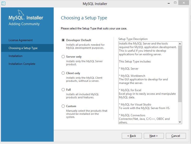
To keep things nice and free, and since we’ll be only using this for personal reasons, we’ll deal with the Community Edition of MySQL. You can find the download link here. You’ll want to choose the second (larger) download link toward the middle of the page. The next page will give you some buttons to login or signup, but you can bypass that with the “No thanks…” link a little further down the page. Once the .msi file has downloaded, go ahead and run it.
If you want to go the quick and dirty way, go ahead and choose the Developer Default option. It will install everything you need, and probably some stuff you don’t. You might want that stuff later on, but for the sake of this article, I’m going to choose the Custom option and pick what I want installed. You should install the Server and Workbench at minimum, though it’s a good idea to include the notifier and the documentation as well. You’ll have to click through some category trees to get what you want. Use the green arrow to add your options to the list of things to be installed.
The installer will check to make sure you have all the required utilities to do what you want. In my case, I didn’t have the C++ 2013 distribution on my machine — you may have more things that need installing. Just click Execute and the necessary files will be downloaded and the respective installers will run. Once everything is installed, click Next and your MySQL install will begin.
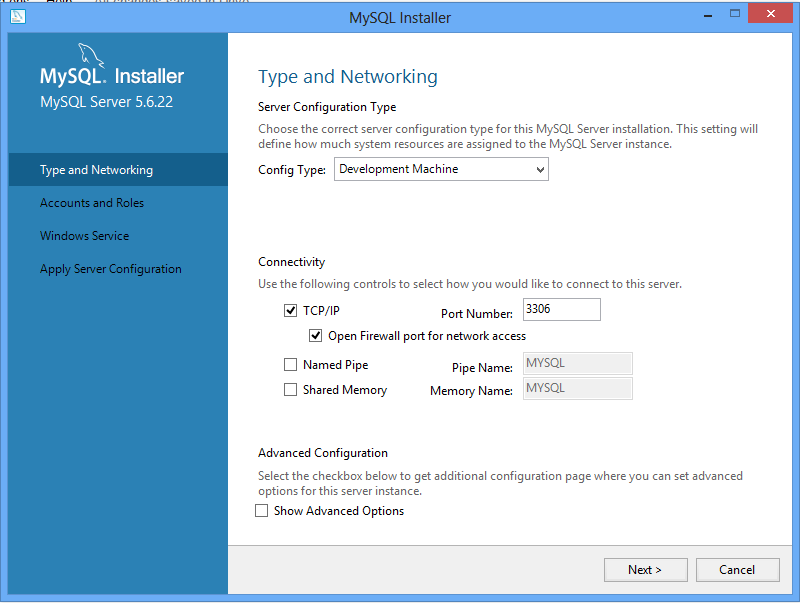
For configuration purposes, go ahead and keep the defaults, unless you have specific reasons not to (and you know what you’re doing).
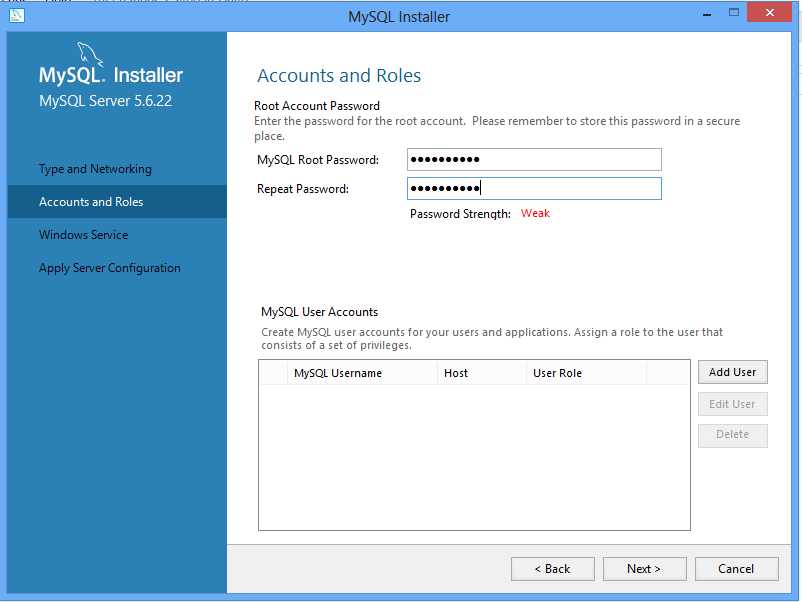
You can add users to the database if you want, but for simplicity, we’re just going to define a password for the “root” user. REMEMBER THIS PASSWORD. It’s your key to doing anything with the database — adding data, querying, etc. If you lose it, you’re pretty much horked. Use a familiar password or write it down. If you’re just having this on your own machine, there’s really no need for a super-complicated password. It’s holding freely-available data, after all.
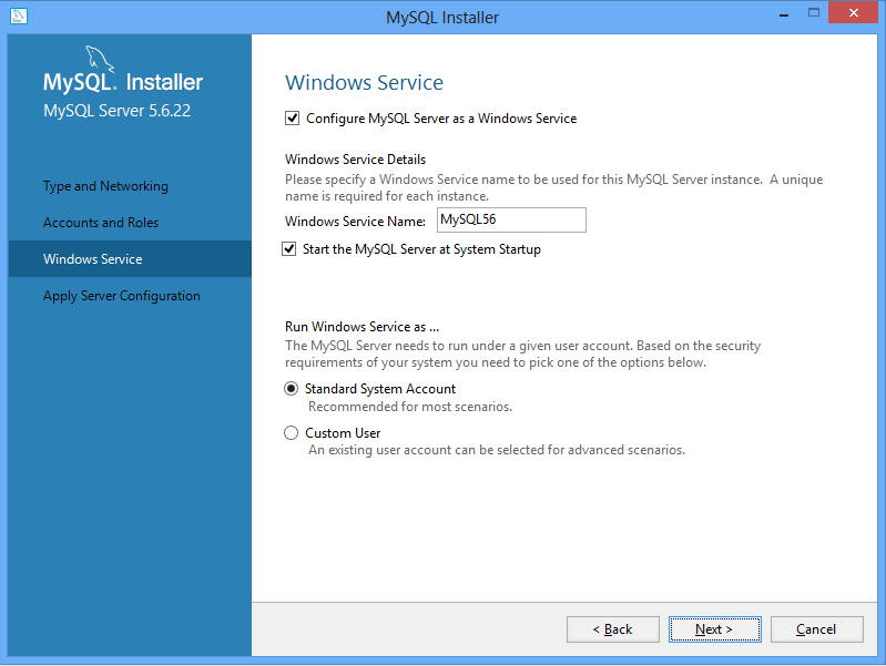
For the Windows Service configuration, you can keep the defaults as well. You can choose to not have the MySQL service to run when you start the machine, but if you do you’ll have to manually start the service each time you want to use the database. If you don’t know what that means, have it run on default.
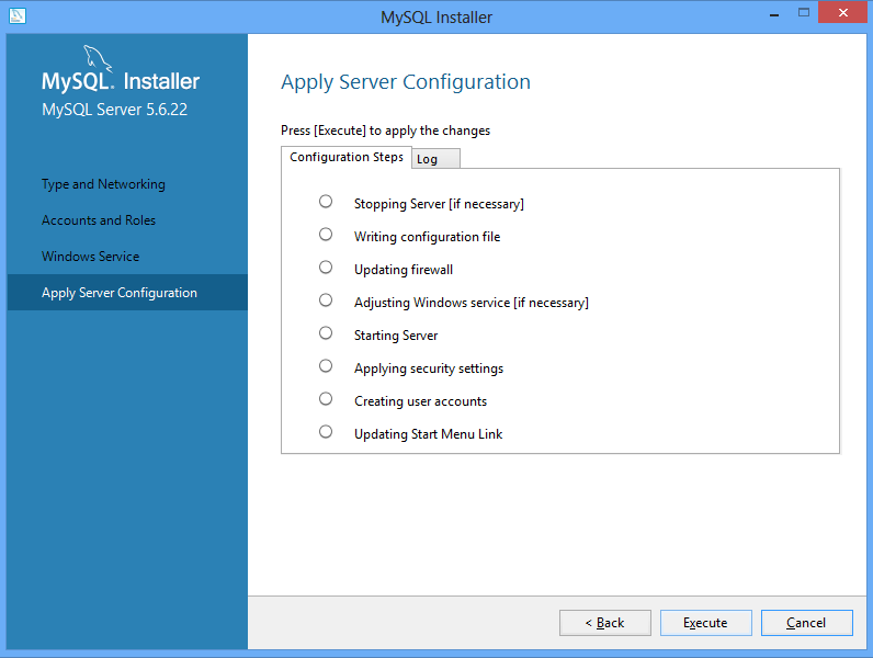
Go ahead and click Execute, and the options will be configured. After that, a few clicks of Next should do it. You’ve just installed MySQL on your machine. Congratulations!
Step 2: Install Wget
Wget is a great utility for downloading mass amounts of data from a server without having to click a thousand links. It’s a script-based tool, and it’s what you’ll need to download all the Retrosheet data with in one big swoop. Don’t worry, we’ll provide the scripts you’ll need.
Download the installer here. Run the installer, keeping all the defaults.
Step 3: Install 7-Zip
7-Zip is a .zip file utility. It’s one of the best free tools for handling .zip files, and it’s what we’ll be using. You can download the installers here. Choose one of the first two options, taking care to choose the right version in regards to 32- or 64-bit. If you don’t know what version you have, go to the Control Panel of your machine, click System and Security, then System. You’ll get a similar screen, which should show you your version. Remember which one you have, as this will be important later on.
Yes, I name all of my devices after baseball players. Don’t judge.
After you’ve downloaded the right version, go ahead and install, using all the defaults.
You’ve done it! You’ve done all the pre-steps for installing your Retrosheet database. If you have any questions, sound off in the comments. Stay tuned, as next week, we’ll get our hands dirty with installing the actual Retrosheet data. I’ve made it as painless as possible, I promise. Don’t get worried. If you can handle what we did today, you can handle the rest. Good luck, and don’t feel bad about asking for help.
A Rating Percentage Index (RPI) can be a powerful tool in assessing a team’s quality when a team’s schedule may differ wildly from its peers. RPI calculations are critically important in collegiate athletics, when the No. 1 and No. 2 teams in the nation have few or no shared opponents. RPI helps adjust for that curiosity.
Simply put, RPI is this:
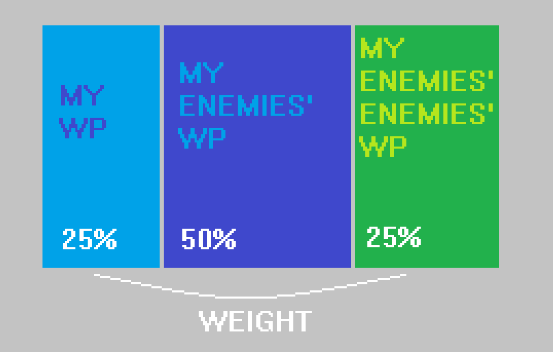
The basic principle of RPI is to give 75% of the weight to other teams’ records.
The formula, in formula mode, is:
RPI = (WP * 0.25) + (OWP * 0.50) + (OOWP * 0.25)
Where:
WP = winning percentage
OWP = opponent’s winning percentage
OOWP = opponent’s opponent’s winning percentage
What’s great about RPI is its intuitiveness and its simplicity. Though it might benefit from information like margin of victory or home field advantage (something it can account for and does in the the NCAA basketball calculations), RPI is simply an attempt to adjust for quality of opponent. It does a decent job of answering the question: “What if everyone played each other?” in a league setting where that’s impossible.
We can then use RPI for:
rec rugby teams with unbalanced schedules
ongoing office ping pong tournaments
high school, middle school, and rec league teams of all sports
Madden records with friends
any environment where two parties battle and one wins
Here’s the file:
NOTE: Don’t download this if you don’t trust me. The file is an Excel file with macros; these can be powerful. I encourage you to trust me, but in general, practice caution when opening an macro-enabled Excel file from a stranger on the Internet.
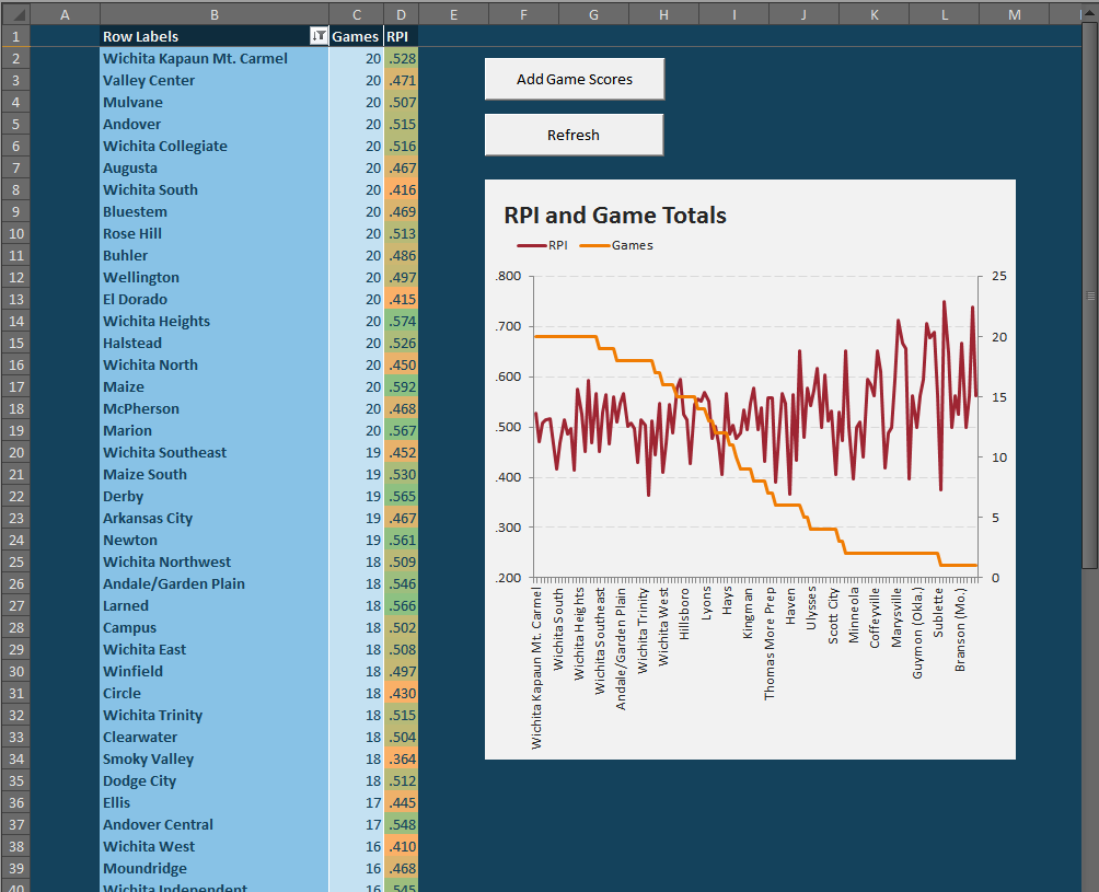
When you open the file, it should look something like this:
The file comes with some default, filler data. You can remove it using the “Add Game Scores” button.
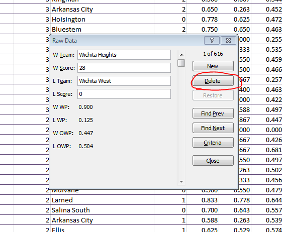
If you want to jam in the results from your weekend of one-on-one basketball games, just click the “Add Game Scores” button. This will produce a list popup where you can add and remove game results:
You can remove an old record by scrolling through the selections (or clicking the “Find Prev” or “Find Next” buttons) and then clicking “Delete.”
You can speed this process up by unhiding the “Raw Data” tab and deleting the unwanted rows of data. But be sure to preserve at least one row so that the final four columns retain their formulas.
To add a new score, you’ll want to click “New” immediately, then fill in the blank spots. NOTE: You don’t need to put in the scores, but since nothing is password locked in this doc, you may want to save those in case later on you feel frisky and want to add some margin of victory inputs somewhere. Once you have input the records you desire, click “Close.” We will now need to refresh the calculations, so press the big, appropriately-titled “Refresh” button. ALSO NOTE: You will likely need to adjust the row filters.
The end result should be something like this:
You may need to refresh a second time to get the RPI column’s conditional formatting to work.
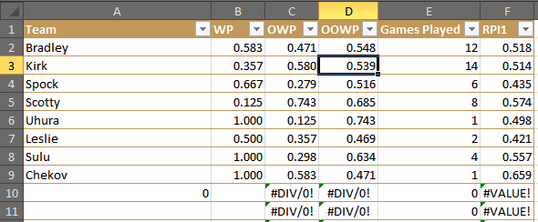
If we want to drill deeper on the data, we can unhide the “Prep” worksheet, which will show each RPI and the three components that go into it.
The “Prep” tab allows us to see the full details of the data.
Analysis:
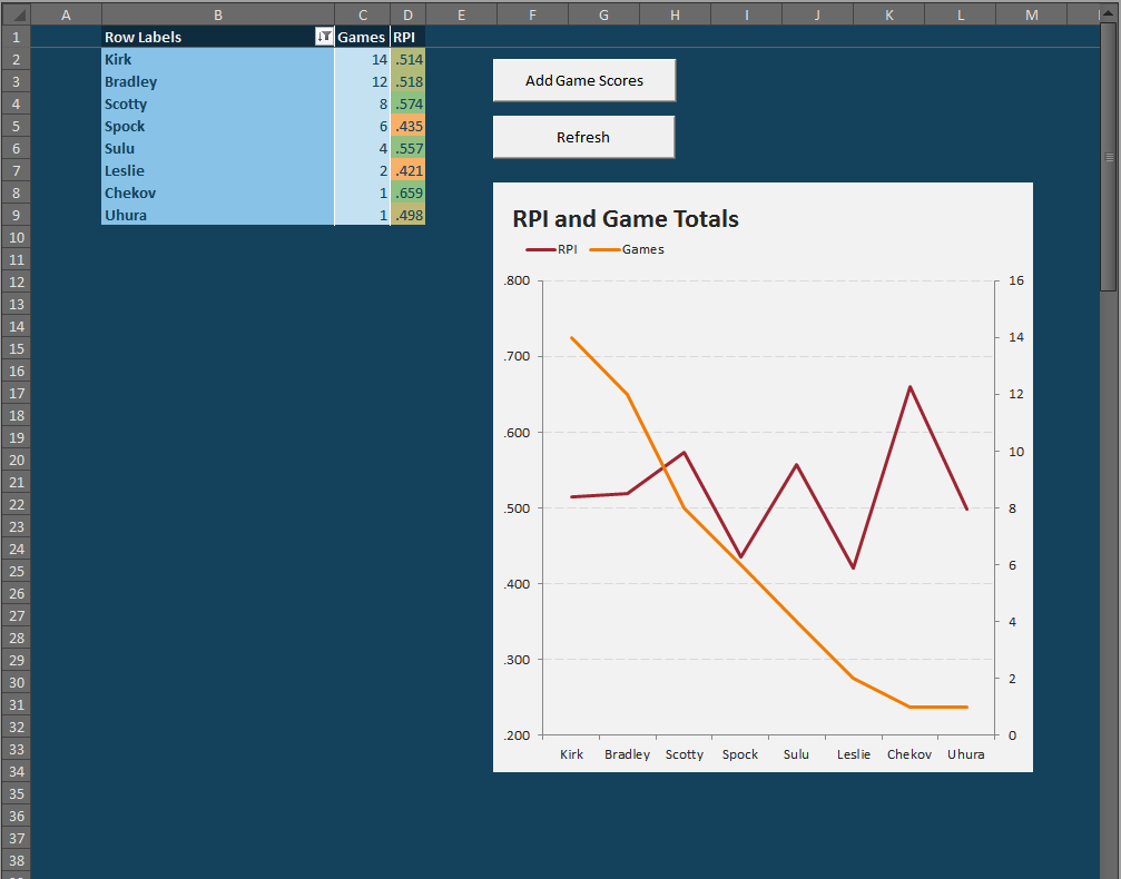
Chekov may have the largest RPI, but he played only one game of Tri-Dimensional Chess — a game which he won, obviously. That’s why it’s important to note the Game Played when looking at RPI (or WP, for that matter). His one victory game against me, which is ultimately neither a big help nor hindrance because my RPI was merely .518 — so his one victory came against a mediocre player.
Despite winning 2 out of every 3 games, Spock’s weak competition (2 wins against Scotty, 1 against Kirk and myself) and his losses against Scotty and Kirk, undermined his otherwise impressive record.
The best player was probably Scotty, who lost a ton, but nevertheless beat Spock. Moreover, many of his losses came at the hands of undefeated Sulu, undefeated Uhura, and the formidable Kirk. If Scotty chose his 8 opponents better, he could conceivably have been the best player.
Analysis of the analysis: If you think these results seem skewed to favor the smaller samples, you are right. That is one of the dangers of RPI. Review that very first RPI chart. The lower the orange line (i.e. the fewer games played), the more upwardly skewed the red line (i.e. the more likely for a bias towards high RPIs). The systems settles down around ten games, so I would consider that as good an arbitrary cutoff as any other number.
If we cut off our Tri-Dimensional Chess club rankings at a minimum of 10 games played, we can comfortably assert that I’m marginally better than Kirk — and that Scotty could be possibly better than us both.
Anyway, that’s the RPI Tool. I hope you enjoy it. Please let me know in the comments if you encounter any problems. I’ve not password locked anything, so feel free to do whatever with the spreadsheet.
Modern spreadsheet programs are powerful. Compared to what our ancestors had to deal with — pen and paper spreadsheets — Excel, Google Spreadsheets, and LibreOffice / Open Office type programs are basically alien. And I mean that both in the utility and the intuitiveness of these programs. While they are incredibly useful in combing data for information, they are also full of hidden treasures — and a productivity program should never have hidden anythings.
Each of these programs has a little gem called “vlookup.” The vlookup function stands for “vertical lookup.” As we might expect, there is also a “horizontal lookup,” which is basically the same thing, but it scans columns instead of rows. The vlookup function is especially useful for when we want to combine information from across two tables. But first we need a question. Playing with data for the sake of playing with data is not super helpful — usually.
So here’s our question: Who is the most important hitter to any given team?
There are a lot of ways to approach this question, but since we want to use vlookups, let’s further this inquiry by asking: Which player has the highest wRC+ relative to the rest of his team? The weighted runs created plus (wRC+) statistic is great because it measures a players total offensive output, but it also controls for era, stadium, and league.
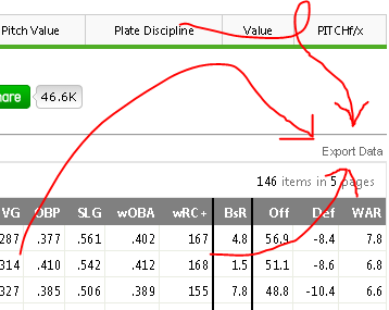
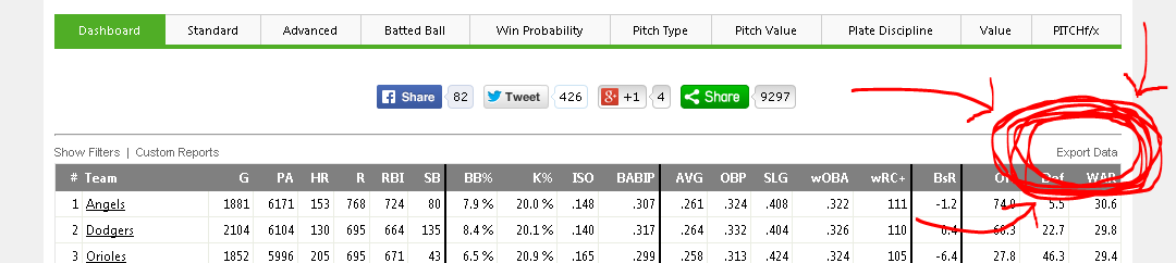
In order to answer this second question, we will need to know our data. We can get each individual player’s wRC+ from the FanGraphs leaderboard here. Using the Export Data button, we can get a CSV of each leaderboard page in an instant.
Here’s the button that makes FanGraphs leaderboards so nifty for outside data analysis programs like Excel or Tableau.
Then, we want the team data. Navigate over to the Teams tab and choose the “NP” or non-pitchers button. This gives the team-level offensive numbers without those nasty pitchers gumming up the data with their strike outs and pop outs and trickle outs.
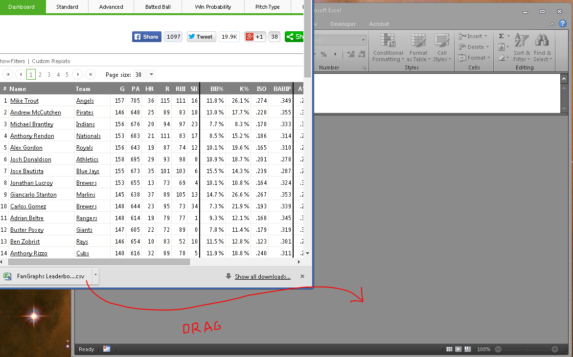
After we’ve exported both data, we can open them either by navigating to the Downloads folder and opening them with Excel, or just clicking the download icon in Chrome or Firefox or Internet Explorer if you’re stuck at work and it’s 1997. I oftentimes have multiple instances of Excel open (for my multi-monitor madness) and so I like to drag the download icon into the Excel window.
I’m a dragger. I like to drag the downloaded files. And if you have multiple Excel windows running (which isn’t necessary for this, but — what the hay? — we all need to look busy at work, right?), then dragging should be a preferred method.
Now we have all the data we want; we just need to combine it. Enter vlookups.
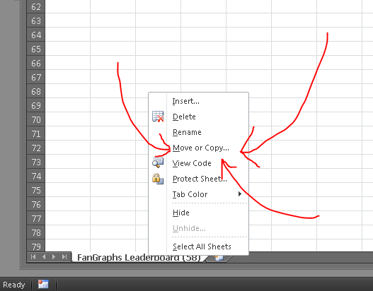
To keep things neat, let’s combine our two separate workbooks. This isn’t a necessary step, but it will help our formula bars be more readable. Right click the tab of one of the worksheets (it doesn’t matter which) and choose Move or Copy…. This will open a dialogue asking where you want to move the worksheet. Using the drop down menu, choose the other workbook and click okay. This should combine the two disparate worksheets into a single workbook. (I’d also go ahead and rename them too, just for whatever’s sake.)
Combining the two worksheets is not a necessary step, but it can simplify the formulas later. Also: It keeps all your data in one place, which is good for later when you reopen the stuff.
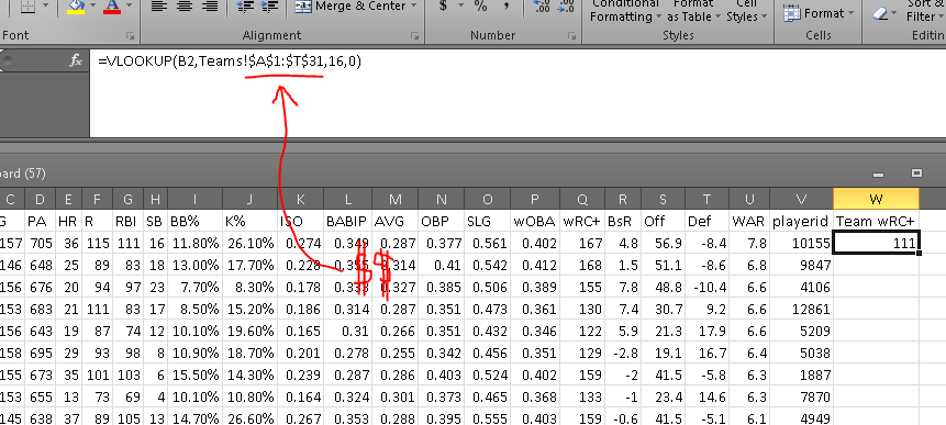
I’ve renamed my two worksheets (or tabs) as “Players” for the first set of data and “Teams” for the data we took from the teams leaderboard. On the players tab, we’ll want to add a column called “Team wRC+”. So in cell W1, I write just that, and then in cell W2 I begin to type the vlookup formula by writing =vlookup(.
lookup_value: What do I want Excel to use to find something? What is the key to unlock the information door? In this case, I want Excel to find the team wRC+ by using a player’s listed wRC+, so the lookup_value needs to be B1, which is where the column “Team” is in this particular spreadsheet. (Now press comma.)
table_array: Where is the data? Or where is the doorway for the aforementioned key? The answer to this question is the data that is in my “Teams” tab — the team totals data from our second CSV download. I’ll navigate to the Team tab, click in cell A:1 and drag until you’ve selected the whole table. Now, we don’t want this selection to move later on (because this table is not moving; it’s dead), so press F4 to add cashmoney symbols in front of your cell references. (Now press comma.)
col_index_num: In which column will Excel find the desired data? Or where in the room is the prize? For this, we need to find which column the team wRC+ is listed in. That’s column P, which is the 16th column in our table_array (because we count every column, including the first). So here, we’ll write 16. (Now press comma.)
range_lookup: Do we want Excel to find an exact match for the lookup_value? OF COURSE. DON’T BE SO FREAKIN’ LAZY, EXCEL. YOU’RE A ROBOT, YOU DON’T GET TIRED. Type a 0 (zero) or FALSE in here. (Now close the parenthesis and hit enter.)
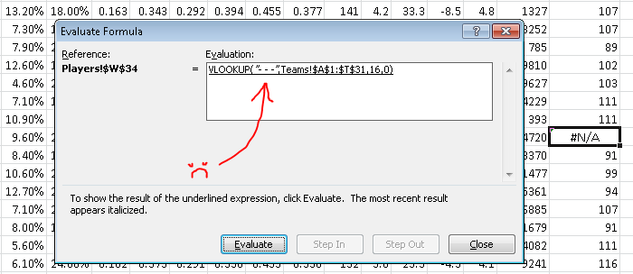
Look at that! If all has gone according to plan, you should have a number populating that W2 cell (probably a “111” if Mike Trout is at the top of your list and you’re using the 2014 season data). If there is a problem and we’re getting an error message, we can always find out where that particular error is occurring by using the Evaluate Formula function (Formulas > Evaluate Formula).
Your formula, en totale, should look something like this:
This is what your formula and result should ultimately look like. Make sure to have the dollar signs in their, which will make it an absolute reference rather than a relative reference.
Now we need to apply that formula to all the cells in the column. We can drag that bottom right corner of that “111” cell, or copy and then paste on the empty cells, or whatever the hell we want.
If all goes well, you should get a few #N/As. These mean that something went wrong in the formula. Let’s use the Evaluate Formula button (Formulas > Evaluate Formula) to find out what went wrong. If you’re using the same data as me, go to the first #N/A, which should be Chase Headley at W34.
The Evaluate Formula pop up window will then walk us through the steps of the formula and we can see the point at which it all goes terribly wrong. Clicking “Evaluate” one time shows us this:
Unless we add a “- – -” value to the Teams page, this will always return an “#N/A” result.
The problem here is that the formula is looking for a team named “- – -” in the Teams tab. That’s because the Padres traded Headly to the Yankees in 2014, so he has two teams on record. There’s a variety of ways to work around this (the most easy method being: check the box marked “Split Teams” on the FanGraphs leaderboard), but I just wanted to should have Evaluate Formula can be useful.
Anyway, to finish out our question (“Which hitters meant the most to their teams?”), we need some more calculations. For the ease of viewing, let’s add another column to this data. (Normally, I’d just thrust these additional calculations into the formula I’ve already got going, but that has the downside of looking complex and hiding additional errors.)
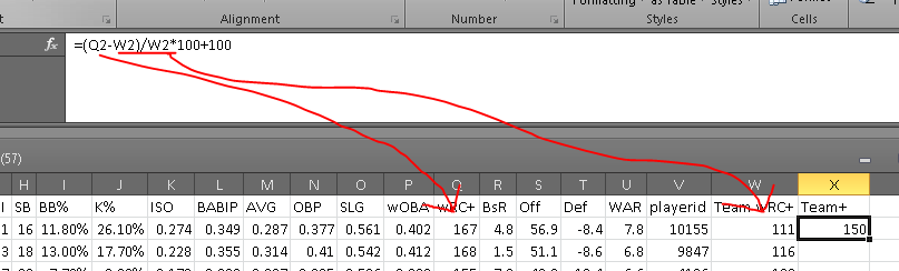
In order to get a Team+ stat (that’s the name we’ll use for our wRC+ applied to the team level), we’ll need to find the players’ differences from their team’s wRC+ and index them, the way wRC+ does. The formula for that would be something like:
Applying that Mike Trout’s 167 wRC+ and the Angels’ 111 wRC+, the formula would look like:
Putting that into Excel, we’ll get something along the lines of this:
If all goes well, it will output a number. I like to take away the decimal places because science.
Where Q2 is the wRC+ column (Q) and Mike Trout Row (2), and W2 is the Team wRC+ column (W) and the Mike Trout row (2). For the 2014 data, this should result in Mike Trout having a 150 Team+ or thereabouts.
After applying the formula to the remaining players, we get a top five Team Most Valuable Hitters of:
Well done, Mr. Rookie! Jose Abreu may not have had as strong a season as Andrew McCutchen — the league’s top hitter — but nobody meant more to his lineup than Abreu, according to the measures we’re using here.
I hope this instruction was helpful. Let me know if you have additional questions.
It’s Postseason time and you want to put some baseball in your face. But what if you are on a plane during the game? What if your TV exploded? What if your dumb boss is forcing you to work the weekend? What if your significant other is making you go to a farm to pick apples or decorative gourds? Well, believe it or not, it will actually be easier to (legally) stream playoff baseball this year. Please notice my use of the word easier in the previous sentence, and how I did not use the word easy. MLB is offering many of their games to stream through MLB.tv, assuming you have the proper cable/satellite subscription. The games not offered by MLB.tv, those playing on Fox Sports 1, can also be streamed if you have the proper cable/satellite subscription, but the way the provider/subscriber deals work out, there is actually very little overlap. For a five spot, you can subscribe to Postseason.tv, which offers “alternate” — read: bad — views of the ALDS and ALCS games, and an Gameday Audio subscription should give you the ability to stream the radio broadcasts. Otherwise, if you just can’t park your butt on the couch this weekend, here’s your guide for streaming the Postseason this weekend.
(EDIT: Intrepid reader Micah pointed out that he was able to watch Friday’s early game through TBS.com, which allows subscribers of other providers like Dish, Xfinity, and COX to watch as well. This may be an option for AL games tomorrow. I’ll edit this post if that is the case. Thanks Micah!)
(Followup: It does appear you can stream these via TBS.com, but the option is only available for computers, not mobile devices.)
NLDS Game 2 (SFN @ WAS)
You can only stream this game on mobile devices or the web, not through connected devices (game systems, Roku, etc.)
You can only stream this game through the Fox Sports Go App
You must subscribe to Fox Sports 1, and provide a valid login to one of the following TV providers (some smaller providers not listed):
AT&T U-Verse
Bright House
Cox
Mediacom
Time Warner Cable
Xfinity (Comcast)
Optimum
Suddenlink
NLDS Game 2 (SLN @ LAD)
You can stream this game on mobile devices, the web, or on connected devices
You can only stream this game through the MLB At Bat app or on MLB.tv
You must provide a valid MLB.tv login
You must subscribe to MLB Network, and provide a valid login to one of the following TV providers:
DirecTV
Optimum
Time Warner Cable
Verizon FiOS
Bright House
Buckeye
ALDS Game 3 (BAL @ DET)
You can only stream this game on mobile devices or the web
You can only stream this game through the MLB At Bat app or on MLB.tv
You must provide a valid MLB.tv login
You must subscribe to TBS, and provide a valid login to one of the following TV providers:
DirecTV
Optimum
Verizon FiOS
Buckeye
ALDS Game 3 (LAA @ KCA)
You can only stream this game on mobile devices or the web
You can only stream this game through the MLB At Bat app or on MLB.tv
You must provide a valid MLB.tv login
You must subscribe to TBS, and provide a valid login to one of the following TV providers:
DirecTV
Optimum
Verizon FiOS
Buckeye
Clear as mud? That’s what I thought. Of course, if you have a decent cable/satellite package or can get to a local watering hole with a bank of TVs, you should be set. Stay tuned for another steaming guide on Monday to get you through the week. In the meantime, enjoy some weekend baseball.
Allow me to start off by apologizing. Thus far I have done two game reviews here at TechGraphs, Madden 15 and FIFA 15, and didn’t have a working capture card for either. Worry no more, dear readers, as from now on I have a smooth running Roxio HD Pro.
There is no shortage of various capture cards, both Amazon and NewEgg have hundreds of search results, however I chose the Roxio brand for a few reasons. Now I’m a fairly technologically-inclined person — I’m sure you’re shocked to hear this — so I don’t shy away from something that could be described as having a difficult installation. Of course, just because I can do something doesn’t mean I want to struggle and get frustrated. One of the biggest selling points for me when deciding which card to get was ease of installation. The only parts I needed to get the Roxio HD Pro up and running on my Xbox 360 were a pair of HDMI cables that ran me about nine bucks.
The instructions contained within the Roxio HD Pro packaging wasn’t at all what I expected. They looked much longer and more intricate than what I planned on.
Then I realized I had been looking at the PlayStation setup. The setup guide for the 360 is literally one sentence plus three bullet points for troubleshooting tips.
The first thing I did was to make sure my Xbox was off. Next I plugged the USB/power cable from my laptop to the Roxio itself. I then unplugged the AV cable and inserted an HDMI to the 360 and the other to the Roxio. Step three was simply taking the other HDMI cable and plugging it into the other side of the capture card and the back of my TV. The next step was putting the installation CD that came with the card into my computer and installing the necessary software. And that’s it. basically five steps, including just double checking my 360 was turned off.
The whole point of springing for the HD Pro version of the Roxio (other than the ease of installation) rather than the standard version for me was two fold: capture footage in 1080p — only 480p is available on the standard model — and the ability to live stream directly to either a YouTube or a Twitch.tv channel. I don’t play competitive console games (though once Halo: Master Chief Collection comes out that my change…), however the option to stream in real time to viewers all over the world is a pretty cool thing to have ready to go.
Really, that is what video games and to a certain extent sports are about: the thrill of winning, and winning in public fashion. Everything from bragging rights, smack talk to whatever you’d like to call is all part of competitive culture in sports and esports alike. Capture cards give you the ability to grab every moment of action so you never miss a highlight. The free software with the Roxio HD Pro allows for editing — it isn’t Sony Vegas but it is quite nice given the price tag — like changing speed such as slo-mo, adjusting the lighting, frame-by-frame trimming and voice over commentary is great for creating montages.
If you can have video evidence of you crushing your friends 6-1 in FIFA or dropping consecutive 3-pointers on them from just across half court, it’s all part of the fun. I’ve already had a blast just tinkering with the editing options. Perhaps in the coming days I’ll upload more gameplay to my YouTube or Twitch channel, maybe even some footage of me getting stomped by pre-teens on Xbox Live while they hurl insults at my parents. But for now, enjoy me playing as QPR against Fulham:
If written words aren’t really your jam, then check out this fast-paced, edge-of-the-seat Tableau Public high-speed thriller of a film I made. For bonus points, listen for my cat in the background:
Ask yourself:
• Do I want to use data as evidence for a claim?
• Do I want to present my data in way other than a table?
• Do I want the user to be able to interact with my data?
If the answers to these questions are “yes,” then I cannot more highly recommend using the free program Tableau Public for creating a visualization for your data. Of course, the answer to these questions should not always be yes. Sometimes a contingency table is sufficient, and sometimes all you need is an Excel graph (which does not allow for user interaction). The temptation we have to resist is thinking: Well, Tableau makes it pretty and interactive, so let’s use Tableau every time.
I have used tables, GIFs, word diagrams, and interactive tables to communicate data-driven ideas, but nothing has been more fantastic — or easier to learn — than Tableau Public. The first thing you’ll need is not the program, but a question. If you don’t have a question, then you don’t need Tableau. Good questions lead to good articles and good Tableaus, but if you just want to dump data into a program, then the interest in your product will be limited.
Let’s, together, ask this question: What is the relationship between a team’s hitting and it’s win-loss record?
This is a great and basic baseball question — and it is one we can transmute into other sports easily, if’n baseball isn’t your thing (i.e. What is the relationship between field goal percentage / points per drive / shooting percentage to an NBA / NFL / NHL team’s W-L record?). We start by getting some data. For my baseball questions, I usually grab data from the FanGraphs SQL server (which is proprietary) as well as the FanGraphs Leaderboard.
The FanGraphs Leaderboards are magnificent and David Appelman (hi, boss!) has done a double-bang-up job making them highly functional. Sometimes the Sports-Reference Play Index tools answer some of my more unusual questions (like: What is the average team record in 1-run games?), but about 60 to 80 percent of my questions can be answered via the FanGraphs leaderboard (which has wOBA, WAR, wRC+, and PITCHf/x data, making it especially useful for advanced analytics questions). There’s a lot of great things you can do with drop-menus and filters on the FG leaderboards, but for now, let’s just use this handy Export Data link here:
Midway down the page, we find the magic Make a CSV button!
Your browser will now download a .csv file (a comma-separated values file, basically a text document version of an Excel spreadsheet). This is our data.
Now we have a question and we have data. Next we need Tableau Public. Download the appropriate file (Windows or Mac), and then install it. If you are using Linux, you’ll want to download the .exe file and install it using Wine. In order to save and to publish any of your work with Tableau, you will need to set up an account with their cloud server. They will probably send you and email from time to time, but in my experience, it has been the good kinds of email — y’know, actual people asking you what they think of their product.
Let me know in the comments if you are having any trouble at this stage, and I will go into more detail with regards of how to install and set up Tableau Public. I’m assuming most people intimidated by this program are not blocked by the installation process, but the data manipulation side of things, so I’ll focus there.
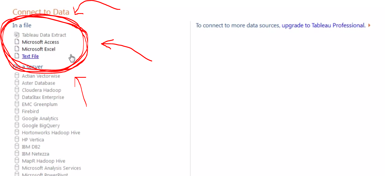
Once you install and open Tableau, you will land on a screen with a big orange button that says “Open Data.” That will take you to this screen, whereupon you can choose your data source:
I typically use Excel files because I will usually want to alter the data a bit before creating a visualization.
We can select our CSV file from our downloads folder, or we can open an Excel file from this screen. Personally, I like dropping the data in Excel first (as seen in the video above) to be sure I’ve got all the right data. Also, Tableau Public does not always love working with CSV files for whatever reason.
Anyway, once we select our data source, a window pops up asking us some specifics about the data. I’d suggest reading the options in here, but for the most part, we can just hit okay and go on living our lives.
With the data loaded, we finally reach Tableau’s sheet view. This is where we will construct charts and graphics, as well as embeddable HTML for blog posts and the like — this, in other words, is where the magic happens.
The Tableau sheet view has a great drag and drop interface.
Our main three areas, at least at first, will be the (1) Measures and Dimensions panel on the left, (2) the Marks panel in the middle, and (3) the Columns and Rows panels across the top. Just dragging and dropping items between these three areas, we can make a whole Tableau document.
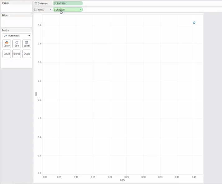
Let’s start by dragging two measures into the columns and rows sections. When we do that, we — disappointingly — get this:
With the data types set to incorrect formats, we can end up with disappointing results. Trial and error is your friend here.
So we obviously didn’t want just a single point in our scatterplot. This is a side effect of wrong data types. Tableau is treating my two inputs (ISO and SB%, which I calculated in Excel as SB/PA) as continuous variables. That means it is summing up all the ISOs and SB-rates in the league, but I want each team to have it’s own individual point in the plot.
By clicking that little green arrow inside my variable icons, I can play around with the data types until I finally have a scatter plot that is scatter plottish.
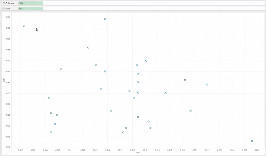
The green arrow inside the variable icon allows us to tweak the data types.
Once we have both variables switched to, in this case, “dimension,” we can then see a proper scatter plot forming:
Scatter plots tend to be my favorite form of data representation, and with Tableau, we can cleanly add more than just two dimensions of information into a scatter plot.
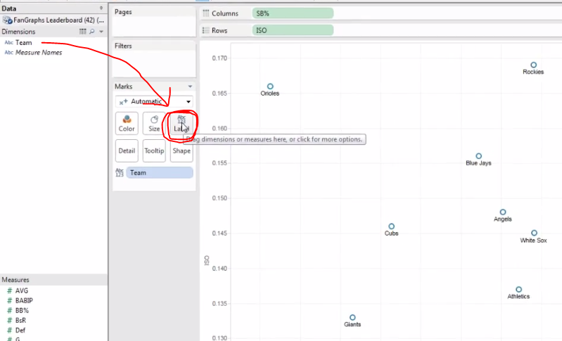
Now we can play around with the presentation — and this is where Tableau really separates itself from Excel. In Excel, if I add labels or colors to my icon, I cannot do so with a third information element. In other words, if I have a plot comparing SB-rate and ISO and then ask Excel to add labels, it’s going to use the Y-axis to automatically populate the label names. That’s no good if I want my dots to represent specific teams.
With Tableau, I can just drag the Teams dimension into the Label square and then Presto-Magnifico, I’ve got my dots labeled appropriately:
Another nifty thing: Tableau does a great job of arranging labels to avoid annoying overlap.
I cannot recommend highly enough the value of playing around with the Marks section. Just drag and drop different Measures and Dimensions into those little rounded squares. As you get more comfortable with these tools, you will start to see the great depth of Tableau’s functionality.
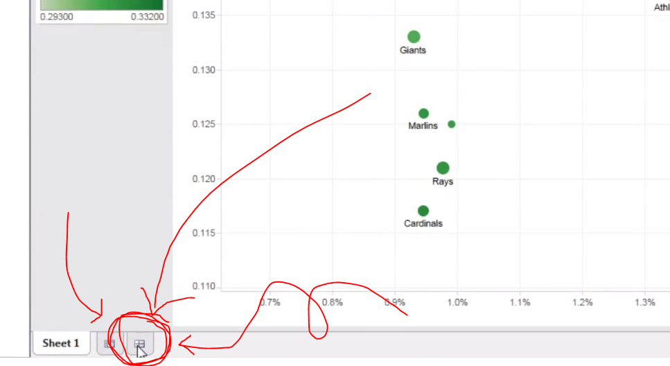
When you have finished getting your plot to where you want it, you’ll want to create a new dashboard. The dashboards are where you can combine multiple graphics (say, a scatter plot and bar graph) as well as organize your keys and color scales and whatnots. To create a new dashboard, click on the new tab icon on the bottom that so happens to look like the Chinese character for field or farm, 田:
Click this little icon to create a new dashboard. You’ll probably want a dashboard if you’re planning on embedding your plot into an HTML blog post.
Like before, everything is click-and-drag in the dashboard view, and if you want any extra formatting options, just right-click something. When you have arranged your dashboard how you like it (and the video above goes into greater detail about this), then you will want to save you project. (Yikes! We waited this long to save?!)
When you save, you are not saving to your hard drive, but Tableau’s cloud. This is both a blessing and a bummer. This means you can access your Tableau biz from all manner of computers — which has proved handy for that last-minute correction — but also means Tableau kinda controls and distributes your work as it so pleases. So, in other words, don’t go around making charts of your friend’s personal cycles on Tableau, lest that kind of info go accidentally public.
Of course, if you’re using Tableau for just sports research, as I do, then you will probably like the extra exposure your hard work gets from, say, appearing on their occasional list of most popular Tableaus (a list I have appeared on a few times, thanks to FanGraphs readership, but would not have otherwise known about had someone not congratulated me). Moreover, the people at Tableau seem genuinely interested in improving their product and have in the past contacted me about questions I had. I imagine if I have serious concerns about my data going public (which, again, why would be using Tableau Public?) then the people Tableau would work with me to find a better fit.
Anyway, once you save your data, a new window will popup. I usually click the “Open in a Web Browser” button at the bottom of the screen and then grab the embed code from the bottom of the page that opens up. I can go into more detail on the embedding process in later articles.
I hope this was helpful! Let me know if you would like more of these or if you feel like I’ve just crushed your soul, wasted your life, or skipped too many steps.


