Word is the Google Cardboard toy — which started as a gimmick, is now a toy, and will soon be a tool, I suspect — now has over 500,000 users.
This got me thinking: We already have mini-cameras we can embed in the ground; we have 360° camera technology; and now we have cheap, accessible virtual reality (VR).
Isn’t it time for 360° MLB.tv? Perhaps a camera embedded neatly in front of home plate or the pitcher’s mound. Maybe on the back of the mound to watch closeup up as the shortstop flips a double-play ball to the second baseman.
Google Cardboard could rapidly democratize the world of VR customers.
Or what about mounting a 3D camera on the cable-tugged NFL sky view cameras? Allow fans to watch the play unfold while focusing on just their fantasy wide receiver, finally giving them the vindication to scream at the quarterback, “He’s wide open! Throw it to James Jones already!”
And doesn’t NASCAR already have cameras mounted on every vehicle? Would it be any more difficult to swap in a 360 model?
The technology is probably not a point just yet where a 360 camera can be safely embedded into a soccer pitch or — certainly not — a basketball court or hockey rink. But goal post cross bars, tops of basketball backboards and jumbotrons dangling from stadium roofs could all be reasonable and fun locations for VR watchers.
Think about it, sports execs. Because it would be awesome.
Powdered supplements and meal replacements have existed for years, but over the recent months, they have taken merged and unified to answer the question: “Can we survive on artificial substance alone?”
Rob Rhinehart, the creator of Soylent, appeared on the Colbert Report to discuss his open source product. That’s when I first heard about it. In the course of the interview, Stephen Colbert tastes Soylent, adds chocolate sauce, and receives commendation from Rinehart:
This intrigued me. I figured Rinehart would have grimaced or demured when Colbert augmented his carefully crafted food replacement. But he didn’t. Something about this made me jump to the thought: This could work for athletes.
First in high school and then in college, I had weight problems. I was too light in high school (a 185 lbs. offensive lineman) and too heavy in college (a 210 lbs. five-seat rower). One of the greatest difficulties I faced was in the cafeteria. In high school, there was insufficient good food, so I couldn’t bulk up healthily. In college — with a Sodexho buffet — I had unlimited access to decent food and even more non-decent food. Part of the college problem was self control, but just as much of it was, let’s say, digestibility. The healthy options — the salads and vegetarian quiches — were often unpleasant or cold, but the pizza and the cheesy pastas and the cookies tasted warm and vaguely reminiscent of delicious (and more importantly, the pizza and pasta went well with the salad dressings and hot sauces that provided a much-needed variety).
In other words: Eating right was hard. Eating like an athlete — when I was burning 1000+ calories every day, and thus was 1000+ calories more hungry every day — was even harder (this, of course, is to say nothing of when your coaches actually want you to be obese).
Perhaps something like Soylent could be a solution? Not only does it meet the hard-to-hit nutritional standards, but it can provide 2000 calories and do so for around $10 a day — or $3.33 per meal.
One of the best resources I have found for learning about Soylent and Soylent-like products is the Soylent Subreddit on Reddit.com. In a recent conversation about the efficacy of the diet entirely on Soylent, user eviljolly pointed out one of the key advantages of a liquid diet — not that it trumps a standard balanced diet, but that it can bring a balanced diet to more people:
Soylent has come along and made nutrition easy for people, and people (like me) that would probably never devote themselves to eating perfectly healthy, can now do so without little to no effort involved.
The current problem for many athletes is a combination of incorrect calorie amount and poor calorie types.
“Americans are not lacking in calories,” Rob Rhinehart said to Stephen Colbert. “They’re lacking in balance.”
Athletes can be disciplined sorts. It’s not unthinkable a diet composed 2/3rds or 100% of liquified nutrition could be viable — especially if it comes cheap. I think Soylent and its sisters might be able to offer that balance.
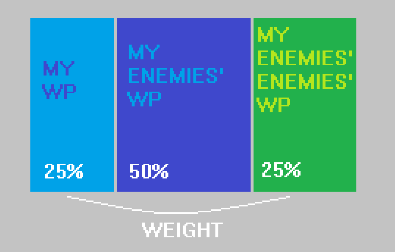
A Rating Percentage Index (RPI) can be a powerful tool in assessing a team’s quality when a team’s schedule may differ wildly from its peers. RPI calculations are critically important in collegiate athletics, when the No. 1 and No. 2 teams in the nation have few or no shared opponents. RPI helps adjust for that curiosity.
Simply put, RPI is this:
The basic principle of RPI is to give 75% of the weight to other teams’ records.
The formula, in formula mode, is:
RPI = (WP * 0.25) + (OWP * 0.50) + (OOWP * 0.25)
Where:
WP = winning percentage
OWP = opponent’s winning percentage
OOWP = opponent’s opponent’s winning percentage
What’s great about RPI is its intuitiveness and its simplicity. Though it might benefit from information like margin of victory or home field advantage (something it can account for and does in the the NCAA basketball calculations), RPI is simply an attempt to adjust for quality of opponent. It does a decent job of answering the question: “What if everyone played each other?” in a league setting where that’s impossible.
We can then use RPI for:
rec rugby teams with unbalanced schedules
ongoing office ping pong tournaments
high school, middle school, and rec league teams of all sports
Madden records with friends
any environment where two parties battle and one wins
Here’s the file:
NOTE: Don’t download this if you don’t trust me. The file is an Excel file with macros; these can be powerful. I encourage you to trust me, but in general, practice caution when opening an macro-enabled Excel file from a stranger on the Internet.
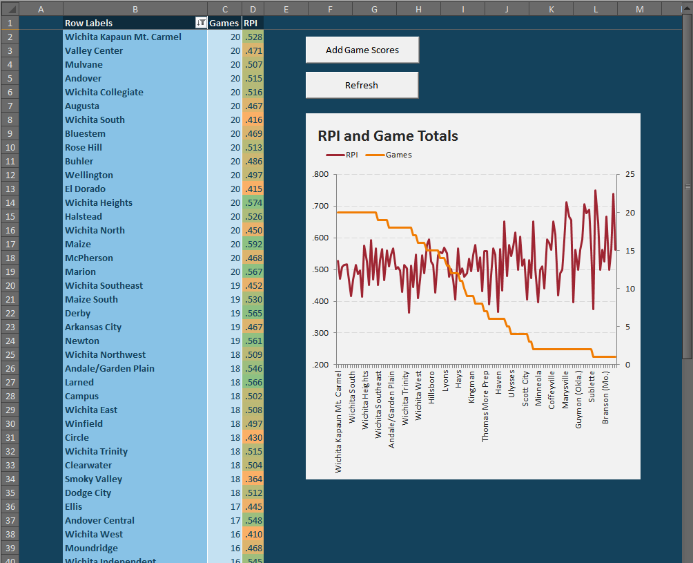
When you open the file, it should look something like this:
The file comes with some default, filler data. You can remove it using the “Add Game Scores” button.
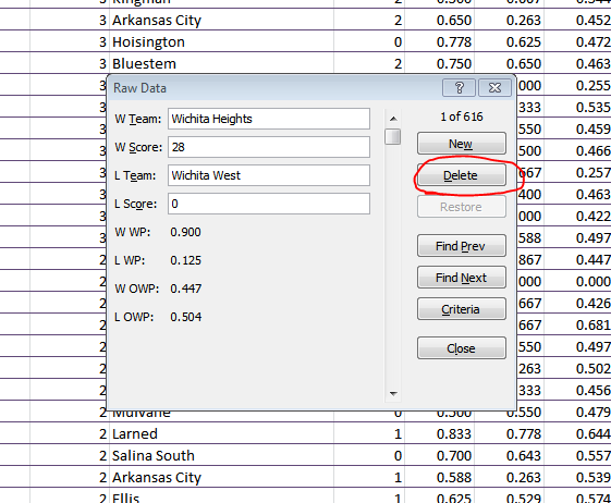
If you want to jam in the results from your weekend of one-on-one basketball games, just click the “Add Game Scores” button. This will produce a list popup where you can add and remove game results:
You can remove an old record by scrolling through the selections (or clicking the “Find Prev” or “Find Next” buttons) and then clicking “Delete.”
You can speed this process up by unhiding the “Raw Data” tab and deleting the unwanted rows of data. But be sure to preserve at least one row so that the final four columns retain their formulas.
To add a new score, you’ll want to click “New” immediately, then fill in the blank spots. NOTE: You don’t need to put in the scores, but since nothing is password locked in this doc, you may want to save those in case later on you feel frisky and want to add some margin of victory inputs somewhere. Once you have input the records you desire, click “Close.” We will now need to refresh the calculations, so press the big, appropriately-titled “Refresh” button. ALSO NOTE: You will likely need to adjust the row filters.
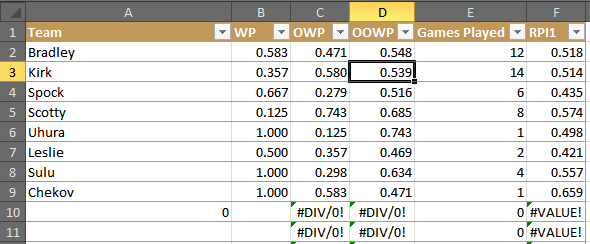
The end result should be something like this:
You may need to refresh a second time to get the RPI column’s conditional formatting to work.
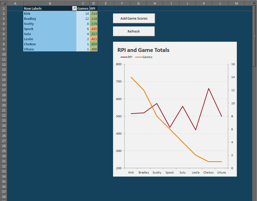
If we want to drill deeper on the data, we can unhide the “Prep” worksheet, which will show each RPI and the three components that go into it.
The “Prep” tab allows us to see the full details of the data.
Analysis:
Chekov may have the largest RPI, but he played only one game of Tri-Dimensional Chess — a game which he won, obviously. That’s why it’s important to note the Game Played when looking at RPI (or WP, for that matter). His one victory game against me, which is ultimately neither a big help nor hindrance because my RPI was merely .518 — so his one victory came against a mediocre player.
Despite winning 2 out of every 3 games, Spock’s weak competition (2 wins against Scotty, 1 against Kirk and myself) and his losses against Scotty and Kirk, undermined his otherwise impressive record.
The best player was probably Scotty, who lost a ton, but nevertheless beat Spock. Moreover, many of his losses came at the hands of undefeated Sulu, undefeated Uhura, and the formidable Kirk. If Scotty chose his 8 opponents better, he could conceivably have been the best player.
Analysis of the analysis: If you think these results seem skewed to favor the smaller samples, you are right. That is one of the dangers of RPI. Review that very first RPI chart. The lower the orange line (i.e. the fewer games played), the more upwardly skewed the red line (i.e. the more likely for a bias towards high RPIs). The systems settles down around ten games, so I would consider that as good an arbitrary cutoff as any other number.
If we cut off our Tri-Dimensional Chess club rankings at a minimum of 10 games played, we can comfortably assert that I’m marginally better than Kirk — and that Scotty could be possibly better than us both.
Anyway, that’s the RPI Tool. I hope you enjoy it. Please let me know in the comments if you encounter any problems. I’ve not password locked anything, so feel free to do whatever with the spreadsheet.
As recently as October, we mused about the possibilities of augmented reality in sports, and I concluded with a brief story about some strange display technology my grandfather encountered in the 1960s — a device that could purportedly display 3D images without 3D goggles. I have always had trouble conceptualizing that idea. How to you make light stop mid air? How can you create a hologram without some sort mist or substance to reflect the light in transit? Well, I dunno. Maybe it’s not possible.
And maybe this:
This technology could be significant in many ways. It could illuminate the ball path for a touchdown throw, a three-pointer or a fastball on the outside edge for fans in the stadium (not to mention umpires and referees). It could show a glowing yellow line for the first down marker that more than just the audience at home could see. It could change the role of a scoreboard as we know it.
A butterfly image flits above a street in Japan — and everyone can see it.
Obviously, glittering dots in the sky are a long way away from an illuminated pitch tracker. But computers went from singing Daisy to World is Mine, this, in under 60 years. We cannot say where this current technology can and will end.
We are already accustomed to seeing unreal sights in our sports. But what about seeing tracers for free throws and drive charts on the gridiron when we are at the stadium?
When the yellow line appears on the first down line, we don’t hide behind our couches in caveman fear, nor do we dive under the bed when car names and driver photos appear above the machines zipping around the Daytona Speedway. And baseball fans have embraced the new MLB Statcast, which debuted during the 2014 MLB All-Star break and has shined in the 2014 MLB postseason. It essentially quantifies every movement on a baseball field and then visualizes the data for viewers at home:
Modern spreadsheet programs are powerful. Compared to what our ancestors had to deal with — pen and paper spreadsheets — Excel, Google Spreadsheets, and LibreOffice / Open Office type programs are basically alien. And I mean that both in the utility and the intuitiveness of these programs. While they are incredibly useful in combing data for information, they are also full of hidden treasures — and a productivity program should never have hidden anythings.
Each of these programs has a little gem called “vlookup.” The vlookup function stands for “vertical lookup.” As we might expect, there is also a “horizontal lookup,” which is basically the same thing, but it scans columns instead of rows. The vlookup function is especially useful for when we want to combine information from across two tables. But first we need a question. Playing with data for the sake of playing with data is not super helpful — usually.
So here’s our question: Who is the most important hitter to any given team?
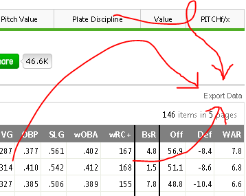
There are a lot of ways to approach this question, but since we want to use vlookups, let’s further this inquiry by asking: Which player has the highest wRC+ relative to the rest of his team? The weighted runs created plus (wRC+) statistic is great because it measures a players total offensive output, but it also controls for era, stadium, and league.
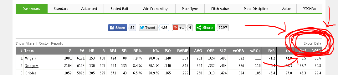
In order to answer this second question, we will need to know our data. We can get each individual player’s wRC+ from the FanGraphs leaderboard here. Using the Export Data button, we can get a CSV of each leaderboard page in an instant.
Here’s the button that makes FanGraphs leaderboards so nifty for outside data analysis programs like Excel or Tableau.
Then, we want the team data. Navigate over to the Teams tab and choose the “NP” or non-pitchers button. This gives the team-level offensive numbers without those nasty pitchers gumming up the data with their strike outs and pop outs and trickle outs.
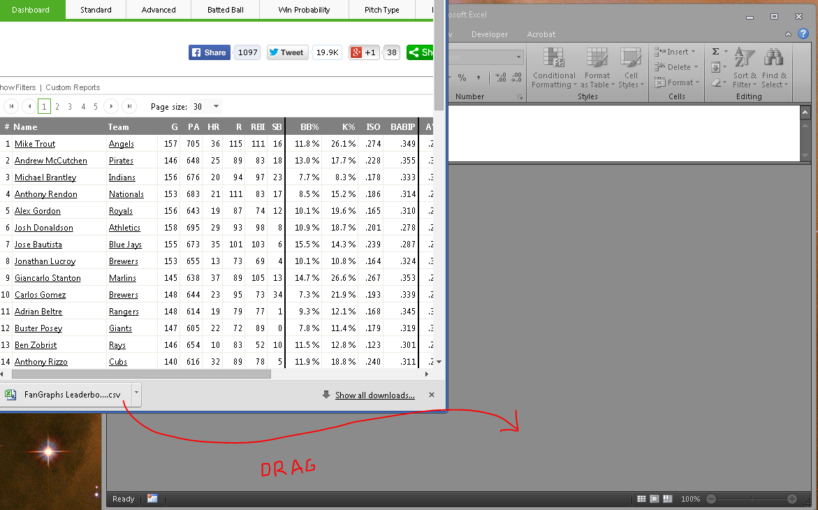
After we’ve exported both data, we can open them either by navigating to the Downloads folder and opening them with Excel, or just clicking the download icon in Chrome or Firefox or Internet Explorer if you’re stuck at work and it’s 1997. I oftentimes have multiple instances of Excel open (for my multi-monitor madness) and so I like to drag the download icon into the Excel window.
I’m a dragger. I like to drag the downloaded files. And if you have multiple Excel windows running (which isn’t necessary for this, but — what the hay? — we all need to look busy at work, right?), then dragging should be a preferred method.
Now we have all the data we want; we just need to combine it. Enter vlookups.
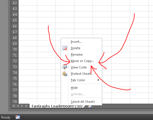
To keep things neat, let’s combine our two separate workbooks. This isn’t a necessary step, but it will help our formula bars be more readable. Right click the tab of one of the worksheets (it doesn’t matter which) and choose Move or Copy…. This will open a dialogue asking where you want to move the worksheet. Using the drop down menu, choose the other workbook and click okay. This should combine the two disparate worksheets into a single workbook. (I’d also go ahead and rename them too, just for whatever’s sake.)
Combining the two worksheets is not a necessary step, but it can simplify the formulas later. Also: It keeps all your data in one place, which is good for later when you reopen the stuff.
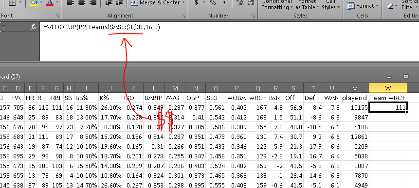
I’ve renamed my two worksheets (or tabs) as “Players” for the first set of data and “Teams” for the data we took from the teams leaderboard. On the players tab, we’ll want to add a column called “Team wRC+”. So in cell W1, I write just that, and then in cell W2 I begin to type the vlookup formula by writing =vlookup(.
lookup_value: What do I want Excel to use to find something? What is the key to unlock the information door? In this case, I want Excel to find the team wRC+ by using a player’s listed wRC+, so the lookup_value needs to be B1, which is where the column “Team” is in this particular spreadsheet. (Now press comma.)
table_array: Where is the data? Or where is the doorway for the aforementioned key? The answer to this question is the data that is in my “Teams” tab — the team totals data from our second CSV download. I’ll navigate to the Team tab, click in cell A:1 and drag until you’ve selected the whole table. Now, we don’t want this selection to move later on (because this table is not moving; it’s dead), so press F4 to add cashmoney symbols in front of your cell references. (Now press comma.)
col_index_num: In which column will Excel find the desired data? Or where in the room is the prize? For this, we need to find which column the team wRC+ is listed in. That’s column P, which is the 16th column in our table_array (because we count every column, including the first). So here, we’ll write 16. (Now press comma.)
range_lookup: Do we want Excel to find an exact match for the lookup_value? OF COURSE. DON’T BE SO FREAKIN’ LAZY, EXCEL. YOU’RE A ROBOT, YOU DON’T GET TIRED. Type a 0 (zero) or FALSE in here. (Now close the parenthesis and hit enter.)
Look at that! If all has gone according to plan, you should have a number populating that W2 cell (probably a “111” if Mike Trout is at the top of your list and you’re using the 2014 season data). If there is a problem and we’re getting an error message, we can always find out where that particular error is occurring by using the Evaluate Formula function (Formulas > Evaluate Formula).
Your formula, en totale, should look something like this:
This is what your formula and result should ultimately look like. Make sure to have the dollar signs in their, which will make it an absolute reference rather than a relative reference.
Now we need to apply that formula to all the cells in the column. We can drag that bottom right corner of that “111” cell, or copy and then paste on the empty cells, or whatever the hell we want.
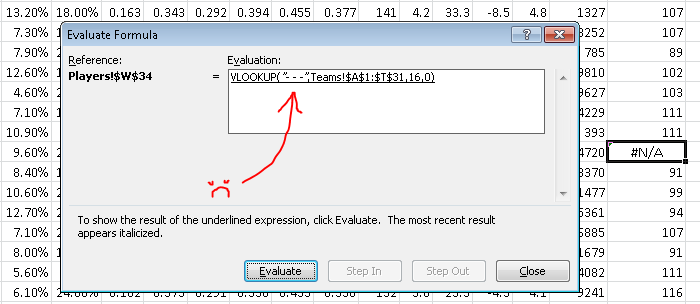
If all goes well, you should get a few #N/As. These mean that something went wrong in the formula. Let’s use the Evaluate Formula button (Formulas > Evaluate Formula) to find out what went wrong. If you’re using the same data as me, go to the first #N/A, which should be Chase Headley at W34.
The Evaluate Formula pop up window will then walk us through the steps of the formula and we can see the point at which it all goes terribly wrong. Clicking “Evaluate” one time shows us this:
Unless we add a “- – -” value to the Teams page, this will always return an “#N/A” result.
The problem here is that the formula is looking for a team named “- – -” in the Teams tab. That’s because the Padres traded Headly to the Yankees in 2014, so he has two teams on record. There’s a variety of ways to work around this (the most easy method being: check the box marked “Split Teams” on the FanGraphs leaderboard), but I just wanted to should have Evaluate Formula can be useful.
Anyway, to finish out our question (“Which hitters meant the most to their teams?”), we need some more calculations. For the ease of viewing, let’s add another column to this data. (Normally, I’d just thrust these additional calculations into the formula I’ve already got going, but that has the downside of looking complex and hiding additional errors.)
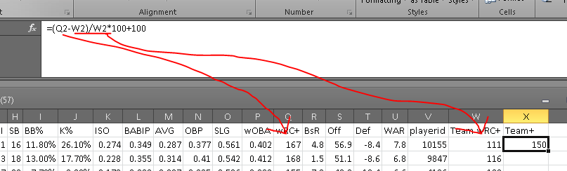
In order to get a Team+ stat (that’s the name we’ll use for our wRC+ applied to the team level), we’ll need to find the players’ differences from their team’s wRC+ and index them, the way wRC+ does. The formula for that would be something like:
Applying that Mike Trout’s 167 wRC+ and the Angels’ 111 wRC+, the formula would look like:
Putting that into Excel, we’ll get something along the lines of this:
If all goes well, it will output a number. I like to take away the decimal places because science.
Where Q2 is the wRC+ column (Q) and Mike Trout Row (2), and W2 is the Team wRC+ column (W) and the Mike Trout row (2). For the 2014 data, this should result in Mike Trout having a 150 Team+ or thereabouts.
After applying the formula to the remaining players, we get a top five Team Most Valuable Hitters of:
Well done, Mr. Rookie! Jose Abreu may not have had as strong a season as Andrew McCutchen — the league’s top hitter — but nobody meant more to his lineup than Abreu, according to the measures we’re using here.
I hope this instruction was helpful. Let me know if you have additional questions.
That’s right. A scholarship for video game players. How both delightful and terrifying. And I don’t really know why either emotion strikes me, much less both simultaneously. Perhaps I’m terrified because — much in the way my grandfather, born in 1901, became dismayed at the increasing popularity of the NFL in the 1970s — I am witnessing an irrevocable change in the universe of sports. Esports — or electronic sports — are going mainstream. They’re going NCAA.
Well, not necessarily NCAA, but they’re getting legit like crazy. Actually, the video game tournaments themselves are already legit. Consider pro gamer Nadeshot’s discussion about the team roster around the 2:50 mark in this interview. He makes it very clear how the players inside the industry already see themselves as brethren to the pro athletes of traditional sports. Students of the history of pro sporting leagues (or perhaps just anyone who’s seen the first two episodes of Ken Burn’s Baseball documentary) will no doubt suffer from deja vu at this juncture: Players rapidly jumping from one team to the next; the league lacking clear regulation; the popularity outpacing the structure.
I doubt the world of esports and gaming will ever have a business model identical to the NFL, Premier League, or any other stadium-based sports league, but at the same time, the models of these leagues are changing rapidly, too. The proliferation and growing demand for services like MLB.tv, NFL Rewind, and similar streaming services suggests that an online broadcast would not only be successful, but well-positioned for the next decade of broadcasting trends.
Video games tourneys are not getting legit. They are legit. Past tense. Stuff’s for real now. (Image by Milton Jung.)
So esports happens to be an activity that people care about. It makes sense, then, that good esports players could make a living doing this popular thing makes sense — that’s how all our current pro sports leagues came into existence. Jim Creighton got paid (under the table) to play baseball, and he got paid with the money from the ticket booth. And when radio coverage started making the sport more money, tickets, hot dogs, and toothpaste commercials lined Babe Ruth’s wallet.
Now, Peyton Manning makes the heft of his income from television. Gate receipts for an NFL game represent only a fraction of the NFL’s revenue. But a guy like Manning also makes a great deal of money in non-NFL advertisements. And this is another piece of the economic puzzle that is pro game.
SK Gaming, one of Germany’s premier gaming teams, has sponsorship deals with Intel, Medion AG, and previously Adidas. As recently as 2008, the 85% of the team’s funding came from sponsorships.
The other side of this inquiry is the question: Is this a sport? Should gaming be considered athletic? Are the Robert Morris gamers student-athletes? I think the answer is probably yes. Maybe it has to be yes. If NASCAR, with it’s heavy reliance on mechanical and electronic components, is a sport, then so is gaming. Like racing sports, gamers cannot survive on intellect alone — so it is unlike a chess or board game tournament. Esports have a very specific, very real physical component to their execution — the rapid maneuvering and manipulating of the hands and fingers; the ability to communicate reflexively and across multiple mediums (with the headset and, say, on-screen flares).
Of course, if we don’t consider pro racing athletic (and I think there’s semantical room to argue that), then we can easily paste that same conclusion on the Robert Morris students. But I’ve digressed.
I would like to point out another similarity of the pro sports and pro esports worlds: Rapid player obsolescence. Whereas the pro tennis, basketball, football, soccer, or baseball player has finished his or her career by age 40, the 30-year-old gamer is an equally rare sight — which is especially surprising since video games have been around for nearly 40 years. But gamer fatigue appears just as real as NFL running back obsoletcence — though with far fewer life-altering concussions to worry about.
So from a collegiate perspective, I think a gaming scholarship is perfectly rational (assuming any sports scholarship is at all rational). It is a sport that could draw attention and attendance to the school; it nurtures an ability that can — though unlikely — result in a lucrative pro career; and it is a topic that is relevant to the interests of many students’ and many in the coming generations.
I say: Well done, Robert Morris. You may have broken the sports and esports barrier, and I think we can all agree that’s delightifying.
Real-life Tony Stark — Telsa and SpaceX founder Elon Musk — is in the news again on the merit of a recent and fascinating Aeon Magazine article. The article sums up some of Musk’s recent Mars ambitions, and by way of recap: His original call for an 80,000-person colony has expanded to a 1-million-person civilization. And in case we might suspect the idea is discovery-driven, we should know the emphasis actual orbits the concept of survival.
And, oddly enough, it makes some sense. What he’s saying is:
There are no other civilizations networked across the known galaxy;
so barring any unknown unknowns, there’s either no life by Earth life or all other single-planet civs died off;
so what the hell? Let’s build a second Earth in case we break this one a little earlier than expected.
And since every science fiction movie ever includes Earth either being destroyed or being wasted via pollution, then I’d say we pretty much need to make that Mars colony right now. Read the rest of this entry »
If written words aren’t really your jam, then check out this fast-paced, edge-of-the-seat Tableau Public high-speed thriller of a film I made. For bonus points, listen for my cat in the background:
Ask yourself:
• Do I want to use data as evidence for a claim?
• Do I want to present my data in way other than a table?
• Do I want the user to be able to interact with my data?
If the answers to these questions are “yes,” then I cannot more highly recommend using the free program Tableau Public for creating a visualization for your data. Of course, the answer to these questions should not always be yes. Sometimes a contingency table is sufficient, and sometimes all you need is an Excel graph (which does not allow for user interaction). The temptation we have to resist is thinking: Well, Tableau makes it pretty and interactive, so let’s use Tableau every time.
I have used tables, GIFs, word diagrams, and interactive tables to communicate data-driven ideas, but nothing has been more fantastic — or easier to learn — than Tableau Public. The first thing you’ll need is not the program, but a question. If you don’t have a question, then you don’t need Tableau. Good questions lead to good articles and good Tableaus, but if you just want to dump data into a program, then the interest in your product will be limited.
Let’s, together, ask this question: What is the relationship between a team’s hitting and it’s win-loss record?
This is a great and basic baseball question — and it is one we can transmute into other sports easily, if’n baseball isn’t your thing (i.e. What is the relationship between field goal percentage / points per drive / shooting percentage to an NBA / NFL / NHL team’s W-L record?). We start by getting some data. For my baseball questions, I usually grab data from the FanGraphs SQL server (which is proprietary) as well as the FanGraphs Leaderboard.
The FanGraphs Leaderboards are magnificent and David Appelman (hi, boss!) has done a double-bang-up job making them highly functional. Sometimes the Sports-Reference Play Index tools answer some of my more unusual questions (like: What is the average team record in 1-run games?), but about 60 to 80 percent of my questions can be answered via the FanGraphs leaderboard (which has wOBA, WAR, wRC+, and PITCHf/x data, making it especially useful for advanced analytics questions). There’s a lot of great things you can do with drop-menus and filters on the FG leaderboards, but for now, let’s just use this handy Export Data link here:
Midway down the page, we find the magic Make a CSV button!
Your browser will now download a .csv file (a comma-separated values file, basically a text document version of an Excel spreadsheet). This is our data.
Now we have a question and we have data. Next we need Tableau Public. Download the appropriate file (Windows or Mac), and then install it. If you are using Linux, you’ll want to download the .exe file and install it using Wine. In order to save and to publish any of your work with Tableau, you will need to set up an account with their cloud server. They will probably send you and email from time to time, but in my experience, it has been the good kinds of email — y’know, actual people asking you what they think of their product.
Let me know in the comments if you are having any trouble at this stage, and I will go into more detail with regards of how to install and set up Tableau Public. I’m assuming most people intimidated by this program are not blocked by the installation process, but the data manipulation side of things, so I’ll focus there.
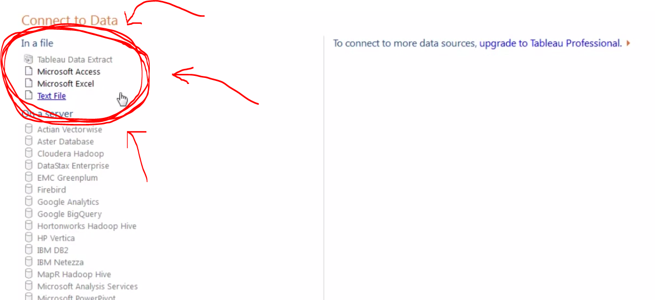
Once you install and open Tableau, you will land on a screen with a big orange button that says “Open Data.” That will take you to this screen, whereupon you can choose your data source:
I typically use Excel files because I will usually want to alter the data a bit before creating a visualization.
We can select our CSV file from our downloads folder, or we can open an Excel file from this screen. Personally, I like dropping the data in Excel first (as seen in the video above) to be sure I’ve got all the right data. Also, Tableau Public does not always love working with CSV files for whatever reason.
Anyway, once we select our data source, a window pops up asking us some specifics about the data. I’d suggest reading the options in here, but for the most part, we can just hit okay and go on living our lives.
With the data loaded, we finally reach Tableau’s sheet view. This is where we will construct charts and graphics, as well as embeddable HTML for blog posts and the like — this, in other words, is where the magic happens.
The Tableau sheet view has a great drag and drop interface.
Our main three areas, at least at first, will be the (1) Measures and Dimensions panel on the left, (2) the Marks panel in the middle, and (3) the Columns and Rows panels across the top. Just dragging and dropping items between these three areas, we can make a whole Tableau document.
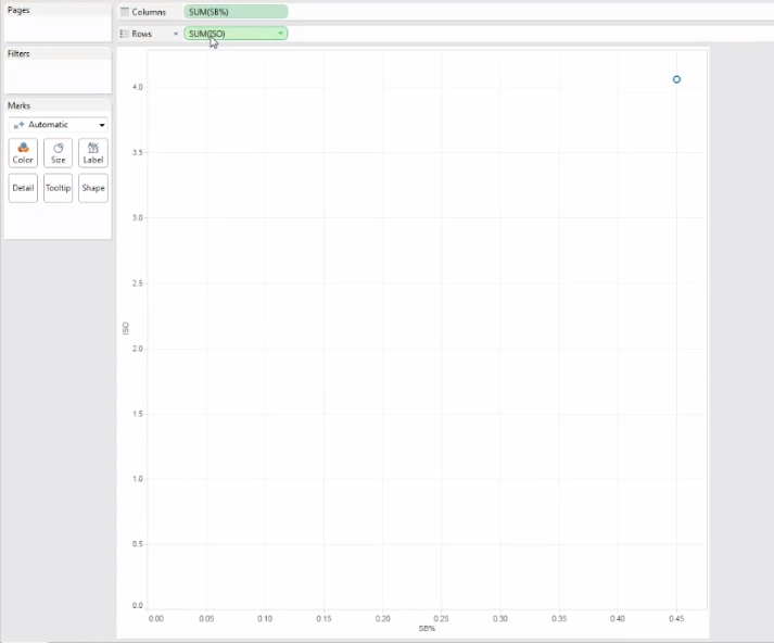
Let’s start by dragging two measures into the columns and rows sections. When we do that, we — disappointingly — get this:
With the data types set to incorrect formats, we can end up with disappointing results. Trial and error is your friend here.
So we obviously didn’t want just a single point in our scatterplot. This is a side effect of wrong data types. Tableau is treating my two inputs (ISO and SB%, which I calculated in Excel as SB/PA) as continuous variables. That means it is summing up all the ISOs and SB-rates in the league, but I want each team to have it’s own individual point in the plot.
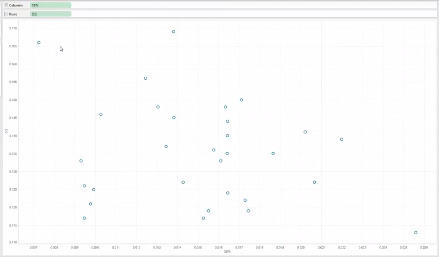
By clicking that little green arrow inside my variable icons, I can play around with the data types until I finally have a scatter plot that is scatter plottish.
The green arrow inside the variable icon allows us to tweak the data types.
Once we have both variables switched to, in this case, “dimension,” we can then see a proper scatter plot forming:
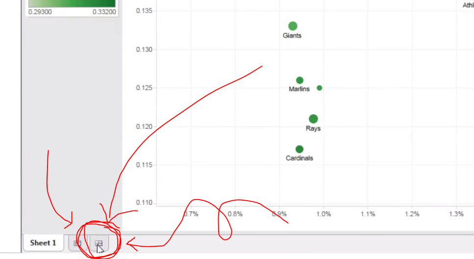
Scatter plots tend to be my favorite form of data representation, and with Tableau, we can cleanly add more than just two dimensions of information into a scatter plot.
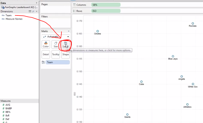
Now we can play around with the presentation — and this is where Tableau really separates itself from Excel. In Excel, if I add labels or colors to my icon, I cannot do so with a third information element. In other words, if I have a plot comparing SB-rate and ISO and then ask Excel to add labels, it’s going to use the Y-axis to automatically populate the label names. That’s no good if I want my dots to represent specific teams.
With Tableau, I can just drag the Teams dimension into the Label square and then Presto-Magnifico, I’ve got my dots labeled appropriately:
Another nifty thing: Tableau does a great job of arranging labels to avoid annoying overlap.
I cannot recommend highly enough the value of playing around with the Marks section. Just drag and drop different Measures and Dimensions into those little rounded squares. As you get more comfortable with these tools, you will start to see the great depth of Tableau’s functionality.
When you have finished getting your plot to where you want it, you’ll want to create a new dashboard. The dashboards are where you can combine multiple graphics (say, a scatter plot and bar graph) as well as organize your keys and color scales and whatnots. To create a new dashboard, click on the new tab icon on the bottom that so happens to look like the Chinese character for field or farm, 田:
Click this little icon to create a new dashboard. You’ll probably want a dashboard if you’re planning on embedding your plot into an HTML blog post.
Like before, everything is click-and-drag in the dashboard view, and if you want any extra formatting options, just right-click something. When you have arranged your dashboard how you like it (and the video above goes into greater detail about this), then you will want to save you project. (Yikes! We waited this long to save?!)
When you save, you are not saving to your hard drive, but Tableau’s cloud. This is both a blessing and a bummer. This means you can access your Tableau biz from all manner of computers — which has proved handy for that last-minute correction — but also means Tableau kinda controls and distributes your work as it so pleases. So, in other words, don’t go around making charts of your friend’s personal cycles on Tableau, lest that kind of info go accidentally public.
Of course, if you’re using Tableau for just sports research, as I do, then you will probably like the extra exposure your hard work gets from, say, appearing on their occasional list of most popular Tableaus (a list I have appeared on a few times, thanks to FanGraphs readership, but would not have otherwise known about had someone not congratulated me). Moreover, the people at Tableau seem genuinely interested in improving their product and have in the past contacted me about questions I had. I imagine if I have serious concerns about my data going public (which, again, why would be using Tableau Public?) then the people Tableau would work with me to find a better fit.
Anyway, once you save your data, a new window will popup. I usually click the “Open in a Web Browser” button at the bottom of the screen and then grab the embed code from the bottom of the page that opens up. I can go into more detail on the embedding process in later articles.
I hope this was helpful! Let me know if you would like more of these or if you feel like I’ve just crushed your soul, wasted your life, or skipped too many steps.
It appears 2K Sports’s NHL video game franchise is returning to life via the mobile sphere (h/t Polygon). With an undated title (simply: NHL 2K) it will be 2K’s first NHL game since NHL 2K11. While there is merit to the question “How terrible will the game be?” given that the rival game, so to speak, has been a wasteland of missing features, I think the enduring question is: What future lies ahead for sim sports games on mobile platforms?
And more generally: Are mobile devices becoming viable platforms for simulation sports game?
Madden NFL Mobile (Metascore 66) and the mobile edition for NBA 2K14 (Metascore 59) have shown (by their graphics) that mobile platforms are viable outlets for graphical demands of the simulation video games, but also (by their relatively weak reviews) that mobile platforms need more than just pared down or freemium versions of the platform games.
The mobile platform, to me, seems ripe for a renter model of video game use — a model many companies seem keen on using given the proliferation of MMORPGs over the last decade. Imagine paying — let’s be user-friendly — $5 a month to play an actively updated (with fresh rosters and occasional bigger patches and upgrades) version of MLB The Show. No upfront cost, just $5 a month — tacked onto your phone bill or your XBOX Live / PS Plus bill. You can play it on your mobile device, your home console, your computer. You can save your games to the cloud so your franchise is constantly developing whether you’re on the bus to work, in the bathroom at work, at home, thinking about work, and so on.
Brian Mazique and 2K Sports exec Chris Snyder discuss the new game.
I’m not talking about a freemium game. Because freemium games are not really cut out for simulation gaming and are also kinda the devil. Instead it would be a good game that, over the course of a year, would cost $60, but not expire come the end the season.
This model seems like a win-win to me. I can test out a game for just $5 (or, heck maybe $10) and if I love it, I will never have to buy a replacement and I will have it across all platforms simultaneously. I firmly believe this is what fans of simulation sports games want. Meanwhile, the gaming industry will get a steady income stream for his gold coin pool.
Of course, I could be wrong — maybe no one has an interest in pairing a controller with their iPad or Nexus phone; maybe no one else wants franchise mode in something that has a battery life; maybe there’s no better way to do it than it’s being done now — but maybe it’s time for a developer to find out. And maybe NHL 2K is the first step in that new direction?


